Preview image. Unlock full-res
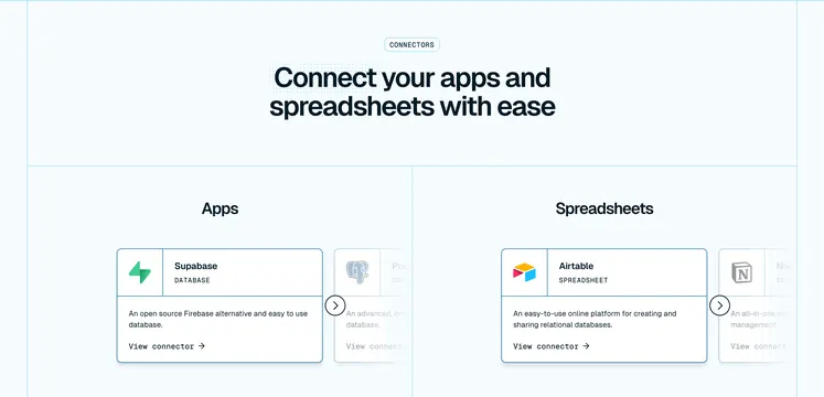
Light-blue connectors section with Apps and Spreadsheets columns, each showing logo cards in a horizontal carousel with arrow navigation.
Summary
A CONNECTORS badge heads a two-column layout where Apps and Spreadsheets each get a horizontal card carousel with logo, category label, description, and View connector link.
Visual description
Very light blue background with thin blue grid lines. Centered pill badge reads CONNECTORS. Bold navy headline: "Connect your apps and spreadsheets with ease." Two columns labeled Apps and Spreadsheets. Each column shows white bordered cards with app logo, name, category in small caps (DATABASE, SPREADSHEET), description, and View connector arrow link. Supabase and Airtable cards are primary; PostgreSQL and Notion peek from the right. Circular arrow buttons overlap card edges for carousel navigation.
Key takeaway
Splitting connectors by type (apps vs spreadsheets) reduces cognitive load in a large catalog. Carousel keeps the section compact while hinting at depth. Category labels in caps below the name clarify what each integration is.
Reuse notes
Strong for integration platforms or marketplaces. Needs enough connectors to justify carousels. Grid-line background reinforces technical SaaS tone without adding color noise.
More integrations sections
See all











More like this
Keep what you find
A free account saves references to boards and can send you a weekly email of picks based on what you save.
To see every result, go Pro.