Preview image. Unlock full-res
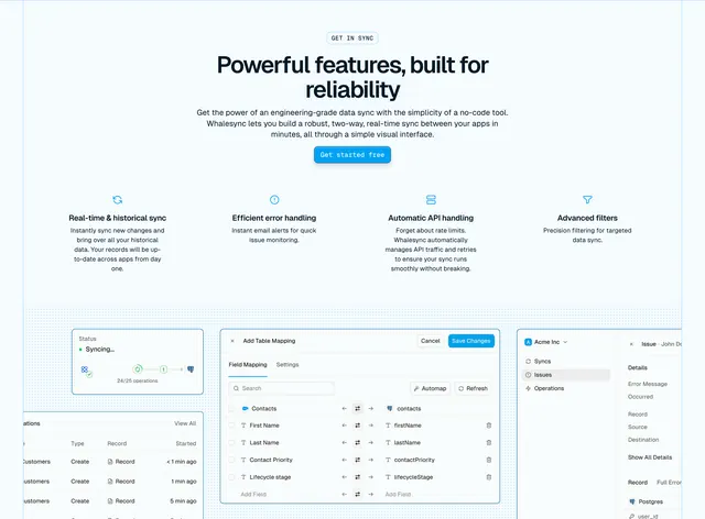
Feature section with four icon columns, then an overlapping collage of product UI screens for sync status, operations, field mapping, and issues.
Summary
GET IN SYNC section leads with four feature icon columns, then a dot-grid stage with overlapping UI panels showing sync status, operations table, field mapping modal, and issue sidebar.
Visual description
White background. Centered GET IN SYNC pill, headline "Powerful features, built for reliability," grey value prop copy, blue Get started free button. Four equal columns with thin blue line icons and headings: Real-time & historical sync, Efficient error handling, Automatic API handling, Advanced filters, each with short description. Below, light blue dot-grid background anchors overlapping product UI: status card showing Syncing progress, operations table with recent creates, large Add Table Mapping modal with Salesforce Contacts to database field list and Automap button, and Issue detail sidebar with error metadata.
Key takeaway
Icon row summarizes benefits; UI collage below proves them with real product depth. Overlapping panels on a dot grid create depth without animation. Field mapping modal as hero UI communicates power-user capability immediately.
Reuse notes
Strong for data or developer tools where the interface is the product. Collage needs polished UI screenshots updated with releases. Dot grid background ties disparate panels into one composition.
More features sections
See all











More like this
Keep what you find
A free account saves references to boards and can send you a weekly email of picks based on what you save.
To see every result, go Pro.