Preview image. Unlock full-res
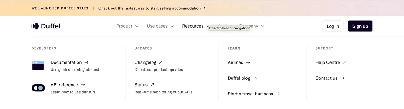
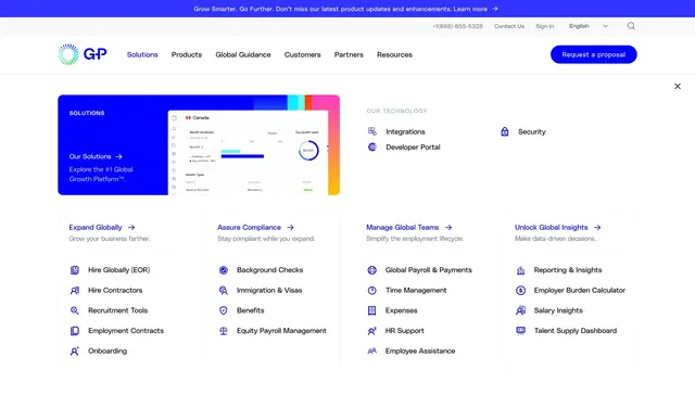
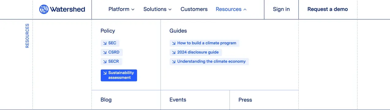
Resources mega-menu with grid lines, Policy and Guides columns, and Sustainability assessment hover state.
Summary
A grid-lined Resources mega-menu organizing policy links and guides with a highlighted hover row.
Visual description
Top nav with Watershed logo, Platform, Solutions, Customers, Resources with open dropdown, Sign in, and Request a demo. Dropdown panel uses visible navy grid lines dividing cells. Left vertical RESOURCES label. Policy column lists SEC, CSRD, SECR with arrow icons; Sustainability assessment row shown in solid blue hover fill with white text. Guides column lists climate program and disclosure guides on pale blue cells. Bottom row cells for Blog, Events, and Press.
Key takeaway
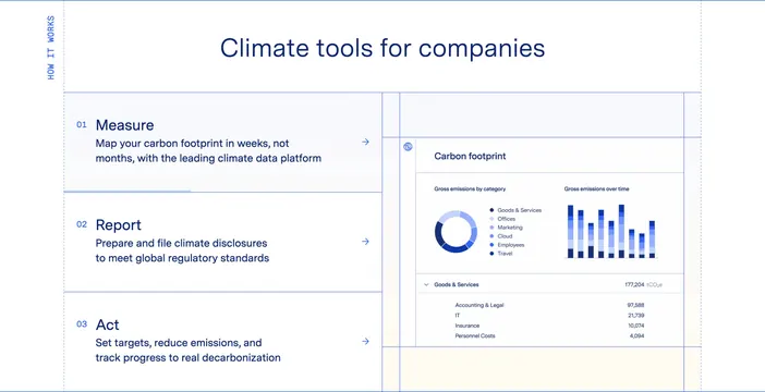
Blueprint grid lines turn a mega-menu into a branded system component. Column labels (Policy, Guides) match how compliance buyers think.
Reuse notes
Reference for B2B sites with deep resource IA. Grid must stay readable when translated or at narrower desktop widths.