Preview image. Unlock full-res
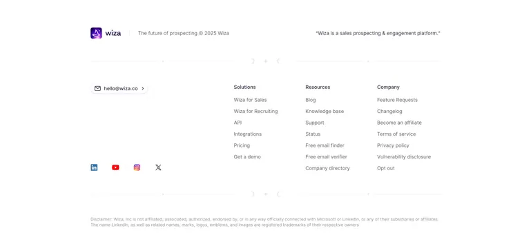
Airy light footer with a brand row and tagline up top, three right-aligned link columns, a pill email link and social icons, framed by thin celestial divider rules.
Summary
A clean, spacious white footer led by a brand-plus-tagline row, with three right-aligned link columns, an email pill, and social icons, all framed by thin horizontal rules carrying tiny moon-and-star glyphs. The defining note is those celestial divider lines breaking the footer into bands.
Visual description
White background, dark navy text. A top row places the purple Wiza app icon and wordmark at left, a vertical bar, then "The future of prospecting © 2025 Wiza," with a right-aligned quoted line "Wiza is a sales prospecting & engagement platform." A thin full-width rule below carries small crescent-moon and sparkle glyphs at its center. The main band keeps a "hello@wiza.co" pill link and a row of social icons (LinkedIn, YouTube, Instagram, X) on the left, and three link columns on the right (Solutions, Resources, Company) in muted grey. A second celestial rule closes the band, and a faint two-line legal disclaimer about LinkedIn and Microsoft sits at the bottom.
Key takeaway
Using ultra-thin horizontal rules decorated with tiny moon and sparkle glyphs to segment a footer into calm bands without heavy borders. Anchoring contact (email pill plus socials) on the left opposite the link columns balances an otherwise empty-feeling layout.
Reuse notes
Good for a brand wanting a light, breathable, slightly characterful footer. The celestial glyphs are subtle, so they read as polish rather than theme. Suits products that need a visible legal or trademark disclaimer; keep link columns grey so the brand row stays primary.
More footer sections
See all











More like this








Keep what you find
A free account saves references to boards and can send you a weekly email of picks based on what you save.
To see every result, go Pro.