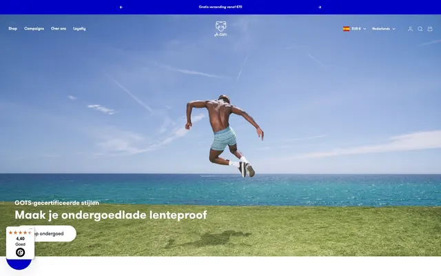
Preview image. Unlock full-res
Electric blue minimalist playground
Color palette
Violet action color for filled buttons, selected navigation states, and focused conversion moments
Accents for borders and interactive elements, slightly lighter than Ocean Blue, providing a subtle variant for interactive states or secondary branding
Primary text, prominent headings, interface icons, card text. Also background for dark sections to create high contrast
Page background, card surfaces, interactive elements backgrounds, secondary text on dark surfaces
Strong borders, primarily for structural elements or when separating distinct content blocks
Subtle borders, dividers, ghost element outlines. Provides minimal separation without visual weight
Slightly stronger borders and inactive element outlines, used for definition without being stark
Secondary background for cards or sections, providing a slight uplift from the main white canvas
Muted text, secondary information, helper text. Provides lower contrast for less prominent content
Typography
- Weights
- 400, 500, 700, 900
- Sizes
- 11px, 12px, 13px, 15px, 16px, 20px, 26px, 30px, 38px, 44px, 70px
- Line height
- 1, 1.1, 1.2, 1.4
- Fallback
- system-ui, sans-serif
Brand typeface for all primary content: headlines, body text, navigation, and buttons. Its geometric forms provide a modern, friendly character. The range of weights allows for distinct visual hierarchy without changing families.
- Weights
- 400, 700
- Sizes
- 16px
- Line height
- 1.2
sans-serif — detected in extracted data but not described by AI
- Weights
- 400
- Sizes
- 13px
- Line height
- 1.4
Arial — detected in extracted data but not described by AI
- Weights
- 400
- Sizes
- 18px
- Line height
- 1.2
GT-Walsheim-Pro — detected in extracted data but not described by AI
Spacing & shape
Components
Transparent background, Polar White text when on dark, Midnight Ink text when on light. Underlined with Ocean Blue on hover. No padding or border radius applied by default.
White background, Midnight Ink text, surrounded by a 1px solid black border. Has a 30px border-radius, creating a pill shape. Text is horizontally and vertically centered with no explicit padding.
Flexible background (transparent, Polar White, or Off-White Canvas), no box shadow or border radius. Content padding is 0px. Text color is Midnight Ink.
Polar White background, Midnight Ink text. Has a 1px light border of rgba(0, 14, 31, 0.15) on top, and a 30px 0px 0px 30px border radius (pill shape on the left). Padded 12px vertically and 16px horizontally.
Transparent background with Midnight Ink text. No border-radius or padding specified, allowing text to define size.
Guidelines
- Prioritize GT Walsheim Pro at various weights and sizes for all text elements to maintain brand identity.
- Use Midnight Ink (#000E1F) for primary text and headings, employing it as the dominant dark element.
- Apply Polar White (#FFFFFF) as the default page background and for card surfaces, creating a bright base.
- Accent actions and navigational highlights with Ocean Blue (#0000C5) for distinct brand moments.
- Ensure interactive elements like buttons and inputs primarily feature a 30px border radius for a consistent pill-shaped aesthetic.
- Utilize Off-White Canvas (#F4F4F4) for secondary card backgrounds or section differentiation to add subtle depth.
- Limit borders to Light Mist (#E6E7E9) or Subtle Gray (#DCDDDF) for ghosting effects or minimal separation, avoiding heavy outlines.
- Avoid using harsh, saturated colors outside the defined brand blue for general design elements; keep the palette disciplined.
- Do not introduce heavy drop shadows or significant elevation effects; the design relies on flat surfaces and subtle borders.
- Resist using generic sans-serif fonts; the custom GT Walsheim Pro is critical for the brand’s friendly yet confident tone.
- Do not deviate from the established 30px border-radius for interactive inputs and buttons, as it defines the component style.
- Refrain from using thick, dark borders on cards or product listings; maintain an open and lightweight feel.
- Avoid excessive spacing that leads to sparse layouts; aim for a compact density that feels efficient but not crowded.
- Do not rely on complex gradients; the system uses solid colors and minimal surface variation.
About this system
ShowHide
A-dam embodies a playful, energetic aesthetic with a strong commitment to brand identity. Dominant dark blue accents punctuate a clean, bright white canvas, creating distinct contrasts. Typography is confident yet friendly, utilizing a custom geometric sans-serif for both headlines and body text. Components are minimalist, often ghosted or subtly outlined, relying on content and brand blue for emphasis rather than heavy styling or dramatic elevation.
The page model is a max-width contained layout, likely around 1200px, centered on a Polar White canvas. The hero prominently features a full-bleed lifestyle image with an overlaid centered headline and descriptive text. Section rhythm is consistent, primarily using clear vertical spacing between content blocks, often alternating between a main white background and an Off-White Canvas for subtle visual breaks. Content is arranged in flexible grid systems, particularly a 3-column product grid, and also features alternating text-left/image-right patterns for feature sections. Navigation is a sticky top bar with a centered brand logo and functional links to the left and right.
The imagery predominantly features lifestyle photography with a clear, bright color palette, emphasizing activity and vitality under natural, often blue-sky, conditions. Product imagery is clean, often showing items in context or as flat lays. Illustrations are minimal, primarily limited to the brand's iconic bear logo. Graphics serve a functional or decorative accent role. The overall density is balanced, allowing prominent section imagery to dominate without overwhelming the clean UI.
Reminiscent of Everlane, Allbirds, Bombas, MeUndies.
# A-dam — Style Reference
> Electric blue minimalist playground

**Theme:** light

**Site:** https://a-dam.com

A-dam embodies a playful, energetic aesthetic with a strong commitment to brand identity. Dominant dark blue accents punctuate a clean, bright white canvas, creating distinct contrasts. Typography is confident yet friendly, utilizing a custom geometric sans-serif for both headlines and body text. Components are minimalist, often ghosted or subtly outlined, relying on content and brand blue for emphasis rather than heavy styling or dramatic elevation.

## Tokens — Colors

| Name | Value | Token | Role |
|------|------|------|------|
| Ocean Blue | `#0000C5` | `--color-ocean-blue` | Violet action color for filled buttons, selected navigation states, and focused conversion moments |
| Sky Blue | `#1A1ACB` | `--color-sky-blue` | Accents for borders and interactive elements, slightly lighter than Ocean Blue, providing a subtle variant for interactive states or secondary branding |
| Midnight Ink | `#000E1F` | `--color-midnight-ink` | Primary text, prominent headings, interface icons, card text. Also background for dark sections to create high contrast |
| Polar White | `#FFFFFF` | `--color-polar-white` | Page background, card surfaces, interactive elements backgrounds, secondary text on dark surfaces |
| Slate Border | `#1A2635` | `--color-slate-border` | Strong borders, primarily for structural elements or when separating distinct content blocks |
| Light Mist | `#E6E7E9` | `--color-light-mist` | Subtle borders, dividers, ghost element outlines. Provides minimal separation without visual weight |
| Subtle Gray | `#DCDDDF` | `--color-subtle-gray` | Slightly stronger borders and inactive element outlines, used for definition without being stark |
| Off-White Canvas | `#F4F4F4` | `--color-off-white-canvas` | Secondary background for cards or sections, providing a slight uplift from the main white canvas |
| Midtone Gray | `#666E79` | `--color-midtone-gray` | Muted text, secondary information, helper text. Provides lower contrast for less prominent content |

## Tokens — Typography

### GT Walsheim Pro
- **Substitute:** system-ui, sans-serif
- **Weights:** 400, 500, 700, 900
- **Sizes:** 11px, 12px, 13px, 15px, 16px, 20px, 26px, 30px, 38px, 44px, 70px
- **Line height:** 1, 1.1, 1.2, 1.4
- **Role:** Brand typeface for all primary content: headlines, body text, navigation, and buttons. Its geometric forms provide a modern, friendly character. The range of weights allows for distinct visual hierarchy without changing families.

### sans-serif
- **Weights:** 400, 700
- **Sizes:** 16px
- **Line height:** 1.2
- **Role:** sans-serif — detected in extracted data but not described by AI

### Arial
- **Weights:** 400
- **Sizes:** 13px
- **Line height:** 1.4
- **Role:** Arial — detected in extracted data but not described by AI

### GT-Walsheim-Pro
- **Weights:** 400
- **Sizes:** 18px
- **Line height:** 1.2
- **Role:** GT-Walsheim-Pro — detected in extracted data but not described by AI

## Tokens — Type Scale

Perfect Fourth (1.333) from 15px base.

| Role | Size | Line height | Letter spacing |
|------|------|------|------|
| caption | 11px | 1.4 | — |
| body | 15px | 1.4 | — |
| body-lg | 18px | 1.2 | — |
| subheading | 20px | 1.2 | — |
| heading-sm | 26px | 1.2 | — |
| heading | 38px | 1.1 | — |
| heading-lg | 44px | 1.1 | — |
| display | 70px | 1 | — |

## Tokens — Spacing

- **Max width:** 1200px
- **Section gap:** 48px
- **Card padding:** 16px
- **Element gap:** 10px

## Tokens — Radius

- **Buttons:** 30px
- **Inputs:** 30px 0px 0px 30px
- **badges:** 0px

## Layout

The page model is a max-width contained layout, likely around 1200px, centered on a Polar White canvas. The hero prominently features a full-bleed lifestyle image with an overlaid centered headline and descriptive text. Section rhythm is consistent, primarily using clear vertical spacing between content blocks, often alternating between a main white background and an Off-White Canvas for subtle visual breaks. Content is arranged in flexible grid systems, particularly a 3-column product grid, and also features alternating text-left/image-right patterns for feature sections. Navigation is a sticky top bar with a centered brand logo and functional links to the left and right.

## Imagery

The imagery predominantly features lifestyle photography with a clear, bright color palette, emphasizing activity and vitality under natural, often blue-sky, conditions. Product imagery is clean, often showing items in context or as flat lays. Illustrations are minimal, primarily limited to the brand's iconic bear logo. Graphics serve a functional or decorative accent role. The overall density is balanced, allowing prominent section imagery to dominate without overwhelming the clean UI.

## Components

### Ghost Button
*Navigation links and subtle actions*

Transparent background, Polar White text when on dark, Midnight Ink text when on light. Underlined with Ocean Blue on hover. No padding or border radius applied by default.

### Outline Pill Button
*Primary Call to Action*

White background, Midnight Ink text, surrounded by a 1px solid black border. Has a 30px border-radius, creating a pill shape. Text is horizontally and vertically centered with no explicit padding.

### Product Card
*Displaying product items*

Flexible background (transparent, Polar White, or Off-White Canvas), no box shadow or border radius. Content padding is 0px. Text color is Midnight Ink.

### Search Input Field
*User input for search*

Polar White background, Midnight Ink text. Has a 1px light border of rgba(0, 14, 31, 0.15) on top, and a 30px 0px 0px 30px border radius (pill shape on the left). Padded 12px vertically and 16px horizontally.

### Badge (Neutral Text)
*Informational labels*

Transparent background with Midnight Ink text. No border-radius or padding specified, allowing text to define size.

## Guidelines

### Do

- Prioritize GT Walsheim Pro at various weights and sizes for all text elements to maintain brand identity.
- Use Midnight Ink (#000E1F) for primary text and headings, employing it as the dominant dark element.
- Apply Polar White (#FFFFFF) as the default page background and for card surfaces, creating a bright base.
- Accent actions and navigational highlights with Ocean Blue (#0000C5) for distinct brand moments.
- Ensure interactive elements like buttons and inputs primarily feature a 30px border radius for a consistent pill-shaped aesthetic.
- Utilize Off-White Canvas (#F4F4F4) for secondary card backgrounds or section differentiation to add subtle depth.
- Limit borders to Light Mist (#E6E7E9) or Subtle Gray (#DCDDDF) for ghosting effects or minimal separation, avoiding heavy outlines.

### Don't

- Avoid using harsh, saturated colors outside the defined brand blue for general design elements; keep the palette disciplined.
- Do not introduce heavy drop shadows or significant elevation effects; the design relies on flat surfaces and subtle borders.
- Resist using generic sans-serif fonts; the custom GT Walsheim Pro is critical for the brand’s friendly yet confident tone.
- Do not deviate from the established 30px border-radius for interactive inputs and buttons, as it defines the component style.
- Refrain from using thick, dark borders on cards or product listings; maintain an open and lightweight feel.
- Avoid excessive spacing that leads to sparse layouts; aim for a compact density that feels efficient but not crowded.
- Do not rely on complex gradients; the system uses solid colors and minimal surface variation.

## Agent Prompt Guide

Quick Color Reference:
- text: #000E1F
- background: #FFFFFF
- border: #E6E7E9
- accent: #0000C5
- primary action: #0000c5 (filled action)

Example Component Prompts:
- Create a ghost button: transparent background, text in Midnight Ink (#000E1F), hover state underlines with Ocean Blue (#0000C5), no padding or border radius.
- Generate a product card: Off-White Canvas (#F4F4F4) background, no border, text in Midnight Ink (#000E1F), 0px border radius, 0px padding.
- Design a search input: Polar White (#FFFFFF) background, Midnight Ink (#000E1F) text, 1px top border of rgba(0, 14, 31, 0.15), 30px 0px 0px 30px border-radius, 12px vertical and 16px horizontal padding.
- Create a Primary Action Button: #0000c5 background, #ffffff text, 9999px radius, compact pill padding. Use this filled treatment for the main CTA.
More like this






Keep what you find
A free account saves references to boards and can send you a weekly email of picks based on what you save.
To see every result, go Pro.