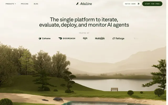
Preview image. Unlock full-res
Mist-shrouded valley
Color palette
Primary text, heading text, strong borders, brand accents, button text on light backgrounds
Brand accent for active states, link hover states, icon fills, and ghost button text/borders
Primary action button background – a warm, muted brown that grounds interactive elements
Page backgrounds, elevated surface backgrounds, neutral button fills, focus rings
Subtle borders, secondary text, muted backgrounds for layered surfaces, list item delimiters
Decorative fills and strokes in illustrations, occasional subtle text on light backgrounds
Secondary button borders, subtle separator lines, card dividers
Light background fill for subtle elements or active navigation items
Rare strong contrast element, graphic fills for brand logos
Typography
- Weights
- 400, 700
- Sizes
- 12px, 14px, 18px, 47px, 53px
- Line height
- 0.98, 1, 1.33, 1.43, 1.44, 1.67
- Letter spacing
- -0.0400em
Primary brand typeface for all headings, body text, and UI elements. Its slightly condensed and precise forms define the system's clarity. The consistent subtle negative letter spacing across sizes provides legibility while maintaining a focused visual presence.
- Weights
- 400
- Sizes
- 14px
- Line height
- 1
- Letter spacing
- 0.0200em
Monospaced typeface used for small, functional UI elements like labels or metadata, providing a clear, technical counterpoint to the primary typeface without being overly dominant due to its fixed size and positive letter spacing.
Spacing & shape
Components
Filled with Amber Seed (#4a3212), text in Canvas Ice (#fbfdf6), 20px border-radius, 24px horizontal padding.
Ghost button with Canvas Ice (#fbfdf6) background, Adaline Ink (#0a1d08) text and 1px border. 20px border-radius, 24px horizontal padding. Hover state shifts to Valley Green text and border.
Ghost button with Canvas Ice (#fbfdf6) background, muted Valley Green (#203b14) text and 1px Stone Moss (#e0e5d5) border. 20px border-radius, 24px horizontal padding.
Adaline Ink (#0a1d08) text, akkuraat 400 at 14px, typically 24px horizontal padding and 16px vertical spacing from siblings. Active states may use Forest Dew (#d7e8b5) background or Valley Green text.
Contained within a subtle border of Mist Gray (#c5ccb6), with a Canvas Ice (#fbfdf6) background. Logos are often Blackest Night (#000000) for contrast. 8px border-radius.
Guidelines
- Prioritize Canvas Ice (#fbfdf6) for all primary backgrounds to maintain the light, airy feel.
- Use Adaline Ink (#0a1d08) for primary headings and body text, ensuring a consistent dark, earthy tone.
- Apply Akkurat with a consistent -0.0400em letter spacing for all headings and body text to maintain signature visual precision.
- Employ 20px border-radius for all interactive elements like buttons and navigation items for a softer, approachable feel.
- Reserve Amber Seed (#4a3212) exclusively for the background of primary calls to action to ensure clear visual hierarchy.
- Maintain a clear vertical rhythm using 48px sectional gaps and 24px inner padding for cards.
- Use Valley Green (#203b14) as the primary accent for interactive states, icons, and subtle brand highlights.
- Do not use highly saturated or vivid colors outside of designated brand accent areas; the system relies on a muted, natural palette.
- Avoid harsh shadows or strong elevation; the design favors flat, layered surfaces with minimal depth indicators.
- Do not introduce new typefaces; Akkurat and fragmentMono are the only approved fonts.
- Do not use generic square or minimal border radii for buttons or navigation items; always apply 20px for consistency.
- Avoid dense packing of elements; maintain comfortable element gaps (e.g., 4px) and page-level spacing.
- Do not use light text on light backgrounds for interactive elements; ensure sufficient contrast, particularly against Canvas Ice.
- Do not deviate from the established color roles; for instance, only Amber Seed should be a solid button background.
About this system
ShowHide
Adaline employs a serene, naturally-inspired aesthetic, combining a nearly monochromatic palette with organic, muted greens and browns. The visual language conveys quiet authority: elegant typography with subtle letter spacing, carefully rounded components, and restrained use of color only for functional elements. Grays are abundant, creating a soft, layered depth, while a single striking green serves as the primary accent, signaling interactive states and brand identity. Components feel integrated with their environment, avoiding harsh contrasts or strong shadows.
The site predominantly uses abstract, digital-nature illustrations. These feature rendered landscapes reminiscent of real-world photography but with a stylized, digital art aesthetic, such as misty mountains and serene lakes. Imagery serves a decorative and atmospheric role, often as full-bleed backgrounds for hero sections, creating a calm and contemplative mood. There are also product UI screenshots, which appear as contained elements, likely with slight rounding and minimal borders. Icons are minimal, monochromatic, and outlined, maintaining a clean and functional appearance. The overall impression is one of visual spaciousness and low density, letting the abstract visuals set the tone.
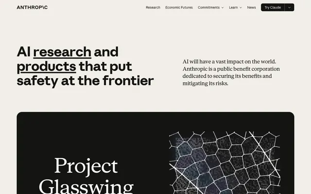
Reminiscent of Anthropic AI, Linear, Aether AI, Vercel.
# Adaline — Style Reference
> Mist-shrouded valley

**Theme:** light

**Site:** https://www.adaline.ai

Adaline employs a serene, naturally-inspired aesthetic, combining a nearly monochromatic palette with organic, muted greens and browns. The visual language conveys quiet authority: elegant typography with subtle letter spacing, carefully rounded components, and restrained use of color only for functional elements. Grays are abundant, creating a soft, layered depth, while a single striking green serves as the primary accent, signaling interactive states and brand identity. Components feel integrated with their environment, avoiding harsh contrasts or strong shadows.

## Tokens — Colors

| Name | Value | Token | Role |
|------|------|------|------|
| Adaline Ink | `#0a1d08` | `--color-adaline-ink` | Primary text, heading text, strong borders, brand accents, button text on light backgrounds |
| Valley Green | `#203b14` | `--color-valley-green` | Brand accent for active states, link hover states, icon fills, and ghost button text/borders |
| Amber Seed | `#4a3212` | `--color-amber-seed` | Primary action button background – a warm, muted brown that grounds interactive elements |
| Canvas Ice | `#fbfdf6` | `--color-canvas-ice` | Page backgrounds, elevated surface backgrounds, neutral button fills, focus rings |
| Mist Gray | `#c5ccb6` | `--color-mist-gray` | Subtle borders, secondary text, muted backgrounds for layered surfaces, list item delimiters |
| Deep Earth | `#31200b` | `--color-deep-earth` | Decorative fills and strokes in illustrations, occasional subtle text on light backgrounds |
| Stone Moss | `#e0e5d5` | `--color-stone-moss` | Secondary button borders, subtle separator lines, card dividers |
| Forest Dew | `#d7e8b5` | `--color-forest-dew` | Light background fill for subtle elements or active navigation items |
| Blackest Night | `#000000` | `--color-blackest-night` | Rare strong contrast element, graphic fills for brand logos |

## Tokens — Typography

### akkurat
- **Weights:** 400, 700
- **Sizes:** 12px, 14px, 18px, 47px, 53px
- **Line height:** 0.98, 1, 1.33, 1.43, 1.44, 1.67
- **Letter spacing:** -0.0400em
- **Role:** Primary brand typeface for all headings, body text, and UI elements. Its slightly condensed and precise forms define the system's clarity. The consistent subtle negative letter spacing across sizes provides legibility while maintaining a focused visual presence.

### fragmentMono
- **Weights:** 400
- **Sizes:** 14px
- **Line height:** 1
- **Letter spacing:** 0.0200em
- **Role:** Monospaced typeface used for small, functional UI elements like labels or metadata, providing a clear, technical counterpoint to the primary typeface without being overly dominant due to its fixed size and positive letter spacing.

## Tokens — Type Scale

| Role | Size | Line height | Letter spacing |
|------|------|------|------|
| caption | 12px | 1.43 | — |
| body-sm | 14px | 1.43 | — |
| body | 18px | 1.43 | — |
| body-lg | 47px | 1.3 | — |
| heading-sm | 53px | 1.3 | — |

## Tokens — Spacing

- **Section gap:** 48px
- **Card padding:** 24px
- **Element gap:** 4px

## Tokens — Radius

- **Buttons:** 20px
- **Images:** 8px
- **navItems:** 20px

## Imagery

The site predominantly uses abstract, digital-nature illustrations. These feature rendered landscapes reminiscent of real-world photography but with a stylized, digital art aesthetic, such as misty mountains and serene lakes. Imagery serves a decorative and atmospheric role, often as full-bleed backgrounds for hero sections, creating a calm and contemplative mood. There are also product UI screenshots, which appear as contained elements, likely with slight rounding and minimal borders. Icons are minimal, monochromatic, and outlined, maintaining a clean and functional appearance. The overall impression is one of visual spaciousness and low density, letting the abstract visuals set the tone.

## Components

### Primary Action Button (Filled)
*Emphasized calls to action*

Filled with Amber Seed (#4a3212), text in Canvas Ice (#fbfdf6), 20px border-radius, 24px horizontal padding.

### Secondary Action Button (Ghost)
*Secondary calls to action, less emphasis*

Ghost button with Canvas Ice (#fbfdf6) background, Adaline Ink (#0a1d08) text and 1px border. 20px border-radius, 24px horizontal padding. Hover state shifts to Valley Green text and border.

### Tertiary Action Button (Ghost Thin)
*Minimal calls to action, often in navigation*

Ghost button with Canvas Ice (#fbfdf6) background, muted Valley Green (#203b14) text and 1px Stone Moss (#e0e5d5) border. 20px border-radius, 24px horizontal padding.

### Navigation Link
*Top-level navigation and contextual links*

Adaline Ink (#0a1d08) text, akkuraat 400 at 14px, typically 24px horizontal padding and 16px vertical spacing from siblings. Active states may use Forest Dew (#d7e8b5) background or Valley Green text.

### Client Logo Card
*Display partner logos*

Contained within a subtle border of Mist Gray (#c5ccb6), with a Canvas Ice (#fbfdf6) background. Logos are often Blackest Night (#000000) for contrast. 8px border-radius.

## Guidelines

### Do

- Prioritize Canvas Ice (#fbfdf6) for all primary backgrounds to maintain the light, airy feel.
- Use Adaline Ink (#0a1d08) for primary headings and body text, ensuring a consistent dark, earthy tone.
- Apply Akkurat with a consistent -0.0400em letter spacing for all headings and body text to maintain signature visual precision.
- Employ 20px border-radius for all interactive elements like buttons and navigation items for a softer, approachable feel.
- Reserve Amber Seed (#4a3212) exclusively for the background of primary calls to action to ensure clear visual hierarchy.
- Maintain a clear vertical rhythm using 48px sectional gaps and 24px inner padding for cards.
- Use Valley Green (#203b14) as the primary accent for interactive states, icons, and subtle brand highlights.

### Don't

- Do not use highly saturated or vivid colors outside of designated brand accent areas; the system relies on a muted, natural palette.
- Avoid harsh shadows or strong elevation; the design favors flat, layered surfaces with minimal depth indicators.
- Do not introduce new typefaces; Akkurat and fragmentMono are the only approved fonts.
- Do not use generic square or minimal border radii for buttons or navigation items; always apply 20px for consistency.
- Avoid dense packing of elements; maintain comfortable element gaps (e.g., 4px) and page-level spacing.
- Do not use light text on light backgrounds for interactive elements; ensure sufficient contrast, particularly against Canvas Ice.
- Do not deviate from the established color roles; for instance, only Amber Seed should be a solid button background.

## Agent Prompt Guide

Quick Color Reference:
text: #0a1d08
background: #fbfdf6
border: #e0e5d5
accent: #203b14
primary action: #4a3212 (filled action)

Example Component Prompts:
Create a Primary Action Button: #4a3212 background, #fbfdf6 text, 9999px radius, compact pill padding. Use this filled treatment for the main CTA.

Create a feature card: use Canvas Ice (#fbfdf6) background and Mist Gray (#c5ccb6) 1px border with 8px radius. Inside, use Akkurat 18px weight 400 for a title, Adaline Ink (#0a1d08). Include a body text paragraph in Akkurat 14px weight 400, Adaline Ink (#0a1d08) with 16px top margin. Apply 24px padding inside the card.

Create a navigation bar: use Canvas Ice (#fbfdf6) background. Left-aligned links 'Products', 'Pricing', 'Blog' in Akkurat 14px weight 400, Adaline Ink (#0a1d08), with 16px elementGap. Right-aligned ghost button 'Watch Demo' with Canvas Ice (#fbfdf6) background, Valley Green (#203b14) text, 1px Stone Moss (#e0e5d5) border, 20px radius, 24px horizontal padding. Next to it, a filled button 'Start for free' with Amber Seed (#4a3212) background, Canvas Ice (#fbfdf6) text, 20px radius, 24px horizontal padding. Ensure all elements have appropriate vertical alignment and 24px horizontal padding within the nav bar.
More like this






Keep what you find
A free account saves references to boards and can send you a weekly email of picks based on what you save.
To see every result, go Pro.