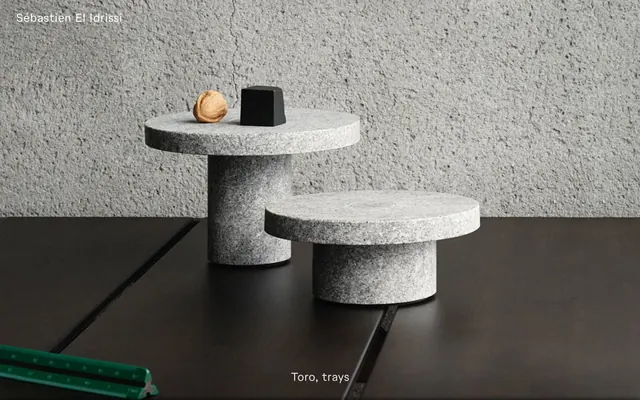
Preview image. Unlock full-res
Gallery of Quiet Objects
Color palette
Primary text, critical interface elements, borders for ghost buttons, page backgrounds for dark sections. Its absolute blackness provides stark contrast
Text on dark backgrounds, secondary backgrounds in light-themed sections, and subtle borders
Dominant background for main content areas, creating a stark, object-focused display environment
Subtle shadow tint for elevated components, suggesting depth in a dark context
Very faint shadow tint, used minimally for a touch of light contrast in darker areas
Typography
- Weights
- 400
- Sizes
- 24px
- Line height
- 1.2, 1.33
- Letter spacing
- normal
- Fallback
- Playfair Display, Lora
The sole typeface, 'Toto', is a refined serif, used consistently across all headings, body text, navigation, and interactive elements. Its consistent weight 400 and tabular figures ('tnum') contribute to a strong, understated, and precise editorial voice.
Spacing & shape
Elevation
Components
Transparent background, 'Midnight Matte' text, 'Midnight Matte' 0px border (acting as an underline on hover/focus), 12px vertical padding, 42px horizontal padding. No border-radius, maintaining sharp edges.
Transparent background, 'Midnight Matte' text. No border-radius. 12px vertical padding, 18px horizontal padding. Focus state indicated purely by text color and cursor.
Each thumbnail is housed within a responsive container. Text ('Midnight Matte') is centered below, with generous vertical spacing (24px below image) and a 40px column gap between items, promoting individual focus.
Fixed header. 'Sébastien El Idrissi' in 'Canvas White' text, with a top padding of 36px. Its height is minimal, leaving the content itself as the dominant visual.
Guidelines
- Use 'Midnight Matte' (#000000) for all primary text and important borders to maintain high contrast.
- Apply 'Toto' font (or 'Playfair Display' as substitute) consistently for all text elements, maintaining weight 400 and tabular figures.
- Implement a '0px' border-radius for all interactive elements and containers, promoting sharp, defined edges.
- Employ `sectionGap` of 72px for generous vertical spacing between major content blocks.
- Ensure interactive elements like buttons and inputs use 12px vertical padding as a minimum.
- Maintain a spacious density with a base unit of 6px for all spacing decisions.
- Use 'Charcoal Surface' (#1c1c1c) as the primary background for content presentation.
- Avoid using highly saturated, chromatic colors; the palette is strictly achromatic to maintain focus on content.
- Do not introduce additional font families or weights beyond Toto 400.
- Prevent any rounded corners; elements should always have sharp, 0px border-radius edges.
- Do not constrain page content with a `pageMaxWidth`; allow content to span the full viewport.
- Avoid decorative gradients; rely on stark color blocks and subtle shadows for visual interest.
- Do not introduce complex shadow styles; keep shadows minimal and subtle to suggest depth without visual clutter.
- Refrain from using small, tight line heights; maintain generous line spacing for legibility, especially for body text (1.33).
About this system
ShowHide
This design system presents content with deliberate minimalism, using strong achromatic contrast and ample negative space to spotlight product visuals. Typography anchors the identity with a single serif font used across all content, creating a consistent, editorial feel. The dark, spacious layout emphasizes raw object forms, while a subtle border style offers a tactile texture to interactive elements.
The page primarily uses a full-bleed layout, particularly for hero sections, which feature large product images or statements with centered text. Content sections typically utilize a contained grid for product listings, often a 3-column arrangement, within the dominant 'Charcoal Surface' background. The section rhythm is consistent with vertical separation provided by `72px` `sectionGap`. Layouts are often single-column or symmetrical multi-column stacks, emphasizing individual items rather than complex arrangements. Navigation is minimal, consisting of a sticky top header with the brand name.
The site primarily uses product photography, often showcasing single objects or small arrangements against a stark, desaturated background or a textured concrete wall, highlighting material and form. These are contained within their own blocks or function as full-bleed hero banners, without overlapping. The treatment is focused, with tight crops and minimal contextual information, making the object the central focus. Illustrations or complex graphic elements are absent; the visual language relies purely on clean product representation and achromatic UI.
Reminiscent of Opendesigns, Figma, AIGA, Aer.
# Sébastien El Idrissi — Style Reference
> Gallery of Quiet Objects

**Theme:** dark

**Site:** https://seis.studio

This design system presents content with deliberate minimalism, using strong achromatic contrast and ample negative space to spotlight product visuals. Typography anchors the identity with a single serif font used across all content, creating a consistent, editorial feel. The dark, spacious layout emphasizes raw object forms, while a subtle border style offers a tactile texture to interactive elements.

## Tokens — Colors

| Name | Value | Token | Role |
|------|------|------|------|
| Midnight Matte | `#000000` | `--color-midnight-matte` | Primary text, critical interface elements, borders for ghost buttons, page backgrounds for dark sections. Its absolute blackness provides stark contrast |
| Canvas White | `#ffffff` | `--color-canvas-white` | Text on dark backgrounds, secondary backgrounds in light-themed sections, and subtle borders |
| Charcoal Surface | `#1c1c1c` | `--color-charcoal-surface` | Dominant background for main content areas, creating a stark, object-focused display environment |
| Fine Stone | `#808080` | `--color-fine-stone` | Subtle shadow tint for elevated components, suggesting depth in a dark context |
| Pebble Gray | `#cccccc` | `--color-pebble-gray` | Very faint shadow tint, used minimally for a touch of light contrast in darker areas |

## Tokens — Typography

### Toto
- **Substitute:** Playfair Display, Lora
- **Weights:** 400
- **Sizes:** 24px
- **Line height:** 1.2, 1.33
- **Letter spacing:** normal
- **Role:** The sole typeface, 'Toto', is a refined serif, used consistently across all headings, body text, navigation, and interactive elements. Its consistent weight 400 and tabular figures ('tnum') contribute to a strong, understated, and precise editorial voice.

## Tokens — Spacing

- **Section gap:** 72px
- **Card padding:** 12px
- **Element gap:** 12px

## Tokens — Radius

- **none:** 0px

## Tokens — Elevation

- **Surface interactions:** `rgba(0, 0, 0, 0.5) 0px -3px 6px 0px`
- **Hero section depth:** `rgba(0, 0, 0, 0.2) 0px -50px 50px 0px, rgba(0, 0, 0, 0.5) 0px -4px 8px 0px`

## Layout

The page primarily uses a full-bleed layout, particularly for hero sections, which feature large product images or statements with centered text. Content sections typically utilize a contained grid for product listings, often a 3-column arrangement, within the dominant 'Charcoal Surface' background. The section rhythm is consistent with vertical separation provided by `72px` `sectionGap`. Layouts are often single-column or symmetrical multi-column stacks, emphasizing individual items rather than complex arrangements. Navigation is minimal, consisting of a sticky top header with the brand name.

## Imagery

The site primarily uses product photography, often showcasing single objects or small arrangements against a stark, desaturated background or a textured concrete wall, highlighting material and form. These are contained within their own blocks or function as full-bleed hero banners, without overlapping. The treatment is focused, with tight crops and minimal contextual information, making the object the central focus. Illustrations or complex graphic elements are absent; the visual language relies purely on clean product representation and achromatic UI.

## Components

### Ghost Button
*Action button with minimal visual footprint.*

Transparent background, 'Midnight Matte' text, 'Midnight Matte' 0px border (acting as an underline on hover/focus), 12px vertical padding, 42px horizontal padding. No border-radius, maintaining sharp edges.

### Minimal Input Field
*Form input field.*

Transparent background, 'Midnight Matte' text. No border-radius. 12px vertical padding, 18px horizontal padding. Focus state indicated purely by text color and cursor.

### Product Thumbnail
*Display individual product or work items visually.*

Each thumbnail is housed within a responsive container. Text ('Midnight Matte') is centered below, with generous vertical spacing (24px below image) and a 40px column gap between items, promoting individual focus.

### Page Header
*Brand identity and navigation.*

Fixed header. 'Sébastien El Idrissi' in 'Canvas White' text, with a top padding of 36px. Its height is minimal, leaving the content itself as the dominant visual.

## Guidelines

### Do

- Use 'Midnight Matte' (#000000) for all primary text and important borders to maintain high contrast.
- Apply 'Toto' font (or 'Playfair Display' as substitute) consistently for all text elements, maintaining weight 400 and tabular figures.
- Implement a '0px' border-radius for all interactive elements and containers, promoting sharp, defined edges.
- Employ `sectionGap` of 72px for generous vertical spacing between major content blocks.
- Ensure interactive elements like buttons and inputs use 12px vertical padding as a minimum.
- Maintain a spacious density with a base unit of 6px for all spacing decisions.
- Use 'Charcoal Surface' (#1c1c1c) as the primary background for content presentation.

### Don't

- Avoid using highly saturated, chromatic colors; the palette is strictly achromatic to maintain focus on content.
- Do not introduce additional font families or weights beyond Toto 400.
- Prevent any rounded corners; elements should always have sharp, 0px border-radius edges.
- Do not constrain page content with a `pageMaxWidth`; allow content to span the full viewport.
- Avoid decorative gradients; rely on stark color blocks and subtle shadows for visual interest.
- Do not introduce complex shadow styles; keep shadows minimal and subtle to suggest depth without visual clutter.
- Refrain from using small, tight line heights; maintain generous line spacing for legibility, especially for body text (1.33).

## Agent Prompt Guide

Quick Color Reference: text: #000000, background: #1c1c1c, border: #000000, accent: none, primary action: no distinct CTA color

Example Component Prompts:
Create a hero section: 'Charcoal Surface' (#1c1c1c) background. Centered headline 'Selected Works' in 'Canvas White' (#ffffff) using Toto 24px/1.2. Below, provide 3 columns with 24px vertical padding and 40px column gap, each containing an image (placeholder) and 'Midnight Matte' (#000000) text 'Screens lighting' 'Toto' 24px/1.2 centered below, 24px margin-bottom.
Create a ghost button: 'Ghost Button' variant with 'Midnight Matte' (#000000) text, transparent background, and a 0px border in 'Midnight Matte' (#000000). Use 12px vertical padding and 42px horizontal padding.
Create an about text block: 'Canvas White' (#ffffff) background. Body text in 'Midnight Matte' (#000000), Toto 24px/1.33. Apply 24px vertical padding to the block.
More like this






Keep what you find
A free account saves references to boards and can send you a weekly email of picks based on what you save.
To see every result, go Pro.