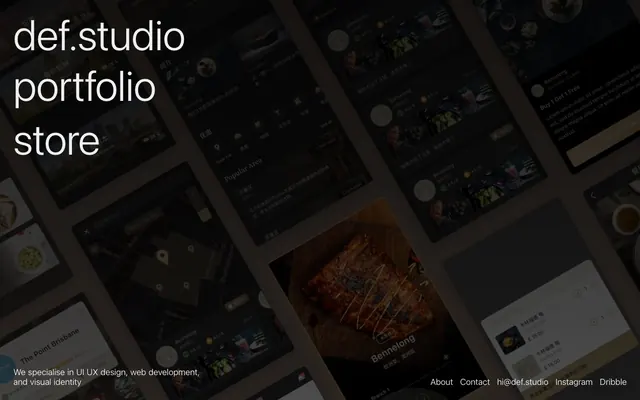
Preview image. Unlock full-res
Midnight Command Center
Color palette
Primary page background, unifies the visual field
Secondary background, subtly distinguishes content sections or cards from the main canvas
Hairline borders, dividers, input outlines, and card edges on light surfaces. Do not promote it to the primary CTA color
Subtle borders, ghost button outlines, and supporting text that needs to recede slightly from primary text
Secondary text, metadata, and less prominent descriptive elements
Typography
- Weights
- 300, 400
- Sizes
- 16px, 19px, 96px
- Line height
- 1.2
- Letter spacing
- normal
- Fallback
- Inter
Custom font used for all text; its clean, modern lines and light weights contribute to the system's understated yet authoritative feel.
Spacing & shape
Components
Text link using Frost White (#ffffff) for clarity against the dark background. No explicit background or border, relying on color for interaction indication.
Text rendered in Steel Gray (#7477474) at 16px, weight 400. Used for descriptive content, subheadings, and general information.
Large text at 96px, weight 300, in Frost White (#ffffff). The exceptionally light weight for a headline creates a sense of gravitas and restraint.
A ghost link or element with a border in Smoked Glass (#efefef) and text in Frost White (#ffffff). Used when a subtle visual separation or interactive hint is needed without a fill.
Guidelines
- Prioritize Deep Midnight (#000000) for primary canvas backgrounds, allowing content to emerge from a dark void.
- Use Charcoal Canvas (#1c1c1d) for content blocks or secondary sections to provide subtle visual relief within the dark theme.
- Employ Frost White (#ffffff) exclusively for primary text, headlines, and active links to ensure maximum contrast and readability.
- Leverage Smoked Glass (#efefef) for hairline borders, dividers, and inactive or supporting interactive elements.
- Maintain a clear typographic hierarchy using Synthese: 96px for main headlines (weight 300), 19px for subheadings, and 16px for body text (weight 400).
- Apply 8px as the default element gap for inline spacing, and 20px padding for content sections.
- Utilize 30px for horizontal and vertical spacing for major content sections, creating generous breathing room.
- Avoid using saturated or vibrant colors unless specifically for illustrative or product-focused content outside of the UI.
- Do not introduce overt shadows or heavy elevation; surfaces should appear flat or subtly layered within the dark environment.
- Refrain from using strong visual borders or heavy background fills for interactive elements; prefer text color shifts or subtle outlines.
- Do not deviate from the Synthese font family; consistency in typeface is crucial for the brand's quiet authority.
- Avoid arbitrary changes in text color or weight for emphasis; rely on the established hierarchy and the three neutral text colors.
- Do not introduce rounded corners; maintain sharp, crisp edges for all UI elements to align with the precise aesthetic.
- Do not use generic system fonts; the custom 'Synthese' typeface is critical to the brand's identity.
About this system
ShowHide
def.studio employs a midnight canvas aesthetic, using deep, dark backgrounds with subtle shifts in luminosity to define planes. Typography is stark and prominent, relying on high contrast white for headings and links, with muted gray for supporting text. The absence of vibrant colors and reliance on crisp typography creates an atmosphere of focused, understated authority. Components blend seamlessly into the dark background, prioritizing content display over overt UI elements.
The page operates on a full-bleed dark background, with main content centered but allowing for dynamic, overlapping visual arrangement in the hero section. The hero prominently features large, high-contrast typography 'def.studio' etc., stacked vertically and aligned left. Below this, smaller body text defines the brand's services. The central area of the page displays an array of product screenshots, likely app interfaces, arranged in an overlapping, dynamic grid or cascade, suggesting movement and depth. The footer is minimal, horizontally aligned links on a single line. The overall rhythm suggests a spacious, yet content-rich layout without a rigid grid for the main visual display.
The visual language predominantly features product screenshots and interface mockups, presented as embedded elements on the dark canvas. These are not full-bleed but contained, often shown as mobile screens arranged dynamically. There is no visible photography or abstract graphics in the UI shown. Icons appear to be filled or solid and monochromatic, blending into the dark interface. Imagery primarily serves to showcase product work rather than decorative atmosphere, emphasizing a content-heavy, portfolio-driven display.
Reminiscent of Stripe, Linear, Figma (dark mode), Notion (dark mode).
# def.studio — Style Reference
> Midnight Command Center

**Theme:** dark

**Site:** https://def.studio

def.studio employs a midnight canvas aesthetic, using deep, dark backgrounds with subtle shifts in luminosity to define planes. Typography is stark and prominent, relying on high contrast white for headings and links, with muted gray for supporting text. The absence of vibrant colors and reliance on crisp typography creates an atmosphere of focused, understated authority. Components blend seamlessly into the dark background, prioritizing content display over overt UI elements.

## Tokens — Colors

| Name | Value | Token | Role |
|------|------|------|------|
| Deep Midnight | `#000000` | `--color-deep-midnight` | Primary page background, unifies the visual field |
| Charcoal Canvas | `#1c1c1d` | `--color-charcoal-canvas` | Secondary background, subtly distinguishes content sections or cards from the main canvas |
| Frost White | `#ffffff` | `--color-frost-white` | Hairline borders, dividers, input outlines, and card edges on light surfaces. Do not promote it to the primary CTA color |
| Smoked Glass | `#efefef` | `--color-smoked-glass` | Subtle borders, ghost button outlines, and supporting text that needs to recede slightly from primary text |
| Steel Gray | `#747474` | `--color-steel-gray` | Secondary text, metadata, and less prominent descriptive elements |

## Tokens — Typography

### Synthese
- **Substitute:** Inter
- **Weights:** 300, 400
- **Sizes:** 16px, 19px, 96px
- **Line height:** 1.2
- **Letter spacing:** normal
- **Role:** Custom font used for all text; its clean, modern lines and light weights contribute to the system's understated yet authoritative feel.

## Tokens — Type Scale

| Role | Size | Line height | Letter spacing |
|------|------|------|------|
| caption | 16px | 1.2 | — |
| body-sm | 19px | 1.2 | — |
| body | 96px | 1.2 | — |

## Tokens — Spacing

- **Section gap:** 30px
- **Card padding:** 20px
- **Element gap:** 8px

## Tokens — Radius

- **Default:** 0px

## Layout

The page operates on a full-bleed dark background, with main content centered but allowing for dynamic, overlapping visual arrangement in the hero section. The hero prominently features large, high-contrast typography 'def.studio' etc., stacked vertically and aligned left. Below this, smaller body text defines the brand's services. The central area of the page displays an array of product screenshots, likely app interfaces, arranged in an overlapping, dynamic grid or cascade, suggesting movement and depth. The footer is minimal, horizontally aligned links on a single line. The overall rhythm suggests a spacious, yet content-rich layout without a rigid grid for the main visual display.

## Imagery

The visual language predominantly features product screenshots and interface mockups, presented as embedded elements on the dark canvas. These are not full-bleed but contained, often shown as mobile screens arranged dynamically. There is no visible photography or abstract graphics in the UI shown. Icons appear to be filled or solid and monochromatic, blending into the dark interface. Imagery primarily serves to showcase product work rather than decorative atmosphere, emphasizing a content-heavy, portfolio-driven display.

## Components

### Navigation Link
*Primary navigation item*

Text link using Frost White (#ffffff) for clarity against the dark background. No explicit background or border, relying on color for interaction indication.

### Body Text Block
*Standard paragraph text*

Text rendered in Steel Gray (#7477474) at 16px, weight 400. Used for descriptive content, subheadings, and general information.

### Hero Headline
*Main page title*

Large text at 96px, weight 300, in Frost White (#ffffff). The exceptionally light weight for a headline creates a sense of gravitas and restraint.

### Ghost Border Link
*Subtle interactive border*

A ghost link or element with a border in Smoked Glass (#efefef) and text in Frost White (#ffffff). Used when a subtle visual separation or interactive hint is needed without a fill.

## Guidelines

### Do

- Prioritize Deep Midnight (#000000) for primary canvas backgrounds, allowing content to emerge from a dark void.
- Use Charcoal Canvas (#1c1c1d) for content blocks or secondary sections to provide subtle visual relief within the dark theme.
- Employ Frost White (#ffffff) exclusively for primary text, headlines, and active links to ensure maximum contrast and readability.
- Leverage Smoked Glass (#efefef) for hairline borders, dividers, and inactive or supporting interactive elements.
- Maintain a clear typographic hierarchy using Synthese: 96px for main headlines (weight 300), 19px for subheadings, and 16px for body text (weight 400).
- Apply 8px as the default element gap for inline spacing, and 20px padding for content sections.
- Utilize 30px for horizontal and vertical spacing for major content sections, creating generous breathing room.

### Don't

- Avoid using saturated or vibrant colors unless specifically for illustrative or product-focused content outside of the UI.
- Do not introduce overt shadows or heavy elevation; surfaces should appear flat or subtly layered within the dark environment.
- Refrain from using strong visual borders or heavy background fills for interactive elements; prefer text color shifts or subtle outlines.
- Do not deviate from the Synthese font family; consistency in typeface is crucial for the brand's quiet authority.
- Avoid arbitrary changes in text color or weight for emphasis; rely on the established hierarchy and the three neutral text colors.
- Do not introduce rounded corners; maintain sharp, crisp edges for all UI elements to align with the precise aesthetic.
- Do not use generic system fonts; the custom 'Synthese' typeface is critical to the brand's identity.

## Agent Prompt Guide

### Quick Color Reference
text: #ffffff
background: #000000
border: #efefef
accent: none observed
primary action: no distinct CTA color

### 3-5 Example Component Prompts
1. Create a Hero section: background Deep Midnight (#000000). Main headline 'def.studio' in Frost White (#ffffff), Synthese font, 96px, weight 300, line-height 1.20. Subtitle in Steel Gray (#747477), Synthese font, 16px, weight 400.
2. Design a Footer: background Deep Midnight (#000000). Links 'About', 'Contact', 'hi@def.studio', 'Instagram', 'Dribble' in Frost White (#ffffff), Synthese font, 16px, weight 400, separated by 30px horizontal spacing.
3. Implement a Project Listing Item: A text block 'Logofolio Brand identity' using Frost White (#ffffff), Synthese font, 19px, weight 400. Below it, a descriptive text 'We specialise in UI UX design' in Steel Gray (#747474), Synthese font, 16px, weight 400. Use Charcoal Canvas (#1c1c1d) as a subtle background for the item, with 20px padding.
More like this





Keep what you find
A free account saves references to boards and can send you a weekly email of picks based on what you save.
To see every result, go Pro.