Preview image. Unlock full-res
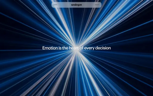
Midnight data stream
Color palette
Primary background for dark sections, robust borders, black text on light surfaces
Key surfaces and text on dark backgrounds – creates contrast without stark pure white. Also used as background for content sections
Dark body text, secondary backgrounds in a subtle gradient from pure black, and borders for elevated elements
Placeholder text, subtle dividers, and tertiary background fills for depth
Content backgrounds, especially for overlay elements and pure white text on dark backgrounds
Muted subtext, disabled states, and subtle border accents
Helper text, less prominent headings, and soft UI accents
Typography
- Weights
- 400, 500
- Sizes
- 11px, 13px, 17px, 18px, 40px, 60px
- Line height
- 1, 1.05, 1.1, 1.18, 1.25, 1.3
- Letter spacing
- -0.05em at 60px, -0.04em at 40px, -0.035em at 18px, -0.031em at 17px, -0.027em at 13px, normal at 11px
- Fallback
- system-ui
Primary brand typeface for all headings and body copy. Its precise tracking and range of weights maintain a formal, technical feel, especially the tightly tracked larger sizes.
- Weights
- 400
- Sizes
- 12px
- Line height
- 1.2
Fallback system font for small text elements, ensuring broad compatibility.
- Weights
- 400
- Sizes
- 20px
- Line height
- 1
- Letter spacing
- 0.04em for headings, 0.025em for body text
- Fallback
- monospace
Decorative monospace font used sparingly for unique, data-driven or 'display' elements, such as the widely spaced 'E m o t i o n i s t h e' in the hero, adding a retro-futuristic counterpoint.
Spacing & shape
Components
Text in Ghostly Gray (#ededed) for active states or Shadow (#1c1c1c) for inactive, on a transparent background, with 13px border radius. Hover adds a subtle blur effect to the background.
Text color Deep Space (#000000) or Ash (#7a7a7a), no underline by default. On hover, text color shifts, and sometimes a subtle border appears.
Graphik Medium, primarily size 60px, weight 400 or 500, with a tight letter spacing of -0.05em, color Ghostly Gray (#ededed). Sometimes features individual characters spaced out using LCDDot TR Regular with wide tracking (0.04em).
Graphik Medium, size 17px, weight 400, color Shadow (#1c1c1c) on light backgrounds, or Ghostly Gray (#ededed) on dark backgrounds. Line height 1.18 maintains a dense, compact feel.
Frosted glass effect using a transparent Deep Space background with a backdrop filter blur(10px) or blur(20px). Features Ghost Navigation Items, centered logo, and a subtle border with Shadow (#1c1c1c).
Guidelines
- Use Deep Space (#000000) as the primary background for dark mode sections, often with an overlying content layer using Shadow (#1c1c1c).
- Apply Graphik Medium for all textual elements and reserve LCDDot TR Regular for highly stylized, spaced-out display text.
- Maintain tight letter spacing for Graphik headings: -0.05em for display, -0.04em for headings, and -0.035em for subheadings.
- Leverage transparency and backdrop-filter: blur(10px) or blur(20px) to create layered, 'frosted glass' UI elements, especially for navigation.
- Utilize a minimal color palette composed primarily of Deep Space (#000000), Shadow (#1c1c1c), Ghostly Gray (#ededed), and Cloud (#ffffff) to maintain a monochromatic, high-contrast aesthetic.
- Implement a 10px default border radius for cards and images, with 13px for interactive elements like buttons and links.
- Employ an element spacing of 10px for vertical and horizontal rhythm between components, and 40px for section separation.
- Avoid introducing additional saturated colors; maintain the monochromatic focus with blue tones for only the most interactive, brand-defining elements if needed.
- Do not use generic system fonts for prominent headings or body copy; always prioritize Graphik Medium.
- Refrain from using strong, opaque background colors for interactive elements. Prefer ghost buttons or subtle fills that blend with the background.
- Do not rely on large, heavy drop shadows for elevation; instead, use subtle border treatments, background blurs, and shifts in neutral color for perceived depth.
- Avoid excessive padding or large gaps; the design system favors a compact and dense information display.
- Do not use highly decorative imagery; visuals should be abstract, motion-focused, or product-centric, blending with the dark interface.
About this system
ShowHide
Analogue's design system evokes a dark, digital command center aesthetic with a focus on deep contrast and crisp typography. The visual mood is serious and professional, leveraging near-black and dark gray canvases accented by stark white and light gray text. Transparency and blur effects create a sense of depth and layered information, while minimal use of saturated color keeps the interface focused and understated, allowing the content to dominate.
The page primarily uses a full-bleed structure, with the hero section dominating the viewport with a dynamic abstract background. Text and navigation elements are typically centered or symmetrically balanced within a conceptual max-width container, without explicit pageMaxWidth. Vertical rhythm is established through consistent sectionGap of 40px. Content sections appear to alternate between large, impactful headlines (sometimes widely spaced) and standard text blocks, with a compact density for body content. Navigation is a minimalist, centered floating bar with a translucent, blurred background.
The visual language is characterized by abstract, high-speed light beam graphics, often full-bleed and serving as dynamic backgrounds. There's a strong emphasis on motion and digital effects rather than static photography or ornate illustrations. When type is used decoratively, it leverages wide letter-spacing, almost transforming into graphic elements itself. Iconography, if present, is expected to be simple, outlined, and monochromatic, maintaining the minimal and technical feel. Imagery acts as atmospheric mood-setting rather than direct content explanation, creating an immersive, futuristic environment.
Reminiscent of Stripe, Framer, Linear.
# Analogue — Style Reference
> Midnight data stream

**Theme:** dark

**Site:** https://analogueagency.com

Analogue's design system evokes a dark, digital command center aesthetic with a focus on deep contrast and crisp typography. The visual mood is serious and professional, leveraging near-black and dark gray canvases accented by stark white and light gray text. Transparency and blur effects create a sense of depth and layered information, while minimal use of saturated color keeps the interface focused and understated, allowing the content to dominate.

## Tokens — Colors

| Name | Value | Token | Role |
|------|------|------|------|
| Deep Space | `#000000` | `--color-deep-space` | Primary background for dark sections, robust borders, black text on light surfaces |
| Ghostly Gray | `#ededed` | `--color-ghostly-gray` | Key surfaces and text on dark backgrounds – creates contrast without stark pure white. Also used as background for content sections |
| Shadow | `#1c1c1c` | `--color-shadow` | Dark body text, secondary backgrounds in a subtle gradient from pure black, and borders for elevated elements |
| Stone | `#b8b8b8` | `--color-stone` | Placeholder text, subtle dividers, and tertiary background fills for depth |
| Cloud | `#ffffff` | `--color-cloud` | Content backgrounds, especially for overlay elements and pure white text on dark backgrounds |
| Ash | `#7a7a7a` | `--color-ash` | Muted subtext, disabled states, and subtle border accents |
| Horizon | `#a6a6a6` | `--color-horizon` | Helper text, less prominent headings, and soft UI accents |

## Tokens — Typography

### Graphik Medium
- **Substitute:** system-ui
- **Weights:** 400, 500
- **Sizes:** 11px, 13px, 17px, 18px, 40px, 60px
- **Line height:** 1, 1.05, 1.1, 1.18, 1.25, 1.3
- **Letter spacing:** -0.05em at 60px, -0.04em at 40px, -0.035em at 18px, -0.031em at 17px, -0.027em at 13px, normal at 11px
- **Role:** Primary brand typeface for all headings and body copy. Its precise tracking and range of weights maintain a formal, technical feel, especially the tightly tracked larger sizes.

### sans-serif
- **Weights:** 400
- **Sizes:** 12px
- **Line height:** 1.2
- **Role:** Fallback system font for small text elements, ensuring broad compatibility.

### LCDDot TR Regular
- **Substitute:** monospace
- **Weights:** 400
- **Sizes:** 20px
- **Line height:** 1
- **Letter spacing:** 0.04em for headings, 0.025em for body text
- **Role:** Decorative monospace font used sparingly for unique, data-driven or 'display' elements, such as the widely spaced 'E m o t i o n i s t h e' in the hero, adding a retro-futuristic counterpoint.

## Tokens — Type Scale

| Role | Size | Line height | Letter spacing |
|------|------|------|------|
| caption | 11px | 1.3 | — |
| subheading | 18px | 1.18 | -0.63px |
| heading | 40px | 1.05 | -1.6px |
| display | 60px | 1 | -3px |

## Tokens — Spacing

- **Section gap:** 40px
- **Card padding:** 20px
- **Element gap:** 10px

## Tokens — Radius

- **Default:** 10px
- **Buttons:** 13px
- **badges:** 100px
- **pill:** 1000px

## Layout

The page primarily uses a full-bleed structure, with the hero section dominating the viewport with a dynamic abstract background. Text and navigation elements are typically centered or symmetrically balanced within a conceptual max-width container, without explicit pageMaxWidth. Vertical rhythm is established through consistent sectionGap of 40px. Content sections appear to alternate between large, impactful headlines (sometimes widely spaced) and standard text blocks, with a compact density for body content. Navigation is a minimalist, centered floating bar with a translucent, blurred background.

## Imagery

The visual language is characterized by abstract, high-speed light beam graphics, often full-bleed and serving as dynamic backgrounds. There's a strong emphasis on motion and digital effects rather than static photography or ornate illustrations. When type is used decoratively, it leverages wide letter-spacing, almost transforming into graphic elements itself. Iconography, if present, is expected to be simple, outlined, and monochromatic, maintaining the minimal and technical feel. Imagery acts as atmospheric mood-setting rather than direct content explanation, creating an immersive, futuristic environment.

## Components

### Ghost Navigation Item
*Navigation links in the header*

Text in Ghostly Gray (#ededed) for active states or Shadow (#1c1c1c) for inactive, on a transparent background, with 13px border radius. Hover adds a subtle blur effect to the background.

### Text Link
*Inline textual hyperlinks*

Text color Deep Space (#000000) or Ash (#7a7a7a), no underline by default. On hover, text color shifts, and sometimes a subtle border appears.

### Hero Headline
*Primary heading in the hero section*

Graphik Medium, primarily size 60px, weight 400 or 500, with a tight letter spacing of -0.05em, color Ghostly Gray (#ededed). Sometimes features individual characters spaced out using LCDDot TR Regular with wide tracking (0.04em).

### Body Text
*General paragraph content*

Graphik Medium, size 17px, weight 400, color Shadow (#1c1c1c) on light backgrounds, or Ghostly Gray (#ededed) on dark backgrounds. Line height 1.18 maintains a dense, compact feel.

### Navigation Bar
*Main top-level persistent navigation*

Frosted glass effect using a transparent Deep Space background with a backdrop filter blur(10px) or blur(20px). Features Ghost Navigation Items, centered logo, and a subtle border with Shadow (#1c1c1c).

## Guidelines

### Do

- Use Deep Space (#000000) as the primary background for dark mode sections, often with an overlying content layer using Shadow (#1c1c1c).
- Apply Graphik Medium for all textual elements and reserve LCDDot TR Regular for highly stylized, spaced-out display text.
- Maintain tight letter spacing for Graphik headings: -0.05em for display, -0.04em for headings, and -0.035em for subheadings.
- Leverage transparency and backdrop-filter: blur(10px) or blur(20px) to create layered, 'frosted glass' UI elements, especially for navigation.
- Utilize a minimal color palette composed primarily of Deep Space (#000000), Shadow (#1c1c1c), Ghostly Gray (#ededed), and Cloud (#ffffff) to maintain a monochromatic, high-contrast aesthetic.
- Implement a 10px default border radius for cards and images, with 13px for interactive elements like buttons and links.
- Employ an element spacing of 10px for vertical and horizontal rhythm between components, and 40px for section separation.

### Don't

- Avoid introducing additional saturated colors; maintain the monochromatic focus with blue tones for only the most interactive, brand-defining elements if needed.
- Do not use generic system fonts for prominent headings or body copy; always prioritize Graphik Medium.
- Refrain from using strong, opaque background colors for interactive elements. Prefer ghost buttons or subtle fills that blend with the background.
- Do not rely on large, heavy drop shadows for elevation; instead, use subtle border treatments, background blurs, and shifts in neutral color for perceived depth.
- Avoid excessive padding or large gaps; the design system favors a compact and dense information display.
- Do not use highly decorative imagery; visuals should be abstract, motion-focused, or product-centric, blending with the dark interface.

## Agent Prompt Guide

Quick Color Reference:
text: #ededed
background: #000000
border: #1c1c1c
accent: no distinct accent color
primary action: no distinct CTA color

Example Component Prompts:
1. Create a Hero Headline: Text 'FUTURE' in Graphik Medium, weight 500, size 60px, color #ededed, letter-spacing -3px. Position it centrally on a full-bleed #000000 background.
2. Create a Ghost Navigation Item: Text 'ABOUT' in Graphik Medium, weight 400, size 13px, color #ededed, letter-spacing -0.35px. Use a transparent background with an 8px #1c1c1c border and 13px border-radius, with 10px padding on all sides.
3. Create a Body Text Block: Text 'This is a detailed description of our services.' in Graphik Medium, weight 400, size 17px, color #1c1c1c, line-height 1.18. Place this within a section with #ededed background and 20px padding.
More like this





Keep what you find
A free account saves references to boards and can send you a weekly email of picks based on what you save.
To see every result, go Pro.