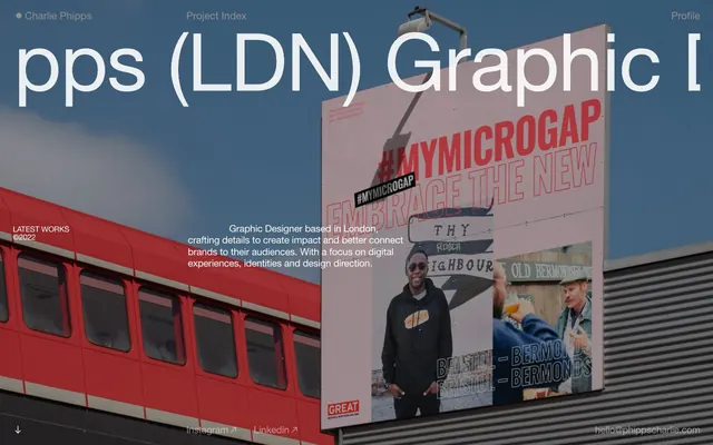
Preview image. Unlock full-res
Midnight Command Center: precise lines on a deep, expansive canvas, guided by stark textual contrasts.
Color palette
Dark borders and separators for elevated surfaces and inverted UI. Do not promote it to the primary CTA color
Primary text color for headlines and body text on dark backgrounds; used for key information and some borders
Primary text color on light backgrounds
Secondary background surface for cards or sections, providing subtle differentiation from the main canvas
Muted headline text, providing soft contrast
Subtler text, decorative borders, secondary links, and icons, adding depth without distraction
Dark borders and separators for elevated surfaces and inverted UI. Do not promote it to the primary CTA color
Deepest dark for specific text and subtle accent borders
Typography
- Weights
- 400
- Sizes
- 16px, 17px, 19px, 21px, 52px, 64px, 162px
- Line height
- 0.9, 1, 1.2
- Letter spacing
- -0.0240em at 162px, -0.0130em at 64px, -0.0120em at 52px, -0.0100em at 21px, -0.0040em at 19px, normal at 16px, 17px
- Fallback
- Arial, Helvetica
The primary sans-serif for headlines, body text, and interactive elements. Its neutral character provides clarity and adapts to varying scale and tracking for distinct hierarchal purposes.
- Weights
- 400
- Sizes
- 13px
- Line height
- 1.2
- Fallback
- Times New Roman
A serif font used sparingly for atmospheric, smaller captions and metadata, providing a touch of classic contrast against the sans-serif dominance.
Spacing & shape
Components
Text uses Cloud White on Midnight Canvas background. On hover, the background might transition to Midnight Canvas with an inverse text color, or a subtle border appears using Dark Granite Border. Padding is 2px at the bottom. Smallest text size 13px Times with normal letter spacing, or 16px Helvetica Neue with normal letter spacing.
Background is transparent (rgba(0,0,0,0)). No border or shadow. Internal padding is 13px on all sides. Content uses Cloud White text.
Background is Midnight Canvas. Can have borders or text in Cloud White, Obsidian Text, or Ash Panel. Internal padding varies, often 6px vertical.
Contains links (Project Index, Profile) in Cloud White. Implicit borders or active states use Charcoal Detail. Text uses Helvetica Neue 16px, weight 400.
Guidelines
- Prioritize Cloud White (#ffffff) text on midnight Canvas (#101011) whenever possible to leverage the primary brand contrast.
- Use Helvetica Neue for all primary textual content and headings to maintain the sharp, modern tone.
- Reserve the Times typeface for subtle meta-information, captions, or contextual details at 13px size.
- Employ 13px global padding on cards and content blocks for a comfortable density.
- Utilize 0px border-radius across all elements to enforce a precise, architectural aesthetic.
- Apply precise negative letter-spacing from the Helvetica Neue typography profile for all headings to achieve tight, impactful text blocks.
- Use Charcoal Detail (#888888) for all secondary interactive elements like borders and muted links to prevent visual clutter.
- Avoid using saturated or chromatic colors; the palette is strictly achromatic to maintain a stark, sophisticated feel.
- Do not introduce rounded corners; all elements should adhere to sharp, squared edges (0px radius).
- Do not use box-shadows or elevation effects; the design relies on flat layers and precise lines for depth.
- Avoid generic system fonts when Helvetica Neue or Times are specified; utilize the provided typefaces for brand consistency.
- Do not deviate from the defined letter-spacing values, especially for headlines, as it’s critical to brand identity.
- Do not use heavy panel backgrounds; instead, use transparent backgrounds or subtle Ash Panel (#ededed) for content separation.
About this system
ShowHide
Charlie Phipps' design system evokes a digital architect's blueprint, utilizing a stark, high-contrast monochrome palette. The interface relies on precise typographical interplay of a clean sans-serif and a classic serif to establish hierarchy and character. Layouts are spacious, with ample negative space emphasizing content blocks through strict alignment and subtle borders rather than heavy visual containers, creating an atmosphere of considered precision amidst a dark canvas.
The page exhibits a full-bleed, left-aligned layout, with content primarily flowing top-to-bottom. The hero section features an expansive background image and a large, centered headline that bleeds off the edges. Subsequent sections maintain a generous vertical rhythm, often alternating between large text blocks and image groupings, with a flexible column structure. The navigation is a split top-bar, with a minimal left-aligned brand mark and right-aligned links. There's no strict grid observed for large content blocks; rather, an organic arrangement emphasizing large visual and textual elements within ample negative space. The overall density is comfortable, giving significant breathing room to each content segment.
This system features a blend of product photography and contextual imagery. Photography appears as full-bleed, unmasked backgrounds for hero sections, specifically urban landscapes with architectural elements or public transport. Product images within the portfolio are contained, often occupying clean, minimal frames. There's an absence of traditional icons, instead using typographic arrows (e.g., '︎︎︎') for interaction cues. Imagery serves both decorative atmosphere in heroes and explanatory content within the portfolio sections, with a generally high density of visual content.
Reminiscent of Stripe, Linear, Awwwards Nominees (certain portfolios).
# Charlie Phipps — Style Reference > Midnight Command Center: precise lines on a deep, expansive canvas, guided by stark textual contrasts. **Theme:** dark **Site:** https://phippscharlie.com Charlie Phipps' design system evokes a digital architect's blueprint, utilizing a stark, high-contrast monochrome palette. The interface relies on precise typographical interplay of a clean sans-serif and a classic serif to establish hierarchy and character. Layouts are spacious, with ample negative space emphasizing content blocks through strict alignment and subtle borders rather than heavy visual containers, creating an atmosphere of considered precision amidst a dark canvas. ## Tokens — Colors | Name | Value | Token | Role | |------|------|------|------| | Midnight Canvas | `#101011` | `--color-midnight-canvas` | Dark borders and separators for elevated surfaces and inverted UI. Do not promote it to the primary CTA color | | Cloud White | `#ffffff` | `--color-cloud-white` | Primary text color for headlines and body text on dark backgrounds; used for key information and some borders | | Obsidian Text | `#000000` | `--color-obsidian-text` | Primary text color on light backgrounds | | Ash Panel | `#ededed` | `--color-ash-panel` | Secondary background surface for cards or sections, providing subtle differentiation from the main canvas | | Whisper Grey | `#bab7b2` | `--color-whisper-grey` | Muted headline text, providing soft contrast | | Charcoal Detail | `#888888` | `--color-charcoal-detail` | Subtler text, decorative borders, secondary links, and icons, adding depth without distraction | | Dark Granite Border | `#262627` | `--color-dark-granite-border` | Dark borders and separators for elevated surfaces and inverted UI. Do not promote it to the primary CTA color | | Deep Space Accent | `#080809` | `--color-deep-space-accent` | Deepest dark for specific text and subtle accent borders | ## Tokens — Typography ### Helvetica Neue - **Substitute:** Arial, Helvetica - **Weights:** 400 - **Sizes:** 16px, 17px, 19px, 21px, 52px, 64px, 162px - **Line height:** 0.9, 1, 1.2 - **Letter spacing:** -0.0240em at 162px, -0.0130em at 64px, -0.0120em at 52px, -0.0100em at 21px, -0.0040em at 19px, normal at 16px, 17px - **Role:** The primary sans-serif for headlines, body text, and interactive elements. Its neutral character provides clarity and adapts to varying scale and tracking for distinct hierarchal purposes. ### Times - **Substitute:** Times New Roman - **Weights:** 400 - **Sizes:** 13px - **Line height:** 1.2 - **Role:** A serif font used sparingly for atmospheric, smaller captions and metadata, providing a touch of classic contrast against the sans-serif dominance. ## Tokens — Type Scale Perfect Fifth (1.5) from 19px base. | Role | Size | Line height | Letter spacing | |------|------|------|------| | caption | 16px | 1 | — | | body-sm | 17px | 1 | — | | body | 19px | 1 | — | | body-lg | 21px | 1 | — | | heading-sm | 52px | 1 | — | | heading | 64px | 1 | — | | heading-lg | 162px | 1 | — | ## Tokens — Spacing - **Section gap:** 41px - **Card padding:** 13px - **Element gap:** 6px ## Tokens — Radius - **none:** 0px ## Layout The page exhibits a full-bleed, left-aligned layout, with content primarily flowing top-to-bottom. The hero section features an expansive background image and a large, centered headline that bleeds off the edges. Subsequent sections maintain a generous vertical rhythm, often alternating between large text blocks and image groupings, with a flexible column structure. The navigation is a split top-bar, with a minimal left-aligned brand mark and right-aligned links. There's no strict grid observed for large content blocks; rather, an organic arrangement emphasizing large visual and textual elements within ample negative space. The overall density is comfortable, giving significant breathing room to each content segment. ## Imagery This system features a blend of product photography and contextual imagery. Photography appears as full-bleed, unmasked backgrounds for hero sections, specifically urban landscapes with architectural elements or public transport. Product images within the portfolio are contained, often occupying clean, minimal frames. There's an absence of traditional icons, instead using typographic arrows (e.g., '︎︎︎') for interaction cues. Imagery serves both decorative atmosphere in heroes and explanatory content within the portfolio sections, with a generally high density of visual content. ## Components ### Navigation Link *Top and bottom navigation items.* Text uses Cloud White on Midnight Canvas background. On hover, the background might transition to Midnight Canvas with an inverse text color, or a subtle border appears using Dark Granite Border. Padding is 2px at the bottom. Smallest text size 13px Times with normal letter spacing, or 16px Helvetica Neue with normal letter spacing. ### Text Card *Container for textual content or project summaries.* Background is transparent (rgba(0,0,0,0)). No border or shadow. Internal padding is 13px on all sides. Content uses Cloud White text. ### Interactive Text Box *Visually distinct blocks of text that might respond to interaction.* Background is Midnight Canvas. Can have borders or text in Cloud White, Obsidian Text, or Ash Panel. Internal padding varies, often 6px vertical. ### Page Header Nav *Persistent top-level navigation.* Contains links (Project Index, Profile) in Cloud White. Implicit borders or active states use Charcoal Detail. Text uses Helvetica Neue 16px, weight 400. ## Guidelines ### Do - Prioritize Cloud White (#ffffff) text on midnight Canvas (#101011) whenever possible to leverage the primary brand contrast. - Use Helvetica Neue for all primary textual content and headings to maintain the sharp, modern tone. - Reserve the Times typeface for subtle meta-information, captions, or contextual details at 13px size. - Employ 13px global padding on cards and content blocks for a comfortable density. - Utilize 0px border-radius across all elements to enforce a precise, architectural aesthetic. - Apply precise negative letter-spacing from the Helvetica Neue typography profile for all headings to achieve tight, impactful text blocks. - Use Charcoal Detail (#888888) for all secondary interactive elements like borders and muted links to prevent visual clutter. ### Don't - Avoid using saturated or chromatic colors; the palette is strictly achromatic to maintain a stark, sophisticated feel. - Do not introduce rounded corners; all elements should adhere to sharp, squared edges (0px radius). - Do not use box-shadows or elevation effects; the design relies on flat layers and precise lines for depth. - Avoid generic system fonts when Helvetica Neue or Times are specified; utilize the provided typefaces for brand consistency. - Do not deviate from the defined letter-spacing values, especially for headlines, as it’s critical to brand identity. - Do not use heavy panel backgrounds; instead, use transparent backgrounds or subtle Ash Panel (#ededed) for content separation. ## Agent Prompt Guide Quick Color Reference: text: #ffffff background: #101011 border: #262627 accent: no distinct accent color primary action: no distinct CTA color Example Component Prompts: 1. Create a top navigation bar: background #101011. Left-aligned brand text '● Charlie Phipps' in #ffffff, Helvetica Neue 16px weight 400. Right-aligned links 'Project Index' and 'Profile' in #ffffff, Helvetica Neue 16px weight 400. All elements have 0px radius. 2. Design a hero section: full-width background image. Overlay a large headline 'pps (LDN) Graphic [' in #ffffff, Helvetica Neue 162px weight 400, letter-spacing -0.0240em, centered on the screen. No padding or radius for the headline. 3. Create a text block with a sub-heading: 'Selected works ©2022.' as heading in #ffffff, Helvetica Neue 52px weight 400, letter-spacing -0.0120em. Below it, a paragraph 'Overview of my latest and featured projects (2019 —2022) within Digital Design, Brand Design and Design Direction.' in #ffffff, Helvetica Neue 21px weight 400, letter-spacing -0.0100em. Both text blocks have 13px padding on all sides.
More like this





Keep what you find
A free account saves references to boards and can send you a weekly email of picks based on what you save.
To see every result, go Pro.