Preview image. Unlock full-res
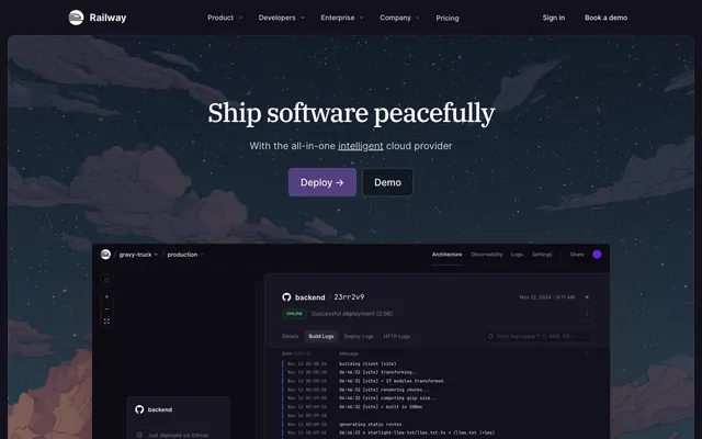
Cosmic Midnight Express. A calm, powerful journey through a dark, starlit environment, guided by clear signals.
Color palette
Primary CTA buttons — a calm but distinct call to action against the dark backdrop.
Decorative background effect — adds a powerful, futuristic energy.
Focus rings, active state borders, UI highlights — a brighter violet for interactive feedback.
Decorative highlights, accent text.
Primary page background.
Card backgrounds, secondary surfaces.
Darkest UI components, code blocks.
Primary text, active navigation, icons.
Subheadings, less prominent text.
Body copy, placeholder text, inactive-state UI.
Helper text, metadata, disabled states.
Error messages and destructive action states.
Typography
- Weights
- 400, 500
- Sizes
- 36px, 40px, 54px
- Line height
- 1.12, 1.2, 1.33
- Letter spacing
- -1.94px at 54px, -0.72px at 36px.
- Fallback
- Georgia, Times New Roman
Display headlines (54px) and large section titles (36-40px). The serif choice is a signature move, lending a classic, literary authority to a technical product. The tight negative letter-spacing is essential.
- Weights
- 400, 500, 600, 700
- Sizes
- 12px, 14px, 16px, 18px, 20px, 24px
- Line height
- 1.25, 1.33, 1.4, 1.43, 1.5, 1.56, 1.6, 1.63, 1.75
- Letter spacing
- Slightly tightened at all sizes (e.g., -0.1px at 16px).
- Fallback
- system-ui, -apple-system
The workhorse font for all UI text, body copy, and subtitles. Its neutrality and readability provide a clean canvas that allows the serif headlines to stand out.
- Weights
- 400, 600
- Sizes
- 32px, 40px
- Line height
- 1.2, 1.38
- Letter spacing
- -0.6px at 40px, -0.48px at 32px.
- Fallback
- Inter
Used for some medium-to-large headings, offering a slightly more condensed feel than Inter for specific layouts.
- Weights
- 400
- Sizes
- 16px, 40px
- Line height
- 1.4, 1.63
- Fallback
- Menlo, Monaco, Consolas
Code snippets and log outputs in product demonstrations, providing a familiar terminal aesthetic.
Spacing & shape
Components
Solid `Cosmic Lilac` (#553f83) background with `Starlight` (#f7f7f8) text. Padding is `12px 24px` with an `8px` border radius. Border is a subtle `rgba(255, 255, 255, 0.15)`. Font is Inter 500.
Transparent background with `Starlight` (#f7f7f8) text and a `1px` solid border of `Crater` (#33323e). Padding is `12px 24px` with an `8px` border radius. Font is Inter 500.
Transparent background with `Comet` (#a1a0ab) text. On hover, text changes to `Starlight` (#f7f7f8). Padding is minimal, typically around `6px 12px`.
`Surface` (#1a191f) background with a `12px` border radius and `24px` padding. A `1px` `Crater` (#33323e) border defines the card. Displays a grayscale partner logo at its center.
Text label in `Asteroid` (#868593). The active tab has `Starlight` (#f7f7f8) text and a `2px` bottom border of `Supernova` (#a05fcf), providing a clear visual indicator.
Dark green background (`#15231d`) with `Success` (#42946e) text and a `4px` border radius. A `1px` border of muted green (`#26543f`) provides subtle definition.
Uses `ui-monospace` font at 16px. Background is `Black Hole` (#0d0c14). Text color varies by log level, but defaults to `Comet` (#a1a0ab).
Guidelines
- Use IBM Plex Serif exclusively for display-level headlines to create a sophisticated, literary feel.
- Rely on surface color shifts (`Deep Space` page, `Surface` cards) and 1px `Crater` borders for elevation.
- Reserve the `Cosmic Lilac` color for primary, high-value calls to action.
- Incorporate the atmospheric, painterly illustration style for hero sections to set the mood.
- Maintain generous vertical spacing (96px+) between content sections for a calm, spacious rhythm.
- Use a subtle grid pattern on the background of key container cards like testimonials.
- Ensure all interactive elements have a clear focus state, typically using `Supernova` (#a05fcf) as a highlight border or ring.
- Don't use traditional box-shadows. The system's depth comes from color and borders.
- Don't use serif fonts for body copy, buttons, or any UI controls.
- Don't use the brand purples for large blocks of text.
- Don't make layouts feel dense or rushed. Prioritize breathing room.
- Don't use bright, saturated colors outside the defined purple accent and semantic palette.
- Don't use photography, especially lifestyle photos. The visual language is illustrative and product-focused.
- Don't create buttons or cards with sharp corners; use the established `8px` and `12px` radii.
About this system
ShowHide
The design system feels like a tranquil night journey on a futuristic train. It operates in a deep, near-black space (#13111c), punctuated by a single, focused accent of cosmic lilac (#553f83) for primary actions, creating a calm yet confident mood. Large, elegant serif headlines (IBM Plex Serif) provide a literary, almost classic authority that contrasts with the clean, utilitarian sans-serif (Inter) used for the UI. Elevation is achieved through subtle surface shifts and fine borders (#33323e) rather than shadows, reinforcing a flat, technical aesthetic. The signature element is the painterly, atmospheric hero illustration, which establishes a peaceful, imaginative tone that subverts typical dev-tool intensity.
The layout is governed by a centered, max-width container of 1280px. It opens with an immersive, full-bleed hero featuring a large atmospheric illustration that sets a calm, imaginative tone. Subsequent content sections are contained within the max-width, separated by generous vertical spacing (96px+), creating a spacious, unhurried rhythm. The structure is largely composed of centered headline stacks, followed by multi-column grids for testimonials (3-column) and partner logos. This creates a clear, hierarchical flow from broad statements to specific proof points.
The visual language is defined by a dichotomy. Atmospheric, painterly illustrations with a lofi, dreamy quality dominate the hero and background elements, establishing a unique, non-corporate mood. These are juxtaposed with clean, unadorned product UI screenshots which anchor the site in its technical reality. Customer logos are presented simply on contained cards. There is no lifestyle photography; the focus is on the abstract mood and the concrete product. Icons are minimal, likely line-based, and used for functional UI rather than decoration.
Reminiscent of Vercel, Linear, PlanetScale, Supabase.
# Railway — Style Reference
> Cosmic Midnight Express. A calm, powerful journey through a dark, starlit environment, guided by clear signals.

**Theme:** dark

**Site:** https://railway.app

The design system feels like a tranquil night journey on a futuristic train. It operates in a deep, near-black space (#13111c), punctuated by a single, focused accent of cosmic lilac (#553f83) for primary actions, creating a calm yet confident mood. Large, elegant serif headlines (IBM Plex Serif) provide a literary, almost classic authority that contrasts with the clean, utilitarian sans-serif (Inter) used for the UI. Elevation is achieved through subtle surface shifts and fine borders (#33323e) rather than shadows, reinforcing a flat, technical aesthetic. The signature element is the painterly, atmospheric hero illustration, which establishes a peaceful, imaginative tone that subverts typical dev-tool intensity.

## Tokens — Colors

| Name | Value | Token | Role |
|------|------|------|------|
| Cosmic Lilac | `#553f83` | `--color-cosmic-lilac` | Primary CTA buttons — a calm but distinct call to action against the dark backdrop. |
| Warp Drive Glow | `#a05fcf` | `--color-warp-drive-glow` | Decorative background effect — adds a powerful, futuristic energy. |
| Supernova | `#a05fcf` | `--color-supernova` | Focus rings, active state borders, UI highlights — a brighter violet for interactive feedback. |
| Nebula Haze | `#bf92ec` | `--color-nebula-haze` | Decorative highlights, accent text. |
| Deep Space | `#13111c` | `--color-deep-space` | Primary page background. |
| Surface | `#1a191f` | `--color-surface` | Card backgrounds, secondary surfaces. |
| Black Hole | `#0d0c14` | `--color-black-hole` | Darkest UI components, code blocks. |
| Starlight | `#f7f7f8` | `--color-starlight` | Primary text, active navigation, icons. |
| Starlight Dim | `#d0cfd2` | `--color-starlight-dim` | Subheadings, less prominent text. |
| Comet | `#a1a0ab` | `--color-comet` | Body copy, placeholder text, inactive-state UI. |
| Asteroid | `#868593` | `--color-asteroid` | Helper text, metadata, disabled states. |
| Error | `#d82c20` | `--color-error` | Error messages and destructive action states. |

## Tokens — Typography

### IBM Plex Serif
- **Substitute:** Georgia, Times New Roman
- **Weights:** 400, 500
- **Sizes:** 36px, 40px, 54px
- **Line height:** 1.12, 1.2, 1.33
- **Letter spacing:** -1.94px at 54px, -0.72px at 36px.
- **Role:** Display headlines (54px) and large section titles (36-40px). The serif choice is a signature move, lending a classic, literary authority to a technical product. The tight negative letter-spacing is essential.

### Inter
- **Substitute:** system-ui, -apple-system
- **Weights:** 400, 500, 600, 700
- **Sizes:** 12px, 14px, 16px, 18px, 20px, 24px
- **Line height:** 1.25, 1.33, 1.4, 1.43, 1.5, 1.56, 1.6, 1.63, 1.75
- **Letter spacing:** Slightly tightened at all sizes (e.g., -0.1px at 16px).
- **Role:** The workhorse font for all UI text, body copy, and subtitles. Its neutrality and readability provide a clean canvas that allows the serif headlines to stand out.

### Inter Tight
- **Substitute:** Inter
- **Weights:** 400, 600
- **Sizes:** 32px, 40px
- **Line height:** 1.2, 1.38
- **Letter spacing:** -0.6px at 40px, -0.48px at 32px.
- **Role:** Used for some medium-to-large headings, offering a slightly more condensed feel than Inter for specific layouts.

### ui-monospace
- **Substitute:** Menlo, Monaco, Consolas
- **Weights:** 400
- **Sizes:** 16px, 40px
- **Line height:** 1.4, 1.63
- **Role:** Code snippets and log outputs in product demonstrations, providing a familiar terminal aesthetic.

## Tokens — Type Scale

Major Third (1.25) from 16px base.

| Role | Size | Line height | Letter spacing |
|------|------|------|------|
| caption | 12px | 1.5 | -0.12px |
| body-sm | 14px | 1.5 | -0.14px |
| body | 16px | 1.6 | -0.1px |
| subheading | 18px | 1.5 | -0.09em |
| heading-sm | 24px | 1.33 | — |
| heading | 36px | 1.2 | -0.72px |
| heading-lg | 40px | 1.2 | — |
| display | 54px | 1.12 | -1.94px |

## Tokens — Spacing

- **Max width:** 1280px
- **Section gap:** 96-160px
- **Card padding:** 32px
- **Element gap:** 8px

## Tokens — Radius

- **Buttons:** 8px
- **Inputs:** 6px
- **Cards:** 12px
- **tags:** 9999px

## Layout

The layout is governed by a centered, max-width container of 1280px. It opens with an immersive, full-bleed hero featuring a large atmospheric illustration that sets a calm, imaginative tone. Subsequent content sections are contained within the max-width, separated by generous vertical spacing (96px+), creating a spacious, unhurried rhythm. The structure is largely composed of centered headline stacks, followed by multi-column grids for testimonials (3-column) and partner logos. This creates a clear, hierarchical flow from broad statements to specific proof points.

## Imagery

The visual language is defined by a dichotomy. Atmospheric, painterly illustrations with a lofi, dreamy quality dominate the hero and background elements, establishing a unique, non-corporate mood. These are juxtaposed with clean, unadorned product UI screenshots which anchor the site in its technical reality. Customer logos are presented simply on contained cards. There is no lifestyle photography; the focus is on the abstract mood and the concrete product. Icons are minimal, likely line-based, and used for functional UI rather than decoration.

## Components

### CTA Button Group

### Deployment Success Toast + Tab Bar

### Testimonial Cards

### Primary CTA Button
*The main call-to-action, like 'Deploy →'.*

Solid `Cosmic Lilac` (#553f83) background with `Starlight` (#f7f7f8) text. Padding is `12px 24px` with an `8px` border radius. Border is a subtle `rgba(255, 255, 255, 0.15)`. Font is Inter 500.

### Secondary Button
*Secondary actions, like 'Demo'.*

Transparent background with `Starlight` (#f7f7f8) text and a `1px` solid border of `Crater` (#33323e). Padding is `12px 24px` with an `8px` border radius. Font is Inter 500.

### Navigation Link
*Header and footer navigation items.*

Transparent background with `Comet` (#a1a0ab) text. On hover, text changes to `Starlight` (#f7f7f8). Padding is minimal, typically around `6px 12px`.

### Logo Grid Card
*Container for customer logos in the 'Trusted by' section.*

`Surface` (#1a191f) background with a `12px` border radius and `24px` padding. A `1px` `Crater` (#33323e) border defines the card. Displays a grayscale partner logo at its center.

### Product UI Tab
*Navigation within the product UI demo.*

Text label in `Asteroid` (#868593). The active tab has `Starlight` (#f7f7f8) text and a `2px` bottom border of `Supernova` (#a05fcf), providing a clear visual indicator.

### Success Toast
*A small notification for successful operations.*

Dark green background (`#15231d`) with `Success` (#42946e) text and a `4px` border radius. A `1px` border of muted green (`#26543f`) provides subtle definition.

### Log Line Item
*A single line in the product's log viewer.*

Uses `ui-monospace` font at 16px. Background is `Black Hole` (#0d0c14). Text color varies by log level, but defaults to `Comet` (#a1a0ab).

## Guidelines

### Do

- Use IBM Plex Serif exclusively for display-level headlines to create a sophisticated, literary feel.
- Rely on surface color shifts (`Deep Space` page, `Surface` cards) and 1px `Crater` borders for elevation.
- Reserve the `Cosmic Lilac` color for primary, high-value calls to action.
- Incorporate the atmospheric, painterly illustration style for hero sections to set the mood.
- Maintain generous vertical spacing (96px+) between content sections for a calm, spacious rhythm.
- Use a subtle grid pattern on the background of key container cards like testimonials.
- Ensure all interactive elements have a clear focus state, typically using `Supernova` (#a05fcf) as a highlight border or ring.

### Don't

- Don't use traditional box-shadows. The system's depth comes from color and borders.
- Don't use serif fonts for body copy, buttons, or any UI controls.
- Don't use the brand purples for large blocks of text.
- Don't make layouts feel dense or rushed. Prioritize breathing room.
- Don't use bright, saturated colors outside the defined purple accent and semantic palette.
- Don't use photography, especially lifestyle photos. The visual language is illustrative and product-focused.
- Don't create buttons or cards with sharp corners; use the established `8px` and `12px` radii.

## Agent Prompt Guide

### Quick Color Reference
- **Page Background**: `Deep Space` (#13111c)
- **Card Background**: `Surface` (#1a191f)
- **Primary Text**: `Starlight` (#f7f7f8)
- **Body Text**: `Comet` (#a1a0ab)
- **Border**: `Crater` (#33323e)
- **CTA / Accent**: `Cosmic Lilac` (#553f83)
- **Focus Accent**: `Supernova` (#a05fcf)

### Example Component Prompts
1.  **Hero Section:** Create a full-bleed hero section with the painterly night sky illustration as the background. Add a centered headline 'Ship software peacefully' in 54px `IBM Plex Serif` font, `Starlight` (#f7f7f8) color, with -1.94px letter-spacing. Below it, create a Primary CTA Button with text 'Deploy →' and a Secondary Button with text 'Demo'.

2.  **Primary CTA Button:** Create a button with text 'Deploy →'. Use a `Cosmic Lilac` (#553f83) background, `Starlight` (#f7f7f8) text, 8px border radius, and `12px 24px` padding. The font should be 16px Inter at weight 500.

3.  **Testimonial Card:** Create a card with a `Surface` (#1a191f) background, a 1px solid `Crater` (#33323e) border, and a 12px border radius. Padding should be 32px. Add a subtle 1px grid background pattern inside the card. Place a quote inside using `Starlight` (#f7f7f8) text at 18px and an attribution below it in `Comet` (#a1a0ab) text at 14px.
More like this



Keep what you find
A free account saves references to boards and can send you a weekly email of picks based on what you save.
To see every result, go Pro.