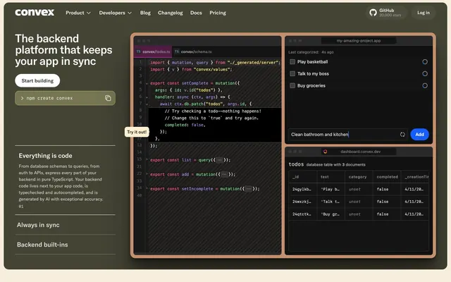
Preview image. Unlock full-res
Warm charcoal workbench with code syntax highlights. The core experience is dark and functional, highlighted by colorful code snippets.
Color palette
Action button background on dark mode, indicating primary interaction.
Highlighting interactive elements within code editors, adding warmth and focus.
Subtle background for active tabs or secondary interactive states in a coding context.
Background for code editors and terminal-like areas, creating a dimensional, immersive coding environment.
Syntax highlighting, occasional decorative text, drawing attention in code blocks.
Syntax highlighting for declarations and keywords, drawing attention in code blocks.
Syntax highlighting for string literals, creating visual parsing of code.
Syntax highlighting for specific variable types or functions, providing tertiary color coding.
Primary background for dark mode sections, heading text on light backgrounds, primary text in many contexts.
Primary text on dark backgrounds, icon fills, key interactive elements in light sections.
Light mode page backgrounds, input fields, header background.
Subtle light background in main content areas of some light mode sections, providing a warm off-white.
Card backgrounds, secondary dark surfaces, dark mode interactive element backgrounds.
Divider lines, subtle borders, inactive element text.
Subtle borders, text in low contrast areas, outlines.
Typography
- Weights
- 400, 500, 700
- Sizes
- 10px, 12px, 13px, 14px, 15px, 16px, 18px, 20px, 36px, 40px, 56px
- Line height
- 1, 1.25, 1.38, 1.5
- Letter spacing
- 0.5, 0.38, 0.33, 0.3, 0.25, 0.25, 0.25, -0.5, -0.9, -1, -2.8
- Fallback
- system-ui
The primary brand typeface for all headlines, body text, and UI elements. Its strong geometric sans-serif character defines the modern, precise tone.
- Weights
- 400
- Sizes
- 13px
- Line height
- 1.4
- Fallback
- monospace
Default monospace font for code blocks, terminal output, and technical data displays. Ensures consistent and readable code presentation.
Spacing & shape
Components
Background #69bee2 with #141414 text. Square corners (0px radius). Padding 12px horizontal, 12px vertical. Uses GT America, bold (700) at 16px.
Transparent background with #E5E5E5 text and 1px #E5E5E5 border. Square corners (0px radius). Padding 16px vertical, 6px horizontal. Uses GT America, regular (400) at 16px.
Transparent background with #141414 text and 1px #141414 border. Square corners (0px radius). Padding 8px vertical, 6px horizontal. Uses GT America, regular (400).
Background is 'Workbench Gradient' (#221f1d to rgba(41, 57, 105, 0.9)). Rounded corners (12px radius). Uses ui-monospace at 13px with syntax highlighting colors.
Background is #1E1C1A. Rounded corners (12px radius). Text is #F6F6F6. Internal padding varies (e.g., 16px). Employs code syntax colors for data entry distinction.
Background #F6F6F6, text #F6F6F6. 0px border radius, with a 1px #F6F6F6 border. Padding 16px all around. Uses GT America.
Text color #ffffff on dark navigation bars. Underlined if on dark background with #ffffff color. Font GT America, weight 400.
Text color #A9A9AC or #6D6D70. Font GT America, weight 400.
Guidelines
- Prioritize GT America for all textual elements except for specific code blocks, using ui-monospace for technical content.
- Use 0px border-radius for all interactive buttons to maintain a precise, angular aesthetic.
- Apply 'Workbench Gradient' (#221f1d to rgba(41, 57, 105, 0.9)) for rich, dark, interactive code editor backgrounds.
- Maintain a primary text color of Carbon (#141414) on light backgrounds and Cloud (#ffffff) on dark backgrounds for readability.
- Employ the code syntax colors (Code Violet, Pink, Green, Yellow) exclusively for code snippets or specific data highlights to prevent visual noise.
- Utilize Ash (#f6f6f6) for light page backgrounds and Slate (#292929) for dark card/surface backgrounds, clearly defining section depth.
- Enforce a hierarchical typography scale, with the largest display text at 56px and -2.8px letter spacing, creating a distinct visual voice.
- Avoid using rounded corners for buttons; all buttons must have 0px border-radius.
- Do not introduce new chromatic colors outside the defined accent palette for syntax highlighting; maintain the established code color scheme.
- Do not use generic system fonts for headlines or body text; GT America is fundamental to the brand identity.
- Avoid excessive use of shadows; prefer distinct background colors and gradients to indicate elevation or separate surfaces.
- Do not dilute the contrast between text and background; ensure high contrast ratios like #ffffff on #141414 or #f6f6f6 on #000000.
- Do not mix 'Parchment' (#fdefd2) with 'Ash' (#f6f6f6) on adjacent surfaces; these subtle neutrals serve distinct light-theme background roles.
About this system
ShowHide
This design system feels like a developer's workbench with a warm, analog-meets-digital aesthetic. It pairs a dark, almost charcoal-colored UI with hints of muted earth tones and vibrant, isolated code syntax colors. The sharp, unrounded buttons stand in contrast to the subtly rounded general UI elements, creating a precise, tool-like feel, while the extensive use of `GT America` font brings a distinctive modern tech presence.
The site uses a mixed layout approach. The initial hero section is dark and full-bleed with a centered headline and action buttons. Subsequent sections alternate between light and dark themes, often using a max-width contained grid for content, centered to a pageMaxWidth of approximately 1200px. Content arrangement frequently features split layouts (text on one side, visual on the other) or stacked content blocks. Vertical spacing between sections is generous and consistent (e.g., 940-1392px gaps). The navigation is a sticky top bar with logo, links, and action buttons. Feature sections often employ a 2-column layout or a card grid structure (e.g., pricing tiers). The density is varied, with spacious hero sections and more compact, information-dense blocks for features and explanations.
The visual language blends illustrative elements with minimalist product UI. Product screenshots are typically dark-themed code editor environments, often presented within a rounded-corner frame, signifying a working digital tool. Illustrations are abstract, pixelated, and geometric, featuring brand colors against light or dark backgrounds (e.g., the grid pattern with scattered orange and black squares), adding a playful yet technical feel. These are often used as decorative atmospheric elements, not functional content. Icons are minimal, either filled white on dark or filled dark on light, without apparent outlines, primarily serving UI navigation and feature indication. The overall density is balanced, with imagery serving as visual breaks or context for text-dominant sections, without overwhelming the content.
Reminiscent of Vercel, GitHub (dark mode), Linear, Stripe (developer docs).
# Convex — Style Reference
> Warm charcoal workbench with code syntax highlights. The core experience is dark and functional, highlighted by colorful code snippets.

**Theme:** mixed

**Site:** https://convex.dev

This design system feels like a developer's workbench with a warm, analog-meets-digital aesthetic. It pairs a dark, almost charcoal-colored UI with hints of muted earth tones and vibrant, isolated code syntax colors. The sharp, unrounded buttons stand in contrast to the subtly rounded general UI elements, creating a precise, tool-like feel, while the extensive use of `GT America` font brings a distinctive modern tech presence.

## Tokens — Colors

| Name | Value | Token | Role |
|------|------|------|------|
| Warm Code Blue | `#69bee2` | `--color-warm-code-blue` | Action button background on dark mode, indicating primary interaction. |
| Burnt Orange | `#de5d33` | `--color-burnt-orange` | Highlighting interactive elements within code editors, adding warmth and focus. |
| Deep Plum | `#8d2676` | `--color-deep-plum` | Subtle background for active tabs or secondary interactive states in a coding context. |
| Workbench Gradient | `#221f1d` | `--color-workbench-gradient` | Background for code editors and terminal-like areas, creating a dimensional, immersive coding environment. |
| Code Violet | `#948ae3` | `--color-code-violet` | Syntax highlighting, occasional decorative text, drawing attention in code blocks. |
| Code Pink | `#fc618d` | `--color-code-pink` | Syntax highlighting for declarations and keywords, drawing attention in code blocks. |
| Code Green | `#7bd88f` | `--color-code-green` | Syntax highlighting for string literals, creating visual parsing of code. |
| Code Yellow | `#f8e67a` | `--color-code-yellow` | Syntax highlighting for specific variable types or functions, providing tertiary color coding. |
| Carbon | `#141414` | `--color-carbon` | Primary background for dark mode sections, heading text on light backgrounds, primary text in many contexts. |
| Cloud | `#ffffff` | `--color-cloud` | Primary text on dark backgrounds, icon fills, key interactive elements in light sections. |
| Ash | `#f6f6f6` | `--color-ash` | Light mode page backgrounds, input fields, header background. |
| Parchment | `#fdefd2` | `--color-parchment` | Subtle light background in main content areas of some light mode sections, providing a warm off-white. |
| Slate | `#292929` | `--color-slate` | Card backgrounds, secondary dark surfaces, dark mode interactive element backgrounds. |
| Stone | `#d7d7d7` | `--color-stone` | Divider lines, subtle borders, inactive element text. |
| Whisper | `#e5e5e5` | `--color-whisper` | Subtle borders, text in low contrast areas, outlines. |

## Tokens — Typography

### GT America
- **Substitute:** system-ui
- **Weights:** 400, 500, 700
- **Sizes:** 10px, 12px, 13px, 14px, 15px, 16px, 18px, 20px, 36px, 40px, 56px
- **Line height:** 1, 1.25, 1.38, 1.5
- **Letter spacing:** 0.5, 0.38, 0.33, 0.3, 0.25, 0.25, 0.25, -0.5, -0.9, -1, -2.8
- **Role:** The primary brand typeface for all headlines, body text, and UI elements. Its strong geometric sans-serif character defines the modern, precise tone.

### ui-monospace
- **Substitute:** monospace
- **Weights:** 400
- **Sizes:** 13px
- **Line height:** 1.4
- **Role:** Default monospace font for code blocks, terminal output, and technical data displays. Ensures consistent and readable code presentation.

## Tokens — Type Scale

| Role | Size | Line height | Letter spacing |
|------|------|------|------|
| caption | 10px | 1.5 | 0.5px |
| subheading | 18px | 1.5 | 0.25px |
| heading | 36px | 1.25 | -0.9px |
| heading-lg | 40px | 1.25 | -1px |
| display | 56px | 1 | -2.8px |

## Tokens — Spacing

- **Max width:** 1200px
- **Card padding:** 12px
- **Element gap:** 4-16px

## Tokens — Radius

- **General:** 4px
- **Buttons:** 0px
- **Cards:** 12px
- **nav:** 8px

## Layout

The site uses a mixed layout approach. The initial hero section is dark and full-bleed with a centered headline and action buttons. Subsequent sections alternate between light and dark themes, often using a max-width contained grid for content, centered to a pageMaxWidth of approximately 1200px. Content arrangement frequently features split layouts (text on one side, visual on the other) or stacked content blocks. Vertical spacing between sections is generous and consistent (e.g., 940-1392px gaps). The navigation is a sticky top bar with logo, links, and action buttons. Feature sections often employ a 2-column layout or a card grid structure (e.g., pricing tiers). The density is varied, with spacious hero sections and more compact, information-dense blocks for features and explanations.

## Imagery

The visual language blends illustrative elements with minimalist product UI. Product screenshots are typically dark-themed code editor environments, often presented within a rounded-corner frame, signifying a working digital tool. Illustrations are abstract, pixelated, and geometric, featuring brand colors against light or dark backgrounds (e.g., the grid pattern with scattered orange and black squares), adding a playful yet technical feel. These are often used as decorative atmospheric elements, not functional content. Icons are minimal, either filled white on dark or filled dark on light, without apparent outlines, primarily serving UI navigation and feature indication. The overall density is balanced, with imagery serving as visual breaks or context for text-dominant sections, without overwhelming the content.

## Components

### Button Group — Primary + Ghost

### Feature List — Everything is code

### Product Section Banner — Not just a database

### Primary Action Button - Dark BG
*Primary call to action on dark backgrounds.*

Background #69bee2 with #141414 text. Square corners (0px radius). Padding 12px horizontal, 12px vertical. Uses GT America, bold (700) at 16px.

### Outline Ghost Button - Dark BG
*Secondary action or navigation on dark themed sections.*

Transparent background with #E5E5E5 text and 1px #E5E5E5 border. Square corners (0px radius). Padding 16px vertical, 6px horizontal. Uses GT America, regular (400) at 16px.

### Outline Ghost Button - Light BG
*Secondary action or navigation on light themed sections.*

Transparent background with #141414 text and 1px #141414 border. Square corners (0px radius). Padding 8px vertical, 6px horizontal. Uses GT America, regular (400).

### Code Window Container
*Displays interactive code examples and snippets.*

Background is 'Workbench Gradient' (#221f1d to rgba(41, 57, 105, 0.9)). Rounded corners (12px radius). Uses ui-monospace at 13px with syntax highlighting colors.

### Dashboard Card
*Displays data or a list of items within the interactive dashboard.*

Background is #1E1C1A. Rounded corners (12px radius). Text is #F6F6F6. Internal padding varies (e.g., 16px). Employs code syntax colors for data entry distinction.

### Search Input Field
*Global or section-specific search functionality.*

Background #F6F6F6, text #F6F6F6. 0px border radius, with a 1px #F6F6F6 border. Padding 16px all around. Uses GT America.

### Navigation Link - Active
*Indicates current page or active menu item.*

Text color #ffffff on dark navigation bars. Underlined if on dark background with #ffffff color. Font GT America, weight 400.

### Navigation Link - Inactive
*Standard navigation item.*

Text color #A9A9AC or #6D6D70. Font GT America, weight 400.

## Guidelines

### Do

- Prioritize GT America for all textual elements except for specific code blocks, using ui-monospace for technical content.
- Use 0px border-radius for all interactive buttons to maintain a precise, angular aesthetic.
- Apply 'Workbench Gradient' (#221f1d to rgba(41, 57, 105, 0.9)) for rich, dark, interactive code editor backgrounds.
- Maintain a primary text color of Carbon (#141414) on light backgrounds and Cloud (#ffffff) on dark backgrounds for readability.
- Employ the code syntax colors (Code Violet, Pink, Green, Yellow) exclusively for code snippets or specific data highlights to prevent visual noise.
- Utilize Ash (#f6f6f6) for light page backgrounds and Slate (#292929) for dark card/surface backgrounds, clearly defining section depth.
- Enforce a hierarchical typography scale, with the largest display text at 56px and -2.8px letter spacing, creating a distinct visual voice.

### Don't

- Avoid using rounded corners for buttons; all buttons must have 0px border-radius.
- Do not introduce new chromatic colors outside the defined accent palette for syntax highlighting; maintain the established code color scheme.
- Do not use generic system fonts for headlines or body text; GT America is fundamental to the brand identity.
- Avoid excessive use of shadows; prefer distinct background colors and gradients to indicate elevation or separate surfaces.
- Do not dilute the contrast between text and background; ensure high contrast ratios like #ffffff on #141414 or #f6f6f6 on #000000.
- Do not mix 'Parchment' (#fdefd2) with 'Ash' (#f6f6f6) on adjacent surfaces; these subtle neutrals serve distinct light-theme background roles.

## Agent Prompt Guide

### Quick Color Reference
- Text (Dark BG): #ffffff (Cloud)
- Text (Light BG): #141414 (Carbon)
- Background (Dark Section): #141414 (Carbon)
- Background (Light Section): #f6f6f6 (Ash)
- CTA (Primary): #69bee2 (Warm Code Blue)
- Accent (Code Pink): #fc618d

### Example Component Prompts
1. Create a dark hero section: `background: #141414 (Carbon)`. Headline: 'The backend platform that keeps your app in sync' `GT America, 56px, weight 700, #ffffff (Cloud), letter-spacing: -2.8px`. Primary CTA button: 'Start building' `background: #69bee2 (Warm Code Blue), text: #141414 (Carbon), radius: 0px, padding: 12px 12px`.
2. Design a `Code Window Container`: `background:` linear-gradient(45deg, rgb(34, 31, 29), rgb(49, 43, 43) 28%, rgba(41, 57, 105, 0.9) 50%) (Workbench Gradient). `border-radius: 12px`. Inner code text: `ui-monospace, 13px, #ffffff (Cloud) with syntax highlights for keywords (#948ae3 - Code Violet), strings (#7bd88f - Code Green), and functions (#fc618d - Code Pink).`
3. Generate an 'Outline Ghost Button (Dark BG)': `background: rgba(0, 0, 0, 0), color: #E5E5E5 (Whisper), border: 1px solid #E5E5E5 (Whisper), radius: 0px, padding: 16px 6px`. Text 'npm create convex' `GT America, 16px, weight 400`.
4. Produce a light-themed section card: `background: #fdefd2 (Parchment), border-radius: 12px`. Headline: 'LLMs love Convex' `GT America, 40px, weight 700, #141414 (Carbon), letter-spacing: -1.0px`. Body text: 'With Convex, everything is just TypeScript.' `GT America, 16px, weight 400, #141414 (Carbon)`. Secondary CTA: 'Learn more' `background: rgba(0, 0, 0, 0), color: #141414 (Carbon), border: 1px solid #141414 (Carbon), radius: 0px, padding: 8px 6px`.
More like this




Keep what you find
A free account saves references to boards and can send you a weekly email of picks based on what you save.
To see every result, go Pro.