Preview image. Unlock full-res
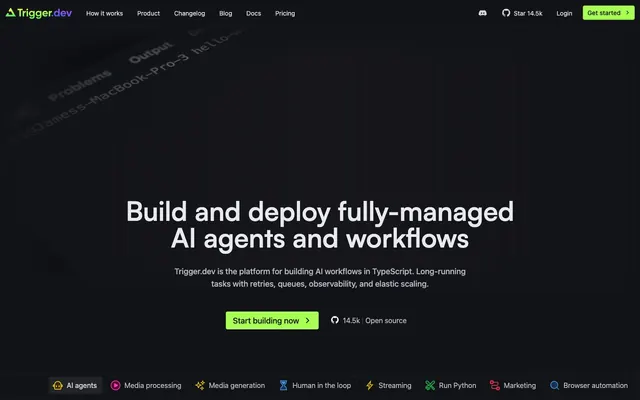
Midnight Terminal, illuminated by command prompts and spectral highlights.
Color palette
Primary call-to-action buttons, 'get started' elements, and positive status indicators — a vibrant beacon against dark surfaces.
Highlighting interactive elements, sub-headings, and decorative accents, suggesting an underlying digital core.
Secondary accent for interactive elements and specific highlighted text, providing depth to the purple spectrum.
Decorative elements, iconography, and occasional text highlights.
Specific iconography and product feature highlights.
Accent for status indicators or specific feature callouts.
Primary background for the application shell and content sections.
Card backgrounds, elevated content panels, and subtle section dividers.
Subtle borders and inactive element states, providing a discrete visual separation.
Primary Readable text, headings, and icon fills.
High-contrast text for active states and critical information, button borders.
Secondary text, muted descriptions, and placeholder text.
Subtle background shading on review cards, creating a sense of dimension without harsh shadows.
Success messages and positive confirmations; distinct from brand green.
Typography
- Weights
- 300, 400, 500
- Sizes
- 14px, 16px, 18px, 20px
- Line height
- 1.4, 1.43, 1.5, 1.56, 1.71
- Letter spacing
- normal
- Fallback
- Inter
Body copy, navigation items, general UI labels. Its neutral, legible character forms the workhorse text of the system.
- Weights
- 300, 400
- Sizes
- 14px
- Line height
- 1.43
- Letter spacing
- normal
- Fallback
- JetBrains Mono
Specialized for code blocks and technical annotations, providing a distinct, precise feel for developer-centric content.
- Weights
- 500, 600
- Sizes
- 16px, 18px, 20px, 24px, 30px, 36px, 48px, 60px
- Line height
- 1, 1.11, 1.2, 1.33, 1.38, 1.4, 1.5, 1.56
- Letter spacing
- 0.5, 0.25
- Fallback
- Outfit
Primary typeface for all headlines and display text. Its distinct, confident forms and subtle letter-spacing give visual weight to key messages.
Spacing & shape
Components
Rounded rectangular button with Spring Green (#a8ff53) background, Obsidian Black (#121317) text. Text is Satoshi-Variable, weight 600, 16px. Padding: 8px vertical, 12px horizontal. Border radius: 4px.
Transparent background, Slate Text (#d7d9dd) text. Text is Geist-Regular, weight 400, 16px. Padding: 4px vertical, 8px horizontal. Border radius: 4px.
Dark translucent background rgba(26, 27, 31, 0.5), Whisper White (#e5e7eb) text. Text is Geist-Regular, weight 400, 16px. Border radius: 4px. Padding: 8px vertical, 12px horizontal. Border: 1px solid Whisper White (#e5e7eb).
Transparent background, Steel Accent (#b5b8c0) text. Text is Geist-Regular, weight 400, 16px. No specific padding or border, serves as an in-line clickable element.
Pill-shaped with Obsidian Black (#121317) background and Spring Green (#a8ff53) text. Text is Geist-Regular, weight 400, 14px. Border radius: 9999px. Padding: 4px vertical, 12px horizontal.
Charcoal Surface (#1c1e21) background, with a 1px border of Ash Gray (#3b3e45). Content is centered. Border radius: 4px. Padding: dynamically adapts to content, min vertical 12px, horizontal 16px.
Charcoal Surface (#1c1e21) background with a 1px Whisper White (#e5e7eb) border. Border radius: 4px. Internal padding: 28px. Features Slate Text (#d7d9dd) body copy (Geist-Regular 16px) and Satoshi-Variable headings.
Guidelines
- Use Obsidian Black (#121317) as the primary page background to maintain the strong dark theme.
- Apply 4px border radius for all card components, buttons, and input fields for a consistent technical appearance.
- Utilize Spring Green (#a8ff53) exclusively for primary calls to action, maintaining its high-impact role.
- Employ Geist-Regular 16px, weight 400, and Slate Text (#d7d9dd) for all standard body copy.
- Reserve Satoshi-Variable for all headings, ensuring letter-spacing of 0.25px and 0.5px is applied at larger sizes as indicated in typography.
- Maintain an elementGap of 8px between closely related UI elements like buttons in a group or icons and text.
- Use Ash Gray (#3b3e45) for subtle borders and dividers between content blocks to delineate sections without strong visual breaks.
- Do not use saturated colors other than Spring Green (#a8ff53) as primary button backgrounds.
- Avoid applying large, soft shadows; leverage background color changes for elevation and depth instead.
- Do not use more than two saturated accent colors in close proximity to prevent visual clutter and maintain focus on the core information.
- Resist using highly decorative or illustrative imagery; favor clean, functional visuals or code snippets.
- Do not vary line-height significantly from the type scale; precise vertical rhythm is key for readability.
- Avoid pill shapes (9999px radius) for anything other than small, tertiary elements like tags to preserve the predominantly rectangular aesthetic.
- Do not use bold weights (600+) from Geist-Regular; rely on Satoshi-Variable for strong typographic emphasis.
About this system
ShowHide
Trigger.dev creates a 'technical luxury' dark mode experience, balancing utility with subtle visual richness. The deep charcoal backgrounds paired with crisp, cool-toned neutrals establish a serious, professional tone, while vibrant accents act as precise markers on a complex system. Custom fonts with precise letter-spacing and varied weights contribute to its sharp, information-dense feel. The interplay of minimalist buttons with sharp corners against a few pill-shaped elements hints at a system that values both traditional interface clarity and modern digital fluidity.
The layout follows a primarily max-width contained model (around 1200px equivalent) with centered content blocks, although the hero section extends full-bleed with a dark background. Sections generally alternate between distinct dark backgrounds, creating a clear vertical rhythm. Content is arranged in alternating text-left/visual-right patterns or centered stacks for stronger statements. There's a 3-column card grid for features and testimonials. Navigation is a sticky top bar with a left-aligned logo and right-aligned actions. The overall density is comfortable, with generous vertical spacing (40px) between sections.
The site uses a combination of abstract, gradient-infused graphics, product screenshots, and intricate code snippets. Imagery is generally contained within sections, not full-bleed, and often features a subtle dark background or blur. Photography is minimal, primarily headshots for testimonials. Icons are outline-style, mono-color, and subtle, often employing accent colors for specific features. The primary visual language centers around showcasing code and technical diagrams, giving a direct and functional representation of the product. Imagery is used to explain concepts, not merely decorate, reinforcing the developer-tool identity.
Reminiscent of Vercel, Stripe (developer docs), Linear, Tailwind CSS, GitHub (dark theme).
# Trigger.dev — Style Reference
> Midnight Terminal, illuminated by command prompts and spectral highlights.

**Theme:** dark

**Site:** https://trigger.dev

Trigger.dev creates a 'technical luxury' dark mode experience, balancing utility with subtle visual richness. The deep charcoal backgrounds paired with crisp, cool-toned neutrals establish a serious, professional tone, while vibrant accents act as precise markers on a complex system. Custom fonts with precise letter-spacing and varied weights contribute to its sharp, information-dense feel. The interplay of minimalist buttons with sharp corners against a few pill-shaped elements hints at a system that values both traditional interface clarity and modern digital fluidity.

## Tokens — Colors

| Name | Value | Token | Role |
|------|------|------|------|
| Spring Green | `#a8ff53` | `--color-spring-green` | Primary call-to-action buttons, 'get started' elements, and positive status indicators — a vibrant beacon against dark surfaces. |
| Cloud Violet | `#9c9af2` | `--color-cloud-violet` | Highlighting interactive elements, sub-headings, and decorative accents, suggesting an underlying digital core. |
| Deep Plum | `#7655fd` | `--color-deep-plum` | Secondary accent for interactive elements and specific highlighted text, providing depth to the purple spectrum. |
| Fuchsia Highlight | `#fa3abf` | `--color-fuchsia-highlight` | Decorative elements, iconography, and occasional text highlights. |
| Cosmic Blue | `#479dec` | `--color-cosmic-blue` | Specific iconography and product feature highlights. |
| Flare Orange | `#eccf06` | `--color-flare-orange` | Accent for status indicators or specific feature callouts. |
| Obsidian Black | `#121317` | `--color-obsidian-black` | Primary background for the application shell and content sections. |
| Charcoal Surface | `#1c1e21` | `--color-charcoal-surface` | Card backgrounds, elevated content panels, and subtle section dividers. |
| Ash Gray | `#3b3e45` | `--color-ash-gray` | Subtle borders and inactive element states, providing a discrete visual separation. |
| Slate Text | `#d7d9dd` | `--color-slate-text` | Primary Readable text, headings, and icon fills. |
| Whisper White | `#e5e7eb` | `--color-whisper-white` | High-contrast text for active states and critical information, button borders. |
| Steel Accent | `#b5b8c0` | `--color-steel-accent` | Secondary text, muted descriptions, and placeholder text. |
| Highlight Gradient | `#878c99` | `--color-highlight-gradient` | Subtle background shading on review cards, creating a sense of dimension without harsh shadows. |
| Success Green | `#afec73` | `--color-success-green` | Success messages and positive confirmations; distinct from brand green. |

## Tokens — Typography

### Geist-Regular
- **Substitute:** Inter
- **Weights:** 300, 400, 500
- **Sizes:** 14px, 16px, 18px, 20px
- **Line height:** 1.4, 1.43, 1.5, 1.56, 1.71
- **Letter spacing:** normal
- **Role:** Body copy, navigation items, general UI labels. Its neutral, legible character forms the workhorse text of the system.

### GeistMono-Regular
- **Substitute:** JetBrains Mono
- **Weights:** 300, 400
- **Sizes:** 14px
- **Line height:** 1.43
- **Letter spacing:** normal
- **Role:** Specialized for code blocks and technical annotations, providing a distinct, precise feel for developer-centric content.

### Satoshi-Variable
- **Substitute:** Outfit
- **Weights:** 500, 600
- **Sizes:** 16px, 18px, 20px, 24px, 30px, 36px, 48px, 60px
- **Line height:** 1, 1.11, 1.2, 1.33, 1.38, 1.4, 1.5, 1.56
- **Letter spacing:** 0.5, 0.25
- **Role:** Primary typeface for all headlines and display text. Its distinct, confident forms and subtle letter-spacing give visual weight to key messages.

## Tokens — Type Scale

Major Third (1.25) from 16px base.

| Role | Size | Line height | Letter spacing |
|------|------|------|------|
| body-sm | 14px | 1.5 | — |
| body | 16px | 1.5 | — |
| subheading | 18px | 1.4 | — |
| heading-sm | 20px | 1.38 | — |
| heading | 24px | 1.33 | — |
| heading-lg | 36px | 1.2 | 0.25px |
| display | 60px | 1.11 | 0.5px |

## Tokens — Spacing

- **Section gap:** 40px
- **Card padding:** 28px
- **Element gap:** 8px

## Tokens — Radius

- **Default:** 4px
- **Buttons:** 4px
- **tags:** 9999px

## Layout

The layout follows a primarily max-width contained model (around 1200px equivalent) with centered content blocks, although the hero section extends full-bleed with a dark background. Sections generally alternate between distinct dark backgrounds, creating a clear vertical rhythm. Content is arranged in alternating text-left/visual-right patterns or centered stacks for stronger statements. There's a 3-column card grid for features and testimonials. Navigation is a sticky top bar with a left-aligned logo and right-aligned actions. The overall density is comfortable, with generous vertical spacing (40px) between sections.

## Imagery

The site uses a combination of abstract, gradient-infused graphics, product screenshots, and intricate code snippets. Imagery is generally contained within sections, not full-bleed, and often features a subtle dark background or blur. Photography is minimal, primarily headshots for testimonials. Icons are outline-style, mono-color, and subtle, often employing accent colors for specific features. The primary visual language centers around showcasing code and technical diagrams, giving a direct and functional representation of the product. Imagery is used to explain concepts, not merely decorate, reinforcing the developer-tool identity.

## Components

### CTA Button Group

### Feature Tag Pills

### Testimonial Card

### Primary Action Button
*Main call to action*

Rounded rectangular button with Spring Green (#a8ff53) background, Obsidian Black (#121317) text. Text is Satoshi-Variable, weight 600, 16px. Padding: 8px vertical, 12px horizontal. Border radius: 4px.

### Ghost Navigation Button
*Secondary navigation and non-primary actions*

Transparent background, Slate Text (#d7d9dd) text. Text is Geist-Regular, weight 400, 16px. Padding: 4px vertical, 8px horizontal. Border radius: 4px.

### Subtle Information Button
*Informational or tertiary actions within content sections*

Dark translucent background rgba(26, 27, 31, 0.5), Whisper White (#e5e7eb) text. Text is Geist-Regular, weight 400, 16px. Border radius: 4px. Padding: 8px vertical, 12px horizontal. Border: 1px solid Whisper White (#e5e7eb).

### Minor Navigation Link
*Small, context-specific links in clusters*

Transparent background, Steel Accent (#b5b8c0) text. Text is Geist-Regular, weight 400, 16px. No specific padding or border, serves as an in-line clickable element.

### Feature Tag
*Categorization or short labels*

Pill-shaped with Obsidian Black (#121317) background and Spring Green (#a8ff53) text. Text is Geist-Regular, weight 400, 14px. Border radius: 9999px. Padding: 4px vertical, 12px horizontal.

### Client Logo Card
*Displaying trusted brand logos*

Charcoal Surface (#1c1e21) background, with a 1px border of Ash Gray (#3b3e45). Content is centered. Border radius: 4px. Padding: dynamically adapts to content, min vertical 12px, horizontal 16px.

### Testimonial Card
*Showcasing user feedback*

Charcoal Surface (#1c1e21) background with a 1px Whisper White (#e5e7eb) border. Border radius: 4px. Internal padding: 28px. Features Slate Text (#d7d9dd) body copy (Geist-Regular 16px) and Satoshi-Variable headings.

## Guidelines

### Do

- Use Obsidian Black (#121317) as the primary page background to maintain the strong dark theme.
- Apply 4px border radius for all card components, buttons, and input fields for a consistent technical appearance.
- Utilize Spring Green (#a8ff53) exclusively for primary calls to action, maintaining its high-impact role.
- Employ Geist-Regular 16px, weight 400, and Slate Text (#d7d9dd) for all standard body copy.
- Reserve Satoshi-Variable for all headings, ensuring letter-spacing of 0.25px and 0.5px is applied at larger sizes as indicated in typography.
- Maintain an elementGap of 8px between closely related UI elements like buttons in a group or icons and text.
- Use Ash Gray (#3b3e45) for subtle borders and dividers between content blocks to delineate sections without strong visual breaks.

### Don't

- Do not use saturated colors other than Spring Green (#a8ff53) as primary button backgrounds.
- Avoid applying large, soft shadows; leverage background color changes for elevation and depth instead.
- Do not use more than two saturated accent colors in close proximity to prevent visual clutter and maintain focus on the core information.
- Resist using highly decorative or illustrative imagery; favor clean, functional visuals or code snippets.
- Do not vary line-height significantly from the type scale; precise vertical rhythm is key for readability.
- Avoid pill shapes (9999px radius) for anything other than small, tertiary elements like tags to preserve the predominantly rectangular aesthetic.
- Do not use bold weights (600+) from Geist-Regular; rely on Satoshi-Variable for strong typographic emphasis.

## Agent Prompt Guide

### Quick Color Reference
- Text: #d7d9dd
- Background: #121317
- CTA: #a8ff53
- Border: #e5e7eb
- Accent: #9c9af2

### Example Component Prompts
1. Create a primary call to action button: Spring Green background, Obsidian Black text. Text is Satoshi-Variable, weight 600, 16px. Padding: 8px vertical, 12px horizontal. Border radius: 4px. Label: 'Start building now'.
2. Design a Testimonial Card: Charcoal Surface background, 1px Whisper White border, 4px border radius, 28px internal padding. Headline: Satoshi-Variable, 24px, #d7d9dd. Body text: Geist-Regular, 16px, #d7d9dd.
3. Make a Feature Tag: Pill-shaped with Obsidian Black background, Spring Green text. Text is Geist-Regular, 14px, weight 400. Padding: 4px vertical, 12px horizontal. Label: 'AI agents'.
4. Generate a Hero Headline: Text 'Build and deploy fully‑managed AI agents and workflows'. Apply Satoshi-Variable font, size 60px, weight 600, letter-spacing 0.5px, Slate Text (#d7d9dd) color, centered.
More like this





Keep what you find
A free account saves references to boards and can send you a weekly email of picks based on what you save.
To see every result, go Pro.