Preview image. Unlock full-res
Color palette
Page backgrounds, primary text, structural borders, logo text — creates a high-contrast, bold foundation
Hairline borders, dividers, input outlines, and card edges on light surfaces. Do not promote it to the primary CTA color
Typography
- Weights
- 300
- Sizes
- 12px, 16px, 20px
- Line height
- 1.2, 1.5, 1.58
- Letter spacing
- -0.0650em
- Fallback
- Inter
Body text, navigation links, secondary information, and small descriptive labels.
- Weights
- 300
- Sizes
- 18px, 65px, 75px
- Line height
- 1, 1.09, 1.2
- Letter spacing
- -0.0310em, -0.0100em
- Fallback
- Playfair Display
Primary headings and brand elements, conveying a sophisticated and art-focused aesthetic.
- Weights
- 300
- Sizes
- 16px, 65px, 75px
- Line height
- 1, 1.09, 1.5
- Letter spacing
- -0.0310em, -0.0100em
- Fallback
- Playfair Display Italic
Display headings, artist names, and highlighted textual content to add emphasis and elegance.
- Weights
- 300
- Sizes
- 18px
- Line height
- 1.2
- Letter spacing
- -0.0110em
- Fallback
- Playfair Display Italic
Specialized body contexts, captions, and footers, offering a subtle, refined touch.
Spacing & shape
Guidelines
- Use Canvas Black (#000000) for all primary backgrounds and primary text.
- Apply Surface White (#ffffff) for inverse text or decorative elements on dark backgrounds.
- Prioritize Graphik Light (300) for all functional text, maintaining -0.0650em letter-spacing.
- Reserve Cardinal Fruit (300) and its italic variants for headings and prominent textual features, using specific letter-spacing values like -0.0310em or -0.0100em.
- Maintain a spacious density for all layouts, with a minimum element gap of 20px and section gap of 40px.
- Ensure all interactive elements are text-based or have subtle ghost borders in Canvas Black (#000000).
- Adhere to a strict monochrome palette; avoid introducing any chromatic colors unless explicitly stated for semantic purposes (which are not present in this system).
- Do not use box shadows or other elevation effects; all surfaces should remain flat.
- Avoid colored backgrounds or elements other than Canvas Black (#000000) or Surface White (#ffffff).
- Do not introduce rounded corners; maintain sharp, crisp edges for all elements.
- Refrain from using heavily decorative gradients or textures.
- Do not deviate from the specified font families, weights, and letter-spacing values to maintain the distinct typographic hierarchy.
- Avoid dense, information-packed layouts; preserve ample whitespace around elements.
- Do not use explicit button backgrounds for primary actions; rely on text-only links or ghost borders defined by Canvas Black.
About this system
ShowHide
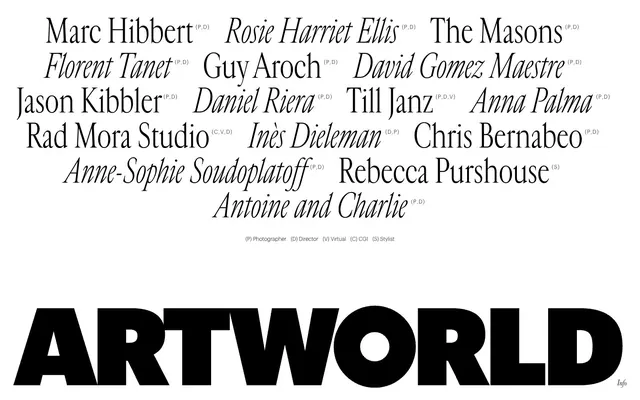
ARTWORLD projects an austere, gallery-like visual identity, dominated by stark black and white. Typography takes center stage, mixing a bold, modern sans-serif with an elegant serif in both regular and italic styles. The layout is spacious, giving elements ample room to breathe, while interactions are subtly expressed through text-only links and ghost borders.
The page operates on a full-bleed structure, with content (primarily text) filling the horizontal space. The hero section is characterized by large, often italicized display typography. Sections exhibit consistent vertical spacing, creating an airy, uncrowded experience. Content is arranged in stacked text blocks, with some elements appearing in two-column structures implicitly through alignment rather than explicit grids. Navigation is minimal, likely integrated as discreet text links.
This system features no visible photographic or illustrative imagery on the main white canvas. The visual language is purely typographic, with the exception of possible small, unobtrusive icons that would maintain the monochrome, crisp aesthetic. The brand identity is communicated through font choices and composition rather than pictorial content.
Reminiscent of The Row, A-POC by Issey Miyake, Studio Dielman.
# ARTWORLD — Style Reference
> monochrome gallery canvas

**Theme:** dark

**Site:** https://artworld.agency

ARTWORLD projects an austere, gallery-like visual identity, dominated by stark black and white. Typography takes center stage, mixing a bold, modern sans-serif with an elegant serif in both regular and italic styles. The layout is spacious, giving elements ample room to breathe, while interactions are subtly expressed through text-only links and ghost borders.

## Tokens — Colors

| Name | Value | Token | Role |
|------|------|------|------|
| Canvas Black | `#000000` | `--color-canvas-black` | Page backgrounds, primary text, structural borders, logo text — creates a high-contrast, bold foundation |
| Surface White | `#ffffff` | `--color-surface-white` | Hairline borders, dividers, input outlines, and card edges on light surfaces. Do not promote it to the primary CTA color |

## Tokens — Typography

### Graphik Light
- **Substitute:** Inter
- **Weights:** 300
- **Sizes:** 12px, 16px, 20px
- **Line height:** 1.2, 1.5, 1.58
- **Letter spacing:** -0.0650em
- **Role:** Body text, navigation links, secondary information, and small descriptive labels.

### Cardinal Fruit
- **Substitute:** Playfair Display
- **Weights:** 300
- **Sizes:** 18px, 65px, 75px
- **Line height:** 1, 1.09, 1.2
- **Letter spacing:** -0.0310em, -0.0100em
- **Role:** Primary headings and brand elements, conveying a sophisticated and art-focused aesthetic.

### Cardinal Fruit Italic
- **Substitute:** Playfair Display Italic
- **Weights:** 300
- **Sizes:** 16px, 65px, 75px
- **Line height:** 1, 1.09, 1.5
- **Letter spacing:** -0.0310em, -0.0100em
- **Role:** Display headings, artist names, and highlighted textual content to add emphasis and elegance.

### Cardinal Classic Italic
- **Substitute:** Playfair Display Italic
- **Weights:** 300
- **Sizes:** 18px
- **Line height:** 1.2
- **Letter spacing:** -0.0110em
- **Role:** Specialized body contexts, captions, and footers, offering a subtle, refined touch.

## Tokens — Type Scale

Augmented Fourth (1.414) from 18px base.

| Role | Size | Line height | Letter spacing |
|------|------|------|------|
| caption | 12px | 1.2 | -0.78px |
| body-sm | 16px | 1.5 | -1.04px |
| body | 18px | 1.2 | -0.198px |
| body-lg | 20px | 1.58 | -1.3px |
| display-sm | 65px | 1 | -2.015px |
| display | 75px | 1.09 | -0.75px |

## Tokens — Spacing

- **Section gap:** 40px
- **Card padding:** 20px
- **Element gap:** 20px

## Tokens — Radius

- **Default:** 0px

## Layout

The page operates on a full-bleed structure, with content (primarily text) filling the horizontal space. The hero section is characterized by large, often italicized display typography. Sections exhibit consistent vertical spacing, creating an airy, uncrowded experience. Content is arranged in stacked text blocks, with some elements appearing in two-column structures implicitly through alignment rather than explicit grids. Navigation is minimal, likely integrated as discreet text links.

## Imagery

This system features no visible photographic or illustrative imagery on the main white canvas. The visual language is purely typographic, with the exception of possible small, unobtrusive icons that would maintain the monochrome, crisp aesthetic. The brand identity is communicated through font choices and composition rather than pictorial content.

## Guidelines

### Do

- Use Canvas Black (#000000) for all primary backgrounds and primary text.
- Apply Surface White (#ffffff) for inverse text or decorative elements on dark backgrounds.
- Prioritize Graphik Light (300) for all functional text, maintaining -0.0650em letter-spacing.
- Reserve Cardinal Fruit (300) and its italic variants for headings and prominent textual features, using specific letter-spacing values like -0.0310em or -0.0100em.
- Maintain a spacious density for all layouts, with a minimum element gap of 20px and section gap of 40px.
- Ensure all interactive elements are text-based or have subtle ghost borders in Canvas Black (#000000).
- Adhere to a strict monochrome palette; avoid introducing any chromatic colors unless explicitly stated for semantic purposes (which are not present in this system).

### Don't

- Do not use box shadows or other elevation effects; all surfaces should remain flat.
- Avoid colored backgrounds or elements other than Canvas Black (#000000) or Surface White (#ffffff).
- Do not introduce rounded corners; maintain sharp, crisp edges for all elements.
- Refrain from using heavily decorative gradients or textures.
- Do not deviate from the specified font families, weights, and letter-spacing values to maintain the distinct typographic hierarchy.
- Avoid dense, information-packed layouts; preserve ample whitespace around elements.
- Do not use explicit button backgrounds for primary actions; rely on text-only links or ghost borders defined by Canvas Black.

## Agent Prompt Guide

Quick Color Reference:
text: #000000
background: #000000
border: #000000
accent: no distinct accent color
primary action: no distinct CTA color

Example Component Prompts:
1. Create a primary heading: 'ARTWORLD' using Cardinal Fruit (300) at 75px, #000000, letter-spacing -0.75px.
2. Create an artist name list item: 'Marc Hibbert' using Cardinal Fruit Italic (300) at 65px, #000000, letter-spacing -2.015px.
3. Create a body text paragraph: 'is an Artist Management Agency, launched in 2017 we develop...' using Graphik Light (300) at 20px, #000000, letter-spacing -1.3px.
More like this





Keep what you find
A free account saves references to boards and can send you a weekly email of picks based on what you save.
To see every result, go Pro.