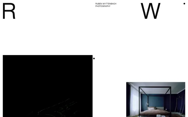
Preview image. Unlock full-res
Gallery canvas, framed silence
Color palette
Page background, primary text, subtle borders around clickable areas like links and image containers, creating framed content zones on the dark canvas
Hairline borders, dividers, input outlines, and card edges on light surfaces. Do not promote it to the primary CTA color
Decorative dots, icon fills, secondary text, borders on light backgrounds. Used for high-contrast details rather than large surface areas
Typography
- Weights
- 400
- Sizes
- 16px, 19px, 98px, 173px
- Line height
- 0.9, 0.92, 1, 1.15, 1.2
- Letter spacing
- -0.050em at 173px, -0.040em at 98px, -0.020em at 19px, -0.017em at 16px
- Fallback
- Arial
All textual content, from large, impactful display headings (like 'R' or 'W') to body text and navigation. Its consistent single weight emphasizes clarity and directness, letting size and spacing dictate hierarchy.
Spacing & shape
Components
Images are presented on a `Canvas Black` background. When hovered, a `Paper White` border of 1px appears around the image, creating a subtle highlight. Uses 11px padding on all sides, but this can extend to 173px padding bottom in some cases for a taller effect.
Text in Kern-Regular, `Paper White` color, 16px size. On hover, a `Canvas Black` border of 1px appears, creating an outlined ghost button effect around the text. Often accompanied by small `Text Black` dots.
Kern-Regular, 16px, `Paper White` color. Used for headings, sub-descriptions, and journal entries. Employs horizontal padding of 4px on the right creating an uneven visual rhythm.
Extra-large (173px, 98px) `Paper White` characters in Kern-Regular, `Canvas Black` 1px border. Feature tight letter-spacing to maintain a block-like appearance, like '-0.050em' for the largest size. These act as distinct, almost abstract visual anchors.
A small circular element with a 50px border-radius, `Text Black` fill, often used as a minimalist pointer or separator. Diameter appears to be around 6px to 10px.
Guidelines
- Use Canvas Black (#0a0a0a) for most page backgrounds and Text Black (#000000) only for small accent details like dots and icons.
- Set typography in Kern-Regular (or Arial as substitute) at weight 400 for all text, varying size and letter-spacing to establish hierarchy.
- Apply `Paper White` (#ffffff) for all main textual content to ensure strong contrast against the dark `Canvas Black` backgrounds.
- Employ a 1px border using `Canvas Black` or `Paper White` to create framing around interactive elements, images, or text on hover/active states.
- Establish horizontal rhythm using 118px `marginLeft` and `marginRight` for content blocks, providing significant negative space.
- Leverage large initial characters (98px or 173px) with negative letter-spacing for editorial or section headings, making them prominent visual elements.
- Maintain a compact element spacing of 6px for immediate proximity between related items, contrasting with larger section gaps.
- Avoid using multiple font weights or families; the system relies on a single consistent font at one weight.
- Do not introduce highly chromatic colors; the palette is strictly achromatic, with black, white, and near-black dominating.
- Refrain from using strong shadows or gradients; the design aesthetic is flat, emphasizing clean lines and stark contrasts.
- Do not fill buttons with solid colors; interactive elements should primarily use outlined or ghost styles, often with 1px borders.
- Avoid decorative imagery that competes with primary content; graphics should be minimal icon-like objects (e.g., dots) or photography presented without heavy manipulation.
- Do not break the visual rhythm with inconsistent component padding; adhere to 11px general padding, sometimes extended at the bottom to 173px for specific elements.
- Do not use generic border-radii; adhere to the specific 2px for general elements and 50px for perfectly circular small elements.
About this system
ShowHide
Rubenwyttenbach expresses a minimalist, high-contrast aesthetic where imagery reigns supreme. The design relies on expansive black canvases and crisp white typography, creating a gallery-like experience. Text is sparse, acting as precise labels or subtle navigation, while large initial letters hint at an editorial, artistic sensibility. Elements are subtly framed or bordered, emphasizing clean lines and negative space.
The page adheres to a full-bleed model, not confined by a `pageMaxWidth`. The hero section features large, artful initial letters (`R`, `W`) acting as both branding and navigation. Content is arranged with significant vertical `sectionGap` (118px) creating breathing room. A common pattern involves alternating blocks of content and imagery, with a strong vertical rhythm established by explicit spacing choices. Navigation is minimal, likely a top-bar or overlay, with sparse text links. Content sections appear to float on the dark canvas, sometimes subtly framed by borders when interactive.
This design system primarily uses photography presented with minimal framing. Images lack rounded corners or complex masking; they are presented as raw edges against the `Canvas Black` background. The treatment is focused on showcasing the photography itself, with a tendency towards tight crops or interior shots, rather than lifestyle imagery or abstract graphics. Icons are minimal, represented by small `Text Black` dots.
Reminiscent of A.P.C., The Row, Studio Faculty, Acne Studios.
# Rubenwyttenbach — Style Reference
> Gallery canvas, framed silence

**Theme:** dark

**Site:** https://rubenwyttenbach.ch

Rubenwyttenbach expresses a minimalist, high-contrast aesthetic where imagery reigns supreme. The design relies on expansive black canvases and crisp white typography, creating a gallery-like experience. Text is sparse, acting as precise labels or subtle navigation, while large initial letters hint at an editorial, artistic sensibility. Elements are subtly framed or bordered, emphasizing clean lines and negative space.

## Tokens — Colors

| Name | Value | Token | Role |
|------|------|------|------|
| Canvas Black | `#0a0a0a` | `--color-canvas-black` | Page background, primary text, subtle borders around clickable areas like links and image containers, creating framed content zones on the dark canvas |
| Paper White | `#ffffff` | `--color-paper-white` | Hairline borders, dividers, input outlines, and card edges on light surfaces. Do not promote it to the primary CTA color |
| Text Black | `#000000` | `--color-text-black` | Decorative dots, icon fills, secondary text, borders on light backgrounds. Used for high-contrast details rather than large surface areas |

## Tokens — Typography

### Kern-Regular
- **Substitute:** Arial
- **Weights:** 400
- **Sizes:** 16px, 19px, 98px, 173px
- **Line height:** 0.9, 0.92, 1, 1.15, 1.2
- **Letter spacing:** -0.050em at 173px, -0.040em at 98px, -0.020em at 19px, -0.017em at 16px
- **Role:** All textual content, from large, impactful display headings (like 'R' or 'W') to body text and navigation. Its consistent single weight emphasizes clarity and directness, letting size and spacing dictate hierarchy.

## Tokens — Type Scale

| Role | Size | Line height | Letter spacing |
|------|------|------|------|
| caption | 16px | 1 | — |
| body-sm | 19px | 1 | — |
| body | 98px | 1 | — |
| body-lg | 173px | 1 | — |

## Tokens — Spacing

- **Section gap:** 118px
- **Card padding:** 11px
- **Element gap:** 6px

## Tokens — Radius

- **Default:** 2px
- **circularElements:** 50px

## Layout

The page adheres to a full-bleed model, not confined by a `pageMaxWidth`. The hero section features large, artful initial letters (`R`, `W`) acting as both branding and navigation. Content is arranged with significant vertical `sectionGap` (118px) creating breathing room. A common pattern involves alternating blocks of content and imagery, with a strong vertical rhythm established by explicit spacing choices. Navigation is minimal, likely a top-bar or overlay, with sparse text links. Content sections appear to float on the dark canvas, sometimes subtly framed by borders when interactive.

## Imagery

This design system primarily uses photography presented with minimal framing. Images lack rounded corners or complex masking; they are presented as raw edges against the `Canvas Black` background. The treatment is focused on showcasing the photography itself, with a tendency towards tight crops or interior shots, rather than lifestyle imagery or abstract graphics. Icons are minimal, represented by small `Text Black` dots.

## Components

### Framed Image Area
*Visual content container with hover effect*

Images are presented on a `Canvas Black` background. When hovered, a `Paper White` border of 1px appears around the image, creating a subtle highlight. Uses 11px padding on all sides, but this can extend to 173px padding bottom in some cases for a taller effect.

### Navigation Link
*Main navigation and content links*

Text in Kern-Regular, `Paper White` color, 16px size. On hover, a `Canvas Black` border of 1px appears, creating an outlined ghost button effect around the text. Often accompanied by small `Text Black` dots.

### Descriptive Text Label
*Auxiliary and contextual text*

Kern-Regular, 16px, `Paper White` color. Used for headings, sub-descriptions, and journal entries. Employs horizontal padding of 4px on the right creating an uneven visual rhythm.

### Large Initial Letter Display
*Decorative and navigational large-scale typography*

Extra-large (173px, 98px) `Paper White` characters in Kern-Regular, `Canvas Black` 1px border. Feature tight letter-spacing to maintain a block-like appearance, like '-0.050em' for the largest size. These act as distinct, almost abstract visual anchors.

### Circular Focus Dot
*Visual indicator for active states or markers*

A small circular element with a 50px border-radius, `Text Black` fill, often used as a minimalist pointer or separator. Diameter appears to be around 6px to 10px.

## Guidelines

### Do

- Use Canvas Black (#0a0a0a) for most page backgrounds and Text Black (#000000) only for small accent details like dots and icons.
- Set typography in Kern-Regular (or Arial as substitute) at weight 400 for all text, varying size and letter-spacing to establish hierarchy.
- Apply `Paper White` (#ffffff) for all main textual content to ensure strong contrast against the dark `Canvas Black` backgrounds.
- Employ a 1px border using `Canvas Black` or `Paper White` to create framing around interactive elements, images, or text on hover/active states.
- Establish horizontal rhythm using 118px `marginLeft` and `marginRight` for content blocks, providing significant negative space.
- Leverage large initial characters (98px or 173px) with negative letter-spacing for editorial or section headings, making them prominent visual elements.
- Maintain a compact element spacing of 6px for immediate proximity between related items, contrasting with larger section gaps.

### Don't

- Avoid using multiple font weights or families; the system relies on a single consistent font at one weight.
- Do not introduce highly chromatic colors; the palette is strictly achromatic, with black, white, and near-black dominating.
- Refrain from using strong shadows or gradients; the design aesthetic is flat, emphasizing clean lines and stark contrasts.
- Do not fill buttons with solid colors; interactive elements should primarily use outlined or ghost styles, often with 1px borders.
- Avoid decorative imagery that competes with primary content; graphics should be minimal icon-like objects (e.g., dots) or photography presented without heavy manipulation.
- Do not break the visual rhythm with inconsistent component padding; adhere to 11px general padding, sometimes extended at the bottom to 173px for specific elements.
- Do not use generic border-radii; adhere to the specific 2px for general elements and 50px for perfectly circular small elements.

## Agent Prompt Guide

Quick Color Reference:
text: #ffffff
background: #0a0a0a
border: #0a0a0a
accent: none observed
primary action: no distinct CTA color

Example Component Prompts:
Create a framed image card with a 1px `Canvas Black` border and 11px padding, displaying a photograph. The border appears on hover.
Create a navigation link: 'Index' with `Paper White` text, 16px Kern-Regular, and a 1px transparent border, which becomes `Canvas Black` on hover, along with a small `Text Black` dot indicator.
Create a section heading: 'E d i t o r i a l' using Kern-Regular, 19px, `Paper White` text, with a `Canvas Black` 1px border. The heading has a 4px `paddingRight`.
More like this





Keep what you find
A free account saves references to boards and can send you a weekly email of picks based on what you save.
To see every result, go Pro.