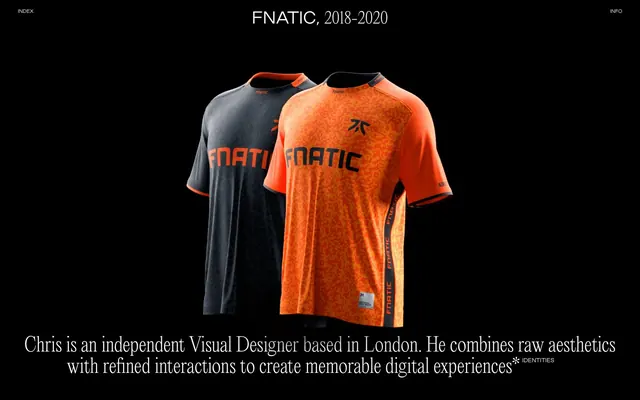
Preview image. Unlock full-res
Color palette
Dark borders and separators for elevated surfaces and inverted UI. Do not promote it to the primary CTA color
Primary text on dark backgrounds, active navigation elements, decorative accents
Typography
- Weights
- 400
- Sizes
- 16px, 32px, 35px, 43px
- Line height
- 1, 1.1, 1.15
- Fallback
- Playfair Display
Headlines, expressive body text, and key content labels - its distinct serif character provides a classical, editorial feel, contrasting with the minimalist layout.
- Weights
- 400
- Sizes
- 10px, 12px, 35px
- Line height
- 1, 1.1
- Fallback
- Open Sans
Navigation, small labels, and accent text - its clean, geometric forms provide a modern, functional counterpoint to the more decorative serif.
Spacing & shape
Components
Text: Arctic Mist (#ffffff) using goodsans, 12px, weight 400. Hover state shows a subtle border or color change. Padded with 50px on right.
Text: Arctic Mist (#ffffff) using editorial, 16px, weight 400. Contained within a spacious layout.
Text: Arctic Mist (#ffffff) using editorial, typically 35px or 43px, weight 400. All-caps for strong visual presence.
Text: Arctic Mist (#ffffff) using editorial, 16px, weight 400. Usually appears centered at the bottom of the page.
Guidelines
- Prioritize Midnight Void (#000000) for all main backgrounds to maintain the dark theme.
- Use Arctic Mist (#ffffff) for all primary text and interactive elements on dark backgrounds.
- Apply the `editorial` font for all major headings and expressive textual content, leveraging its classical aesthetic.
- Use the `goodsans` font for all functional elements like navigation, labels, and small informational text.
- Maintain generous spacing: `50px` for vertical section gaps and `22px` for internal content padding.
- Enforce all-caps for headlines using the `editorial` font to maximize impact.
- Utilize border-only interactive states for buttons and links, using Midnight Void (#000000) for borders on light elements, and Arctic Mist (#ffffff) for borders on dark elements.
- Avoid introducing any saturated colors; the palette is strictly achromatic.
- Do not use small line heights for `goodsans` text; maintain ample leading for readability in compact areas.
- Do not add any drop shadows or complex elevation; the design relies on flat, high-contrast surfaces.
- Do not add non-functional ornamentation; every visual element should serve a clear purpose.
- Avoid using `goodsans` for large, dominant headlines; reserve `editorial` for that role to preserve typographic hierarchy.
- Do not deviate from the established spacing values; consistency is key to the spacious feel.
- Avoid generic icon libraries; icons should be minimalist and align with the sharp, clean aesthetic, likely using pure white strokes.
About this system
ShowHide
Chris Biron presents a dark, minimalist aesthetic with a strong focus on high-contrast typography and subtle interactive elements. The design system emphasizes spacious layouts and a sense of calm, with large areas of negative space allowing content and imagery to breathe. Typography carries significant weight in conveying messages, often in all-caps, with a striking interplay between a classical serif and a modern sans-serif. Visual transitions are smooth and expressive, complementing the refined but raw interaction style.
The page adheres to a full-bleed layout, maximizing the dark canvas, with content often centered vertically and horizontally within large sections. The hero section frequently features a full-viewport visual (image or render) with minimal, centered textual overlay. Section rhythm is marked by distinct, generously spaced content blocks rather than explicit visual dividers, featuring alternating arrangements of text and visuals. Content frequently stacks centrally or uses a 2-column layout for text and images or product mockups. The navigation is a minimalist top bar, likely sticky, with 'INDEX' and 'INFO' links positioned at the top left and right corners, serving as a subtle framing element.
The visual language is characterized by bold, full-bleed product photography within simulated digital interfaces (like phone mockups) or artistic 3D renders of physical products. Imagery is typically self-contained, presented with raw edges and little to no masking. When photography is used, it often features tight crops and a sense of candid immediacy, with high contrast. The role of imagery is to showcase product design and provide contextual examples of the designer's work, rather than decorative atmosphere. The overall density is image-heavy in showcased project sections, balanced by text-dominant areas for descriptions.
Reminiscent of Aytm.com, Pichard.me, Adrien Giraud, Basile David.
# Chris Biron — Style Reference
> High-contrast typographic canvas

**Theme:** dark

**Site:** https://biron.io

Chris Biron presents a dark, minimalist aesthetic with a strong focus on high-contrast typography and subtle interactive elements. The design system emphasizes spacious layouts and a sense of calm, with large areas of negative space allowing content and imagery to breathe. Typography carries significant weight in conveying messages, often in all-caps, with a striking interplay between a classical serif and a modern sans-serif. Visual transitions are smooth and expressive, complementing the refined but raw interaction style.

## Tokens — Colors

| Name | Value | Token | Role |
|------|------|------|------|
| Midnight Void | `#000000` | `--color-midnight-void` | Dark borders and separators for elevated surfaces and inverted UI. Do not promote it to the primary CTA color |
| Arctic Mist | `#ffffff` | `--color-arctic-mist` | Primary text on dark backgrounds, active navigation elements, decorative accents |

## Tokens — Typography

### editorial
- **Substitute:** Playfair Display
- **Weights:** 400
- **Sizes:** 16px, 32px, 35px, 43px
- **Line height:** 1, 1.1, 1.15
- **Role:** Headlines, expressive body text, and key content labels - its distinct serif character provides a classical, editorial feel, contrasting with the minimalist layout.

### goodsans
- **Substitute:** Open Sans
- **Weights:** 400
- **Sizes:** 10px, 12px, 35px
- **Line height:** 1, 1.1
- **Role:** Navigation, small labels, and accent text - its clean, geometric forms provide a modern, functional counterpoint to the more decorative serif.

## Tokens — Type Scale

Augmented Fourth (1.414) from 35px base.

| Role | Size | Line height | Letter spacing |
|------|------|------|------|
| caption | 16px | 1.1 | — |
| body-sm | 32px | 1.1 | — |
| body | 35px | 1.1 | — |
| body-lg | 43px | 1.1 | — |

## Tokens — Spacing

- **Section gap:** 50px
- **Card padding:** 22px
- **Element gap:** 5px

## Layout

The page adheres to a full-bleed layout, maximizing the dark canvas, with content often centered vertically and horizontally within large sections. The hero section frequently features a full-viewport visual (image or render) with minimal, centered textual overlay. Section rhythm is marked by distinct, generously spaced content blocks rather than explicit visual dividers, featuring alternating arrangements of text and visuals. Content frequently stacks centrally or uses a 2-column layout for text and images or product mockups. The navigation is a minimalist top bar, likely sticky, with 'INDEX' and 'INFO' links positioned at the top left and right corners, serving as a subtle framing element.

## Imagery

The visual language is characterized by bold, full-bleed product photography within simulated digital interfaces (like phone mockups) or artistic 3D renders of physical products. Imagery is typically self-contained, presented with raw edges and little to no masking. When photography is used, it often features tight crops and a sense of candid immediacy, with high contrast. The role of imagery is to showcase product design and provide contextual examples of the designer's work, rather than decorative atmosphere. The overall density is image-heavy in showcased project sections, balanced by text-dominant areas for descriptions.

## Components

### Primary Navigation Link
*Top-level navigation items*

Text: Arctic Mist (#ffffff) using goodsans, 12px, weight 400. Hover state shows a subtle border or color change. Padded with 50px on right.

### Body Text Block
*Main narrative content*

Text: Arctic Mist (#ffffff) using editorial, 16px, weight 400. Contained within a spacious layout.

### Section Heading
*Major content section titles*

Text: Arctic Mist (#ffffff) using editorial, typically 35px or 43px, weight 400. All-caps for strong visual presence.

### Footer Description
*Site-wide descriptive text*

Text: Arctic Mist (#ffffff) using editorial, 16px, weight 400. Usually appears centered at the bottom of the page.

## Guidelines

### Do

- Prioritize Midnight Void (#000000) for all main backgrounds to maintain the dark theme.
- Use Arctic Mist (#ffffff) for all primary text and interactive elements on dark backgrounds.
- Apply the `editorial` font for all major headings and expressive textual content, leveraging its classical aesthetic.
- Use the `goodsans` font for all functional elements like navigation, labels, and small informational text.
- Maintain generous spacing: `50px` for vertical section gaps and `22px` for internal content padding.
- Enforce all-caps for headlines using the `editorial` font to maximize impact.
- Utilize border-only interactive states for buttons and links, using Midnight Void (#000000) for borders on light elements, and Arctic Mist (#ffffff) for borders on dark elements.

### Don't

- Avoid introducing any saturated colors; the palette is strictly achromatic.
- Do not use small line heights for `goodsans` text; maintain ample leading for readability in compact areas.
- Do not add any drop shadows or complex elevation; the design relies on flat, high-contrast surfaces.
- Do not add non-functional ornamentation; every visual element should serve a clear purpose.
- Avoid using `goodsans` for large, dominant headlines; reserve `editorial` for that role to preserve typographic hierarchy.
- Do not deviate from the established spacing values; consistency is key to the spacious feel.
- Avoid generic icon libraries; icons should be minimalist and align with the sharp, clean aesthetic, likely using pure white strokes.

## Agent Prompt Guide

Quick Color Reference:
text: #ffffff
background: #000000
border: #000000
accent: #ffffff
primary action: no distinct CTA color

Example Component Prompts:
1. Create a top navigation bar: Midnight Void (#000000) background, with 'INDEX' on the left and 'INFO' on the right, both using goodsans font, 12px, Arctic Mist (#ffffff) text color.
2. Design a project title section: Centered text 'FNATIC, 2018-2020' using editorial font, 43px, Arctic Mist (#ffffff) text, positioned above a product image, with 50px vertical padding above and below.
3. Implement a descriptive paragraph: 'Chris is an independent Visual Designer based in London. He combines raw aesthetics with refined interactions to create memorable digital experiences' using editorial font, 16px, Arctic Mist (#ffffff) text, centered horizontally within a Midnight Void (#000000) section, with 50px vertical padding.
More like this





Keep what you find
A free account saves references to boards and can send you a weekly email of picks based on what you save.
To see every result, go Pro.