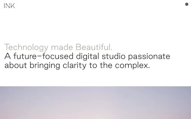
Preview image. Unlock full-res
Architectural blueprint on white marble. Precision, clarity, spaciousness, and carefully chosen details unfold across a pristine, light-drenched surface.
Color palette
Specific background color appearing in a unique asset (Joby Aviation section/image), not a system-wide accent.
Primary text, interactive elements, navigation links, and button outlines — defines the core legible content against light backgrounds.
Dominant page and component background. Its starkness emphasizes content and creates breathing room.
Alternative light background for subtle section shifts or specific footer areas, providing visual relief from pure white without introducing chromatic distraction.
Secondary text, subheadings, and subtle accents. This near-gray provides a softer contrast than Ink Black, used for descriptive text.
Typography
- Weights
- 400
- Sizes
- 18px, 22px, 27px, 60px
- Line height
- 1, 1.09, 1.14, 1.25, 1.31, 1.6, 1.75
- Letter spacing
- normal
- Fallback
- Inter
The singular typeface for all content roles, from body to display. Its custom nature supports the brand's identity through consistent, sophisticated readability. The moderate weights maintain an understated authority, avoiding heavy-handedness.
Spacing & shape
Components
Transparent background with 'Ink Black' (#2e2a2b) text and a 'Ink Black' (#2e2a2b) bottom border (1px). No border radius, emphasizing a crisp, direct interaction.
Rendered as a 100px border-radius shape, likely for visual highlighting of the current page or selection. Color is inferred to be a subtle fill given its high radius in 'nav' context.
Background is transparent (rgba(0,0,0,0)), text is 'Ink Black' (#000000). A 1px top border of 'Ink Black' (#000000) is present, paired with padding of 1px top/bottom and 2px left/right. No border radius, maintaining the system's sharp aesthetic.
Guidelines
- Prioritize 'Frost Canvas' (#ffffff) or 'Warm Paper' (#e6dcd4) as primary backgrounds for all layouts to maintain a bright, expansive feel.
- Use 'Ink Black' (#2e2a2b) for all primary text elements, interactive components, and critical information for maximum legibility.
- Employ spacious vertical gaps between sections, defaulting to '160px' to create significant breathing room and separation.
- Maintain consistently sharp 0px border radii for all primary UI components like buttons and cards, enforcing a precise, architectural aesthetic.
- Utilize 'Cool Stone' (#afa697) for secondary textual elements such as subheadings or descriptive text to introduce visual hierarchy without high contrast.
- Ensure all interactive elements and navigation links use the 'Good Sans' typeface at designated weights and sizes, reinforcing brand consistency.
- Avoid the integration of heavy shadows or complex elevation systems; the design relies on spacing and color contrast for depth.
- Do not introduce overtly rounded elements beyond the specific '100px' radius navigation pill, to preserve the system's sharp, precise nature.
- Refrain from using highly saturated accent colors in prominent UI roles; colorful elements are primarily decorative content, not interactive indicators.
- Do not use multiple font families; all textual elements must strictly adhere to the 'Good Sans' typeface.
- Avoid dense, information-packed sections; embrace the generous spacing guidelines to ensure content feels open and uncluttered.
About this system
ShowHide
This system projects an image of understated luxury, prioritizing spaciousness and meticulous typography over vibrant visuals. The canvas of near-white (#E6DCD4) or pure white allows the refined, custom sans-serif to take center stage, creating a highly legible and authoritative tone. A distinct absence of shadows and geometric borders focuses attention on content through scale and precise placement, rather than overt styling.
The layout is primarily centered and contained, although hero sections can be full-bleed with large, impactful imagery. Content is arranged with ample vertical spacing, giving a sense of gravitas and making each section feel distinct. The page model appears to be a sequence of large, horizontally aligned content blocks, often showcasing a project title and description, followed by a full-width image or video. There's a clear header with minimal navigation and a generous footer, emphasizing content over persistent UI elements.
The site primarily uses high-quality, product-focused or project-specific photography displayed full-bleed in hero sections and content blocks. Images are contained with sharp edges, often acting as showcases for client work. There's an absence of playful illustrations or excessive icons, reinforcing a serious, professional tone. The images serve to illustrate and contextualize the studio's projects rather than merely decorate.
Reminiscent of AIGA, Pentagram, Gusto.
# INK — Style Reference
> Architectural blueprint on white marble. Precision, clarity, spaciousness, and carefully chosen details unfold across a pristine, light-drenched surface.

**Theme:** light

**Site:** https://weareink.co.uk

This system projects an image of understated luxury, prioritizing spaciousness and meticulous typography over vibrant visuals. The canvas of near-white (#E6DCD4) or pure white allows the refined, custom sans-serif to take center stage, creating a highly legible and authoritative tone. A distinct absence of shadows and geometric borders focuses attention on content through scale and precise placement, rather than overt styling.

## Tokens — Colors

| Name | Value | Token | Role |
|------|------|------|------|
| Joby Aviation Sky | `#b6d0e2` | `--color-joby-aviation-sky` | Specific background color appearing in a unique asset (Joby Aviation section/image), not a system-wide accent. |
| Ink Black | `#2e2a2b` | `--color-ink-black` | Primary text, interactive elements, navigation links, and button outlines — defines the core legible content against light backgrounds. |
| Frost Canvas | `#ffffff` | `--color-frost-canvas` | Dominant page and component background. Its starkness emphasizes content and creates breathing room. |
| Warm Paper | `#e6dcd4` | `--color-warm-paper` | Alternative light background for subtle section shifts or specific footer areas, providing visual relief from pure white without introducing chromatic distraction. |
| Cool Stone | `#afa697` | `--color-cool-stone` | Secondary text, subheadings, and subtle accents. This near-gray provides a softer contrast than Ink Black, used for descriptive text. |

## Tokens — Typography

### Good Sans
- **Substitute:** Inter
- **Weights:** 400
- **Sizes:** 18px, 22px, 27px, 60px
- **Line height:** 1, 1.09, 1.14, 1.25, 1.31, 1.6, 1.75
- **Letter spacing:** normal
- **Role:** The singular typeface for all content roles, from body to display. Its custom nature supports the brand's identity through consistent, sophisticated readability. The moderate weights maintain an understated authority, avoiding heavy-handedness.

## Tokens — Type Scale

Perfect Fifth (1.5) from 22px base.

| Role | Size | Line height | Letter spacing |
|------|------|------|------|
| body-sm | 18px | 1.75 | — |
| body | 22px | 1.6 | — |
| subheading | 27px | 1.31 | — |
| display | 60px | 1 | — |

## Tokens — Spacing

- **Section gap:** 160px
- **Card padding:** 64px
- **Element gap:** 32px

## Tokens — Radius

- **Buttons:** 0px
- **Inputs:** 0px
- **Cards:** 0px
- **navPills:** 100px

## Layout

The layout is primarily centered and contained, although hero sections can be full-bleed with large, impactful imagery. Content is arranged with ample vertical spacing, giving a sense of gravitas and making each section feel distinct. The page model appears to be a sequence of large, horizontally aligned content blocks, often showcasing a project title and description, followed by a full-width image or video. There's a clear header with minimal navigation and a generous footer, emphasizing content over persistent UI elements.

## Imagery

The site primarily uses high-quality, product-focused or project-specific photography displayed full-bleed in hero sections and content blocks. Images are contained with sharp edges, often acting as showcases for client work. There's an absence of playful illustrations or excessive icons, reinforcing a serious, professional tone. The images serve to illustrate and contextualize the studio's projects rather than merely decorate.

## Components

### Ghost Button Group

### Project Card — Portfolio Item

### Email Subscription Input

### Ghost Button
*Interactive elements, navigation, and 'Back to top' calls to action.*

Transparent background with 'Ink Black' (#2e2a2b) text and a 'Ink Black' (#2e2a2b) bottom border (1px). No border radius, emphasizing a crisp, direct interaction.

### Navigation Pill Indicator
*Active state or selected item indicator within navigation menus.*

Rendered as a 100px border-radius shape, likely for visual highlighting of the current page or selection. Color is inferred to be a subtle fill given its high radius in 'nav' context.

### Standard Input Field
*Form inputs such as email subscription fields.*

Background is transparent (rgba(0,0,0,0)), text is 'Ink Black' (#000000). A 1px top border of 'Ink Black' (#000000) is present, paired with padding of 1px top/bottom and 2px left/right. No border radius, maintaining the system's sharp aesthetic.

## Guidelines

### Do

- Prioritize 'Frost Canvas' (#ffffff) or 'Warm Paper' (#e6dcd4) as primary backgrounds for all layouts to maintain a bright, expansive feel.
- Use 'Ink Black' (#2e2a2b) for all primary text elements, interactive components, and critical information for maximum legibility.
- Employ spacious vertical gaps between sections, defaulting to '160px' to create significant breathing room and separation.
- Maintain consistently sharp 0px border radii for all primary UI components like buttons and cards, enforcing a precise, architectural aesthetic.
- Utilize 'Cool Stone' (#afa697) for secondary textual elements such as subheadings or descriptive text to introduce visual hierarchy without high contrast.
- Ensure all interactive elements and navigation links use the 'Good Sans' typeface at designated weights and sizes, reinforcing brand consistency.

### Don't

- Avoid the integration of heavy shadows or complex elevation systems; the design relies on spacing and color contrast for depth.
- Do not introduce overtly rounded elements beyond the specific '100px' radius navigation pill, to preserve the system's sharp, precise nature.
- Refrain from using highly saturated accent colors in prominent UI roles; colorful elements are primarily decorative content, not interactive indicators.
- Do not use multiple font families; all textual elements must strictly adhere to the 'Good Sans' typeface.
- Avoid dense, information-packed sections; embrace the generous spacing guidelines to ensure content feels open and uncluttered.

## Agent Prompt Guide

### Quick Color Reference
- Text: #2e2a2b
- Background: #ffffff
- Secondary Background: #e6dcd4
- Secondary Text: #afa697
- Accent Background (example, often project-specific): #b6d0e2

### 3-5 Example Component Prompts
1. Create a primary headline: 'Good Sans' 60px, weight 400, color '#2e2a2b', line-height 1.0, on a '#ffffff' background.
2. Generate a ghost button: Text 'Good Sans' 18px, weight 400, color '#2e2a2b', with a transparent background, 1px bottom border '#2e2a2b', and 0px border radius. Padding 0px all around.
3. Design a descriptive body paragraph: 'Good Sans' 18px, weight 400, color '#afa697', line-height 1.75, on a '#ffffff' background, with 32px margin-bottom.
4. Construct an input field for email: Placeholder text 'Good Sans' 18px, weight 400, color '#2e2a2b', transparent background, 1px top border '#000000', with 1px vertical and 2px horizontal padding, 0px border radius.
More like this







Keep what you find
A free account saves references to boards and can send you a weekly email of picks based on what you save.
To see every result, go Pro.