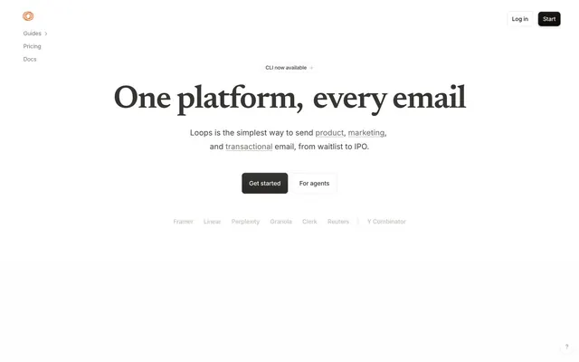
Preview image. Unlock full-res
Architectural blueprint on white marble. Sharp, clean, and formally structured.
Color palette
Highlight accent for specific words, icons, and informational elements. Demands attention without being a primary interaction color
Primary text, strong headings, critical UI elements, default icon color
Page background, primary canvas
Card backgrounds, elevated surfaces
Secondary text, subheadings, some button backgrounds, code backgrounds, dark borders. Provides depth without pure black
Subtle borders, inactive elements, visual dividers. Establishes UI structure
Hairline borders, dividers, input outlines, and card edges on light surfaces. Do not promote it to the primary CTA color
Body text for extended reading
Muted text, helper text, less prominent icons, secondary borders
Body text in specific content blocks, slightly softer than Midnight Ink
Link color, prominent muted text
Tertiary text, less important UI information
Subtle button backgrounds, very light surface differentiation
Typography
- Weights
- 600
- Sizes
- 28px, 34px, 80px
- Line height
- 1, 1.2, 1.25
- Letter spacing
- -0.04em at 80px, -0.03em at 34px, -0.02em at 28px
Headlines and prominent display text. The single bold weight and tightly tracked serif create a commanding, editorial presence with a classic feel, establishing authority without shouting.
- Weights
- 400, 600
- Sizes
- 12px, 16px
- Line height
- 1.2
- Letter spacing
- normal
- Fallback
- system-ui
General body text, navigation elements, and some button labels. Its neutral presence provides clarity and balance to the more opinionated headline font.
- Weights
- 400, 500, 600, 700
- Sizes
- 12px, 13px, 14px, 15px, 16px, 17px
- Line height
- 1, 1.2, 1.25, 1.3, 1.35
- Letter spacing
- -0.02em, -0.015em, 0.01em
- Fallback
- system-ui
Detailed UI text, small labels, and interactive components. The varied weights and slight letter-spacing adjustments support hierarchy and legibility in compact spaces.
- Weights
- 400, 450, 500, 600
- Sizes
- 12px, 13px, 14px, 15px, 16px, 17px, 19px
- Line height
- 0.75, 1, 1.2, 1.33, 1.4, 1.43, 1.5, 1.6, 1.65, 1.8
- Letter spacing
- -0.02em, -0.01em, 0.08em
- Fallback
- system-ui
Contextual body text, links, and specific button text within components. Offers a slightly wider range of weights for granular control over emphasis.
- Weights
- 400, 500
- Sizes
- 14px, 16px
- Line height
- 1.16, 1.2, 1.29, 1.78
- Letter spacing
- normal
- Fallback
- monospace
Code snippets and developer-focused content. Maintains consistent character width for readability in technical displays.
- Weights
- 400
- Sizes
- 20px
- Line height
- 1.45
- Letter spacing
- normal
- Fallback
- serif
Specific body text in short, descriptive paragraphs. Its serif nature provides a softer, more traditional voice compared to the sans-serif body.
Spacing & shape
Components
Background: Ash (#e7e5e4), Text: Stone (#44403c), Border: Ash (#e7e5e4) 1px, Radius: 999px, Padding: 7px vertical, 13px horizontal. This button offers a soft visual presence as a non-primary interaction.
Background: Porcelain (#f1efef), Text: Warm Gray (#292524), Border: none, Radius: 8px, Padding: 0px. Used for tab-like controls or category filters.
Background: Whisper White (#ffffff), Border: Fog (#d6d3d1) 1px, Radius: 8px, Padding: 14px vertical, 18px horizontal. A clear boundary for grouped information.
Text: Midnight Ink (#000000), Weight: 400, Size: 16px, Line height: 1.2. No explicit background or border, relies on text for presence.
Background: Slate Gray (#1c1917), Text: Whisper White (#ffffff), Border: none, Radius: 8px, Padding: ~14-18px horizontal, flexible vertical. The solid fill and dark color make it stand out as the main action, contrasting with lighter secondary ghost buttons.
Background: Whisper White (#ffffff), Border: none, Radius: 12px, Shadow: rgba(0, 0, 0, 0.05) 0px 1px 4px 0px, rgba(0, 0, 0, 0.03) 0px 0px 0px 0.5px. The soft shadow provides a subtle lift from the background.
Background: Greige Canvas (#faf9f7), Border: none, Radius: 14px, Padding: 12px vertical, 10px horizontal. A slightly darker background visually separates code from standard content. Text uses ui-monospace.
Background: transparent, Text: Slate Gray (#1c1917), Border: none, Radius: 0px, flexible padding. Underlined on active state with a solid color from the main text palette.
Guidelines
- Use Newsreader 600 with tight letter-spacing for all primary headings (display, heading-lg, heading).
- Employ Greige Canvas (#faf9f7) as the default page background to maintain a light, expansive feel.
- Accentuate specific terms using Flame Orange (#f97316) for keywords in body text or small decorative icons.
- Structure interactive elements and content cards with a default border-radius of 8px, defaulting to 12px for elevated cards.
- Utilize Slate Gray (#1c1917) as the background for primary action buttons to create visual weight and clear calls to action.
- Apply Soft Shadows (rgba(0, 0, 0, 0.05) 0px 1px 4px 0px, rgba(0, 0, 0, 0.03) 0px 0px 0px 0.5px) sparingly for only truly elevated components like cards or modals.
- Implement the 12px unit as the primary elementGap for vertical and horizontal spacing between content blocks.
- Do not use saturated colors other than Flame Orange (#f97316) unless for semantic success/error states.
- Avoid heavy drop shadows; elevation should be subtle, usually a single soft shadow layer.
- Do not deviate from the specified serif for headlines; maintain its distinct, opinionated character.
- Refrain from using complex background gradients; surfaces should remain flat or subtly shaded neutrals.
- Do not use pure white for large content blocks unless it's a card on a Greige Canvas (#faf9f7) background.
- Avoid excessive spacing or overly large typography for body text; prioritize compact and dense readability.
- Do not introduce new typefaces; rely on the established system sans-serifs, Newsreader, and ui-monospace.
About this system
ShowHide
Loops presents a precise, document-like interface with stark black typography on crisp white and soft gray backgrounds. A distinctive, serif-led typographic voice for headlines creates an established feel, contrasting with system sans-serifs for body text and interactive elements. Interaction is direct and functional, guided by subtle borders, soft shadows, and a singular, vibrant orange accent for specific highlights and calls to attention, rather than primary actions. The overall impression is one of clarity, focused content, and understated authority.
The page uses a maximum-width contained layout, likely around 1200px, centered on the screen. The hero section features a large, centered headline and subtext, followed by a dark, filled button and a ghost button. Content sections alternate between centered text blocks and multi-column layouts, often featuring a 2-column arrangement with text on one side and a content card (like a code block or screenshot) on the other. Vertical spacing between logical sections is consistent and comfortable. The navigation is a minimalist top bar with log-in/start buttons and a left-aligned sidebar for secondary navigation, maintaining a clean, focused presentation.
The site largely avoids decorative imagery beyond simple, functional icons and product screenshots. Photography is absent. Icons are typically solid black or Slate Gray (#1c1917), exhibiting a filled style with clean lines, conveying functionality. Product screenshots are contained within cards or code-like blocks, serving an explanatory and demonstrative role rather than aesthetic adornment. The density is text-dominant, with visuals acting as clear, explanatory anchors.
Reminiscent of Vercel, Stripe, Linear, Supabase, Resend.
# Loops — Style Reference
> Architectural blueprint on white marble. Sharp, clean, and formally structured.

**Theme:** light

**Site:** https://loops.so

Loops presents a precise, document-like interface with stark black typography on crisp white and soft gray backgrounds. A distinctive, serif-led typographic voice for headlines creates an established feel, contrasting with system sans-serifs for body text and interactive elements. Interaction is direct and functional, guided by subtle borders, soft shadows, and a singular, vibrant orange accent for specific highlights and calls to attention, rather than primary actions. The overall impression is one of clarity, focused content, and understated authority.

## Tokens — Colors

| Name | Value | Token | Role |
|------|------|------|------|
| Flame Orange | `#f97316` | `--color-flame-orange` | Highlight accent for specific words, icons, and informational elements. Demands attention without being a primary interaction color |
| Midnight Ink | `#000000` | `--color-midnight-ink` | Primary text, strong headings, critical UI elements, default icon color |
| Greige Canvas | `#faf9f7` | `--color-greige-canvas` | Page background, primary canvas |
| Whisper White | `#ffffff` | `--color-whisper-white` | Card backgrounds, elevated surfaces |
| Slate Gray | `#1c1917` | `--color-slate-gray` | Secondary text, subheadings, some button backgrounds, code backgrounds, dark borders. Provides depth without pure black |
| Fog | `#d6d3d1` | `--color-fog` | Subtle borders, inactive elements, visual dividers. Establishes UI structure |
| Ash | `#e7e5e4` | `--color-ash` | Hairline borders, dividers, input outlines, and card edges on light surfaces. Do not promote it to the primary CTA color |
| Stone | `#44403c` | `--color-stone` | Body text for extended reading |
| Pewter | `#a8a29e` | `--color-pewter` | Muted text, helper text, less prominent icons, secondary borders |
| Warm Gray | `#292524` | `--color-warm-gray` | Body text in specific content blocks, slightly softer than Midnight Ink |
| Steel | `#57534e` | `--color-steel` | Link color, prominent muted text |
| Silver | `#78716c` | `--color-silver` | Tertiary text, less important UI information |
| Porcelain | `#f1efef` | `--color-porcelain` | Subtle button backgrounds, very light surface differentiation |

## Tokens — Typography

### Newsreader
- **Weights:** 600
- **Sizes:** 28px, 34px, 80px
- **Line height:** 1, 1.2, 1.25
- **Letter spacing:** -0.04em at 80px, -0.03em at 34px, -0.02em at 28px
- **Role:** Headlines and prominent display text. The single bold weight and tightly tracked serif create a commanding, editorial presence with a classic feel, establishing authority without shouting.

### sans-serif
- **Substitute:** system-ui
- **Weights:** 400, 600
- **Sizes:** 12px, 16px
- **Line height:** 1.2
- **Letter spacing:** normal
- **Role:** General body text, navigation elements, and some button labels. Its neutral presence provides clarity and balance to the more opinionated headline font.

### ui-sans-serif
- **Substitute:** system-ui
- **Weights:** 400, 500, 600, 700
- **Sizes:** 12px, 13px, 14px, 15px, 16px, 17px
- **Line height:** 1, 1.2, 1.25, 1.3, 1.35
- **Letter spacing:** -0.02em, -0.015em, 0.01em
- **Role:** Detailed UI text, small labels, and interactive components. The varied weights and slight letter-spacing adjustments support hierarchy and legibility in compact spaces.

### Inter
- **Substitute:** system-ui
- **Weights:** 400, 450, 500, 600
- **Sizes:** 12px, 13px, 14px, 15px, 16px, 17px, 19px
- **Line height:** 0.75, 1, 1.2, 1.33, 1.4, 1.43, 1.5, 1.6, 1.65, 1.8
- **Letter spacing:** -0.02em, -0.01em, 0.08em
- **Role:** Contextual body text, links, and specific button text within components. Offers a slightly wider range of weights for granular control over emphasis.

### ui-monospace
- **Substitute:** monospace
- **Weights:** 400, 500
- **Sizes:** 14px, 16px
- **Line height:** 1.16, 1.2, 1.29, 1.78
- **Letter spacing:** normal
- **Role:** Code snippets and developer-focused content. Maintains consistent character width for readability in technical displays.

### Iowan Old Style
- **Substitute:** serif
- **Weights:** 400
- **Sizes:** 20px
- **Line height:** 1.45
- **Letter spacing:** normal
- **Role:** Specific body text in short, descriptive paragraphs. Its serif nature provides a softer, more traditional voice compared to the sans-serif body.

## Tokens — Type Scale

| Role | Size | Line height | Letter spacing |
|------|------|------|------|
| caption | 12px | 1.2 | — |
| body-sm | 14px | 1.29 | — |
| body | 16px | 1.2 | — |
| subheading | 20px | 1.45 | — |
| heading | 28px | 1.25 | -0.56px |
| heading-lg | 34px | 1.2 | -1.02px |
| display | 80px | 1 | -3.2px |

## Tokens — Spacing

- **Section gap:** 40px
- **Card padding:** 12px
- **Element gap:** 12px

## Tokens — Radius

- **Default:** 8px
- **Buttons:** 8px
- **Cards:** 8px
- **elevatedCards:** 12px
- **pill:** 999px

## Layout

The page uses a maximum-width contained layout, likely around 1200px, centered on the screen. The hero section features a large, centered headline and subtext, followed by a dark, filled button and a ghost button. Content sections alternate between centered text blocks and multi-column layouts, often featuring a 2-column arrangement with text on one side and a content card (like a code block or screenshot) on the other. Vertical spacing between logical sections is consistent and comfortable. The navigation is a minimalist top bar with log-in/start buttons and a left-aligned sidebar for secondary navigation, maintaining a clean, focused presentation.

## Imagery

The site largely avoids decorative imagery beyond simple, functional icons and product screenshots. Photography is absent. Icons are typically solid black or Slate Gray (#1c1917), exhibiting a filled style with clean lines, conveying functionality. Product screenshots are contained within cards or code-like blocks, serving an explanatory and demonstrative role rather than aesthetic adornment. The density is text-dominant, with visuals acting as clear, explanatory anchors.

## Components

### Pill Ghost Button
*Secondary action or tag within content.*

Background: Ash (#e7e5e4), Text: Stone (#44403c), Border: Ash (#e7e5e4) 1px, Radius: 999px, Padding: 7px vertical, 13px horizontal. This button offers a soft visual presence as a non-primary interaction.

### Standard Ghost Button
*Informational or subtle action within the UI.*

Background: Porcelain (#f1efef), Text: Warm Gray (#292524), Border: none, Radius: 8px, Padding: 0px. Used for tab-like controls or category filters.

### Outlined Card
*Content container with an emphasis on its contained nature.*

Background: Whisper White (#ffffff), Border: Fog (#d6d3d1) 1px, Radius: 8px, Padding: 14px vertical, 18px horizontal. A clear boundary for grouped information.

### Navigation Link
*Primary navigation item.*

Text: Midnight Ink (#000000), Weight: 400, Size: 16px, Line height: 1.2. No explicit background or border, relies on text for presence.

### Hero Action Button
*Primary Call to Action.*

Background: Slate Gray (#1c1917), Text: Whisper White (#ffffff), Border: none, Radius: 8px, Padding: ~14-18px horizontal, flexible vertical. The solid fill and dark color make it stand out as the main action, contrasting with lighter secondary ghost buttons.

### Elevated Content Card
*Highlighting key information or interactive blocks.*

Background: Whisper White (#ffffff), Border: none, Radius: 12px, Shadow: rgba(0, 0, 0, 0.05) 0px 1px 4px 0px, rgba(0, 0, 0, 0.03) 0px 0px 0px 0.5px. The soft shadow provides a subtle lift from the background.

### Code Block Card
*Showcasing code snippets or API examples.*

Background: Greige Canvas (#faf9f7), Border: none, Radius: 14px, Padding: 12px vertical, 10px horizontal. A slightly darker background visually separates code from standard content. Text uses ui-monospace.

### Monochrome Tab Button
*Switching between content views.*

Background: transparent, Text: Slate Gray (#1c1917), Border: none, Radius: 0px, flexible padding. Underlined on active state with a solid color from the main text palette.

## Guidelines

### Do

- Use Newsreader 600 with tight letter-spacing for all primary headings (display, heading-lg, heading).
- Employ Greige Canvas (#faf9f7) as the default page background to maintain a light, expansive feel.
- Accentuate specific terms using Flame Orange (#f97316) for keywords in body text or small decorative icons.
- Structure interactive elements and content cards with a default border-radius of 8px, defaulting to 12px for elevated cards.
- Utilize Slate Gray (#1c1917) as the background for primary action buttons to create visual weight and clear calls to action.
- Apply Soft Shadows (rgba(0, 0, 0, 0.05) 0px 1px 4px 0px, rgba(0, 0, 0, 0.03) 0px 0px 0px 0.5px) sparingly for only truly elevated components like cards or modals.
- Implement the 12px unit as the primary elementGap for vertical and horizontal spacing between content blocks.

### Don't

- Do not use saturated colors other than Flame Orange (#f97316) unless for semantic success/error states.
- Avoid heavy drop shadows; elevation should be subtle, usually a single soft shadow layer.
- Do not deviate from the specified serif for headlines; maintain its distinct, opinionated character.
- Refrain from using complex background gradients; surfaces should remain flat or subtly shaded neutrals.
- Do not use pure white for large content blocks unless it's a card on a Greige Canvas (#faf9f7) background.
- Avoid excessive spacing or overly large typography for body text; prioritize compact and dense readability.
- Do not introduce new typefaces; rely on the established system sans-serifs, Newsreader, and ui-monospace.

## Agent Prompt Guide

**Quick Color Reference:**
- text: #000000
- background: #faf9f7
- border: #d6d3d1
- accent: #f97316
- primary action: no distinct CTA color

**3-5 Example Component Prompts:**
No distinct primary action color was observed; use the extracted neutral button treatments instead of inventing a filled CTA color.
2.  Create an elevated content card: Whisper White (#ffffff) background, 12px radius, Shadow: rgba(0, 0, 0, 0.05) 0px 1px 4px 0px, rgba(0, 0, 0, 0.03) 0px 0px 0px 0.5px. Inside, a heading (heading role, Newsreader 600, Midnight Ink #000000) 'Email design from first principles'. Body text (body role, Stone #44403c). A soft ghost tab button 'Human' (Standard Ghost Button, Porcelain #f1efef background, Warm Gray #292524 text) and 'Agent Alpha' (Standard Ghost Button, Porcelain #f1efef background, Warm Gray #292524 text).
3.  Create a code block card: Greige Canvas (#f1efef) background, 14px radius, no shadow. Content uses ui-monospace 14px, Midnight Ink (#000000). A muted link within the text uses Flame Orange (#f97316).
4.  Create a navigation bar: Greige Canvas (#faf9f7) background. Left logo. Right buttons: 'Log In' (Whisper White #ffffff text, no button style, regular sans-serif), 'Start' (Hero Action Button, Slate Gray #1c1917 background, Whisper White #ffffff text, 8px radius).
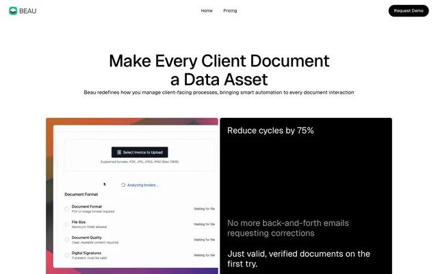
More like this









Keep what you find
A free account saves references to boards and can send you a weekly email of picks based on what you save.
To see every result, go Pro.