Preview image. Unlock full-res
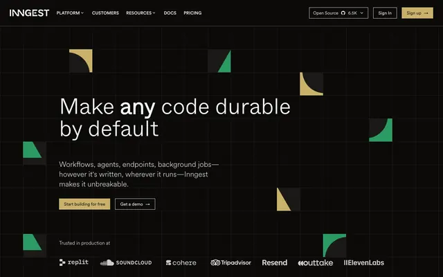
Midnight Grid Console — where precision meets a soft amber glow.
Color palette
Primary accent for interactive elements, CTA buttons, active navigation, and key highlights – a warm counterpoint to the dark neutrals.
Illustrative elements and secondary highlights.
Secondary brand accent; used sparingly for illustrative details.
Page backgrounds, card surfaces, primary dark UI elements.
Elevated card surfaces, input fields, and slightly lighter dark UI elements.
Primary text color for headlines and important body copy on dark backgrounds.
Secondary text and content on dark backgrounds, providing slightly less contrast.
Tertiary text, subtle descriptions, and less prominent information.
Prominent borders, separators, and outlines on light backgrounds (if present) or as high-contrast separators on dark.
Subtle borders and dividers within dark components, providing definition without distraction.
Error states or distinctive highlights in content.
Typography
- Weights
- 300, 400, 500, 600
- Sizes
- 12px, 14px, 16px, 18px, 20px, 24px, 72px
- Line height
- 1, 1.2, 1.33, 1.4, 1.43, 1.5, 1.56, 1.63, 1.64, 1.71, 1.75
- Letter spacing
- -0.019em
- Fallback
- Inter
Primary content font for body text, navigation, and most interactive elements. Its modern, clean aesthetic provides clarity on dark backgrounds.
- Weights
- 400
- Sizes
- 12px, 14px, 18px
- Line height
- 1.33, 1.43, 1.56, 1.63
- Fallback
- Space Mono
Monospace text for code snippets, technical labels, and distinct inline elements, indicating programmatic content.
- Weights
- 300, 400, 600, 700
- Sizes
- 16px, 24px, 30px, 36px, 48px, 72px
- Line height
- 1, 1.11, 1.2, 1.3, 1.33, 1.5
- Letter spacing
- -0.056em
- Fallback
- Montserrat
Display headlines for large, impactful headings. Its distinct letterforms and tighter letter-spacing at larger sizes give headlines a condensed, authoritative presence.
- Weights
- 400, 500, 600
- Sizes
- 18px, 30px, 36px, 48px, 60px
- Line height
- 1, 1.11, 1.2, 1.3, 1.56
- Letter spacing
- -0.056em
- Fallback
- Cabinet Grotesk
Specialized body & headlines for emphasized text and headlines, providing a sharper, more technical edge in select areas.
Spacing & shape
Elevation
Components
Transparent background, #FAFAFA text, no border, 0px border-radius, 0px padding. Uses CircularXX for text. Hover state likely changes color to Amber Glow.
Background: #0C0A09, Text: #FAFAFA, 0px border-radius (effectively square), 8px vertical padding, 16px horizontal padding. Uses CircularXX, weight 400. Text is visually distinct from background, commanding attention.
Transparent background, Text: #FAFAFA, no border-radius by default but specific instances have 6px border-radius, 16px top padding, 0px other padding. Text is CircularXX, often with an arrow icon.
Background: #1C1917, Text: #FAFAFA, 0px border-radius, 8px vertical padding, 16px horizontal padding. Offers a slightly elevated appearance compared to the primary button, useful for grouped actions where one needs to stand out slightly more.
Background: rgba(28, 25, 23, 1), 0px border-radius. No explicit padding detected on the card itself, content dictates inner spacing. Shadow: rgba(0, 0, 0, 0.1) 0px 1px 3px 0px, rgba(0, 0, 0, 0.1) 0px 1px 2px -1px - a very subtle dark shadow giving a slight lift.
Background: rgb(12, 10, 9), 0px border-radius. Similar subtle shadow to Dark Overlay Card. Used for prominent features or sections that need to feel slightly more embedded into the background without disappearing.
9999px border-radius, providing a rounded, pill-like shape. Backgrounds and text colors vary based on context, but the shape indicates a specific type of interactive or informational element. e.g., 'Open Source' button.
Guidelines
- Prioritize `Background Charcoal` (#0C0A09) for primary dark surfaces and `Surface Dark Gray` (#1C1917) for elevated content containers.
- Use `Amber Glow` (#CAB16A) exclusively for primary calls to action, active states, and critical highlights to maintain its impact.
- Employ `Whyte` or `Whyte Inktrap` for all display and large headlines, utilizing their tight letter spacing (`-0.0560em`, `-0.0250em`) for a condensed, impactful look.
- Apply `9999px` border-radius for all interactive buttons and pill-shaped elements to create a consistent soft touch amidst sharper elements.
- Maintain generous vertical spacing between content sections, using `24px` to `40px` padding to provide breathing room on the dark canvas.
- Layer cards atop `Background Charcoal` using `Surface Dark Gray` and the subtle shadow `rgba(0, 0, 0, 0.1) 0px 1px 3px 0px, rgba(0, 0, 0, 0.1) 0px 1px 2px -1px`.
- Do not introduce new primary accent colors; `Amber Glow` (#CAB16A) is the singular visual indicator for key interactions.
- Avoid standard rectangular shapes for buttons; either use `0px` radius for a sharp, embedded look or `9999px` for pill forms.
- Do not apply strong, opaque shadows; leverage subtle, low-opacity dark shadows (`rgba(0, 0, 0, 0.1)`) to create depth without visual weight.
- Refrain from using heavily saturated images or illustrations; opt for abstract, geometric shapes or desaturated imagery that complements the dark theme.
- Do not use generic system fonts; always map to `CircularXX` for body text and `Whyte` for headlines to preserve brand distinctiveness.
- Avoid highly expressive or decorative typography for body copy, stick to the clear and professional feel of `CircularXX`.
About this system
ShowHide
This design system evokes a sense of ordered complexity within a high-contrast dark environment, much like an advanced control panel. The muted black and deep charcoal surfaces provide a sophisticated backdrop, against which subtle geometric patterns and a restrained, precise typography establish a serious, tech-forward identity. Strategic use of a single amber accent color guides the eye to interactive elements, while the generous application of rounded corners on buttons softens the otherwise sharp, grid-like aesthetic, making the technical feel approachable.
The site employs a primarily max-width contained layout, centering content blocks on a dark canvas, though the hero section often uses a full-bleed dark background. The hero features a centered headline over an abstract geometric background. Section rhythm is generally consistent with vertical spacing, often introducing alternating content arrangements like text-left/image-right or centered stacks. Card grids are used to display features or trusted brands, typically in 3-column layouts. The navigation is a sticky top bar, providing persistent access across the dark interface. The overall density is comfortable, with ample breathing room between sections, creating a sense of clarity and focus.
The visual language predominantly features abstract, geometric shapes and patterns, emphasizing structure and technicality. These graphics are often composed of solid, brand-colored blocks (green, amber, orange) or subtle gradients, placed in a grid-like arrangement that occasionally breaks bounds for visual interest. There's a notable absence of photography or detailed illustrations. Icons are simple, outlined, and monochromatic, used functionally to represent concepts or features. The imagery's role is primarily decorative and atmospheric, reinforcing the 'control panel' metaphor rather than conveying specific product details, contributing to a high-tech, somewhat abstracted feel. Density is moderate, with images typically contained within sections rather than full-bleed.
Reminiscent of Vercel, Supabase, PlanetScale, Linear.
# Inngest — Style Reference
> Midnight Grid Console — where precision meets a soft amber glow.

**Theme:** dark

**Site:** https://inngest.com

This design system evokes a sense of ordered complexity within a high-contrast dark environment, much like an advanced control panel. The muted black and deep charcoal surfaces provide a sophisticated backdrop, against which subtle geometric patterns and a restrained, precise typography establish a serious, tech-forward identity. Strategic use of a single amber accent color guides the eye to interactive elements, while the generous application of rounded corners on buttons softens the otherwise sharp, grid-like aesthetic, making the technical feel approachable.

## Tokens — Colors

| Name | Value | Token | Role |
|------|------|------|------|
| Amber Glow | `#cab16a` | `--color-amber-glow` | Primary accent for interactive elements, CTA buttons, active navigation, and key highlights – a warm counterpoint to the dark neutrals. |
| Highlight Green | `#59a569` | `--color-highlight-green` | Illustrative elements and secondary highlights. |
| Vivid Orange | `#cc5b33` | `--color-vivid-orange` | Secondary brand accent; used sparingly for illustrative details. |
| Background Charcoal | `#0c0a09` | `--color-background-charcoal` | Page backgrounds, card surfaces, primary dark UI elements. |
| Surface Dark Gray | `#1c1917` | `--color-surface-dark-gray` | Elevated card surfaces, input fields, and slightly lighter dark UI elements. |
| Text White | `#ffffff` | `--color-text-white` | Primary text color for headlines and important body copy on dark backgrounds. |
| Text Light Gray | `#f6f6f6` | `--color-text-light-gray` | Secondary text and content on dark backgrounds, providing slightly less contrast. |
| Text Medium Gray | `#a89984` | `--color-text-medium-gray` | Tertiary text, subtle descriptions, and less prominent information. |
| Border Light Gray | `#e5e7eb` | `--color-border-light-gray` | Prominent borders, separators, and outlines on light backgrounds (if present) or as high-contrast separators on dark. |
| Border Accent Gray | `#44403c` | `--color-border-accent-gray` | Subtle borders and dividers within dark components, providing definition without distraction. |
| Muted Red | `#ea6962` | `--color-muted-red` | Error states or distinctive highlights in content. |

## Tokens — Typography

### CircularXX
- **Substitute:** Inter
- **Weights:** 300, 400, 500, 600
- **Sizes:** 12px, 14px, 16px, 18px, 20px, 24px, 72px
- **Line height:** 1, 1.2, 1.33, 1.4, 1.43, 1.5, 1.56, 1.63, 1.64, 1.71, 1.75
- **Letter spacing:** -0.019em
- **Role:** Primary content font for body text, navigation, and most interactive elements. Its modern, clean aesthetic provides clarity on dark backgrounds.

### CircularXXMono
- **Substitute:** Space Mono
- **Weights:** 400
- **Sizes:** 12px, 14px, 18px
- **Line height:** 1.33, 1.43, 1.56, 1.63
- **Role:** Monospace text for code snippets, technical labels, and distinct inline elements, indicating programmatic content.

### Whyte
- **Substitute:** Montserrat
- **Weights:** 300, 400, 600, 700
- **Sizes:** 16px, 24px, 30px, 36px, 48px, 72px
- **Line height:** 1, 1.11, 1.2, 1.3, 1.33, 1.5
- **Letter spacing:** -0.056em
- **Role:** Display headlines for large, impactful headings. Its distinct letterforms and tighter letter-spacing at larger sizes give headlines a condensed, authoritative presence.

### Whyte Inktrap
- **Substitute:** Cabinet Grotesk
- **Weights:** 400, 500, 600
- **Sizes:** 18px, 30px, 36px, 48px, 60px
- **Line height:** 1, 1.11, 1.2, 1.3, 1.56
- **Letter spacing:** -0.056em
- **Role:** Specialized body & headlines for emphasized text and headlines, providing a sharper, more technical edge in select areas.

## Tokens — Type Scale

| Role | Size | Line height | Letter spacing |
|------|------|------|------|
| caption | 12px | 1.71 | — |
| body-sm | 14px | 1.63 | — |
| body | 16px | 1.5 | — |
| subheading | 18px | 1.56 | — |
| heading-sm | 24px | 1.33 | — |
| heading | 36px | 1.2 | -0.56px |
| heading-lg | 48px | 1.11 | -0.96px |
| display | 72px | 1 | — |

## Tokens — Spacing

- **Section gap:** 24-40px
- **Card padding:** 0px
- **Element gap:** 4-24px

## Tokens — Radius

- **Default:** 4px
- **Buttons:** 9999px
- **Cards:** 0px

## Tokens — Elevation

- **Navigation Bar:** `rgba(0, 0, 0, 0.05) 0px 1px 2px 0px`
- **Card:** `rgba(0, 0, 0, 0.1) 0px 1px 3px 0px, rgba(0, 0, 0, 0.1) 0px 1px 2px -1px`
- **Elevated Component (e.g., popover):** `rgba(0, 0, 0, 0.1) 0px 20px 25px -5px, rgba(0, 0, 0, 0.1) 0px 8px 10px -6px`

## Layout

The site employs a primarily max-width contained layout, centering content blocks on a dark canvas, though the hero section often uses a full-bleed dark background. The hero features a centered headline over an abstract geometric background. Section rhythm is generally consistent with vertical spacing, often introducing alternating content arrangements like text-left/image-right or centered stacks. Card grids are used to display features or trusted brands, typically in 3-column layouts. The navigation is a sticky top bar, providing persistent access across the dark interface. The overall density is comfortable, with ample breathing room between sections, creating a sense of clarity and focus.

## Imagery

The visual language predominantly features abstract, geometric shapes and patterns, emphasizing structure and technicality. These graphics are often composed of solid, brand-colored blocks (green, amber, orange) or subtle gradients, placed in a grid-like arrangement that occasionally breaks bounds for visual interest. There's a notable absence of photography or detailed illustrations. Icons are simple, outlined, and monochromatic, used functionally to represent concepts or features. The imagery's role is primarily decorative and atmospheric, reinforcing the 'control panel' metaphor rather than conveying specific product details, contributing to a high-tech, somewhat abstracted feel. Density is moderate, with images typically contained within sections rather than full-bleed.

## Components

### CTA Button Group

### Feature Cards — Infraless / Agnostic / Observable

### Enterprise Trust — Built for Trust Feature Block

### Navigation Link
*Primary navigation item*

Transparent background, #FAFAFA text, no border, 0px border-radius, 0px padding. Uses CircularXX for text. Hover state likely changes color to Amber Glow.

### Primary Call to Action Button
*Key interactive element*

Background: #0C0A09, Text: #FAFAFA, 0px border-radius (effectively square), 8px vertical padding, 16px horizontal padding. Uses CircularXX, weight 400. Text is visually distinct from background, commanding attention.

### Secondary Button
*Secondary action or link button*

Transparent background, Text: #FAFAFA, no border-radius by default but specific instances have 6px border-radius, 16px top padding, 0px other padding. Text is CircularXX, often with an arrow icon.

### Tertiary Button
*Subtle button for minor actions*

Background: #1C1917, Text: #FAFAFA, 0px border-radius, 8px vertical padding, 16px horizontal padding. Offers a slightly elevated appearance compared to the primary button, useful for grouped actions where one needs to stand out slightly more.

### Dark Overlay Card
*Information container, features*

Background: rgba(28, 25, 23, 1), 0px border-radius. No explicit padding detected on the card itself, content dictates inner spacing. Shadow: rgba(0, 0, 0, 0.1) 0px 1px 3px 0px, rgba(0, 0, 0, 0.1) 0px 1px 2px -1px - a very subtle dark shadow giving a slight lift.

### Highlight Card
*Featured information container*

Background: rgb(12, 10, 9), 0px border-radius. Similar subtle shadow to Dark Overlay Card. Used for prominent features or sections that need to feel slightly more embedded into the background without disappearing.

### Pill Button
*Status indicator or filter button*

9999px border-radius, providing a rounded, pill-like shape. Backgrounds and text colors vary based on context, but the shape indicates a specific type of interactive or informational element. e.g., 'Open Source' button.

## Guidelines

### Do

- Prioritize `Background Charcoal` (#0C0A09) for primary dark surfaces and `Surface Dark Gray` (#1C1917) for elevated content containers.
- Use `Amber Glow` (#CAB16A) exclusively for primary calls to action, active states, and critical highlights to maintain its impact.
- Employ `Whyte` or `Whyte Inktrap` for all display and large headlines, utilizing their tight letter spacing (`-0.0560em`, `-0.0250em`) for a condensed, impactful look.
- Apply `9999px` border-radius for all interactive buttons and pill-shaped elements to create a consistent soft touch amidst sharper elements.
- Maintain generous vertical spacing between content sections, using `24px` to `40px` padding to provide breathing room on the dark canvas.
- Layer cards atop `Background Charcoal` using `Surface Dark Gray` and the subtle shadow `rgba(0, 0, 0, 0.1) 0px 1px 3px 0px, rgba(0, 0, 0, 0.1) 0px 1px 2px -1px`.

### Don't

- Do not introduce new primary accent colors; `Amber Glow` (#CAB16A) is the singular visual indicator for key interactions.
- Avoid standard rectangular shapes for buttons; either use `0px` radius for a sharp, embedded look or `9999px` for pill forms.
- Do not apply strong, opaque shadows; leverage subtle, low-opacity dark shadows (`rgba(0, 0, 0, 0.1)`) to create depth without visual weight.
- Refrain from using heavily saturated images or illustrations; opt for abstract, geometric shapes or desaturated imagery that complements the dark theme.
- Do not use generic system fonts; always map to `CircularXX` for body text and `Whyte` for headlines to preserve brand distinctiveness.
- Avoid highly expressive or decorative typography for body copy, stick to the clear and professional feel of `CircularXX`.

## Agent Prompt Guide

### Quick Color Reference
- Text Primary: #FFFFFF
- Background Primary: #0C0A09
- CTA Accent: #CAB16A
- Card Surface: #1C1917
- Border High-Contrast: #E5E7EB

### 3-5 Example Component Prompts
1. **Create a hero section:** Full-width `Background Charcoal` (#0C0A09) with a centered headline 'Make any code durable by default' using Whyte family, 72px, weight 700, #FFFFFF, letter-spacing -0.056em. Below it, a body paragraph 'Workflows, agents, endpoints...' using CircularXX, 18px, weight 400, #F6F6F6. Include a primary button 'Start building for free' (Background: #CAB16A, Text: #0C0A09, 8px vertical padding, 16px horizontal padding, 9999px border-radius, CircularXX, weight 500) and a secondary button 'Get a demo →' (Transparent background, Text: #CAB16A, 0px border-radius, 8px vertical padding, 16px horizontal padding, CircularXX, weight 400).
2. **Generate a feature card:** Use `Surface Dark Gray` (#1C1917) as background with 0px border-radius. Apply a shadow `rgba(0, 0, 0, 0.1) 0px 1px 3px 0px, rgba(0, 0, 0, 0.1) 0px 1px 2px -1px`. Inside, a heading (Whyte Inktrap, 24px, weight 600, #FFFFFF, letter-spacing -0.025em), and body text (CircularXX, 16px, weight 400, #F6F6F6).
3. **Design a navigation item:** Text 'PLATFORM' using CircularXX, 16px, weight 500, #FAFAFA. When active, underline with 2px solid line in `Amber Glow` (#CAB16A) and change text color to `Amber Glow`.
4. **Compose a 'Trusted by' logo section:** On a `Background Charcoal` (#0C0A09) section, display a row of monochrome logo icons (all #FFFFFF stroke/fill for visibility) with 24px horizontal `elementGap` between them and 32px vertical `elementGap` from surrounding content.
More like this






Keep what you find
A free account saves references to boards and can send you a weekly email of picks based on what you save.
To see every result, go Pro.