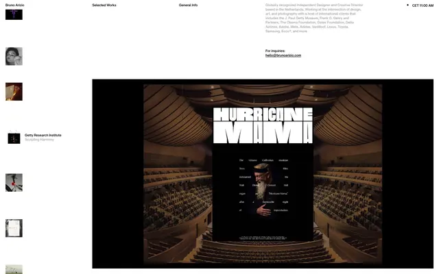
Preview image. Unlock full-res
Color palette
Page backgrounds, video backgrounds, primary text — a stark and unwavering base that frames all content
Secondary text, descriptive body copy, subtle borders and dividers — a softer gray for less prominent information
Typography
- Weights
- 400
- Sizes
- 11px, 13px
- Line height
- 1, 1.2, 1.3
- Letter spacing
- -0.02em
- Fallback
- system-ui, sans-serif
Primary typeface for all text content including navigation, body, links, and buttons. Its precise tracking and custom stylistic sets contribute to a tightly controlled, modern feel.
Spacing & shape
Components
Text in Canvas Black (#000000), Helvetica Now Text, weight 400. Text size 11px, line-height 1.0. No padding or border, ensuring a lightweight, text-only interactive element.
Inherits text color from context (defaulting to Canvas Black #000000), Helvetica Now Text, weight 400, size 11px. Features a 0px border-radius and transparent background. A thin border will appear on hover/active states using Canvas Black (#000000).
Text in Canvas Black (#000000), Helvetica Now Text, weight 400, size 11px for general links, 13px for body-level links. This color choice makes links blend seamlessly with body text until interaction.
Text in Muted Ash (#a6a6a6) on a Canvas Black (#000000) background. Helvetica Now Text, weight 400, size 13px, line-height 1.2. Provides clear readability for longer passages without creating harsh contrast.
Guidelines
- Use Canvas Black (#000000) as the foundational background for most content areas, establishing a high-contrast stage.
- Employ Helvetica Now Text at weight 400 for all typographic elements, leveraging its consistent visual presence.
- Apply -0.02em letter-spacing universally to Helvetica Now Text, maintaining its characteristic tight tracking.
- Utilize Muted Ash (#a6a6a6) exclusively for secondary text and subtle borders, reserving Canvas Black for primary text and interactive elements.
- Keep all interactive elements, including buttons and links, visually minimal with transparent backgrounds and 0px border-radius.
- Maintain generous vertical spacing between content sections, using 45px padding top and bottom to create breathing room.
- Center content panels where possible, and allow full-bleed background elements to anchor major sections.
- Avoid chromatic colors for any UI elements; the system relies on a strictly achromatic palette.
- Do not introduce rounded corners; maintain a sharp, geometric aesthetic with 0px border-radius throughout.
- Do not use box-shadows or other elevation techniques; surfaces should appear flat and flush with the background.
- Refrain from using varied font weights; all text should primarily use Helvetica Now Text at weight 400.
- Do not add unnecessary padding to buttons or interactive links; let their text content define their visual footprint.
- Avoid large, attention-grabbing interactive components; actions should be subtle and integrated into the content flow.
- Do not use dense, compact layouts; prioritize spaciousness and white/black space to frame content.
About this system
ShowHide
Bruno Arizio’s visual identity is a minimalist stage for its content: a high-contrast aesthetic with deep black surfaces serving as a canvas for finely tuned typography. The overall impression is one of stark elegance, where design elements recede to emphasize the work itself. Text and interactive elements are rendered in a precise, almost monochromatic palette, relying on subtle variations in gray and highly specific typographic choices to convey hierarchy and interaction. The design prioritizes content visibility and a clean, unobtrusive user experience.
The page primarily features a full-bleed layout establishing a dark canvas. The hero section often consists of a large, embedded visual (image or video) centered within this dark space. Content sections below the hero exhibit a pattern of alternating visual elements (like large imagery) with descriptive text blocks. Navigation at the top is a minimal, right-aligned horizontal list of text links. Content appears centered within a flexible columnar flow rather than a rigid grid, with generous vertical spacing separating thematic blocks.
This site predominantly uses large, full-bleed photography and embedded video for content showcase. Images often serve as the main attraction, sometimes with minimal overlaid text. There are also small, square thumbnail images, often monochromatic or with desaturated palettes, used for navigation previews. The style prioritizes the artwork itself, with little to no branding or decorative overlays on the images. Icons are minimalist, outlined, and monochromatic, used sparingly for utility actions like time display.
Reminiscent of AIGA Design Archives, Figma, Anyways Creative.
# Bruno Arizio — Style Reference
> Black canvas, precise type

**Theme:** dark

**Site:** https://brunoarizio.com

Bruno Arizio’s visual identity is a minimalist stage for its content: a high-contrast aesthetic with deep black surfaces serving as a canvas for finely tuned typography. The overall impression is one of stark elegance, where design elements recede to emphasize the work itself. Text and interactive elements are rendered in a precise, almost monochromatic palette, relying on subtle variations in gray and highly specific typographic choices to convey hierarchy and interaction. The design prioritizes content visibility and a clean, unobtrusive user experience.

## Tokens — Colors

| Name | Value | Token | Role |
|------|------|------|------|
| Canvas Black | `#000000` | `--color-canvas-black` | Page backgrounds, video backgrounds, primary text — a stark and unwavering base that frames all content |
| Muted Ash | `#a6a6a6` | `--color-muted-ash` | Secondary text, descriptive body copy, subtle borders and dividers — a softer gray for less prominent information |

## Tokens — Typography

### Helvetica Now Text
- **Substitute:** system-ui, sans-serif
- **Weights:** 400
- **Sizes:** 11px, 13px
- **Line height:** 1, 1.2, 1.3
- **Letter spacing:** -0.02em
- **Role:** Primary typeface for all text content including navigation, body, links, and buttons. Its precise tracking and custom stylistic sets contribute to a tightly controlled, modern feel.

## Tokens — Type Scale

| Role | Size | Line height | Letter spacing |
|------|------|------|------|
| caption | 11px | 1 | -0.22px |

## Tokens — Spacing

- **Section gap:** 45px
- **Card padding:** 0px
- **Element gap:** 18px

## Tokens — Radius

- **none:** 0px

## Layout

The page primarily features a full-bleed layout establishing a dark canvas. The hero section often consists of a large, embedded visual (image or video) centered within this dark space. Content sections below the hero exhibit a pattern of alternating visual elements (like large imagery) with descriptive text blocks. Navigation at the top is a minimal, right-aligned horizontal list of text links. Content appears centered within a flexible columnar flow rather than a rigid grid, with generous vertical spacing separating thematic blocks.

## Imagery

This site predominantly uses large, full-bleed photography and embedded video for content showcase. Images often serve as the main attraction, sometimes with minimal overlaid text. There are also small, square thumbnail images, often monochromatic or with desaturated palettes, used for navigation previews. The style prioritizes the artwork itself, with little to no branding or decorative overlays on the images. Icons are minimalist, outlined, and monochromatic, used sparingly for utility actions like time display.

## Components

### Navigation Link
*Top-level menu items and secondary navigation links.*

Text in Canvas Black (#000000), Helvetica Now Text, weight 400. Text size 11px, line-height 1.0. No padding or border, ensuring a lightweight, text-only interactive element.

### Ghost Button
*Interactive elements that do not require a filled background, for a minimal and understated action.*

Inherits text color from context (defaulting to Canvas Black #000000), Helvetica Now Text, weight 400, size 11px. Features a 0px border-radius and transparent background. A thin border will appear on hover/active states using Canvas Black (#000000).

### Primary Link
*Prominent clickable text links, such as contact information.*

Text in Canvas Black (#000000), Helvetica Now Text, weight 400, size 11px for general links, 13px for body-level links. This color choice makes links blend seamlessly with body text until interaction.

### Body Text Block
*Rich text content blocks like descriptions and info sections.*

Text in Muted Ash (#a6a6a6) on a Canvas Black (#000000) background. Helvetica Now Text, weight 400, size 13px, line-height 1.2. Provides clear readability for longer passages without creating harsh contrast.

## Guidelines

### Do

- Use Canvas Black (#000000) as the foundational background for most content areas, establishing a high-contrast stage.
- Employ Helvetica Now Text at weight 400 for all typographic elements, leveraging its consistent visual presence.
- Apply -0.02em letter-spacing universally to Helvetica Now Text, maintaining its characteristic tight tracking.
- Utilize Muted Ash (#a6a6a6) exclusively for secondary text and subtle borders, reserving Canvas Black for primary text and interactive elements.
- Keep all interactive elements, including buttons and links, visually minimal with transparent backgrounds and 0px border-radius.
- Maintain generous vertical spacing between content sections, using 45px padding top and bottom to create breathing room.
- Center content panels where possible, and allow full-bleed background elements to anchor major sections.

### Don't

- Avoid chromatic colors for any UI elements; the system relies on a strictly achromatic palette.
- Do not introduce rounded corners; maintain a sharp, geometric aesthetic with 0px border-radius throughout.
- Do not use box-shadows or other elevation techniques; surfaces should appear flat and flush with the background.
- Refrain from using varied font weights; all text should primarily use Helvetica Now Text at weight 400.
- Do not add unnecessary padding to buttons or interactive links; let their text content define their visual footprint.
- Avoid large, attention-grabbing interactive components; actions should be subtle and integrated into the content flow.
- Do not use dense, compact layouts; prioritize spaciousness and white/black space to frame content.

## Agent Prompt Guide

**Quick Color Reference:**
text: #000000
background: #000000
border: #000000
accent: no distinct accent color
primary action: no distinct CTA color

**3-5 Example Component Prompts:**
1. Create a primary navigation item: 'Selected Works' text, Helvetica Now Text, weight 400, size 11px, color #000000, letter-spacing -0.02em, no padding.
2. Create a contact link: 'hello@brunoarizio.com' text, Helvetica Now Text, weight 400, size 11px, color #000000, letter-spacing -0.02em.
3. Create a descriptive text block for 'Getty Research Institute: Sculpting Harmony': background #000000. 'Getty Research Institute' text Helvetica Now Text, weight 400, size 13px, color #000000, letter-spacing -0.02em. 'Sculpting Harmony' text Helvetica Now Text, weight 400, size 13px, color #a6a6a6, letter-spacing -0.02em.
4. Create a ghost button component: text color #000000, Helvetica Now Text, weight 400, size 11px, letter-spacing -0.02em, no background fill, 0px border-radius, border on hover #000000.
More like this





Keep what you find
A free account saves references to boards and can send you a weekly email of picks based on what you save.
To see every result, go Pro.