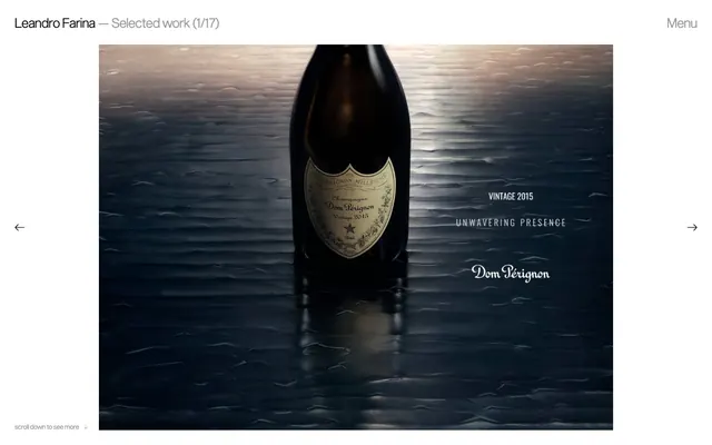
Preview image. Unlock full-res
Minimalist gallery canvas — imagery isolated by deep matte black and sharp, subtle typography.
Color palette
Page backgrounds, card surfaces, primary text. This deep, absolute black serves as a dominant canvas, eliminating distractions
Secondary body text, subtle borders around some elements. A lighter gray for quieter information
Muted link text and ghost button borders, providing a faint presence against the black canvas
Typography
- Weights
- 100, 400
- Sizes
- 13px, 16px, 17px, 27px
- Line height
- 1.2, 1.54
- Letter spacing
- normal
- Fallback
- Helvetica Neue
Primary UI text for navigation, links, and project descriptions. Its custom nature and varying weights, particularly the lighter (100) weight, provide a refined, understated feel without being overly decorative.
- Weights
- 400
- Sizes
- 16px
- Line height
- 1.2
- Letter spacing
- normal
- Fallback
- serif
Small functional text, potentially for image captions or meta information where a classic, almost invisible presence is desired.
Spacing & shape
Components
Text-only buttons using Ghost Gray (#bbbbbb) for their color. No background, no explicit padding, no borders. Interacts by changing text color only. Example: 'Menu' button.
Completely borderless and shadow-free card. Background is Canvas Black (#000000). Contains an image and text description, all at 0px border radius, blending seamlessly with the page background.
Text-only badge using Ghost Gray (#bbbbbb), with no background, padding, or border, and 0px border radius. Used for tags like '#beauty' or '#selected'.
Invisible button container for next/previous arrows. Color #999999, no background or border, 0px radius. The arrow icon itself would be rendered in #999999.
Guidelines
- Always use Canvas Black (#000000) for page backgrounds and primary text to maintain a high-contrast, gallery-like feel.
- Present all images in their raw form, without borders, shadows, or applied corner radii; let the content define its edges.
- Employ Sequel font for all primary interface text, leveraging its thin weights (100) for a subtle, sophisticated presence.
- Utilize Ghost Gray (#bbbbbb) exclusively for inactive links and ghost controls, ensuring minimal visual hierarchy for non-primary actions.
- Keep all interactive elements, such as buttons and navigation links, as text-only or icon-only with no distinct backgrounds or borders unless explicitly for a hover/active state.
- Maintain generous spacing of 45px between major content sections to allow visual breathing room for portfolio pieces.
- Use 0px radius for all elements, including cards and buttons, to achieve a sharp, unyielding aesthetic.
- Avoid using any saturated colors; the system is strictly achromatic, with no exceptions for brand accents or semantic colors.
- Do not add any drop shadows or elevation effects; elements should exist on a single, flat plane against the Canvas Black.
- Refrain from using any background colors for buttons, badges, or cards; these components are defined by their content and text color alone.
- Do not introduce any decorative borders or outlines around images, cards, or sections; visual separation is achieved through negative space.
- Avoid bold or heavy font weights for headlines or primary text; prefer lighter weights like Sequel 100 or 400 for understated elegance.
- Do not use letter-spacing other than 'normal' for any typography, preserving the intended rhythm of the font.
- Never apply rounded corners to any UI element; all corners should be sharp and rectilinear.
About this system
ShowHide
Leandro Farina's visual system evokes a stark gallery aesthetic: pure black canvas, high-contrast typography, and unadorned image presentation. There's a deliberate absence of color, borders, or any decorative elements, placing absolute focus on the photographic work. Typography remains understated and functional, providing context without drawing attention, while navigation is minimal and disappears when not needed. The overall impression is one of quiet contemplation, letting the art speak for itself.
The page primarily follows a full-bleed layout for portfolio items, extending content to the edges, interspersed with max-width contained text. The header is a fixed top bar on larger screens, minimal, featuring the brand name and a 'Menu' link. The hero pattern is a full-bleed image with overlaid, simple text. The main content area features large, often staggered or centered images, with project details appearing below. Vertical spacing between project blocks is consistent and generous, featuring a 45px section gap. There's an implied grid for the project previews in the scrollable section, appearing as a two-column, slightly offset arrangement of image cards.
The site is image-heavy, dominated by highly stylized, professional photography from the artist's portfolio. Images are treated as central content, displayed full-bleed within sections or as large, framed pieces. They are raw-edged, without rounding or overlays, and act as the primary visual interest. Icons (like navigation arrows) are minimal, outlined, and monochromatic, serving purely functional roles without decoration. The density is high in terms of image presence, making the site primarily a visual showcase.
Reminiscent of A.P.C., Acne Studios, The Row.
# Leandro Farina — Style Reference
> Minimalist gallery canvas — imagery isolated by deep matte black and sharp, subtle typography.

**Theme:** dark

**Site:** https://leandrofarina.com

Leandro Farina's visual system evokes a stark gallery aesthetic: pure black canvas, high-contrast typography, and unadorned image presentation. There's a deliberate absence of color, borders, or any decorative elements, placing absolute focus on the photographic work. Typography remains understated and functional, providing context without drawing attention, while navigation is minimal and disappears when not needed. The overall impression is one of quiet contemplation, letting the art speak for itself.

## Tokens — Colors

| Name | Value | Token | Role |
|------|------|------|------|
| Canvas Black | `#000000` | `--color-canvas-black` | Page backgrounds, card surfaces, primary text. This deep, absolute black serves as a dominant canvas, eliminating distractions |
| Muted Ash | `#999999` | `--color-muted-ash` | Secondary body text, subtle borders around some elements. A lighter gray for quieter information |
| Ghost Gray | `#bbbbbb` | `--color-ghost-gray` | Muted link text and ghost button borders, providing a faint presence against the black canvas |

## Tokens — Typography

### Sequel
- **Substitute:** Helvetica Neue
- **Weights:** 100, 400
- **Sizes:** 13px, 16px, 17px, 27px
- **Line height:** 1.2, 1.54
- **Letter spacing:** normal
- **Role:** Primary UI text for navigation, links, and project descriptions. Its custom nature and varying weights, particularly the lighter (100) weight, provide a refined, understated feel without being overly decorative.

### Times
- **Substitute:** serif
- **Weights:** 400
- **Sizes:** 16px
- **Line height:** 1.2
- **Letter spacing:** normal
- **Role:** Small functional text, potentially for image captions or meta information where a classic, almost invisible presence is desired.

## Tokens — Type Scale

Major Third (1.25) from 17px base.

| Role | Size | Line height | Letter spacing |
|------|------|------|------|
| caption | 13px | 1.54 | — |
| body-sm | 16px | 1.54 | — |
| body | 17px | 1.54 | — |
| body-lg | 27px | 1.3 | — |

## Tokens — Spacing

- **Section gap:** 45px
- **Card padding:** 0px
- **Element gap:** 8px

## Tokens — Radius

- **none:** 0px

## Layout

The page primarily follows a full-bleed layout for portfolio items, extending content to the edges, interspersed with max-width contained text. The header is a fixed top bar on larger screens, minimal, featuring the brand name and a 'Menu' link. The hero pattern is a full-bleed image with overlaid, simple text. The main content area features large, often staggered or centered images, with project details appearing below. Vertical spacing between project blocks is consistent and generous, featuring a 45px section gap. There's an implied grid for the project previews in the scrollable section, appearing as a two-column, slightly offset arrangement of image cards.

## Imagery

The site is image-heavy, dominated by highly stylized, professional photography from the artist's portfolio. Images are treated as central content, displayed full-bleed within sections or as large, framed pieces. They are raw-edged, without rounding or overlays, and act as the primary visual interest. Icons (like navigation arrows) are minimal, outlined, and monochromatic, serving purely functional roles without decoration. The density is high in terms of image presence, making the site primarily a visual showcase.

## Components

### Ghost Navigation Button
*Primary navigation interaction, active link states.*

Text-only buttons using Ghost Gray (#bbbbbb) for their color. No background, no explicit padding, no borders. Interacts by changing text color only. Example: 'Menu' button.

### Project Card
*Image containers for portfolio items.*

Completely borderless and shadow-free card. Background is Canvas Black (#000000). Contains an image and text description, all at 0px border radius, blending seamlessly with the page background.

### Muted Tag Badge
*Categorization for portfolio items.*

Text-only badge using Ghost Gray (#bbbbbb), with no background, padding, or border, and 0px border radius. Used for tags like '#beauty' or '#selected'.

### Image Navigation Arrow
*Carousel navigation.*

Invisible button container for next/previous arrows. Color #999999, no background or border, 0px radius. The arrow icon itself would be rendered in #999999.

## Guidelines

### Do

- Always use Canvas Black (#000000) for page backgrounds and primary text to maintain a high-contrast, gallery-like feel.
- Present all images in their raw form, without borders, shadows, or applied corner radii; let the content define its edges.
- Employ Sequel font for all primary interface text, leveraging its thin weights (100) for a subtle, sophisticated presence.
- Utilize Ghost Gray (#bbbbbb) exclusively for inactive links and ghost controls, ensuring minimal visual hierarchy for non-primary actions.
- Keep all interactive elements, such as buttons and navigation links, as text-only or icon-only with no distinct backgrounds or borders unless explicitly for a hover/active state.
- Maintain generous spacing of 45px between major content sections to allow visual breathing room for portfolio pieces.
- Use 0px radius for all elements, including cards and buttons, to achieve a sharp, unyielding aesthetic.

### Don't

- Avoid using any saturated colors; the system is strictly achromatic, with no exceptions for brand accents or semantic colors.
- Do not add any drop shadows or elevation effects; elements should exist on a single, flat plane against the Canvas Black.
- Refrain from using any background colors for buttons, badges, or cards; these components are defined by their content and text color alone.
- Do not introduce any decorative borders or outlines around images, cards, or sections; visual separation is achieved through negative space.
- Avoid bold or heavy font weights for headlines or primary text; prefer lighter weights like Sequel 100 or 400 for understated elegance.
- Do not use letter-spacing other than 'normal' for any typography, preserving the intended rhythm of the font.
- Never apply rounded corners to any UI element; all corners should be sharp and rectilinear.

## Agent Prompt Guide

Quick Color Reference:
text: #000000
background: #000000
border: #999999
accent: no distinct accent color
primary action: no distinct CTA color

Example Component Prompts:
1. Create a top navigation bar: Canvas Black (#000000) background. 'Leandro Farina' text in Sequel, weight 400, size 17px, color Canvas Black (#000000). Right-aligned 'Menu' link in Sequel, weight 400, size 17px, color Ghost Gray (#bbbbbb).
2. Create a project description: Container on Canvas Black (#000000) background. Project title in Sequel, weight 400, size 27px, color Canvas Black (#000000). Tags separated by 8px element gap, using Muted Tag Badge style (#bbbbbb text, no background).
3. Create a horizontal navigation arrow: Uses Ghost Gray (#bbbbbb) color, embedded within an invisible container. Entire container has 0px padding and 0px border radius, blending with the Canvas Black (#000000) background.
More like this





Keep what you find
A free account saves references to boards and can send you a weekly email of picks based on what you save.
To see every result, go Pro.