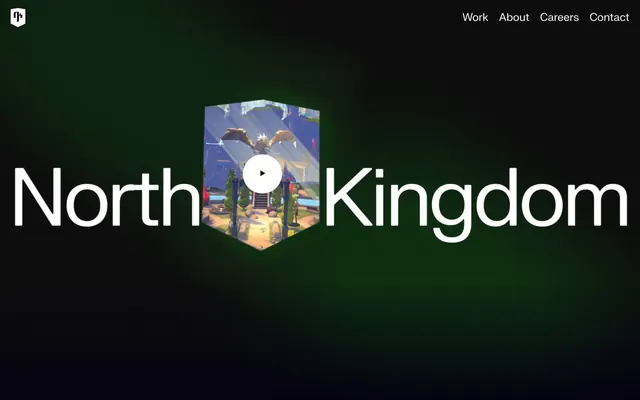
Preview image. Unlock full-res
Cinematic Night Canvas
Color palette
Page and section backgrounds, dark surface base, subtle border accents for text elements
Primary text, headers, interactive elements, navigation links, button outlines — serves as the dominant foreground color against dark backgrounds
Card backgrounds, secondary surface accents, contrast for specific button text
Medium-contrast borders, control outlines, and structural separators. Do not promote it to the primary CTA color
Typography
- Weights
- 400
- Sizes
- 24px
- Line height
- 1.15, 1.7
- Letter spacing
- -0.0100em
- Fallback
- system-ui, sans-serif
General text, links, body copy, and navigation. Its slightly condensed and tabular figures give a precise, digital aesthetic.
- Weights
- 400
- Sizes
- 13px
- Line height
- 1.2
- Letter spacing
- normal
- Fallback
- system-ui, sans-serif
Small functional text within buttons and icons, maintaining legibility at compact sizes.
Spacing & shape
Components
Transparent background, Ghost White text, 1px Ghost White border, 4px border-radius. Padding is minimal at 7px all around. Used for secondary actions and video player controls.
Circular button with 50% border-radius, Pitch Black text on a Ghost White background. Minimal padding 1px vertical, 6px horizontal. Primarily used for embedded media playback.
Transparent background, muted Ghost White text (60% opacity), minimal padding 1px vertical, 6px horizontal. Used for less prominent actions, like 'Unmute Mute' controls.
Pitch Black background, 8px border-radius, with no internal padding; content is expected to manage its own spacing. Used to frame large content blocks like project showcases.
Transparent background, Ghost White text, 1px Ghost White border with a generous 26px border-radius, indicating a pill-shaped input. No internal padding defined at the component level.
Transparent background, Ghost White text, no border-radius defined at this level, but has a significant bottom padding of 62px, used possibly for vertically aligning text within a larger layout.
Guidelines
- Use Midnight Ink (#050311) as the default background for most page sections.
- Prioritize Ghost White (#ffffff) for all primary text, headlines, and active interactive elements to ensure high contrast against dark backgrounds.
- Apply 8px border-radius consistently to all cards and significant image containers.
- Enclose all buttons with a 4px border-radius, even when the button implicitly forms a circle.
- Ensure large headlines leverage the FKGroteskNeue font to maintain the distinct heavy yet precise typographic style.
- Maintain a compact element spacing of 10px between minor UI elements to keep information dense.
- Outline all interactive buttons with a Ghost White (#ffffff) border if not using a solid fill.
- Avoid using highly saturated accent colors that deviate from the dark, monochrome palette.
- Do not introduce strong shadows or excessive elevation; maintain a generally flat and layered UI aesthetic.
- Do not use generic system fonts for prominent headlines; utilize FKGroteskNeue for brand consistency.
- Avoid large gaps between closely related UI elements; maintain a compact, dense arrangement where appropriate.
- Do not use highly rounded corners for general elements; reserve 26px radius for specific inputs and 4-8px for cards/buttons.
- Do not use standard paragraph spacing for headlines; large headlines are expected to have tight line heights and letter-spacing.
- Avoid full-width content blocks without internal padding; use the specified 140px horizontal padding for content within major sections.
About this system
ShowHide
North Kingdom presents a dark, cinematic brand experience that marries deep, dark backgrounds with sharp, white typography. The design emphasizes content through dramatic scaling of text and minimal UI elements, creating a focused, immersive feel. Surface treatments are largely flat with subtle layering, relying on bold text and large visuals to convey impact rather than intricate component styling. Typography carries significant weight in establishing brand presence, particularly in prominent headlines.
This design system primarily uses captivating, often game-related, conceptual 3D renders or stylized illustrations, frequently presented within hexagonal or irregularly masked cutouts. Images are typically large, serving as focal points rather than decorative backdrops. When photography is used, it often maintains a dark, moody atmosphere with a focus on product or conceptual scenes. Icons are simple, filled, and monochromatic (white against dark), embodying a functional, minimal style. The visual density heavily leans towards large imagery dominating sections, with text supporting the visual impact.
Reminiscent of Riot Games, Unity (website), Epic Games.
# North Kingdom — Style Reference
> Cinematic Night Canvas

**Theme:** dark

**Site:** https://www.northkingdom.com

North Kingdom presents a dark, cinematic brand experience that marries deep, dark backgrounds with sharp, white typography. The design emphasizes content through dramatic scaling of text and minimal UI elements, creating a focused, immersive feel. Surface treatments are largely flat with subtle layering, relying on bold text and large visuals to convey impact rather than intricate component styling. Typography carries significant weight in establishing brand presence, particularly in prominent headlines.

## Tokens — Colors

| Name | Value | Token | Role |
|------|------|------|------|
| Midnight Ink | `#050311` | `--color-midnight-ink` | Page and section backgrounds, dark surface base, subtle border accents for text elements |
| Ghost White | `#ffffff` | `--color-ghost-white` | Primary text, headers, interactive elements, navigation links, button outlines — serves as the dominant foreground color against dark backgrounds |
| Pitch Black | `#000000` | `--color-pitch-black` | Card backgrounds, secondary surface accents, contrast for specific button text |
| Dusty Slate | `#9b9aa0` | `--color-dusty-slate` | Medium-contrast borders, control outlines, and structural separators. Do not promote it to the primary CTA color |

## Tokens — Typography

### FKGroteskNeue
- **Substitute:** system-ui, sans-serif
- **Weights:** 400
- **Sizes:** 24px
- **Line height:** 1.15, 1.7
- **Letter spacing:** -0.0100em
- **Role:** General text, links, body copy, and navigation. Its slightly condensed and tabular figures give a precise, digital aesthetic.

### Arial
- **Substitute:** system-ui, sans-serif
- **Weights:** 400
- **Sizes:** 13px
- **Line height:** 1.2
- **Letter spacing:** normal
- **Role:** Small functional text within buttons and icons, maintaining legibility at compact sizes.

## Tokens — Spacing

- **Section gap:** 80px
- **Card padding:** 0px
- **Element gap:** 10px

## Tokens — Radius

- **General:** 8px
- **Buttons:** 4px
- **Cards:** 8px
- **input:** 26px

## Imagery

This design system primarily uses captivating, often game-related, conceptual 3D renders or stylized illustrations, frequently presented within hexagonal or irregularly masked cutouts. Images are typically large, serving as focal points rather than decorative backdrops. When photography is used, it often maintains a dark, moody atmosphere with a focus on product or conceptual scenes. Icons are simple, filled, and monochromatic (white against dark), embodying a functional, minimal style. The visual density heavily leans towards large imagery dominating sections, with text supporting the visual impact.

## Components

### Ghost Border Button
*Interactive element (e.g. video controls)*

Transparent background, Ghost White text, 1px Ghost White border, 4px border-radius. Padding is minimal at 7px all around. Used for secondary actions and video player controls.

### Circular Play Button
*Video player control*

Circular button with 50% border-radius, Pitch Black text on a Ghost White background. Minimal padding 1px vertical, 6px horizontal. Primarily used for embedded media playback.

### Muted Ghost Button
*Tertiary interactive state*

Transparent background, muted Ghost White text (60% opacity), minimal padding 1px vertical, 6px horizontal. Used for less prominent actions, like 'Unmute Mute' controls.

### Feature Card
*Content display*

Pitch Black background, 8px border-radius, with no internal padding; content is expected to manage its own spacing. Used to frame large content blocks like project showcases.

### Text Input
*Form entry*

Transparent background, Ghost White text, 1px Ghost White border with a generous 26px border-radius, indicating a pill-shaped input. No internal padding defined at the component level.

### Badge/Label
*Categorization or decorative text*

Transparent background, Ghost White text, no border-radius defined at this level, but has a significant bottom padding of 62px, used possibly for vertically aligning text within a larger layout.

## Guidelines

### Do

- Use Midnight Ink (#050311) as the default background for most page sections.
- Prioritize Ghost White (#ffffff) for all primary text, headlines, and active interactive elements to ensure high contrast against dark backgrounds.
- Apply 8px border-radius consistently to all cards and significant image containers.
- Enclose all buttons with a 4px border-radius, even when the button implicitly forms a circle.
- Ensure large headlines leverage the FKGroteskNeue font to maintain the distinct heavy yet precise typographic style.
- Maintain a compact element spacing of 10px between minor UI elements to keep information dense.
- Outline all interactive buttons with a Ghost White (#ffffff) border if not using a solid fill.

### Don't

- Avoid using highly saturated accent colors that deviate from the dark, monochrome palette.
- Do not introduce strong shadows or excessive elevation; maintain a generally flat and layered UI aesthetic.
- Do not use generic system fonts for prominent headlines; utilize FKGroteskNeue for brand consistency.
- Avoid large gaps between closely related UI elements; maintain a compact, dense arrangement where appropriate.
- Do not use highly rounded corners for general elements; reserve 26px radius for specific inputs and 4-8px for cards/buttons.
- Do not use standard paragraph spacing for headlines; large headlines are expected to have tight line heights and letter-spacing.
- Avoid full-width content blocks without internal padding; use the specified 140px horizontal padding for content within major sections.

## Agent Prompt Guide

Quick Color Reference:
text: #ffffff
background: #050311
border: #ffffff
accent: no distinct accent color
primary action: #ffffff (filled action)

Example Component Prompts:
1. Create a Hero Headline: Ghost White (#ffffff) text, using FKGroteskNeue at large sizes (e.g., 96px, 1.15 line height, -0.0100em letter-spacing) against a Midnight Ink (#050311) background. Follow general element spacing guidelines if a visual element is present.
2. Create a Ghost Border Button: Ghost White (#ffffff) text, 1px Ghost White (#ffffff) border, 4px border-radius, with a transparent background. Padding 7px all sides, using FKGroteskNeue font.
3. Create a Feature Card: A Pitch Black (#000000) background, 8px border-radius, with no padding inside. This card should contain a large image or visual element that fills the card from edge to edge.
4. Create a Navigation Link: Ghost White (#ffffff) text, using FKGroteskNeue, letter-spacing -0.0100em, with 24px vertical and horizontal padding around the link if part of a list, against a Midnight Ink (#050311) header background.
More like this





Keep what you find
A free account saves references to boards and can send you a weekly email of picks based on what you save.
To see every result, go Pro.