Preview image. Unlock full-res
Architectural Blueprint on Carbon
Color palette
Page backgrounds, card backgrounds, primary text, prominent borders, focus indicators. This deep black provides a neutral and stark canvas allowing project thumbnails and typography to stand out clearly
Muted secondary text, descriptive labels under project titles. Offers a subtle tonal shift for less prominent information against the dark background
Subtle ghost border for navigation items, less prominent descriptive text. Slightly lighter than Graphite Filter, used for very subtle distinctions
Typography
- Weights
- 300, 400, 500
- Sizes
- 16px
- Line height
- 1.2, 1.5
- Letter spacing
- 0.32, 1.12
- Fallback
- Inter
The primary workhorse font. Weight 300 is used sparingly for a light touch, while 400 and 500 maintain legibility across body text, navigation, and detailed information. The tighter letter-spacing for some contexts provides a more compact, modern feel.
- Weights
- 300
- Sizes
- 32px
- Line height
- 1.1
- Letter spacing
- -0.96
- Fallback
- Playfair Display
Used for distinctive project titles and headings. The light weight (300) combined with negative letter-spacing gives a sophisticated, almost whispered presence, creating a delicate counterpoint to the sans-serif body text.
Spacing & shape
Components
Text uses Neue Montreal, 16px, weight 400. Letter spacing is 0.32px. It appears as Midnight Carbon (#000000) against the page background. On hover, a subtle 1px solid Midnight Carbon (#000000) border appears, indicating interactivity without a color change.
Each item is a square module with a 0px border-radius, presenting an image as its primary content. The background is Midnight Carbon (#000000). On hover, it may show a border or text overlay, but the core is a crisp, unpadded visual block.
Uses Ryhmes, 32px, weight 300, Midnight Carbon (#000000) with a refined letter-spacing of -0.96px, giving a distinctive, elegant feel.
Uses Neue Montreal, 16px, weight 400. Text color is Graphite Filter (#999999) or Pewter Mist (#b3b3b3), depending on context, providing a clear but subordinate hierarchy to the main title. This text adheres to a loose letter-spacing of 0.32px.
Rendered in Neue Montreal, 16px, weight 400, Midnight Carbon (#000000). Functionally a link, it matches the primary text style, maintaining a unified typographic appearance.
Uses Neue Montreal, 16px, weight 400, in Midnight Carbon (#000000). When inactive, it may appear as a Graphite Filter (#999999). Interaction is handled by a 1px solid Midnight Carbon (#000000) border-bottom appearing on hover or active states, no background fill.
Guidelines
- Use Midnight Carbon (#000000) as the foundational background color for all pages and components.
- Apply Ryhmes, weight 300, 32px with -0.96px letter-spacing for all primary headings and project titles.
- Utilize Neue Montreal, 16px, weight 400 for all body text, navigation elements, and descriptive labels, adjusting color between Midnight Carbon, Graphite Filter, and Pewter Mist for hierarchy.
- Maintain a precise 0px border-radius for all image containers and content modules, emphasizing sharpness and structured presentation.
- Employ 1px solid Midnight Carbon (#000000) borders for interactive elements like navigation links on hover or focus states, avoiding background fills where possible.
- Keep ample vertical spacing between sections, using a sectionGap of 40px to delineate content blocks clearly.
- Do not introduce soft shadows or excessive elevation; the aesthetic relies on flat surfaces and sharp edges.
- Avoid using saturated accent colors for functional UI elements; color should primarily reside within project imagery.
- Do not use generic button styles with filled backgrounds; interactive elements should primarily be text links with subtle borders or ghost styles.
- Do not vary global border-radius; all corners should be sharp and angular (0px).
- Avoid decorative gradients for backgrounds or surfaces; the system favors solid, monochromatic fields.
- Do not use letter-spacing wider than 0.32px; the typography is designed for a compact, controlled appearance.
About this system
ShowHide
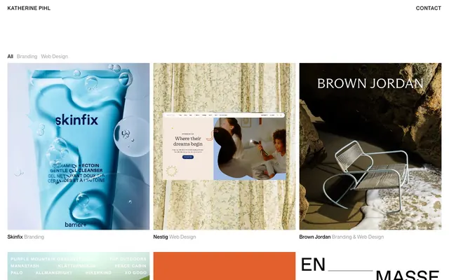
Katherine Pihl uses a refined, architectural blueprint aesthetic with stark monochrome surfaces and precise typographic hierarchy. The design emphasizes content through minimalist presentation, relying on compact text, subtle hover states, and clear segmentation. Projects are presented as visual modules on a uniform dark background, using imagery as the primary accent. The overall impression is one of meticulous craft and sophisticated restraint.
The page uses a full-bleed layout, particularly for the header and main content grid, with elements like the header extending edge-to-edge. The hero section is minimal, featuring the brand name and contact link. The main content area presents projects in a symmetrical, tight grid pattern (likely 3-column), where each project module is a uniform square. Vertical rhythm is maintained through consistent spacing between the project grid and other sections. Navigation is a simple top-right text link. The layout is content-focused and highly structured, relying on the visual strength of the image modules.
The site prominently features product photography and full-bleed image content as the primary visual display for projects. Photography is high-resolution, often with tight crops focusing on product details or contextual atmosphere. Some images include UI mockups or abstract graphics. Imagery is typically self-contained within sharp, unrounded modules, with no overlapping elements. The role of imagery is to showcase product output and provide atmospheric context, acting as the main visual 'color' against the monochromatic UI.
Reminiscent of Huge Inc., Basic (Design Agency), AIGA (American Institute of Graphic Arts), Area 17.
# Katherine Pihl — Style Reference
> Architectural Blueprint on Carbon

**Theme:** dark

**Site:** https://katherinepihl.com

Katherine Pihl uses a refined, architectural blueprint aesthetic with stark monochrome surfaces and precise typographic hierarchy. The design emphasizes content through minimalist presentation, relying on compact text, subtle hover states, and clear segmentation. Projects are presented as visual modules on a uniform dark background, using imagery as the primary accent. The overall impression is one of meticulous craft and sophisticated restraint.

## Tokens — Colors

| Name | Value | Token | Role |
|------|------|------|------|
| Midnight Carbon | `#000000` | `--color-midnight-carbon` | Page backgrounds, card backgrounds, primary text, prominent borders, focus indicators. This deep black provides a neutral and stark canvas allowing project thumbnails and typography to stand out clearly |
| Graphite Filter | `#999999` | `--color-graphite-filter` | Muted secondary text, descriptive labels under project titles. Offers a subtle tonal shift for less prominent information against the dark background |
| Pewter Mist | `#b3b3b3` | `--color-pewter-mist` | Subtle ghost border for navigation items, less prominent descriptive text. Slightly lighter than Graphite Filter, used for very subtle distinctions |

## Tokens — Typography

### Neue Montreal
- **Substitute:** Inter
- **Weights:** 300, 400, 500
- **Sizes:** 16px
- **Line height:** 1.2, 1.5
- **Letter spacing:** 0.32, 1.12
- **Role:** The primary workhorse font. Weight 300 is used sparingly for a light touch, while 400 and 500 maintain legibility across body text, navigation, and detailed information. The tighter letter-spacing for some contexts provides a more compact, modern feel.

### Ryhmes
- **Substitute:** Playfair Display
- **Weights:** 300
- **Sizes:** 32px
- **Line height:** 1.1
- **Letter spacing:** -0.96
- **Role:** Used for distinctive project titles and headings. The light weight (300) combined with negative letter-spacing gives a sophisticated, almost whispered presence, creating a delicate counterpoint to the sans-serif body text.

## Tokens — Spacing

- **Section gap:** 40px
- **Card padding:** 0px
- **Element gap:** 12px

## Tokens — Radius

- **none:** 0px

## Layout

The page uses a full-bleed layout, particularly for the header and main content grid, with elements like the header extending edge-to-edge. The hero section is minimal, featuring the brand name and contact link. The main content area presents projects in a symmetrical, tight grid pattern (likely 3-column), where each project module is a uniform square. Vertical rhythm is maintained through consistent spacing between the project grid and other sections. Navigation is a simple top-right text link. The layout is content-focused and highly structured, relying on the visual strength of the image modules.

## Imagery

The site prominently features product photography and full-bleed image content as the primary visual display for projects. Photography is high-resolution, often with tight crops focusing on product details or contextual atmosphere. Some images include UI mockups or abstract graphics. Imagery is typically self-contained within sharp, unrounded modules, with no overlapping elements. The role of imagery is to showcase product output and provide atmospheric context, acting as the main visual 'color' against the monochromatic UI.

## Components

### Main Navigation Link
*Top-level navigation items and secondary links.*

Text uses Neue Montreal, 16px, weight 400. Letter spacing is 0.32px. It appears as Midnight Carbon (#000000) against the page background. On hover, a subtle 1px solid Midnight Carbon (#000000) border appears, indicating interactivity without a color change.

### Project Gallery Grid Item
*Thumbnail container for showcasing individual projects.*

Each item is a square module with a 0px border-radius, presenting an image as its primary content. The background is Midnight Carbon (#000000). On hover, it may show a border or text overlay, but the core is a crisp, unpadded visual block.

### Project Title
*Displaying the name of individual projects within the gallery or on project pages.*

Uses Ryhmes, 32px, weight 300, Midnight Carbon (#000000) with a refined letter-spacing of -0.96px, giving a distinctive, elegant feel.

### Project Category/Sub-Text
*Descriptive text below project titles, indicating category or additional detail.*

Uses Neue Montreal, 16px, weight 400. Text color is Graphite Filter (#999999) or Pewter Mist (#b3b3b3), depending on context, providing a clear but subordinate hierarchy to the main title. This text adheres to a loose letter-spacing of 0.32px.

### Footer Links
*Contact information or secondary navigation in the footer.*

Rendered in Neue Montreal, 16px, weight 400, Midnight Carbon (#000000). Functionally a link, it matches the primary text style, maintaining a unified typographic appearance.

### Filter Tags
*Categorization labels for filtering content (e.g., 'All', 'Branding', 'Web Design').*

Uses Neue Montreal, 16px, weight 400, in Midnight Carbon (#000000). When inactive, it may appear as a Graphite Filter (#999999). Interaction is handled by a 1px solid Midnight Carbon (#000000) border-bottom appearing on hover or active states, no background fill.

## Guidelines

### Do

- Use Midnight Carbon (#000000) as the foundational background color for all pages and components.
- Apply Ryhmes, weight 300, 32px with -0.96px letter-spacing for all primary headings and project titles.
- Utilize Neue Montreal, 16px, weight 400 for all body text, navigation elements, and descriptive labels, adjusting color between Midnight Carbon, Graphite Filter, and Pewter Mist for hierarchy.
- Maintain a precise 0px border-radius for all image containers and content modules, emphasizing sharpness and structured presentation.
- Employ 1px solid Midnight Carbon (#000000) borders for interactive elements like navigation links on hover or focus states, avoiding background fills where possible.
- Keep ample vertical spacing between sections, using a sectionGap of 40px to delineate content blocks clearly.

### Don't

- Do not introduce soft shadows or excessive elevation; the aesthetic relies on flat surfaces and sharp edges.
- Avoid using saturated accent colors for functional UI elements; color should primarily reside within project imagery.
- Do not use generic button styles with filled backgrounds; interactive elements should primarily be text links with subtle borders or ghost styles.
- Do not vary global border-radius; all corners should be sharp and angular (0px).
- Avoid decorative gradients for backgrounds or surfaces; the system favors solid, monochromatic fields.
- Do not use letter-spacing wider than 0.32px; the typography is designed for a compact, controlled appearance.

## Agent Prompt Guide

Quick Color Reference:
text: #000000
background: #000000
border: #000000
accent: no distinct accent color
primary action: no distinct CTA color

Example Component Prompts:
1. Create a filter navigation bar: 'All', 'Branding', 'Web Design'. Each item is Neue Montreal 16px, weight 400, color #999999. On hover, a 1px solid #000000 border appears underneath. Items are spaced 24px horizontally.
2. Design a project header for 'Skinfix': Title 'Skinfix' in Ryhmes 32px, weight 300, #000000, letter-spacing -0.96px. Below it, text 'Branding & Web Design' in Neue Montreal 16px, weight 400, #999999.
3. Construct a footer: Text 'Katherine Pihl' and 'Contact' on separate lines, both in Neue Montreal 16px, weight 400, #000000, with a line-height of 1.5. Space these items with a 12px element gap vertically.
More like this





Keep what you find
A free account saves references to boards and can send you a weekly email of picks based on what you save.
To see every result, go Pro.