Preview image. Unlock full-res
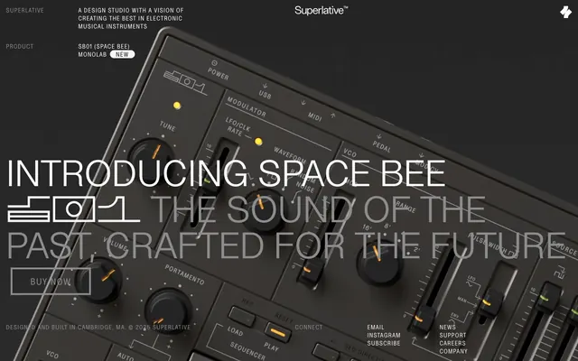
Precision instrument interface—white text glowing on a matte gray panel.
Color palette
Orange wash for highlight backgrounds, decorative bands, and soft emphasis behind content. Do not promote it to the primary CTA color
Primary surface background, text color for light surfaces, prominent borders
Secondary surface backgrounds, muted text on very dark surfaces, darker borders
Placeholder text, subtle borders, inactive link text, secondary headings
Primary text on dark backgrounds, ghost button text, active link text
Badge backgrounds, specific content sections when a lighter contrast is needed
Subtle borders and dividers on lighter surfaces
Outline button borders, selected text on light backgrounds
Typography
- Weights
- 400
- Sizes
- 15px, 23px, 90px
- Line height
- 1, 1.33
- Letter spacing
- 0.0800em
- Fallback
- Bebas Neue
Primary display font for headings and calls to action. The wide letter spacing and condensed form create a mechanical, precise feel.
- Weights
- 400
- Sizes
- 25px, 90px
- Line height
- 1, 1.2
- Letter spacing
- normal
- Fallback
- Open Sans Light
Secondary display font for larger headings, providing legibility at scale while maintaining a lean profile.
- Weights
- 400
- Sizes
- 15px
- Line height
- 1
- Letter spacing
- normal
- Fallback
- Open Sans
Body text, navigation links, and smaller UI labels. Its regular width balances the condensed display fonts.
Spacing & shape
Components
Text: Ghost White (#ffffff), size 25px SL-Light, weight 400, normal letter-spacing. Border: 1px solid Absolute Black (#000000). Background: transparent. Padding: 18.5px vertical, 45px horizontal. Radius: 0px.
Text: Panel Gray (#8c8c8c), size 15px SL-Regular-Condensed, weight 400, letter-spacing 0.0800em. Border: 1px solid Panel Gray (#8c8c8c). Background: transparent. Padding: 18.5px vertical, 45px horizontal. Radius: 0px.
Placeholder Text: Panel Gray (#8c8c8c). Border: 1px solid Panel Gray (#8c8c8c). Background: transparent. No padding is explicitly defined in variants, implying content-based sizing.
Background: Surface White (#f6f4f2). Text: Superlative Black (#141414), size 15px SL-Regular-Condensed, weight 400. Padding: 0px vertical, 15px horizontal. Radius: 15px.
Guidelines
- Use Superlative Black (#141414) as the default background for most sections.
- Employ Ghost White (#ffffff) text for primary content on dark backgrounds.
- Borders for interactive components should be 1px solid using Superlative Black (#000000) or Panel Gray (#8c8c8c).
- Apply Signal Orange (#e66f27) sparingly, strictly for functional highlights and indicators, not for primary actions.
- Maintain a tight layout with an element gap of 15px for most UI elements.
- Utilize SL-Regular-Condensed with 0.0800em letter-spacing for all headlines and button text.
- Apply a 15px border radius to badges and a 3px radius to outlined buttons, with 0px for Ghost Buttons.
- Avoid using Signal Orange (#e66f27) for actionable button backgrounds or primary calls to action.
- Do not introduce heavy shadows or excessive elevation; maintain a generally flat and minimalist appearance.
- Refrain from using color gradients, as the system relies on solid colors and strong contrast.
- Never use serif fonts; stick to the sans-serif SL typefaces for a consistent technical aesthetic.
- Do not deviate from the specified tight letter-spacing for condensed fonts or normal spacing for regular fonts.
- Avoid complex or ornamental visual elements; simplicity and utility are paramount.
- Do not use large, soft paddings; maintain compact and disciplined spacing around components.
About this system
ShowHide
Superlative employs a dark, high-contrast aesthetic that feels like a precision instrument's interface—sharp, functional, and minimal. White and various shades of dark gray define the palette, highlighted by a stark orange accent used for critical indicators. Typography is condensed and uppercase, contributing to a technical, almost industrial feel. Components are stripped down: ghost buttons with thin borders and minimal padding, and tight, disciplined spacing create a sense of focused control.
The page uses a full-bleed layout for its hero section, with primary content layered over a large product image. Subsequent sections maintain this dark, full-width canvas. Content is often centered and stacked, or uses implicit grid-like arrangements where text overlays parts of the background imagery. There isn't a strict max-width container, allowing for immersive full-bleed imagery, but internal text blocks respect generous margins. Vertical rhythm is established through consistent section gaps of 60px. Navigation is minimal, located at the top-left and top-right corners, rather than a heavy header.
This system features prominent, angled product photography of electronic musical instruments, often filling the background without explicit framing. Imagery is focused on the product itself, showcasing its controls and details rather than lifestyle contexts, emphasizing the technical nature of the brand. There are no illustrations; the visual language is strictly photographic or iconographic. Icons are minimal, outlined, and monochromatic, aligning with the precision instrument aesthetic. Imagery serves as atmospheric branding and product showcase, dominating visual space while overlaid with text.
Reminiscent of Teenage Engineering, Arturia, Native Instruments.
# Superlative — Style Reference
> Precision instrument interface—white text glowing on a matte gray panel.

**Theme:** dark

**Site:** https://playsuperlative.com

Superlative employs a dark, high-contrast aesthetic that feels like a precision instrument's interface—sharp, functional, and minimal. White and various shades of dark gray define the palette, highlighted by a stark orange accent used for critical indicators. Typography is condensed and uppercase, contributing to a technical, almost industrial feel. Components are stripped down: ghost buttons with thin borders and minimal padding, and tight, disciplined spacing create a sense of focused control.

## Tokens — Colors

| Name | Value | Token | Role |
|------|------|------|------|
| Signal Orange | `#e66f27` | `--color-signal-orange` | Orange wash for highlight backgrounds, decorative bands, and soft emphasis behind content. Do not promote it to the primary CTA color |
| Superlative Black | `#141414` | `--color-superlative-black` | Primary surface background, text color for light surfaces, prominent borders |
| Instrument Gray | `#232323` | `--color-instrument-gray` | Secondary surface backgrounds, muted text on very dark surfaces, darker borders |
| Panel Gray | `#8c8c8c` | `--color-panel-gray` | Placeholder text, subtle borders, inactive link text, secondary headings |
| Ghost White | `#ffffff` | `--color-ghost-white` | Primary text on dark backgrounds, ghost button text, active link text |
| Surface White | `#f6f4f2` | `--color-surface-white` | Badge backgrounds, specific content sections when a lighter contrast is needed |
| Divider Gray | `#e4e3e2` | `--color-divider-gray` | Subtle borders and dividers on lighter surfaces |
| Absolute Black | `#000000` | `--color-absolute-black` | Outline button borders, selected text on light backgrounds |

## Tokens — Typography

### SL-Regular-Condensed
- **Substitute:** Bebas Neue
- **Weights:** 400
- **Sizes:** 15px, 23px, 90px
- **Line height:** 1, 1.33
- **Letter spacing:** 0.0800em
- **Role:** Primary display font for headings and calls to action. The wide letter spacing and condensed form create a mechanical, precise feel.

### SL-Light
- **Substitute:** Open Sans Light
- **Weights:** 400
- **Sizes:** 25px, 90px
- **Line height:** 1, 1.2
- **Letter spacing:** normal
- **Role:** Secondary display font for larger headings, providing legibility at scale while maintaining a lean profile.

### SL-Regular
- **Substitute:** Open Sans
- **Weights:** 400
- **Sizes:** 15px
- **Line height:** 1
- **Letter spacing:** normal
- **Role:** Body text, navigation links, and smaller UI labels. Its regular width balances the condensed display fonts.

## Tokens — Type Scale

| Role | Size | Line height | Letter spacing |
|------|------|------|------|
| body | 15px | 1 | 0.08em |
| subheading | 23px | 1.33 | 0.08em |
| heading | 25px | 1 | — |
| display | 90px | 1 | — |

## Tokens — Spacing

- **Section gap:** 60px
- **Card padding:** 30px
- **Element gap:** 15px

## Tokens — Radius

- **Buttons:** 3px
- **badges:** 15px

## Layout

The page uses a full-bleed layout for its hero section, with primary content layered over a large product image. Subsequent sections maintain this dark, full-width canvas. Content is often centered and stacked, or uses implicit grid-like arrangements where text overlays parts of the background imagery. There isn't a strict max-width container, allowing for immersive full-bleed imagery, but internal text blocks respect generous margins. Vertical rhythm is established through consistent section gaps of 60px. Navigation is minimal, located at the top-left and top-right corners, rather than a heavy header.

## Imagery

This system features prominent, angled product photography of electronic musical instruments, often filling the background without explicit framing. Imagery is focused on the product itself, showcasing its controls and details rather than lifestyle contexts, emphasizing the technical nature of the brand. There are no illustrations; the visual language is strictly photographic or iconographic. Icons are minimal, outlined, and monochromatic, aligning with the precision instrument aesthetic. Imagery serves as atmospheric branding and product showcase, dominating visual space while overlaid with text.

## Components

### Ghost Primary Button
*Main call to action, outlining key interactive elements.*

Text: Ghost White (#ffffff), size 25px SL-Light, weight 400, normal letter-spacing. Border: 1px solid Absolute Black (#000000). Background: transparent. Padding: 18.5px vertical, 45px horizontal. Radius: 0px.

### Ghost Secondary Button
*Secondary calls to action, maintaining visual weight with interaction.*

Text: Panel Gray (#8c8c8c), size 15px SL-Regular-Condensed, weight 400, letter-spacing 0.0800em. Border: 1px solid Panel Gray (#8c8c8c). Background: transparent. Padding: 18.5px vertical, 45px horizontal. Radius: 0px.

### Input Field
*User input areas for forms.*

Placeholder Text: Panel Gray (#8c8c8c). Border: 1px solid Panel Gray (#8c8c8c). Background: transparent. No padding is explicitly defined in variants, implying content-based sizing.

### New Badge
*Highlighting new features or products.*

Background: Surface White (#f6f4f2). Text: Superlative Black (#141414), size 15px SL-Regular-Condensed, weight 400. Padding: 0px vertical, 15px horizontal. Radius: 15px.

## Guidelines

### Do

- Use Superlative Black (#141414) as the default background for most sections.
- Employ Ghost White (#ffffff) text for primary content on dark backgrounds.
- Borders for interactive components should be 1px solid using Superlative Black (#000000) or Panel Gray (#8c8c8c).
- Apply Signal Orange (#e66f27) sparingly, strictly for functional highlights and indicators, not for primary actions.
- Maintain a tight layout with an element gap of 15px for most UI elements.
- Utilize SL-Regular-Condensed with 0.0800em letter-spacing for all headlines and button text.
- Apply a 15px border radius to badges and a 3px radius to outlined buttons, with 0px for Ghost Buttons.

### Don't

- Avoid using Signal Orange (#e66f27) for actionable button backgrounds or primary calls to action.
- Do not introduce heavy shadows or excessive elevation; maintain a generally flat and minimalist appearance.
- Refrain from using color gradients, as the system relies on solid colors and strong contrast.
- Never use serif fonts; stick to the sans-serif SL typefaces for a consistent technical aesthetic.
- Do not deviate from the specified tight letter-spacing for condensed fonts or normal spacing for regular fonts.
- Avoid complex or ornamental visual elements; simplicity and utility are paramount.
- Do not use large, soft paddings; maintain compact and disciplined spacing around components.

## Agent Prompt Guide

Quick Color Reference:
text: #ffffff
background: #141414
border: #000000
accent: #e66f27
primary action: no distinct CTA color

Example Component Prompts:
No distinct primary action color was observed; use the extracted neutral button treatments instead of inventing a filled CTA color.
2. Create a feature callout: Instrument Gray Panel (#232323) background. Title 'The Sound of the Past' at 25px SL-Light weight 400, Ghost White (#ffffff), normal letter-spacing. Subtext 'Crafted for the Future' at 15px SL-Regular weight 400, Ghost White (#ffffff), normal letter-spacing.
3. Create a navigation link: Text 'PRODUCT' in Panel Gray (#8c8c8c), 15px SL-Light weight 400, normal letter-spacing. On hover, change text to Ghost White (#ffffff).
4. Create a 'New' badge: Background Surface White (#f6f4f2), text 'NEW' in Superlative Black (#141414), 15px SL-Regular-Condensed weight 400, letter-spacing 0.0800em. Radius 15px, 0px vertical padding, 15px horizontal padding.
More like this





Keep what you find
A free account saves references to boards and can send you a weekly email of picks based on what you save.
To see every result, go Pro.