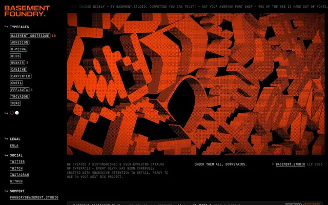
Preview image. Unlock full-res
Typeface Dungeon, Glowing Console
Color palette
Orange accent for outlined action borders, linked labels, and lightweight interactive emphasis. Do not promote it to the primary CTA color
Page backgrounds, primary surface areas, deep void
Primary text color, active states, muted icons, surface backgrounds for toggles
Hairline borders, subtle separators, link underlines, secondary surface borders
Subtle, deeper borders, component outlines on darker surfaces
Secondary and tertiary text, helper messages, less prominent details
Typography
- Weights
- 400, 700
- Sizes
- 12px, 14px, 18px
- Line height
- 1.14, 1.29, 1.3, 1.32, 1.4, 1.5
- Letter spacing
- -0.2, 0.1, 0.4, 0.6
- Fallback
- monospace
Utilitarian interface text: navigation, buttons, body copy, and secondary information. Its monospace nature grounds the typographic system in a technical, code-like aesthetic.
- Weights
- 400
- Sizes
- 14px, 16px, 18px
- Line height
- 1.29, 1.3, 1.5
- Letter spacing
- 0
- Fallback
- system-ui
Minimal body text and structural elements where a clean, approachable sans-serif is appropriate, contrasting with the monospace for hierarchy.
- Weights
- 400
- Sizes
- 120px
- Line height
- 0.95
- Letter spacing
- 1.2
- Fallback
- Impact
Prominent display typeface for showcasing type specimens. Its bold, expanded form demands attention.
- Weights
- 400
- Sizes
- 164px
- Line height
- 1.1
- Letter spacing
- 1.64
- Fallback
- serif
Dramatic display type for showcasing individual font styles, emphasizing their unique character.
- Weights
- 400
- Sizes
- 90px
- Line height
- 1.1
- Letter spacing
- 0.01
FFFLAUTA 400 — detected in extracted data but not described by AI
- Weights
- 400
- Sizes
- 120px
- Line height
- 1.2
- Letter spacing
- 0.01
Mecha Regular — detected in extracted data but not described by AI
- Weights
- 400
- Sizes
- 156px
- Line height
- 1.1
- Letter spacing
- 0.01
Curia Regular — detected in extracted data but not described by AI
- Weights
- 400
- Sizes
- 169px
- Line height
- 1.1
- Letter spacing
- 0.01
Carpenter Regular — detected in extracted data but not described by AI
- Weights
- 400
- Sizes
- 185px
- Line height
- 1.1
- Letter spacing
- 0.01
Bunker Regular — detected in extracted data but not described by AI
- Weights
- 400
- Sizes
- 198px
- Line height
- 1.1
- Letter spacing
- 0.01
Trovador Regular — detected in extracted data but not described by AI
- Weights
- 400
- Sizes
- 198px
- Line height
- 1.1
- Letter spacing
- 0.01
XER0 Regular — detected in extracted data but not described by AI
- Weights
- 400
- Sizes
- 203px
- Line height
- 1.1
- Letter spacing
- 0.01
Caniche Regular — detected in extracted data but not described by AI
- Weights
- 400
- Sizes
- 234px
- Line height
- 1.1
- Letter spacing
- 0.01
Blob Regular — detected in extracted data but not described by AI
Spacing & shape
Components
Links are rendered in Ghostly Gray (#efefef) with no distinct background or border, and a subtle Wireframe White (#e2e8f0) underline on hover. Uses JetBrains Mono at its respective size for context.
A ghost button with text set in Ghostly Gray (#efefef), no background, and a 1px solid Wireframe White (#e2e8f0) bottom border. Padding is 10px on the sides, text is JetBrains Mono 14px.
A ghost button with text set in Ghostly Gray (#efefef), no background, and a 1px solid Basement Orange (#ff4d00) bottom border. Padding is 10px on the sides, text is JetBrains Mono 14px.
A ghost button with text set in Ghostly Gray (#efefef), no background, and a 1px solid Basement Orange (#ff4d00) border. Padding is 10px on the sides, with a circular 50% border radius. Text is JetBrains Mono 14px.
A ghost button with the text 'Mode 1', 'Mode 2', etc. in Ghostly Gray (#efefef), no background, and a 1px solid Wireframe White (#e2e8f0) border, with a 50% border radius. Padding is 10px on all sides, text is JetBrains Mono 14px.
A dark card with 8px border-radius, acting as a canvas for the large font previews. It has a subtle Wireframe White (#e2e8f0) border on its top edge. Contains its oversized typeface examples.
Guidelines
- Prioritize Midnight Ink (#121212) as the base background for most surfaces, embracing the dark theme.
- Use Ghostly Gray (#efefef) for all primary body text and interactive states unless otherwise specified.
- Apply Basement Orange (#ff4d00) sparingly, reserving it for primary interactive elements, active states, and brand highlights.
- Employ Wireframe White (#e2e8f0) for all primary borders, separators, and subtle outlines on neutral components.
- Maintain a compact density for UI elements, using an 8px element gap as a primary spacing unit.
- Ensure JetBrains Mono is the default typeface for all functional UI text where a technical, precise feel is desired.
- Apply 50% border-radius to all small interactive elements like 'mode' buttons and 'buy now' buttons to create distinct visual cues.
- Avoid using multiple chromatic colors; Basement Orange (#ff4d00) is the sole accent.
- Do not introduce heavy shadows or gradients; flat surfaces and crisp borders define the aesthetic.
- Resist using highly decorative or illustrative imagery that conflicts with the stark, type-focused approach.
- Do not deviate from the JetBrains Mono and Inter types for the main interface, unless introducing a distinct display font for showcased content.
- Avoid large, rounded containers; stick to the subtle 2.8px default border radius for most elements and 8px for cards.
- Do not use Ghostly Gray (#efefef) as a background for primary actions; it is a text/border color.
- Introduce complex animations; stick to simple transitions on color and border-color for interactive elements.
About this system
ShowHide
Basement Foundry evokes a clandestine digital workshop feel, with a stark dark theme serving as a canvas for experimental typography. Its visual identity relies on strong contrasts, minimal adornment, and precise geometric forms, accented by a single vivid orange that acts as both highlight and interactive cue. The system prioritizes clarity and directness, using monospace and utilitarian sans-serif fonts until striking display typefaces take center stage as product showcases. Components are mostly outlined or text-based, maintaining a lightweight, almost 'ghostly' presence against the deep background.
The page adheres to a left-aligned, maximal width layout for its primary content area, but with a narrow, fixed-width left sidebar section for navigation and legal links. The hero section is characterized by a full-bleed, dark background integrating dynamic, large-scale type specimen animations. Subsequent sections flow vertically, often featuring full-width dark canvases occupied by prominent typeface showcases, implicitly establishing a consistent vertical rhythm. Content within these sections tends to be centrally balanced or slightly left-biased, with minimal and compact informational text supporting the visual impact of the type. The navigation remains sticky at the top, a horizontal bar against the deep theme, reinforcing the 'single pane of glass' experience.
The site uses minimal explicit imagery beyond typography itself. The primary 'visuals' are dynamic, large-scale renderings of the typefaces, often with textural or glitch-art effects, presented against the dark background. When present, small icons are typically outlined and monochromatic (Ghostly Gray #efefef), maintaining a technical, UI-focused aesthetic. Product screenshots are essentially large typographic specimens, showcasing the fonts without extraneous context.
Reminiscent of Fonts In Use, Commercial Type, Pangram Pangram Foundry.
# Foundry — Style Reference
> Typeface Dungeon, Glowing Console

**Theme:** dark

**Site:** https://foundry.basement.studio

Basement Foundry evokes a clandestine digital workshop feel, with a stark dark theme serving as a canvas for experimental typography. Its visual identity relies on strong contrasts, minimal adornment, and precise geometric forms, accented by a single vivid orange that acts as both highlight and interactive cue. The system prioritizes clarity and directness, using monospace and utilitarian sans-serif fonts until striking display typefaces take center stage as product showcases. Components are mostly outlined or text-based, maintaining a lightweight, almost 'ghostly' presence against the deep background.

## Tokens — Colors

| Name | Value | Token | Role |
|------|------|------|------|
| Basement Orange | `#ff4d00` | `--color-basement-orange` | Orange accent for outlined action borders, linked labels, and lightweight interactive emphasis. Do not promote it to the primary CTA color |
| Midnight Ink | `#121212` | `--color-midnight-ink` | Page backgrounds, primary surface areas, deep void |
| Ghostly Gray | `#efefef` | `--color-ghostly-gray` | Primary text color, active states, muted icons, surface backgrounds for toggles |
| Wireframe White | `#e2e8f0` | `--color-wireframe-white` | Hairline borders, subtle separators, link underlines, secondary surface borders |
| Shadow Border | `#3a3a3a` | `--color-shadow-border` | Subtle, deeper borders, component outlines on darker surfaces |
| Muted Text | `#747474` | `--color-muted-text` | Secondary and tertiary text, helper messages, less prominent details |

## Tokens — Typography

### JetBrains Mono
- **Substitute:** monospace
- **Weights:** 400, 700
- **Sizes:** 12px, 14px, 18px
- **Line height:** 1.14, 1.29, 1.3, 1.32, 1.4, 1.5
- **Letter spacing:** -0.2, 0.1, 0.4, 0.6
- **Role:** Utilitarian interface text: navigation, buttons, body copy, and secondary information. Its monospace nature grounds the typographic system in a technical, code-like aesthetic.

### Inter
- **Substitute:** system-ui
- **Weights:** 400
- **Sizes:** 14px, 16px, 18px
- **Line height:** 1.29, 1.3, 1.5
- **Letter spacing:** 0
- **Role:** Minimal body text and structural elements where a clean, approachable sans-serif is appropriate, contrasting with the monospace for hierarchy.

### Basement Grotesque Black Expanded
- **Substitute:** Impact
- **Weights:** 400
- **Sizes:** 120px
- **Line height:** 0.95
- **Letter spacing:** 1.2
- **Role:** Prominent display typeface for showcasing type specimens. Its bold, expanded form demands attention.

### Adhesion
- **Substitute:** serif
- **Weights:** 400
- **Sizes:** 164px
- **Line height:** 1.1
- **Letter spacing:** 1.64
- **Role:** Dramatic display type for showcasing individual font styles, emphasizing their unique character.

### FFFLAUTA 400
- **Weights:** 400
- **Sizes:** 90px
- **Line height:** 1.1
- **Letter spacing:** 0.01
- **Role:** FFFLAUTA 400 — detected in extracted data but not described by AI

### Mecha Regular
- **Weights:** 400
- **Sizes:** 120px
- **Line height:** 1.2
- **Letter spacing:** 0.01
- **Role:** Mecha Regular — detected in extracted data but not described by AI

### Curia Regular
- **Weights:** 400
- **Sizes:** 156px
- **Line height:** 1.1
- **Letter spacing:** 0.01
- **Role:** Curia Regular — detected in extracted data but not described by AI

### Carpenter Regular
- **Weights:** 400
- **Sizes:** 169px
- **Line height:** 1.1
- **Letter spacing:** 0.01
- **Role:** Carpenter Regular — detected in extracted data but not described by AI

### Bunker Regular
- **Weights:** 400
- **Sizes:** 185px
- **Line height:** 1.1
- **Letter spacing:** 0.01
- **Role:** Bunker Regular — detected in extracted data but not described by AI

### Trovador Regular
- **Weights:** 400
- **Sizes:** 198px
- **Line height:** 1.1
- **Letter spacing:** 0.01
- **Role:** Trovador Regular — detected in extracted data but not described by AI

### XER0 Regular
- **Weights:** 400
- **Sizes:** 198px
- **Line height:** 1.1
- **Letter spacing:** 0.01
- **Role:** XER0 Regular — detected in extracted data but not described by AI

### Caniche Regular
- **Weights:** 400
- **Sizes:** 203px
- **Line height:** 1.1
- **Letter spacing:** 0.01
- **Role:** Caniche Regular — detected in extracted data but not described by AI

### Blob Regular
- **Weights:** 400
- **Sizes:** 234px
- **Line height:** 1.1
- **Letter spacing:** 0.01
- **Role:** Blob Regular — detected in extracted data but not described by AI

## Tokens — Type Scale

| Role | Size | Line height | Letter spacing |
|------|------|------|------|
| caption | 12px | 1.14 | -0.2px |
| body-sm | 14px | 1.29 | — |
| body | 18px | 1.3 | — |
| heading-lg | 120px | 0.95 | 1.2px |
| display | 164px | 1.1 | 1.64px |

## Tokens — Spacing

- **Max width:** 270px
- **Section gap:** 90px
- **Card padding:** 15px
- **Element gap:** 8px

## Tokens — Radius

- **Default:** 2.8px
- **Cards:** 8px
- **interactive:** 50%

## Layout

The page adheres to a left-aligned, maximal width layout for its primary content area, but with a narrow, fixed-width left sidebar section for navigation and legal links. The hero section is characterized by a full-bleed, dark background integrating dynamic, large-scale type specimen animations. Subsequent sections flow vertically, often featuring full-width dark canvases occupied by prominent typeface showcases, implicitly establishing a consistent vertical rhythm. Content within these sections tends to be centrally balanced or slightly left-biased, with minimal and compact informational text supporting the visual impact of the type. The navigation remains sticky at the top, a horizontal bar against the deep theme, reinforcing the 'single pane of glass' experience.

## Imagery

The site uses minimal explicit imagery beyond typography itself. The primary 'visuals' are dynamic, large-scale renderings of the typefaces, often with textural or glitch-art effects, presented against the dark background. When present, small icons are typically outlined and monochromatic (Ghostly Gray #efefef), maintaining a technical, UI-focused aesthetic. Product screenshots are essentially large typographic specimens, showcasing the fonts without extraneous context.

## Components

### Text Link
*Navigation and informational links within body text.*

Links are rendered in Ghostly Gray (#efefef) with no distinct background or border, and a subtle Wireframe White (#e2e8f0) underline on hover. Uses JetBrains Mono at its respective size for context.

### Typeface Navigation Button (Inactive)
*Navigation item for browsing typeface categories.*

A ghost button with text set in Ghostly Gray (#efefef), no background, and a 1px solid Wireframe White (#e2e8f0) bottom border. Padding is 10px on the sides, text is JetBrains Mono 14px.

### Typeface Navigation Button (Active)
*Currently selected typeface category.*

A ghost button with text set in Ghostly Gray (#efefef), no background, and a 1px solid Basement Orange (#ff4d00) bottom border. Padding is 10px on the sides, text is JetBrains Mono 14px.

### Buy Now Button (Outlined)
*Primary action for purchasing typefaces.*

A ghost button with text set in Ghostly Gray (#efefef), no background, and a 1px solid Basement Orange (#ff4d00) border. Padding is 10px on the sides, with a circular 50% border radius. Text is JetBrains Mono 14px.

### Mode Toggle Button
*Interaction for switching display modes within a typeface showcase.*

A ghost button with the text 'Mode 1', 'Mode 2', etc. in Ghostly Gray (#efefef), no background, and a 1px solid Wireframe White (#e2e8f0) border, with a 50% border radius. Padding is 10px on all sides, text is JetBrains Mono 14px.

### Type Specimen Card
*Container for individual typeface previews.*

A dark card with 8px border-radius, acting as a canvas for the large font previews. It has a subtle Wireframe White (#e2e8f0) border on its top edge. Contains its oversized typeface examples.

## Guidelines

### Do

- Prioritize Midnight Ink (#121212) as the base background for most surfaces, embracing the dark theme.
- Use Ghostly Gray (#efefef) for all primary body text and interactive states unless otherwise specified.
- Apply Basement Orange (#ff4d00) sparingly, reserving it for primary interactive elements, active states, and brand highlights.
- Employ Wireframe White (#e2e8f0) for all primary borders, separators, and subtle outlines on neutral components.
- Maintain a compact density for UI elements, using an 8px element gap as a primary spacing unit.
- Ensure JetBrains Mono is the default typeface for all functional UI text where a technical, precise feel is desired.
- Apply 50% border-radius to all small interactive elements like 'mode' buttons and 'buy now' buttons to create distinct visual cues.

### Don't

- Avoid using multiple chromatic colors; Basement Orange (#ff4d00) is the sole accent.
- Do not introduce heavy shadows or gradients; flat surfaces and crisp borders define the aesthetic.
- Resist using highly decorative or illustrative imagery that conflicts with the stark, type-focused approach.
- Do not deviate from the JetBrains Mono and Inter types for the main interface, unless introducing a distinct display font for showcased content.
- Avoid large, rounded containers; stick to the subtle 2.8px default border radius for most elements and 8px for cards.
- Do not use Ghostly Gray (#efefef) as a background for primary actions; it is a text/border color.
- Introduce complex animations; stick to simple transitions on color and border-color for interactive elements.

## Agent Prompt Guide

Quick Color Reference:
text: #efefef
background: #121212
border: #e2e8f0
accent: #ff4d00
primary action: #efefef (filled action)

Example Component Prompts:
1. Create a left-aligned navigation sidebar link for 'Legal': Text `LEGAL` in JetBrains Mono, weight 400, size 14px, #efefef, on a #121212 background. On hover, the text should keep its color, but a 1px solid #e2e8f0 bottom border should appear. The link should have 10px padding-right.
2. Design an active typeface category button: Text `BASMENT GROTESQUE` in JetBrains Mono, weight 400, size 14px, #efefef. The button should have a 1px solid #ff4d00 bottom border, 10px padding-left and padding-right, and no background.
3. Create a 'Buy now' button: Text `Buy now` in JetBrains Mono, weight 400, size 14px, #efefef. The button should have a 1px solid #ff4d00 border, no background, and a 50% border radius with 6px horizontal padding and 0px vertical padding.
4. Build a type specimen card for 'Adhesion': A rectangular container with a #121212 background, 8px border-radius, and a 1px solid #e2e8f0 top border. Inside, the text 'ADHESION' should be displayed using the Adhesion font, weight 400, size 164px, #efefef.
More like this





Keep what you find
A free account saves references to boards and can send you a weekly email of picks based on what you save.
To see every result, go Pro.