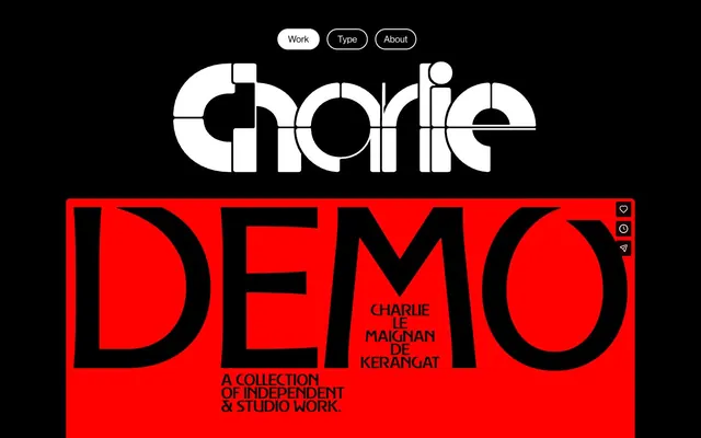
Preview image. Unlock full-res
High-contrast editorial experimentalism
Color palette
Striking background for hero sections, strong visual emphasis, full-bleed content blocks
Page backgrounds, headings (on white surfaces), button text on filled buttons
Contrasting surfaces, button backgrounds, text, borders, active states — the primary highlight color against the dark canvas
Subtle border accents, muted text, secondary link text, for a softer contrast
Typography
- Weights
- 400, 700
- Sizes
- 19px, 20px, 40px
- Line height
- 1.08, 1.25, 1.32
- Letter spacing
- normal
- Fallback
- Helvetica Neue
Primary UI text, body copy, navigation, and footer links. Its classic structure provides stability for content sections.
- Weights
- 400
- Sizes
- 145px, 360px
- Line height
- 0.7
- Letter spacing
- -0.0790em at 360px, -0.0770em at 360px, -0.0720em at 360px, -0.0690em at 360px, -0.0610em at 360px, -0.0510em at 360px, -0.0200em at 145px
- Fallback
- Bebas Neue
Dominant display headlines and stylistic elements. Its highly experimental variable nature and dramatic negative letter-spacing define the brand's 'wizardry' aesthetic.
Spacing & shape
Components
Text: NeueHaas, 19px, weight 400, Paper White. Border: 2px solid Paper White. Padding: 7px vertical, 20px horizontal. Radius: 100px. Background: transparent.
Text: NeueHaas, 19px, weight 400, Midnight Ink. Background: Paper White. Padding: 7px vertical, 20px horizontal. Radius: 100px.
Text: NeueHaas, 19px, weight 400, Concrete Gray. Underlined on hover (implied).
Background: Alert Red. Content usually includes large-format Brasparz Variable typography in Midnight Ink.
Guidelines
- Prioritize text as a primary visual element, using Brasparz Variable for large, impactful headlines.
- Maintain high contrast with a strict black and white base palette; use Alert Red sparingly for strong statements.
- Apply a 100px border radius to all buttons to create a distinct pill shape.
- Utilize NeueHaas for all functional UI elements, ensuring readability against the expressive display typography.
- Implement the large negative letter-spacing provided for Brasparz Variable headlines to achieve the signature condensed aesthetic.
- Use Paper White for borders and text on dark backgrounds to define interactive elements and important information.
- Avoid using multiple chromatic colors; limit color accents strictly to Alert Red.
- Do not introduce complex UI shadows, as the system relies on high-contrast borders and solid color blocks for depth.
- Refrain from using moderate or low-contrast text on dark backgrounds; always ensure text elements are Paper White or Concrete Gray for legibility.
- Do not deviate from the specified custom typefaces; their unique characteristics are central to the brand identity.
- Avoid generic button shapes; buttons must maintain the distinct pill shape with a 100px border radius.
- Do not use subtle background patterns or textures; surfaces should remain flat and monochromatic.
About this system
ShowHide
Charlie Le Maignan showcases a bold, high-contrast visual identity, blending classic editorial typography with experimental letterforms. The system operates on a stark black canvas, punctuated by intense red and crisp white. Typography takes center stage, acting as both content and artistic expression, with custom fonts driving a distinctive, almost art-gallery aesthetic. Component design is minimal, emphasizing outlines and high contrast over complex surfaces or shadows.
The page primarily uses a full-bleed layout for sections, but content within these sections is constrained to a `pageMaxWidth` of 1306px, centered. The hero pattern features large-format typography (Brasparz Variable) over a full-bleed Alert Red background. Sections maintain consistent vertical spacing of 59px. Content is arranged in alternating blocks, often a full-bleed color block followed by a dark background section. Navigation is a minimal top bar with ghost or filled pill-shaped buttons.
The site primarily uses bold, custom typography as its main imaginal and graphic element. When present, imagery (implied in background content) is likely treated with high contrast and minimal adornment, often acting as a canvas for text. Icons are implied to be minimal and monochromatic (Paper White on Midnight Ink) with defined strokes. The overall density is image-light, text-dominant, with typeforms themselves providing visual richness.
Reminiscent of AIGA Eye on Design, Certain graphic design portfolios, Brand New (Under Consideration).
# Charlie — Style Reference
> High-contrast editorial experimentalism

**Theme:** dark

**Site:** https://charlielemaignan.com

Charlie Le Maignan showcases a bold, high-contrast visual identity, blending classic editorial typography with experimental letterforms. The system operates on a stark black canvas, punctuated by intense red and crisp white. Typography takes center stage, acting as both content and artistic expression, with custom fonts driving a distinctive, almost art-gallery aesthetic. Component design is minimal, emphasizing outlines and high contrast over complex surfaces or shadows.

## Tokens — Colors

| Name | Value | Token | Role |
|------|------|------|------|
| Alert Red | `#ff0000` | `--color-alert-red` | Striking background for hero sections, strong visual emphasis, full-bleed content blocks |
| Midnight Ink | `#000000` | `--color-midnight-ink` | Page backgrounds, headings (on white surfaces), button text on filled buttons |
| Paper White | `#ffffff` | `--color-paper-white` | Contrasting surfaces, button backgrounds, text, borders, active states — the primary highlight color against the dark canvas |
| Concrete Gray | `#838383` | `--color-concrete-gray` | Subtle border accents, muted text, secondary link text, for a softer contrast |

## Tokens — Typography

### NeueHaas
- **Substitute:** Helvetica Neue
- **Weights:** 400, 700
- **Sizes:** 19px, 20px, 40px
- **Line height:** 1.08, 1.25, 1.32
- **Letter spacing:** normal
- **Role:** Primary UI text, body copy, navigation, and footer links. Its classic structure provides stability for content sections.

### Brasparz Variable
- **Substitute:** Bebas Neue
- **Weights:** 400
- **Sizes:** 145px, 360px
- **Line height:** 0.7
- **Letter spacing:** -0.0790em at 360px, -0.0770em at 360px, -0.0720em at 360px, -0.0690em at 360px, -0.0610em at 360px, -0.0510em at 360px, -0.0200em at 145px
- **Role:** Dominant display headlines and stylistic elements. Its highly experimental variable nature and dramatic negative letter-spacing define the brand's 'wizardry' aesthetic.

## Tokens — Type Scale

| Role | Size | Line height | Letter spacing |
|------|------|------|------|
| caption | 19px | 1.32 | — |
| subheading | 40px | 1.08 | — |
| heading | 145px | 0.7 | -0.02em |
| display | 360px | 0.7 | -0.079em |

## Tokens — Spacing

- **Max width:** 1306px
- **Section gap:** 59px
- **Card padding:** 20px
- **Element gap:** 30px

## Tokens — Radius

- **Buttons:** 100px

## Layout

The page primarily uses a full-bleed layout for sections, but content within these sections is constrained to a `pageMaxWidth` of 1306px, centered. The hero pattern features large-format typography (Brasparz Variable) over a full-bleed Alert Red background. Sections maintain consistent vertical spacing of 59px. Content is arranged in alternating blocks, often a full-bleed color block followed by a dark background section. Navigation is a minimal top bar with ghost or filled pill-shaped buttons.

## Imagery

The site primarily uses bold, custom typography as its main imaginal and graphic element. When present, imagery (implied in background content) is likely treated with high contrast and minimal adornment, often acting as a canvas for text. Icons are implied to be minimal and monochromatic (Paper White on Midnight Ink) with defined strokes. The overall density is image-light, text-dominant, with typeforms themselves providing visual richness.

## Components

### Ghost Navigation Button
*Ghost button for primary navigation*

Text: NeueHaas, 19px, weight 400, Paper White. Border: 2px solid Paper White. Padding: 7px vertical, 20px horizontal. Radius: 100px. Background: transparent.

### Filled Navigation Button
*Filled button for active navigation states*

Text: NeueHaas, 19px, weight 400, Midnight Ink. Background: Paper White. Padding: 7px vertical, 20px horizontal. Radius: 100px.

### Footer Link
*Secondary interactive elements in the footer*

Text: NeueHaas, 19px, weight 400, Concrete Gray. Underlined on hover (implied).

### Hero Banner - Red
*Full-width background section for dramatic visual impact*

Background: Alert Red. Content usually includes large-format Brasparz Variable typography in Midnight Ink.

## Guidelines

### Do

- Prioritize text as a primary visual element, using Brasparz Variable for large, impactful headlines.
- Maintain high contrast with a strict black and white base palette; use Alert Red sparingly for strong statements.
- Apply a 100px border radius to all buttons to create a distinct pill shape.
- Utilize NeueHaas for all functional UI elements, ensuring readability against the expressive display typography.
- Implement the large negative letter-spacing provided for Brasparz Variable headlines to achieve the signature condensed aesthetic.
- Use Paper White for borders and text on dark backgrounds to define interactive elements and important information.

### Don't

- Avoid using multiple chromatic colors; limit color accents strictly to Alert Red.
- Do not introduce complex UI shadows, as the system relies on high-contrast borders and solid color blocks for depth.
- Refrain from using moderate or low-contrast text on dark backgrounds; always ensure text elements are Paper White or Concrete Gray for legibility.
- Do not deviate from the specified custom typefaces; their unique characteristics are central to the brand identity.
- Avoid generic button shapes; buttons must maintain the distinct pill shape with a 100px border radius.
- Do not use subtle background patterns or textures; surfaces should remain flat and monochromatic.

## Agent Prompt Guide

Quick Color Reference:
- text: #ffffff
- background: #000000
- border: #ffffff
- accent: #ff0000
- primary action: #ffffff (filled action)

Example Component Prompts:
- Create a ghost navigation button: Text 'Work' (NeueHaas, 19px, weight 400, #ffffff), border 2px solid #ffffff, padding 7px 20px, radius 100px, background transparent.
- Create a filled navigation button: Text 'Type' (NeueHaas, 19px, weight 400, #000000), background #ffffff, padding 7px 20px, radius 100px.
- Create a hero section with a red background: Full-bleed background #ff0000. Headline 'DEMO' (Brasparz Variable, 360px, weight 400, #000000, letter-spacing -0.079em). Subtext 'A COLLECTION OF INDEPENDENT & STUDIO WORK.' (NeueHaas, 19px, weight 400, #000000).
More like this





Keep what you find
A free account saves references to boards and can send you a weekly email of picks based on what you save.
To see every result, go Pro.