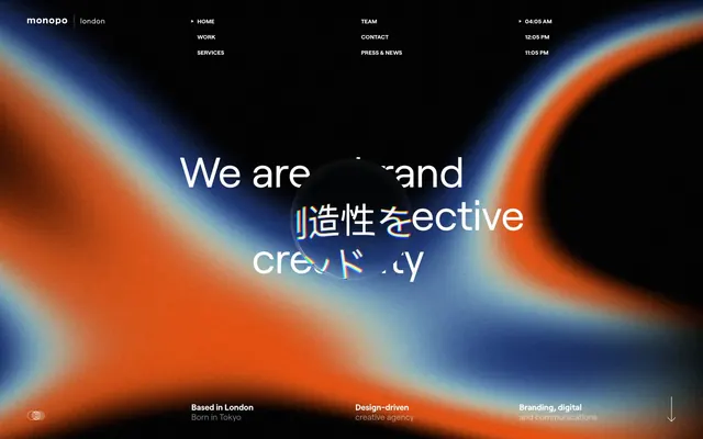
Preview image. Unlock full-res
Midnight gradient canvas
Color palette
Page backgrounds, card surfaces, dominant dark areas
Hairline borders, dividers, input outlines, and card edges on light surfaces. Do not promote it to the primary CTA color
Muted secondary text, inactive link borders, subtle decorative details
Dark borders and separators for elevated surfaces and inverted UI.
Immersive full-bleed background for hero sections and abstract visual elements. This gradient sets the mood and provides visual interest for large areas
Typography
- Weights
- 300, 400, 700, 800
- Sizes
- 12px, 14px, 16px, 17px, 22px, 33px, 45px
- Line height
- 1, 1.09, 1.15, 1.16, 1.2, 1.23, 1.44
- Letter spacing
- 0.1500em
- Fallback
- system-ui, sans-serif or Space Grotesk
The primary typeface for all text. Its compact, almost monospaced feel with consistent letter-spacing across weights contributes to the editorial, high-tech brand identity. Light weights (300, 400) are used for body text and navigation, while heavier weights (700, 800) bring punch to headlines and callouts.
Spacing & shape
Components
Text in Ghost White (#ffffff) with 0.15em letter-spacing. On hover, an underline or border appears. Minimal padding.
Transparent background, Ghost White (#ffffff) text, and a thin Ghost White (#ffffff) border. The border is 1px solid. The border-radius is 42px.
Large text (e.g., 45px) using Roobert, typically weight 800, color Ghost White (#ffffff), with expanded letter-spacing (0.15em) and minimal line-height. Renders central to the gradient background.
Uppercase text (e.g., 22px) using Roobert weight 700, Ghost White (#ffffff) color, with significant letter-spacing (0.15em). Often paired with a subtle border in Medium Gray (#666970).
Guidelines
- Prioritize Midnight Canvas (#000000) for all backgrounds to maintain the dark, atmospheric base.
- Use Ghost White (#ffffff) for all primary text, headlines, and interactive element outlines to ensure high contrast and legibility.
- Apply Roobert as the sole typeface, utilizing its full range of weights and the defined letter-spacing (0.15em) to achieve a modern, compact aesthetic.
- Maintain the distinct 0.15em letter-spacing for all text, overriding default browser rules for a signature look.
- Incorporate subtle linear borders in Medium Gray (#666970) for visual separation or secondary text accents rather than heavy dividers.
- Employ the Nebula Gradient for full-bleed hero sections to establish the site's dynamic and immersive visual identity.
- Use 42px border-radius for all interactive pill-shaped elements like buttons and links to reinforce a consistent soft visual language.
- Do not introduce additional background colors outside of Midnight Canvas (#000000) for primary surfaces.
- Avoid using light backgrounds for content sections; the system is designed around dark mode contrast.
- Do not deviate from the Roobert typeface or its prescribed letter-spacing and line-height values.
- Do not use generic box shadows; elevation is minimal and achieved through subtle borders or background contrast.
- Avoid standard, small icon sizes; elements should feel robust and have presence, even when non-textual.
- Do not use highly saturated, flat colors for large areas; colors should be used for accents or in gradient forms.
- Avoid dense paragraphs of body text; content should be broken into shorter, impactful statements.
About this system
ShowHide
Monopo London employs a moody, high-contrast aesthetic, combining a deep black background with crisp white typography and subtle, shifting gradients that create an immersive, dynamic canvas. Typography is compact and confident, often appearing in all caps with generous letter-spacing, contributing to a premium, editorial feel that prioritizes visual impact over text density. Interactive elements are understated, often relying on hover states or minimal outlines against the dark canvas, maintaining a clean yet engaging user experience.
This design system uses a combination of abstract, subtly blurred gradients (often serving as full-bleed backgrounds) and focused product screenshots or project images. The gradients provide a moody, almost cosmic backdrop, while project images are typically contained, but can occasionally overlap with text. Photography, when present, is product-focused or showcases details relevant to the project, lacking overt lifestyle or human elements. Icons are minimalist, outlined, and monochromatic, taking on the Ghost White (#ffffff) color. The emphasis is on atmosphere and showcasing work crisply rather than illustrative decoration or dense visual content. Image density is moderate, allowing text to also hold significant visual space.
Reminiscent of Basic/Dept®, Active Theory, Ueno, B-Reel.
# monopo london — Style Reference
> Midnight gradient canvas

**Theme:** dark

**Site:** https://monopo.london

Monopo London employs a moody, high-contrast aesthetic, combining a deep black background with crisp white typography and subtle, shifting gradients that create an immersive, dynamic canvas. Typography is compact and confident, often appearing in all caps with generous letter-spacing, contributing to a premium, editorial feel that prioritizes visual impact over text density. Interactive elements are understated, often relying on hover states or minimal outlines against the dark canvas, maintaining a clean yet engaging user experience.

## Tokens — Colors

| Name | Value | Token | Role |
|------|------|------|------|
| Midnight Canvas | `#000000` | `--color-midnight-canvas` | Page backgrounds, card surfaces, dominant dark areas |
| Ghost White | `#ffffff` | `--color-ghost-white` | Hairline borders, dividers, input outlines, and card edges on light surfaces. Do not promote it to the primary CTA color |
| Subtle Gray | `#7f7f7f` | `--color-subtle-gray` | Muted secondary text, inactive link borders, subtle decorative details |
| Medium Gray | `#666970` | `--color-medium-gray` | Dark borders and separators for elevated surfaces and inverted UI. |
| Nebula Gradient | `#cd5a07` | `--color-nebula-gradient` | Immersive full-bleed background for hero sections and abstract visual elements. This gradient sets the mood and provides visual interest for large areas |

## Tokens — Typography

### Roobert
- **Substitute:** system-ui, sans-serif or Space Grotesk
- **Weights:** 300, 400, 700, 800
- **Sizes:** 12px, 14px, 16px, 17px, 22px, 33px, 45px
- **Line height:** 1, 1.09, 1.15, 1.16, 1.2, 1.23, 1.44
- **Letter spacing:** 0.1500em
- **Role:** The primary typeface for all text. Its compact, almost monospaced feel with consistent letter-spacing across weights contributes to the editorial, high-tech brand identity. Light weights (300, 400) are used for body text and navigation, while heavier weights (700, 800) bring punch to headlines and callouts.

## Tokens — Type Scale

Major Third (1.25) from 16px base.

| Role | Size | Line height | Letter spacing |
|------|------|------|------|
| caption | 12px | 1.16 | — |
| body-sm | 14px | 1.16 | — |
| body | 16px | 1.16 | — |
| body-lg | 17px | 1.16 | — |
| heading-sm | 22px | 1.16 | — |
| heading | 33px | 1.16 | — |
| heading-lg | 45px | 1.16 | — |

## Tokens — Spacing

- **Section gap:** 111px
- **Card padding:** 15px
- **Element gap:** 8px

## Tokens — Radius

- **links:** 42px

## Imagery

This design system uses a combination of abstract, subtly blurred gradients (often serving as full-bleed backgrounds) and focused product screenshots or project images. The gradients provide a moody, almost cosmic backdrop, while project images are typically contained, but can occasionally overlap with text. Photography, when present, is product-focused or showcases details relevant to the project, lacking overt lifestyle or human elements. Icons are minimalist, outlined, and monochromatic, taking on the Ghost White (#ffffff) color. The emphasis is on atmosphere and showcasing work crisply rather than illustrative decoration or dense visual content. Image density is moderate, allowing text to also hold significant visual space.

## Components

### Ghost Navigation Link
*Primary navigation and footer links*

Text in Ghost White (#ffffff) with 0.15em letter-spacing. On hover, an underline or border appears. Minimal padding.

### Outlined Call to Action Button
*Secondary action button for discovering projects or general calls to action.*

Transparent background, Ghost White (#ffffff) text, and a thin Ghost White (#ffffff) border. The border is 1px solid. The border-radius is 42px.

### Hero Headline
*Dominant text for hero sections.*

Large text (e.g., 45px) using Roobert, typically weight 800, color Ghost White (#ffffff), with expanded letter-spacing (0.15em) and minimal line-height. Renders central to the gradient background.

### Sub-headline / Section Title
*Titles for section content like 'RECENT WORK'.*

Uppercase text (e.g., 22px) using Roobert weight 700, Ghost White (#ffffff) color, with significant letter-spacing (0.15em). Often paired with a subtle border in Medium Gray (#666970).

## Guidelines

### Do

- Prioritize Midnight Canvas (#000000) for all backgrounds to maintain the dark, atmospheric base.
- Use Ghost White (#ffffff) for all primary text, headlines, and interactive element outlines to ensure high contrast and legibility.
- Apply Roobert as the sole typeface, utilizing its full range of weights and the defined letter-spacing (0.15em) to achieve a modern, compact aesthetic.
- Maintain the distinct 0.15em letter-spacing for all text, overriding default browser rules for a signature look.
- Incorporate subtle linear borders in Medium Gray (#666970) for visual separation or secondary text accents rather than heavy dividers.
- Employ the Nebula Gradient for full-bleed hero sections to establish the site's dynamic and immersive visual identity.
- Use 42px border-radius for all interactive pill-shaped elements like buttons and links to reinforce a consistent soft visual language.

### Don't

- Do not introduce additional background colors outside of Midnight Canvas (#000000) for primary surfaces.
- Avoid using light backgrounds for content sections; the system is designed around dark mode contrast.
- Do not deviate from the Roobert typeface or its prescribed letter-spacing and line-height values.
- Do not use generic box shadows; elevation is minimal and achieved through subtle borders or background contrast.
- Avoid standard, small icon sizes; elements should feel robust and have presence, even when non-textual.
- Do not use highly saturated, flat colors for large areas; colors should be used for accents or in gradient forms.
- Avoid dense paragraphs of body text; content should be broken into shorter, impactful statements.

## Agent Prompt Guide

Quick Color Reference:
text: #ffffff
background: #000000
border: #7f7f7f
accent: #cd5a07 (part of gradient)
primary action: no distinct CTA color

Example Component Prompts:
1. Create a hero section: full-bleed Nebula Gradient background. Centered headline 'We are a brand of collective creativity' using Roobert weight 800, 45px size, 1.0 line-height, 0.15em letter-spacing, #ffffff color. Top-right navigation link 'WORK' using Roobert weight 400, 16px size, 1.44 line-height, 0.15em letter-spacing, #ffffff color.
No distinct primary action color was observed; use the extracted neutral button treatments instead of inventing a filled CTA color.
3. Implement a 'RECENT WORK' section title: Text 'RECENT WORK' using Roobert weight 700, 22px size, 1.23 line-height, 0.15em letter-spacing, #ffffff color. Below that, 'NKORA COFFEE ‣ BRAND IDENTITY' using Roobert weight 800, 33px size, 1.15 line-height, 0.15em letter-spacing, #ffffff color. Add a thin baseline in Medium Gray (#666970).
More like this





Keep what you find
A free account saves references to boards and can send you a weekly email of picks based on what you save.
To see every result, go Pro.