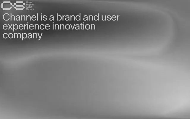
Preview image. Unlock full-res
Stark intellectual minimalism.
Color palette
Highlighted headings, selected project titles, active links — signals importance and draws attention against the dark canvas
Page backgrounds, large dark surfaces
Neutral form states, badge text, and quiet UI feedback where color should stay understated. Do not promote it to the primary CTA color
Muted text, subtle borders
Typography
- Weights
- 400
- Sizes
- 13px, 15px, 16px, 18px, 45px, 75px
- Line height
- 0.9, 0.95, 1.19, 1.2
- Letter spacing
- -0.0300em at large sizes (45px, 75px), -0.0200em at smaller text sizes
- Fallback
- Inter
Primary typeface for all text elements. The singular weight (400) creates a consistent, deliberate tone, relying on size for hierarchy. The tight letter spacing for display text maintains visual density and impact.
Spacing & shape
Components
Text in Ghost Gray (#cacaca), with tight negative letter spacing on larger link sizes. No background or padding. Interactivity is conveyed by changing to Vanguard Red (#ff7777) on hover/active states. Uses 0px border-radius and 0px padding.
Transparent background (rgba(0, 0, 0, 0)), 0px border-radius, no box-shadow, and 0px padding. This component is essentially a content wrapper without its own distinct visual surface.
Transparent background (rgba(0, 0, 0, 0)), text color in Ghost Gray (#cacaca), and a 1px bottom border in Ghost Gray (#cacaca). No padding or border-radius, maintaining a sharp, minimalistic aesthetic.
Lausanne font at a large size (e.g., 75px) with 400 weight, color in Vanguard Red (#ff7777), and significantly tight letter-spacing (-0.0300em). This provides a sharp visual accent and clear content hierarchy.
Guidelines
- Prioritize stark visual clarity by using Midnight Void (#000000) for all backgrounds to establish a consistent dark theme.
- Use Ghost Gray (#cacaca) for all primary text and critical interface elements to ensure readability against dark backgrounds.
- Apply Vanguard Red (#ff7777) sparingly and intentionally for headings, active states, and crucial interactive elements to create focal points.
- Maintain a tight, composed typographic aesthetic with Lausanne (or Inter) at weight 400 across all text, varying size for hierarchy.
- Implement negative letter-spacing for large headlines and display text elements (up to -0.0300em) to enhance visual density and impact.
- Emphasize content through spacious vertical separation between sections, using a base section gap of 40px.
- Utilize 0px border-radius for all elements, including cards and inputs, to reinforce the sharp, precise design language.
- Avoid using saturated colors other than Vanguard Red (#ff7777) for UI elements; maintain a near-achromatic palette otherwise.
- Do not introduce decorative borders or shadows on cards or containers; they should blend seamlessly with the background.
- Refrain from using varied font weights; Lausanne (400) is the sole weight to ensure typographic consistency.
- Do not add internal padding to cards; they should act as zero-padding content wrappers.
- Avoid using curved elements or soft shapes; the design language relies on straight lines and sharp angles.
- Do not use generic system fonts or introduce additional font families; Lausanne (or Inter) is the only approved typeface.
- Do not use wide letter-spacing; all text should be either normal or tightly tracked.
About this system
ShowHide
Channel Studio embraces a dark, conceptual aesthetic where form follows function with minimalist precision. Visual weight is carried by large, unadorned typography and selective use of subtle gradients and textures on otherwise stark backgrounds. The brand accent is a vivid red, reserved for highlighting interactive elements and key headings. The overall impression is one of stark, intellectual clarity, prioritizing content legibility within a controlled, sophisticated environment.
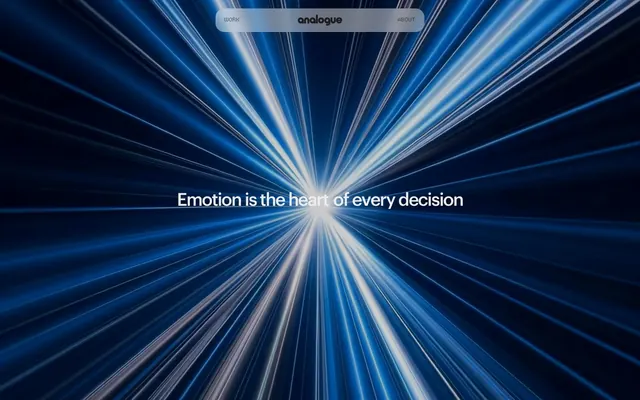
The page uses a full-bleed layout with content primarily aligned to the left, but effectively contained within a wide, implied max-width. The hero section is full-bleed with a background abstract gradient and centered large text. Subsequent sections alternate between large, impactful typography on a black background and visual showcases with full-width abstract renders or product shots. Content arrangement often features large headlines followed by supporting text or visuals, with a clear vertical rhythm. There's an absence of traditional grids for features, instead relying on prominent, stacked elements and fluid text-image combinations. Navigation is minimal, consisting of a top-left logo and ghost links, which become sticky on scroll. The overall density feels open, allowing key content to breathe.
The site predominantly uses abstract, textural imagery and product-focused 3D renders with a monochromatic or desaturated color palette. Photography of physical artwork/sculptures is presented full-bleed with highly reflective surfaces, creating a dynamic yet contained visual. Icons are minimal, outlined, and monochromatic, primarily serving functional rather than decorative roles. Imagery density varies; the hero section uses a large, full-bleed abstract graphic, while project showcases feature prominent, detailed visuals. The overall role of imagery is to evoke a conceptual, high-tech, and artistic atmosphere, supporting the brand's identity as an innovation company.
Reminiscent of B-Reel, Huge Inc., Ueno (now Mailchimp Presents), Basic/Dept.
# Channel Studio — Style Reference
> Stark intellectual minimalism.

**Theme:** dark

**Site:** https://channel.studio

Channel Studio embraces a dark, conceptual aesthetic where form follows function with minimalist precision. Visual weight is carried by large, unadorned typography and selective use of subtle gradients and textures on otherwise stark backgrounds. The brand accent is a vivid red, reserved for highlighting interactive elements and key headings. The overall impression is one of stark, intellectual clarity, prioritizing content legibility within a controlled, sophisticated environment.

## Tokens — Colors

| Name | Value | Token | Role |
|------|------|------|------|
| Vanguard Red | `#ff7777` | `--color-vanguard-red` | Highlighted headings, selected project titles, active links — signals importance and draws attention against the dark canvas |
| Midnight Void | `#000000` | `--color-midnight-void` | Page backgrounds, large dark surfaces |
| Ghost Gray | `#cacaca` | `--color-ghost-gray` | Neutral form states, badge text, and quiet UI feedback where color should stay understated. Do not promote it to the primary CTA color |
| Faded Stone | `#727272` | `--color-faded-stone` | Muted text, subtle borders |

## Tokens — Typography

### Lausanne
- **Substitute:** Inter
- **Weights:** 400
- **Sizes:** 13px, 15px, 16px, 18px, 45px, 75px
- **Line height:** 0.9, 0.95, 1.19, 1.2
- **Letter spacing:** -0.0300em at large sizes (45px, 75px), -0.0200em at smaller text sizes
- **Role:** Primary typeface for all text elements. The singular weight (400) creates a consistent, deliberate tone, relying on size for hierarchy. The tight letter spacing for display text maintains visual density and impact.

## Tokens — Type Scale

| Role | Size | Line height | Letter spacing |
|------|------|------|------|
| caption | 13px | 1.19 | — |
| body-sm | 15px | 1.2 | — |
| subheading | 18px | 1.2 | — |
| heading | 45px | 0.95 | -0.03em |
| display | 75px | 0.9 | -0.03em |

## Tokens — Spacing

- **Section gap:** 40px
- **Card padding:** 0px
- **Element gap:** 10px

## Tokens — Radius

- **none:** 0px

## Layout

The page uses a full-bleed layout with content primarily aligned to the left, but effectively contained within a wide, implied max-width. The hero section is full-bleed with a background abstract gradient and centered large text. Subsequent sections alternate between large, impactful typography on a black background and visual showcases with full-width abstract renders or product shots. Content arrangement often features large headlines followed by supporting text or visuals, with a clear vertical rhythm. There's an absence of traditional grids for features, instead relying on prominent, stacked elements and fluid text-image combinations. Navigation is minimal, consisting of a top-left logo and ghost links, which become sticky on scroll. The overall density feels open, allowing key content to breathe.

## Imagery

The site predominantly uses abstract, textural imagery and product-focused 3D renders with a monochromatic or desaturated color palette. Photography of physical artwork/sculptures is presented full-bleed with highly reflective surfaces, creating a dynamic yet contained visual. Icons are minimal, outlined, and monochromatic, primarily serving functional rather than decorative roles. Imagery density varies; the hero section uses a large, full-bleed abstract graphic, while project showcases feature prominent, detailed visuals. The overall role of imagery is to evoke a conceptual, high-tech, and artistic atmosphere, supporting the brand's identity as an innovation company.

## Components

### Ghost Navigation Link
*Primary navigation links and interactive textual elements.*

Text in Ghost Gray (#cacaca), with tight negative letter spacing on larger link sizes. No background or padding. Interactivity is conveyed by changing to Vanguard Red (#ff7777) on hover/active states. Uses 0px border-radius and 0px padding.

### Zero-Padding Card
*Content containers that use the background as their surface.*

Transparent background (rgba(0, 0, 0, 0)), 0px border-radius, no box-shadow, and 0px padding. This component is essentially a content wrapper without its own distinct visual surface.

### Underlined Input Field
*Input fields for data entry.*

Transparent background (rgba(0, 0, 0, 0)), text color in Ghost Gray (#cacaca), and a 1px bottom border in Ghost Gray (#cacaca). No padding or border-radius, maintaining a sharp, minimalistic aesthetic.

### Highlighted Project Title
*Prominent headings for project names or content sections.*

Lausanne font at a large size (e.g., 75px) with 400 weight, color in Vanguard Red (#ff7777), and significantly tight letter-spacing (-0.0300em). This provides a sharp visual accent and clear content hierarchy.

## Guidelines

### Do

- Prioritize stark visual clarity by using Midnight Void (#000000) for all backgrounds to establish a consistent dark theme.
- Use Ghost Gray (#cacaca) for all primary text and critical interface elements to ensure readability against dark backgrounds.
- Apply Vanguard Red (#ff7777) sparingly and intentionally for headings, active states, and crucial interactive elements to create focal points.
- Maintain a tight, composed typographic aesthetic with Lausanne (or Inter) at weight 400 across all text, varying size for hierarchy.
- Implement negative letter-spacing for large headlines and display text elements (up to -0.0300em) to enhance visual density and impact.
- Emphasize content through spacious vertical separation between sections, using a base section gap of 40px.
- Utilize 0px border-radius for all elements, including cards and inputs, to reinforce the sharp, precise design language.

### Don't

- Avoid using saturated colors other than Vanguard Red (#ff7777) for UI elements; maintain a near-achromatic palette otherwise.
- Do not introduce decorative borders or shadows on cards or containers; they should blend seamlessly with the background.
- Refrain from using varied font weights; Lausanne (400) is the sole weight to ensure typographic consistency.
- Do not add internal padding to cards; they should act as zero-padding content wrappers.
- Avoid using curved elements or soft shapes; the design language relies on straight lines and sharp angles.
- Do not use generic system fonts or introduce additional font families; Lausanne (or Inter) is the only approved typeface.
- Do not use wide letter-spacing; all text should be either normal or tightly tracked.

## Agent Prompt Guide

Quick Color Reference:
text: #cacaca
background: #000000
border: #cacaca
accent: #ff7777
primary action: no distinct CTA color

Example Component Prompts:
1. Create a hero section with 'A New Era of Design' as the headline: background Midnight Void (#000000) with a subtle abstract gradient overlay. Headline text Lausanne 75px weight 400, Ghost Gray (#cacaca), letter-spacing -0.0300em, lineHeight 0.9. Subtext Lausanne 18px weight 400, Faded Stone (#727272), lineHeight 1.2.
2. Design an interactive project listing entry for 'Quantum Interfaces': Text 'Quantum Interfaces' as a Highlighted Project Title, Lausanne 45px weight 400, Vanguard Red (#ff7777), letter-spacing -0.0300em, lineHeight 0.95. Below it, a 'See Project →' Ghost Navigation Link, Lausanne 15px weight 400, Ghost Gray (#cacaca), lineHeight 1.2. The entire entry uses 0px padding and sits on a Midnight Void (#000000) background.
3. Implement a newsletter signup input field: Input field with transparent background, text color in Ghost Gray (#cacaca), a 1px bottom border in Ghost Gray (#cacaca), 0px padding and 0px border-radius. Placeholder text, e.g., 'Your Email Address', in Faded Stone (#727272). A 'Sign Up' button as a Ghost Navigation Link, Lausanne 15px weight 400, Ghost Gray (#cacaca), lineHeight 1.2. The input and button should be separated by an element gap of 10px.
More like this





Keep what you find
A free account saves references to boards and can send you a weekly email of picks based on what you save.
To see every result, go Pro.