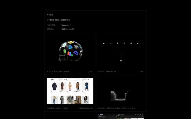
Preview image. Unlock full-res
midnight command center
Color palette
Page background, surface backgrounds, UI borders
Decorative borders for content cards and subtle accents
Primary text for headings, body, and links — provides strong contrast against Deep Space
Secondary text, metadata, and subtle helper text, reducing visual hierarchy slightly
Typography
- Weights
- 400, 600
- Sizes
- 11px, 14px, 16px
- Line height
- 1.43, 1.5
- Letter spacing
- normal
- Fallback
- IBM Plex Mono
The sole typeface, used across all elements from headings to body text and links. Its monospace nature reinforces the technical, code-centric aesthetic, with weight 600 providing subtle emphasis for titles without breaking the overall utilitarian feel.
Spacing & shape
Components
A square or rectangular block with a 1px Cloud Gray border, containing an image or embedding. Text content uses Digital Silver. Background is Deep Space, with no padding or radius given the border is the primary visual separation. No discernible internal padding in the data so padding is 0.
Text in Digital Silver (#d4d4d4) on a transparent background. Features a 1px Cloud Gray (#e5e7eb) border on hover or focus, defining interaction without a filled background. Border radius is 0px.
Set in Commit Mono, Muted Ash (#737373) color, typically at 14px size. Used to provide secondary information without competing with primary content.
Guidelines
- Use Deep Space (#171717) as the primary background for all surfaces and page canvas.
- Typography should exclusively use Commit Mono to maintain the consistent code-centric aesthetic, with weight 600 for subtle emphasis and 400 for all other body text.
- Render all borders, including those for interactive states and content cards, as 1px solid lines using Cloud Gray (#e5e7eb).
- Maintain a stark, no-radius aesthetic with all corners sharp at 0px radius for all components and containers.
- Employ Digital Silver (#d4d4d4) for all primary text content to ensure high contrast against the dark background.
- Utilize Muted Ash (#737373) for secondary text and metadata to create subtle hierarchy without introducing additional colors.
- Structure content with an 80px vertical section gap for clear separation between major content blocks.
- Do not introduce any saturated colors for UI elements; color should be restricted to imagery or embedded content only.
- Avoid using any form of box-shadow or elevation as the design relies on flat, border-defined separation.
- Do not apply radius to any interactive elements, cards, or containers; all corners must be sharp 0px.
- Refrain from using prominent filled buttons or primary actions; all interactive elements should be styled as text links or ghost buttons.
- Do not deviate from the monochrome palette by introducing any chromatic text colors or background tints.
- Avoid decorative gradients or background patterns; surfaces should remain solid Deep Space (#171717).
About this system
ShowHide
Verse employs a stark, high-contrast dark mode aesthetic, reminiscent of a terminal interface or a hacker's workbench. The visual system is built on a foundation of pure black with minimal use of grays, allowing code-like typography and crisp borders to define the structure. Interactive elements are subtle, relying on text color changes and thin border lines rather than prominent fills. The overall impression is one of focused utility and technical precision, avoiding decorative flourishes.
The page uses a full-bleed black background from edge to edge. The main content is vertically stacked in a centered column, appearing as discrete blocks. The hero section features a centered headline and description. Subsequent sections are grid-based, primarily a 2-column or 3-column masonry-like grid for project showcases, with content cells having a 1px Cloud Gray border. Vertical rhythm is established by an 80px gap between these main content sections. Navigation is minimal, consisting of simple text links in the header area.
The site primarily uses product screenshots and embedded visual content to showcase work, rather than distinct branding imagery. When present, images maintain their original aspect ratios and coloring, embedded within card-like structures. There are no consistent icon styles or illustrative elements; visuals are content-driven, serving as direct examples of projects.
Reminiscent of Are.na, Brutalist Websites, Command Line Interfaces, Linear.
# Verse — Style Reference
> midnight command center

**Theme:** dark

**Site:** https://www.verse.sh

Verse employs a stark, high-contrast dark mode aesthetic, reminiscent of a terminal interface or a hacker's workbench. The visual system is built on a foundation of pure black with minimal use of grays, allowing code-like typography and crisp borders to define the structure. Interactive elements are subtle, relying on text color changes and thin border lines rather than prominent fills. The overall impression is one of focused utility and technical precision, avoiding decorative flourishes.

## Tokens — Colors

| Name | Value | Token | Role |
|------|------|------|------|
| Deep Space | `#171717` | `--color-deep-space` | Page background, surface backgrounds, UI borders |
| Cloud Gray | `#e5e7eb` | `--color-cloud-gray` | Decorative borders for content cards and subtle accents |
| Digital Silver | `#d4d4d4` | `--color-digital-silver` | Primary text for headings, body, and links — provides strong contrast against Deep Space |
| Muted Ash | `#737373` | `--color-muted-ash` | Secondary text, metadata, and subtle helper text, reducing visual hierarchy slightly |

## Tokens — Typography

### Commit Mono
- **Substitute:** IBM Plex Mono
- **Weights:** 400, 600
- **Sizes:** 11px, 14px, 16px
- **Line height:** 1.43, 1.5
- **Letter spacing:** normal
- **Role:** The sole typeface, used across all elements from headings to body text and links. Its monospace nature reinforces the technical, code-centric aesthetic, with weight 600 providing subtle emphasis for titles without breaking the overall utilitarian feel.

## Tokens — Type Scale

Minor Third (1.2) from 16px base.

| Role | Size | Line height | Letter spacing |
|------|------|------|------|
| caption | 11px | 1.5 | — |
| body-sm | 14px | 1.5 | — |
| body | 16px | 1.5 | — |

## Tokens — Spacing

- **Section gap:** 80px
- **Card padding:** 16px
- **Element gap:** 16px

## Tokens — Radius

- **Buttons:** 0px
- **Cards:** 0px

## Layout

The page uses a full-bleed black background from edge to edge. The main content is vertically stacked in a centered column, appearing as discrete blocks. The hero section features a centered headline and description. Subsequent sections are grid-based, primarily a 2-column or 3-column masonry-like grid for project showcases, with content cells having a 1px Cloud Gray border. Vertical rhythm is established by an 80px gap between these main content sections. Navigation is minimal, consisting of simple text links in the header area.

## Imagery

The site primarily uses product screenshots and embedded visual content to showcase work, rather than distinct branding imagery. When present, images maintain their original aspect ratios and coloring, embedded within card-like structures. There are no consistent icon styles or illustrative elements; visuals are content-driven, serving as direct examples of projects.

## Components

### Project Card
*Displays individual project entries with an image, title, and link.*

A square or rectangular block with a 1px Cloud Gray border, containing an image or embedding. Text content uses Digital Silver. Background is Deep Space, with no padding or radius given the border is the primary visual separation. No discernible internal padding in the data so padding is 0.

### Ghost Button
*Interactive text or link, appearing within content blocks.*

Text in Digital Silver (#d4d4d4) on a transparent background. Features a 1px Cloud Gray (#e5e7eb) border on hover or focus, defining interaction without a filled background. Border radius is 0px.

### Metadata Text
*Used for descriptive text like 'Twitter:' or project technologies.*

Set in Commit Mono, Muted Ash (#737373) color, typically at 14px size. Used to provide secondary information without competing with primary content.

## Guidelines

### Do

- Use Deep Space (#171717) as the primary background for all surfaces and page canvas.
- Typography should exclusively use Commit Mono to maintain the consistent code-centric aesthetic, with weight 600 for subtle emphasis and 400 for all other body text.
- Render all borders, including those for interactive states and content cards, as 1px solid lines using Cloud Gray (#e5e7eb).
- Maintain a stark, no-radius aesthetic with all corners sharp at 0px radius for all components and containers.
- Employ Digital Silver (#d4d4d4) for all primary text content to ensure high contrast against the dark background.
- Utilize Muted Ash (#737373) for secondary text and metadata to create subtle hierarchy without introducing additional colors.
- Structure content with an 80px vertical section gap for clear separation between major content blocks.

### Don't

- Do not introduce any saturated colors for UI elements; color should be restricted to imagery or embedded content only.
- Avoid using any form of box-shadow or elevation as the design relies on flat, border-defined separation.
- Do not apply radius to any interactive elements, cards, or containers; all corners must be sharp 0px.
- Refrain from using prominent filled buttons or primary actions; all interactive elements should be styled as text links or ghost buttons.
- Do not deviate from the monochrome palette by introducing any chromatic text colors or background tints.
- Avoid decorative gradients or background patterns; surfaces should remain solid Deep Space (#171717).

## Agent Prompt Guide

**Quick Color Reference:**
text: #d4d4d4
background: #171717
border: #e5e7eb
accent: no distinct accent color
primary action: no distinct CTA color

**Example Component Prompts:**
1. Create a heading section: Centered text using Commit Mono weight 600, 16px, #d4d4d4, line-height 1.5. Subtext below it using Commit Mono weight 400, 14px, #737373, line-height 1.43, with an 80px bottom margin.
2. Create a Project Card component: 1px #e5e7eb border. Background #171717. No padding inside the card. Content title below the image should be Commit Mono weight 400, 14px, #d4d4d4. Links within the card in Commit Mono weight 400, 11px, #d4d4d4.
3. Create a Ghost Link: Text in Commit Mono weight 400, 14px, #d4d4d4, on a transparent background. When hovered or focused, show a 1px #e5e7eb border around the text area. No padding, no radius.
More like this





Keep what you find
A free account saves references to boards and can send you a weekly email of picks based on what you save.
To see every result, go Pro.