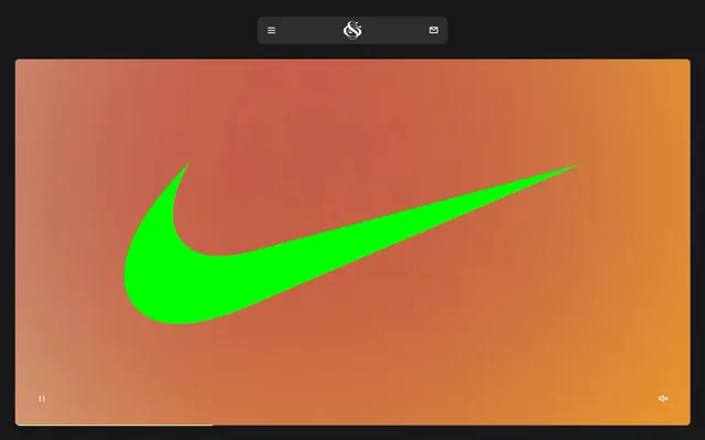
Preview image. Unlock full-res
Midnight Grid, Sharp Light
Color palette
Primary background, header background, modal backdrop — forms the dark canvas of the UI
Secondary surface background for cards, buttons, and elevated panels — provides slight visual separation from the canvas
Primary text, prominent headings, key icons, button text, and active states — delivers high-contrast readability against dark backgrounds
Secondary text, helper text, and subtle borders — offers a softer contrast for less critical information
Subtle borders and text for specific elements, often when reversed from Pure White elements
Typography
- Weights
- 400, 700
- Sizes
- 10px, 15px, 16px, 80px
- Line height
- 1, 1.15, 1.2
- Letter spacing
- normal
- Fallback
- Helvetica Neue
Dominant typeface for all headings, navigation, and most body text. Its sharp, custom character defines the brand's direct and impactful voice.
- Weights
- 400
- Sizes
- 13px
- Line height
- 1.2
- Letter spacing
- normal
- Fallback
- Arial
Used for specific functional elements like subtle button labels or minor navigation items, providing a standard, legible counterpoint to GreedStandard.
Spacing & shape
Components
backgroundColor: #2e2e30, color: #ffffff, borderRadius: 12px, padding: 8px 16px, border: 1px solid transparent
backgroundColor: rgba(0,0,0,0), color: #ffffff, border: 1px solid #ffffff, borderRadius: 0px, padding: 1px 6px
backgroundColor: rgba(0,0,0,0), color: #000000, border: 1px solid #000000, borderRadius: 0px, padding: 0px 0px
backgroundColor: rgba(0,0,0,0), borderRadius: 0px, boxShadow: none, padding: 6px
backgroundColor: rgba(0,0,0,0), borderRadius: 9px, boxShadow: none, padding: 0px
backgroundColor: #2e2e30, borderRadius: 12px, boxShadow: none, padding: 0px
backgroundColor: transparent, color: #ffffff, padding: 8px 12px, borderRadius: 9999px (pill-shaped)
Guidelines
- Prioritize GreedStandard 700 for all marketing headlines; for sub-headings and body use 400 for contrast. Sizes from the typeScale.
- Use Midnight Charcoal #18181b as the primary page background for all sections unless a distinct surface is needed.
- Apply Pure White #ffffff for all primary text elements to maintain high contrast with dark backgrounds.
- Utilize Slate Surface #2e2e30 for all interactive elements like buttons and card backgrounds requiring a slight elevation.
- Maintain a compact information density with primary vertical spacing between sections at 120px, and horizontal element spacing around 10px.
- Apply a 12px border-radius consistently to all interactive elements, cards, and primary containers.
- Employ the Expressive motion profile with 0.5s ease transitions for general interactive states like hover and active to ensure a fluid user experience.
- Avoid using excessive color; restrict chromatic colors to functional accents or specific branding elements where explicitly defined.
- Do not introduce drop shadows; the design relies on flat surface changes and borders for depth.
- Steer clear of large, flowing blocks of body text; break text into smaller, impactful chunks matching the bold typographic style.
- Do not use generic system fonts for branding or primary content areas; GreedStandard is essential for brand identity.
- Avoid overly spacious layouts; the system prefers a compact, dense arrangement, conveying efficiency and directness.
- Do not use arbitrary border-radii; adhere strictly to the defined radii such as 12px for cards and buttons, and 9999px for pill-shaped elements.
- Never use light backgrounds for main content sections; the site is exclusively dark-themed.
About this system
ShowHide
Studio Gruhl presents a stark, high-contrast dark mode aesthetic, emphasizing brand identity through bold, monochrome typography that commands attention. The design system leverages a powerful interplay of deep charcoal and pure white, with minimal use of color reserved for impactful brand moments or subtle interaction cues. Components are compact, sharply defined, and prioritize information density over expansive whitespace, creating a direct and confident user experience. Underlying this is an expressive motion language that adds a dynamic, almost kinetic, fluidity to interactions.
The page model is full-bleed, with content often spanning the entire viewport width, creating an immersive experience. The hero sections boldly present headlines or key visuals, sometimes centered over a background, maintaining a high-impact, direct communication. Section rhythm is driven by sharp transitions between content blocks, often defined by distinct background color changes or large text elements, creating a strong vertical flow without explicit dividers. Content arranges in layered or large-block compositions, prioritizing bold statements. While specific grid usage is not consistently evident across all content, there is a clear emphasis on large, singular visual statements. The navigation is a sticky top bar, minimal and discreet, often appearing as a floating overlay at the top of the viewport.
The visual language is characterized by bold, graphic elements, often abstract or symbolic as seen with the Nike swoosh example. Photography appears to be minimal, focusing on product branding or specific design work tightly integrated into the UI. Icons are simple, outlined, and monochromatic, aligning with the overall stark aesthetic. Imagery serves primarily to showcase project work or provide decorative atmosphere rather than product-focused or lifestyle content. The imagery is secondary to the typographic and color interplay, keeping a text-dominant density.
Reminiscent of AIGA, Pentagram, Future Fonts, Büro Sgu.
# Studio Gruhl — Style Reference
> Midnight Grid, Sharp Light

**Theme:** dark

**Site:** https://www.studiogruhl.com

Studio Gruhl presents a stark, high-contrast dark mode aesthetic, emphasizing brand identity through bold, monochrome typography that commands attention. The design system leverages a powerful interplay of deep charcoal and pure white, with minimal use of color reserved for impactful brand moments or subtle interaction cues. Components are compact, sharply defined, and prioritize information density over expansive whitespace, creating a direct and confident user experience. Underlying this is an expressive motion language that adds a dynamic, almost kinetic, fluidity to interactions.

## Tokens — Colors

| Name | Value | Token | Role |
|------|------|------|------|
| Midnight Charcoal | `#18181b` | `--color-midnight-charcoal` | Primary background, header background, modal backdrop — forms the dark canvas of the UI |
| Slate Surface | `#2e2e30` | `--color-slate-surface` | Secondary surface background for cards, buttons, and elevated panels — provides slight visual separation from the canvas |
| Pure White | `#ffffff` | `--color-pure-white` | Primary text, prominent headings, key icons, button text, and active states — delivers high-contrast readability against dark backgrounds |
| Muted Gray | `#969696` | `--color-muted-gray` | Secondary text, helper text, and subtle borders — offers a softer contrast for less critical information |
| Shadow Ink | `#000000` | `--color-shadow-ink` | Subtle borders and text for specific elements, often when reversed from Pure White elements |

## Tokens — Typography

### GreedStandard
- **Substitute:** Helvetica Neue
- **Weights:** 400, 700
- **Sizes:** 10px, 15px, 16px, 80px
- **Line height:** 1, 1.15, 1.2
- **Letter spacing:** normal
- **Role:** Dominant typeface for all headings, navigation, and most body text. Its sharp, custom character defines the brand's direct and impactful voice.

### Arial
- **Substitute:** Arial
- **Weights:** 400
- **Sizes:** 13px
- **Line height:** 1.2
- **Letter spacing:** normal
- **Role:** Used for specific functional elements like subtle button labels or minor navigation items, providing a standard, legible counterpoint to GreedStandard.

## Tokens — Type Scale

| Role | Size | Line height | Letter spacing |
|------|------|------|------|
| caption | 10px | 1.15 | — |
| body-lg | 16px | 1.2 | — |
| display | 80px | 1 | — |

## Tokens — Spacing

- **Section gap:** 120px
- **Card padding:** 16px
- **Element gap:** 10px

## Tokens — Radius

- **General:** 12px
- **Buttons:** 12px
- **Cards:** 9px
- **navItems:** 9999px

## Layout

The page model is full-bleed, with content often spanning the entire viewport width, creating an immersive experience. The hero sections boldly present headlines or key visuals, sometimes centered over a background, maintaining a high-impact, direct communication. Section rhythm is driven by sharp transitions between content blocks, often defined by distinct background color changes or large text elements, creating a strong vertical flow without explicit dividers. Content arranges in layered or large-block compositions, prioritizing bold statements. While specific grid usage is not consistently evident across all content, there is a clear emphasis on large, singular visual statements. The navigation is a sticky top bar, minimal and discreet, often appearing as a floating overlay at the top of the viewport.

## Imagery

The visual language is characterized by bold, graphic elements, often abstract or symbolic as seen with the Nike swoosh example. Photography appears to be minimal, focusing on product branding or specific design work tightly integrated into the UI. Icons are simple, outlined, and monochromatic, aligning with the overall stark aesthetic. Imagery serves primarily to showcase project work or provide decorative atmosphere rather than product-focused or lifestyle content. The imagery is secondary to the typographic and color interplay, keeping a text-dominant density.

## Components

### Primary Filled Button
*Main call-to-action button, dark background with white text.*

backgroundColor: #2e2e30, color: #ffffff, borderRadius: 12px, padding: 8px 16px, border: 1px solid transparent

### Outlined Text Button
*Secondary action button, white text with a white border, no background fill.*

backgroundColor: rgba(0,0,0,0), color: #ffffff, border: 1px solid #ffffff, borderRadius: 0px, padding: 1px 6px

### Naked Text Button
*Minimalist button for pure textual actions, text only.*

backgroundColor: rgba(0,0,0,0), color: #000000, border: 1px solid #000000, borderRadius: 0px, padding: 0px 0px

### Transparent Project Card
*Card for displaying project previews without a distinct background, relying on content for definition.*

backgroundColor: rgba(0,0,0,0), borderRadius: 0px, boxShadow: none, padding: 6px

### Rounded Project Card
*Card for project previews with a subtle rounded corner, no distinct background.*

backgroundColor: rgba(0,0,0,0), borderRadius: 9px, boxShadow: none, padding: 0px

### Slate Project Highlight Card
*Card for featuring key projects or information, using the Slate Surface background.*

backgroundColor: #2e2e30, borderRadius: 12px, boxShadow: none, padding: 0px

### Header Navigation Item
*Primary navigation links with a clean, rounded focus style.*

backgroundColor: transparent, color: #ffffff, padding: 8px 12px, borderRadius: 9999px (pill-shaped)

## Guidelines

### Do

- Prioritize GreedStandard 700 for all marketing headlines; for sub-headings and body use 400 for contrast. Sizes from the typeScale.
- Use Midnight Charcoal #18181b as the primary page background for all sections unless a distinct surface is needed.
- Apply Pure White #ffffff for all primary text elements to maintain high contrast with dark backgrounds.
- Utilize Slate Surface #2e2e30 for all interactive elements like buttons and card backgrounds requiring a slight elevation.
- Maintain a compact information density with primary vertical spacing between sections at 120px, and horizontal element spacing around 10px.
- Apply a 12px border-radius consistently to all interactive elements, cards, and primary containers.
- Employ the Expressive motion profile with 0.5s ease transitions for general interactive states like hover and active to ensure a fluid user experience.

### Don't

- Avoid using excessive color; restrict chromatic colors to functional accents or specific branding elements where explicitly defined.
- Do not introduce drop shadows; the design relies on flat surface changes and borders for depth.
- Steer clear of large, flowing blocks of body text; break text into smaller, impactful chunks matching the bold typographic style.
- Do not use generic system fonts for branding or primary content areas; GreedStandard is essential for brand identity.
- Avoid overly spacious layouts; the system prefers a compact, dense arrangement, conveying efficiency and directness.
- Do not use arbitrary border-radii; adhere strictly to the defined radii such as 12px for cards and buttons, and 9999px for pill-shaped elements.
- Never use light backgrounds for main content sections; the site is exclusively dark-themed.

## Agent Prompt Guide

Quick Color Reference:
text: #ffffff
background: #18181b
border: #ffffff
accent: no distinct accent color
primary action: #2e2e30 (filled action)

Example Component Prompts:
Create a hero section: background #18181b. Headline 'DESIGN MORE.' in GreedStandard 80px 700, #ffffff. Below, a Primary Filled Button 'More About Us' in #2e2e30 background, #ffffff text, 12px border-radius, 8px 16px padding.
Create a project listing card: background rgba(0,0,0,0), 0px border-radius, 6px padding. Title 'PERFORMULA' in GreedStandard 16px 700, #ffffff. Subtitle 'A new brand design system for the nutrition start-up.' in GreedStandard 15px 400, #ffffff. Include a forward arrow icon in #ffffff.
Create a header navigation bar: background #18181b. Left-aligned menu icon and right-aligned icons in #ffffff. Navigation links like 'Projects' using GreedStandard 16px 700, #ffffff, with a 9999px border-radius on hover.
More like this





Keep what you find
A free account saves references to boards and can send you a weekly email of picks based on what you save.
To see every result, go Pro.