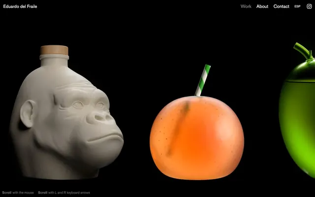
Preview image. Unlock full-res
Gallery Black Canvas
Color palette
Page background, primary canvas, content backdrop, providing infinite depth for product photography
Hairline borders, dividers, input outlines, and card edges on light surfaces. Do not promote it to the primary CTA color
Secondary text, helper messages, less prominent links — a softer, less assertive contrast than Ghost White
Typography
- Weights
- 400, 700
- Sizes
- 14px, 15px, 20px, 21px
- Line height
- 1.3
- Letter spacing
- normal
- Fallback
- Inter
The primary typeface for all textual content, including navigation and body text. Its clean, sans-serif lines support legibility without distracting from the visual content.
Spacing & shape
Components
Ghost White text at 15px, AkzidenzGrotesk weight 400. Borders are only present on interaction.
Eduardo del Fraile text at 15px, AkzidenzGrotesk weight 700, Ghost White color.
Muted Gray text at 14px, AkzidenzGrotesk weight 400. Used for footer instructions.
Guidelines
- Use Void Black (#000000) as the universal page background to provide a consistent dark canvas.
- Utilize Ghost White (#ffffff) for all primary text and interactive elements to ensure high contrast and highlight focus.
- Reserve Muted Gray (#888888) for secondary information or less prominent interactive elements.
- Employ AkzidenzGrotesk (or substitute Inter) for all typography, maintaining a consistent sans-serif aesthetic.
- Apply AkzidenzGrotesk weight 700 for brand names and critical headings, and weight 400 for body and navigation text.
- Maintain a default line height of 1.30 across all text sizes for optimal legibility within dense content blocks.
- Implement 10px padding around primary content blocks within elements and 20px for vertical spacing between sections.
- Avoid the use of any chromatic colors in the UI layer; colors should be reserved for content (product photography) only.
- Do not introduce gradients or heavy shadows on UI elements; maintain a flat, minimalist interface aesthetic.
- Refrain from using any borders or backgrounds on navigation links unless specifically for an active or hover state.
- Avoid crowded layouts; prioritize negative space around focal content to enhance its impact.
- Do not use generic system fonts; AkzidenzGrotesk (or its substitute) must be consistently applied.
- Never use text smaller than 14px or larger than 21px for UI elements to maintain visual rhythm.
About this system
ShowHide
Eduardo del Fraile's visual identity is a high-contrast, minimalist showcase of striking product photography. Against a deep, expansive black canvas, content is primarily visual, featuring starkly lit objects. Typographic elements are understated, monochrome, and serve purely functional navigation or descriptive roles. The design prioritizes the visual impact of the work itself, with the UI receding into the background.
The page uses a full-bleed, dark canvas model. The hero section features large-scale product imagery spanning the width of the viewport. Content then flows vertically with a consistent spacing, showcasing individual projects via immersive visuals. The overall layout is centered and horizontal, giving each product equal visual weight. Navigation is a minimal top-right header, disappearing into the background, with the brand name on the top-left.
The site primarily features product photography and 3D renders. Images are treated as hero content, often against the deep black background, showcasing objects in stark, high-contrast lighting. The focus is on the object itself, often with a raw or sculptural quality, without lifestyle context. Imagery is full-bleed or large-scale, dominating the visual space, serving a product showcase and decorative atmosphere role. No specific icon style is discernable beyond a simple Instagram icon.
Reminiscent of AIGA Design Archives, Pentagram, The Brand Identity, Apple's product pages (for specific products).
# Eduardo del Fraile — Style Reference
> Gallery Black Canvas

**Theme:** dark

**Site:** https://www.eduardodelfraile.com

Eduardo del Fraile's visual identity is a high-contrast, minimalist showcase of striking product photography. Against a deep, expansive black canvas, content is primarily visual, featuring starkly lit objects. Typographic elements are understated, monochrome, and serve purely functional navigation or descriptive roles. The design prioritizes the visual impact of the work itself, with the UI receding into the background.

## Tokens — Colors

| Name | Value | Token | Role |
|------|------|------|------|
| Void Black | `#000000` | `--color-void-black` | Page background, primary canvas, content backdrop, providing infinite depth for product photography |
| Ghost White | `#ffffff` | `--color-ghost-white` | Hairline borders, dividers, input outlines, and card edges on light surfaces. Do not promote it to the primary CTA color |
| Muted Gray | `#888888` | `--color-muted-gray` | Secondary text, helper messages, less prominent links — a softer, less assertive contrast than Ghost White |

## Tokens — Typography

### AkzidenzGrotesk
- **Substitute:** Inter
- **Weights:** 400, 700
- **Sizes:** 14px, 15px, 20px, 21px
- **Line height:** 1.3
- **Letter spacing:** normal
- **Role:** The primary typeface for all textual content, including navigation and body text. Its clean, sans-serif lines support legibility without distracting from the visual content.

## Tokens — Type Scale

Major Second (1.125) from 20px base.

| Role | Size | Line height | Letter spacing |
|------|------|------|------|
| caption | 14px | 1.3 | — |
| body-sm | 15px | 1.3 | — |
| body | 20px | 1.3 | — |
| body-lg | 21px | 1.3 | — |

## Tokens — Spacing

- **Section gap:** 20px
- **Card padding:** 15px
- **Element gap:** 10px

## Layout

The page uses a full-bleed, dark canvas model. The hero section features large-scale product imagery spanning the width of the viewport. Content then flows vertically with a consistent spacing, showcasing individual projects via immersive visuals. The overall layout is centered and horizontal, giving each product equal visual weight. Navigation is a minimal top-right header, disappearing into the background, with the brand name on the top-left.

## Imagery

The site primarily features product photography and 3D renders. Images are treated as hero content, often against the deep black background, showcasing objects in stark, high-contrast lighting. The focus is on the object itself, often with a raw or sculptural quality, without lifestyle context. Imagery is full-bleed or large-scale, dominating the visual space, serving a product showcase and decorative atmosphere role. No specific icon style is discernable beyond a simple Instagram icon.

## Components

### Header Navigation Link
*Primary navigation element*

Ghost White text at 15px, AkzidenzGrotesk weight 400. Borders are only present on interaction.

### Brand Logo Text
*Site identifier*

Eduardo del Fraile text at 15px, AkzidenzGrotesk weight 700, Ghost White color.

### Muted Helper Text
*Contextual navigation or instructional text*

Muted Gray text at 14px, AkzidenzGrotesk weight 400. Used for footer instructions.

## Guidelines

### Do

- Use Void Black (#000000) as the universal page background to provide a consistent dark canvas.
- Utilize Ghost White (#ffffff) for all primary text and interactive elements to ensure high contrast and highlight focus.
- Reserve Muted Gray (#888888) for secondary information or less prominent interactive elements.
- Employ AkzidenzGrotesk (or substitute Inter) for all typography, maintaining a consistent sans-serif aesthetic.
- Apply AkzidenzGrotesk weight 700 for brand names and critical headings, and weight 400 for body and navigation text.
- Maintain a default line height of 1.30 across all text sizes for optimal legibility within dense content blocks.
- Implement 10px padding around primary content blocks within elements and 20px for vertical spacing between sections.

### Don't

- Avoid the use of any chromatic colors in the UI layer; colors should be reserved for content (product photography) only.
- Do not introduce gradients or heavy shadows on UI elements; maintain a flat, minimalist interface aesthetic.
- Refrain from using any borders or backgrounds on navigation links unless specifically for an active or hover state.
- Avoid crowded layouts; prioritize negative space around focal content to enhance its impact.
- Do not use generic system fonts; AkzidenzGrotesk (or its substitute) must be consistently applied.
- Never use text smaller than 14px or larger than 21px for UI elements to maintain visual rhythm.

## Agent Prompt Guide

Quick Color Reference:
text: #ffffff
background: #000000
border: #ffffff
accent: no distinct accent color
primary action: no distinct CTA color

Example Component Prompts:
1. Create a Header Navigation item: 'Work' text, AkzidenzGrotesk weight 400, 15px size, Ghost White (#ffffff).
2. Create a Brand Title: 'Eduardo del Fraile' text, AkzidenzGrotesk weight 700, 15px size, Ghost White (#ffffff).
3. Create Footer Instructional Text: 'Scroll with the mouse' text, AkzidenzGrotesk weight 400, 14px size, Muted Gray (#888888).
More like this





Keep what you find
A free account saves references to boards and can send you a weekly email of picks based on what you save.
To see every result, go Pro.