Preview image. Unlock full-res
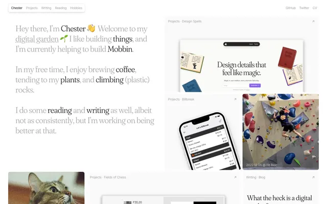
Digital garden journal: crisp pages, intimate handwriting, and colorful bookmarks.
Color palette
Used for 'READ' tags, indicating intellectual content — a warm, inviting educational cue.
Soft background for 'READ' tags, providing gentle visual emphasis.
Specific content type indicators like 'Writing' or 'Projects'.
Soft background wash for 'Writing' or 'Projects' tags.
Soft background wash for 'Hobbies' tags.
Specific content type indicators, e.g., 'Plants' or active states.
Soft background wash for 'Plants' tags.
Major surface background, card backgrounds.
Default borders, subtle separators, background for non-interactive elements.
Primary text color for headings and prominent links.
Strongest text contrast, used for body text and navigation links.
Secondary text, disabled states, supporting icons.
Typography
- Weights
- 400
- Sizes
- 14px, 16px
- Line height
- 1.43, 1.5, 1.63
- Letter spacing
- -0.4
- Fallback
- system-ui, sans-serif
Workhorse sans-serif for body text, navigation, and detailed information. Its subtle negative letter-spacing keeps text feeling grounded and compact, fitting the 'notebook' analogy.
- Weights
- 300
- Sizes
- 30px, 36px, 60px
- Line height
- 1, 1.11, 1.2, 1.25
- Letter spacing
- -0.9
- Fallback
- Georgia, serif
Signature serif for all headings and key narrative elements. Its light weight (300) at larger display sizes (60px) sets a tone of quiet confidence, conveying authority through elegance rather than boldness. The generous negative letter-spacing maintains a polished, traditional feel.
- Weights
- 400
- Sizes
- 14px
- Line height
- 1.43
- Letter spacing
- -0.35
- Fallback
- monospace
Used for code snippets or technical details, providing a clear distinction from the main narrative while maintaining legibility with tight letter-spacing.
Spacing & shape
Components
Text 'Inter' weight 400, 16px, #a3a3a3 initially, changing to #000000 on hover. Underlined on hover. Hover state indicates interaction without changing layout.
Rounded pill shape with 9999px border-radius. Background is #000000, text is #fafafa. Padding: 4px vertical, 6px horizontal. Acts as a filter or category selection.
Background #fafafa, 8px border-radius. Border is 1px solid #e5e7eb. No ambient shadow, but a subtle inset shadow rgba(0, 0, 0, 0.1) 0px 0px 0px 1px inset, rgba(0, 0, 0, 0.1) 0px -2px 0px 1px inset suggests depth without lifting the card off the surface.
Text in 'Inter', 16px, weight 400. Color #000000 with an underline only appearing on hover. Matches main text color to avoid visual noise until interacted with.
Pill-shaped with 9999px border-radius. Text 'Inter' 14px, weight 400. Examples: 'READ' has background #fdd3b1 and text #7c2d12. 'Writing' has background #e6cefe and text #581c87. Consistent padding: 2px vertical, 6px horizontal.
Pill-shaped with 9999px border-radius. Text 'Inter' 14px, weight 400. Background #daf5ae, text #365314. Consistent padding: 2px vertical, 6px horizontal. Similar to primary tags but uses specific accent colors for different themes.
Image has 4px border-radius. Card itself has 8px border-radius with #e5e7eb border. A subtle shadow rgba(0, 0, 0, 0.1) 0px 10px 15px -3px, rgba(0, 0, 0, 0.1) 0px 4px 6px -4px is used to give images a slight lift off the page, mimicking prints on a surface.
Text 'Inter' 16px, weight 400, #a3a3a3. No underline. Color remains the same on hover, only interaction is implied by cursor change, subtly minimalist.
Guidelines
- Prioritize 'Fraunces' for all headings and short, impactful statements to leverage its elegant, light-weight character.
- Use 'Inter' 16px weight 400 for all paragraph text, maintaining a consistent, highly readable, and unobtrusive voice.
- Apply #fafafa as the primary background color for all main content areas to create a bright, airy canvas.
- Utilize #e5e7eb for subtle borders and background for non-interactive list items or dividers, maintaining visual softness.
- Employ 8px border-radius for all content cards and larger UI elements, balancing subtle softness with structure.
- Apply 9999px border-radius to all interactive tags and buttons, creating a distinct pill shape that signals interactivity.
- Use accent colors (e.g., #7c2d12, #581c87, #0c4a6, #365314) and their light background variants consistently for content categorization, acting as visual cues like colored labels.
- Apply minimal inset shadow rgba(0, 0, 0, 0.1) 0px 0px 0px 1px inset, rgba(0, 0, 0, 0.1) 0px -2px 0px 1px inset to card backgrounds, giving them a subtle definition without heavy lifting.
- Avoid bolding or using heavier weights for 'Fraunces'; its impact comes from its lightness (weight 300).
- Do not use highly saturated colors for large blocks of content; reserve them for small, intentional accents only.
- Refrain from introducing strong drop shadows; the design relies on subtle inset shadows for depth or light elevation for images (rgba(0, 0, 0, 0.1) 0px 10px 15px -3px, rgba(0, 0, 0, 0.1) 0px 4px 6px -4px).
- Avoid using multiple border-radii values for a single component type; maintain consistency (e.g., tags are always 9999px).
- Do not use #000000 for body text unless higher contrast is explicitly required, #171717 or #a3a3a3 are preferred for a softer read.
- Do not vary letter spacing from the defined values; 'Inter' at -0.4px and 'Fraunces' at -0.9px letter-spacing are critical to the typographic feel.
- Avoid generic hover states like simple color changes for interactive elements; opt for underlines on links or distinct background changes for buttons/tags.
About this system
ShowHide
Chester's Garden feels like a carefully curated notebook or a personal journal, blending structured content with an organic, lived-in feel. The clean, almost stark white background (#fafafa) and light gray divisions (#e5e7eb) provide a quiet stage, allowing strong typographic choices and varied media to take center-stage. The interplay between the elegant, serifed Fraunces for headlines and the pragmatic, sans-serif Inter for body text defines its character, creating a sense of approachable authority where intellectual pursuits meet personal exploration. Subtle accent colors are used as contextual highlights, like digital Post-it notes within a physical garden.
The page follows a `max-width 1536px` centered layout, offering a structured, comfortable reading experience. The hero section presents a centered block of text with a large, inviting 'Fraunces' headline. Below the hero, the content transitions into a dynamic, asymmetric grid that blends images, short text blocks, and categorized content cards. The rhythm of sections is primarily a flow of content blocks with consistent vertical spacing (40px sections, 12-24px internal gaps). The navigation is a minimalist sticky header and also appears as inline text links. A significant feature is the `flex/grid` layout of content, favoring a varied and engaging presentation over rigid rows and columns.
The visual language blends personal photography (a cat, a person climbing, a beach scene) with product screenshots (UI designs, book covers) and abstract graphics (chess patterns). Photography is largely unedited, natural, and sometimes retro-filtered (e.g., 'FilmNeverDie KIRO 400'), giving a raw, authentic feel. Images are primarily contained within card components, featuring a 4px border-radius, often with subtle, lifting shadows (rgba(0, 0, 0, 0.1) 0px 10px 15px -3px, rgba(0, 0, 0, 0.1) 0px 4px 6px -4px). The role of imagery is descriptive and personal, illustrating content rather than existing purely decoratively, contributing heavily to the 'journal' aesthetic. Density is image-heavy in the grid sections, balancing the text-dominant introductory area.
Reminiscent of Read.cv, Notion, Substack, Linear.
# Chester's Garden — Style Reference
> Digital garden journal: crisp pages, intimate handwriting, and colorful bookmarks.

**Theme:** light

**Site:** https://chester.how

Chester's Garden feels like a carefully curated notebook or a personal journal, blending structured content with an organic, lived-in feel. The clean, almost stark white background (#fafafa) and light gray divisions (#e5e7eb) provide a quiet stage, allowing strong typographic choices and varied media to take center-stage. The interplay between the elegant, serifed Fraunces for headlines and the pragmatic, sans-serif Inter for body text defines its character, creating a sense of approachable authority where intellectual pursuits meet personal exploration. Subtle accent colors are used as contextual highlights, like digital Post-it notes within a physical garden.

## Tokens — Colors

| Name | Value | Token | Role |
|------|------|------|------|
| Accent Orange | `#7c2d12` | `--color-accent-orange` | Used for 'READ' tags, indicating intellectual content — a warm, inviting educational cue. |
| Highlight Orange | `#fdd3b1` | `--color-highlight-orange` | Soft background for 'READ' tags, providing gentle visual emphasis. |
| Accent Violet | `#581c87` | `--color-accent-violet` | Specific content type indicators like 'Writing' or 'Projects'. |
| Highlight Violet | `#e6cefe` | `--color-highlight-violet` | Soft background wash for 'Writing' or 'Projects' tags. |
| Highlight Blue | `#afe5fc` | `--color-highlight-blue` | Soft background wash for 'Hobbies' tags. |
| Accent Green | `#365314` | `--color-accent-green` | Specific content type indicators, e.g., 'Plants' or active states. |
| Highlight Green | `#daf5ae` | `--color-highlight-green` | Soft background wash for 'Plants' tags. |
| Canvas White | `#fafafa` | `--color-canvas-white` | Major surface background, card backgrounds. |
| Paper Gray | `#e5e7eb` | `--color-paper-gray` | Default borders, subtle separators, background for non-interactive elements. |
| Charcoal Text | `#171717` | `--color-charcoal-text` | Primary text color for headings and prominent links. |
| Ink Black | `#000000` | `--color-ink-black` | Strongest text contrast, used for body text and navigation links. |
| Subtle Gray | `#a3a3a3` | `--color-subtle-gray` | Secondary text, disabled states, supporting icons. |

## Tokens — Typography

### Inter
- **Substitute:** system-ui, sans-serif
- **Weights:** 400
- **Sizes:** 14px, 16px
- **Line height:** 1.43, 1.5, 1.63
- **Letter spacing:** -0.4
- **Role:** Workhorse sans-serif for body text, navigation, and detailed information. Its subtle negative letter-spacing keeps text feeling grounded and compact, fitting the 'notebook' analogy.

### Fraunces
- **Substitute:** Georgia, serif
- **Weights:** 300
- **Sizes:** 30px, 36px, 60px
- **Line height:** 1, 1.11, 1.2, 1.25
- **Letter spacing:** -0.9
- **Role:** Signature serif for all headings and key narrative elements. Its light weight (300) at larger display sizes (60px) sets a tone of quiet confidence, conveying authority through elegance rather than boldness. The generous negative letter-spacing maintains a polished, traditional feel.

### ui-monospace
- **Substitute:** monospace
- **Weights:** 400
- **Sizes:** 14px
- **Line height:** 1.43
- **Letter spacing:** -0.35
- **Role:** Used for code snippets or technical details, providing a clear distinction from the main narrative while maintaining legibility with tight letter-spacing.

## Tokens — Type Scale

Augmented Fourth (1.414) from 16px base.

| Role | Size | Line height | Letter spacing |
|------|------|------|------|
| body-sm | 14px | 1.43 | -0.4px |
| body | 16px | 1.5 | -0.4px |
| heading | 30px | 1.25 | -0.9px |
| heading-lg | 36px | 1.2 | -0.9px |
| display | 60px | 1.11 | -0.9px |

## Tokens — Spacing

- **Max width:** 1536px
- **Section gap:** 40px
- **Card padding:** 16px
- **Element gap:** 8px

## Tokens — Radius

- **Buttons:** 9999px
- **Cards:** 8px
- **Images:** 4px
- **tags:** 4px

## Layout

The page follows a `max-width 1536px` centered layout, offering a structured, comfortable reading experience. The hero section presents a centered block of text with a large, inviting 'Fraunces' headline. Below the hero, the content transitions into a dynamic, asymmetric grid that blends images, short text blocks, and categorized content cards. The rhythm of sections is primarily a flow of content blocks with consistent vertical spacing (40px sections, 12-24px internal gaps). The navigation is a minimalist sticky header and also appears as inline text links. A significant feature is the `flex/grid` layout of content, favoring a varied and engaging presentation over rigid rows and columns.

## Imagery

The visual language blends personal photography (a cat, a person climbing, a beach scene) with product screenshots (UI designs, book covers) and abstract graphics (chess patterns). Photography is largely unedited, natural, and sometimes retro-filtered (e.g., 'FilmNeverDie KIRO 400'), giving a raw, authentic feel. Images are primarily contained within card components, featuring a 4px border-radius, often with subtle, lifting shadows (rgba(0, 0, 0, 0.1) 0px 10px 15px -3px, rgba(0, 0, 0, 0.1) 0px 4px 6px -4px). The role of imagery is descriptive and personal, illustrating content rather than existing purely decoratively, contributing heavily to the 'journal' aesthetic. Density is image-heavy in the grid sections, balancing the text-dominant introductory area.

## Components

### Content Tag Collection

### Book Card — Reading

### Coffee Brew Card — Hobbies

### Primary Navigation Link
*Top-level navigation items*

Text 'Inter' weight 400, 16px, #a3a3a3 initially, changing to #000000 on hover. Underlined on hover. Hover state indicates interaction without changing layout.

### Navigation Tab Active
*Currently active category indicator*

Rounded pill shape with 9999px border-radius. Background is #000000, text is #fafafa. Padding: 4px vertical, 6px horizontal. Acts as a filter or category selection.

### Card Container
*Content grouping element*

Background #fafafa, 8px border-radius. Border is 1px solid #e5e7eb. No ambient shadow, but a subtle inset shadow rgba(0, 0, 0, 0.1) 0px 0px 0px 1px inset, rgba(0, 0, 0, 0.1) 0px -2px 0px 1px inset suggests depth without lifting the card off the surface.

### Inline Text Link
*Interactive text embedded within body copy*

Text in 'Inter', 16px, weight 400. Color #000000 with an underline only appearing on hover. Matches main text color to avoid visual noise until interacted with.

### Content Tag (Primary)
*Categorization of content, e.g. 'Reading', 'Projects'*

Pill-shaped with 9999px border-radius. Text 'Inter' 14px, weight 400. Examples: 'READ' has background #fdd3b1 and text #7c2d12. 'Writing' has background #e6cefe and text #581c87. Consistent padding: 2px vertical, 6px horizontal.

### Content Tag (Secondary)
*More granular content tags, e.g. 'Plants'*

Pill-shaped with 9999px border-radius. Text 'Inter' 14px, weight 400. Background #daf5ae, text #365314. Consistent padding: 2px vertical, 6px horizontal. Similar to primary tags but uses specific accent colors for different themes.

### Image Card
*Card containing an image*

Image has 4px border-radius. Card itself has 8px border-radius with #e5e7eb border. A subtle shadow rgba(0, 0, 0, 0.1) 0px 10px 15px -3px, rgba(0, 0, 0, 0.1) 0px 4px 6px -4px is used to give images a slight lift off the page, mimicking prints on a surface.

### Footer Link
*Navigational links in the footer*

Text 'Inter' 16px, weight 400, #a3a3a3. No underline. Color remains the same on hover, only interaction is implied by cursor change, subtly minimalist.

## Guidelines

### Do

- Prioritize 'Fraunces' for all headings and short, impactful statements to leverage its elegant, light-weight character.
- Use 'Inter' 16px weight 400 for all paragraph text, maintaining a consistent, highly readable, and unobtrusive voice.
- Apply #fafafa as the primary background color for all main content areas to create a bright, airy canvas.
- Utilize #e5e7eb for subtle borders and background for non-interactive list items or dividers, maintaining visual softness.
- Employ 8px border-radius for all content cards and larger UI elements, balancing subtle softness with structure.
- Apply 9999px border-radius to all interactive tags and buttons, creating a distinct pill shape that signals interactivity.
- Use accent colors (e.g., #7c2d12, #581c87, #0c4a6, #365314) and their light background variants consistently for content categorization, acting as visual cues like colored labels.
- Apply minimal inset shadow rgba(0, 0, 0, 0.1) 0px 0px 0px 1px inset, rgba(0, 0, 0, 0.1) 0px -2px 0px 1px inset to card backgrounds, giving them a subtle definition without heavy lifting.

### Don't

- Avoid bolding or using heavier weights for 'Fraunces'; its impact comes from its lightness (weight 300).
- Do not use highly saturated colors for large blocks of content; reserve them for small, intentional accents only.
- Refrain from introducing strong drop shadows; the design relies on subtle inset shadows for depth or light elevation for images (rgba(0, 0, 0, 0.1) 0px 10px 15px -3px, rgba(0, 0, 0, 0.1) 0px 4px 6px -4px).
- Avoid using multiple border-radii values for a single component type; maintain consistency (e.g., tags are always 9999px).
- Do not use #000000 for body text unless higher contrast is explicitly required, #171717 or #a3a3a3 are preferred for a softer read.
- Do not vary letter spacing from the defined values; 'Inter' at -0.4px and 'Fraunces' at -0.9px letter-spacing are critical to the typographic feel.
- Avoid generic hover states like simple color changes for interactive elements; opt for underlines on links or distinct background changes for buttons/tags.

## Agent Prompt Guide

### Quick Color Reference
- **Text Primary:** #000000
- **Text Secondary:** #a3a3a3
- **Background Soft:** #fafafa
- **Border/Divider:** #e5e7eb
- **Accent Tag (Read):** #7c2d12 (text) on #fdd3b1 (bg)

### 3-5 Example Component Prompts
1. **Create an introductory hero section:** Use a #fafafa background. Headline 'Chester's Garden' should be 'Fraunces' 60px, weight 300, #171717, letter-spacing -0.9px, line-height 1.11. Body paragraph 'Hey there, I’m Chester…' should be 'Inter' 16px, weight 400, #000000, letter-spacing -0.4px. Ensure generous sectionGap of 40px below the text block.
2. **Generate a content card for a project:** Card background #fafafa, border 1px solid #e5e7eb, 8px border-radius. Include an image with 4px border-radius and the shadow `rgba(0, 0, 0, 0.1) 0px 10px 15px -3px, rgba(0, 0, 0, 0.1) 0px 4px 6px -4px`. Use 'Inter' 14px, weight 400, #a3a3a3 for a small subtitle like 'Projects'. Use 'Fraunces' 30px, weight 300, #171717, letter-spacing -0.9px for the main title of the project.
3. **Design a content filter tag for 'Hobbies':** Pill shape (9999px border-radius). Background color #afe5fc, text color #0c4a6e. Text 'Inter' 14px, weight 400. Horizontal padding 6px, vertical padding 2px.
4. **Create a horizontal navigation menu:** Items are 'Inter' 16px, weight 400. Default color #a3a3a3, with active item as #000000 in a 9999px rounded pill with #000000 background and #fafafa text, padding 4px vertical, 6px horizontal. The entire menu should float on a #fafafa background.
More like this








Keep what you find
A free account saves references to boards and can send you a weekly email of picks based on what you save.
To see every result, go Pro.