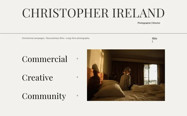
Preview image. Unlock full-res
Gallery Wall Typography – Elegant serifs on a vast, pale canvas.
Color palette
Page background, primary surface color.
Primary text color for headlines, body, links, and borders. Its starkness provides visual weight against the light background.
Secondary dark gray for headlines and borders, providing a slightly softer counterpoint to Charcoal Ink.
Muted body text color, offering a readable but less dominant presence than Charcoal Ink.
Typography
- Weights
- 400
- Sizes
- 63px, 94px
- Line height
- 1, 1.16, 1.2
- Letter spacing
- 0.01em
- Fallback
- Playfair Display
Primary display font for prominent headings and key interactive elements. Its high-contrast serifs, especially at 94px, lend a classic, editorial gravitas, making statements feel significant and considered.
- Weights
- 400
- Sizes
- 16px, 94px
- Line height
- 1.5
- Letter spacing
- normal
- Fallback
- Rubik
Workhorse font for body text, links, and secondary headings. The simpler, sans-serif form ensures readability for functional text, contrasting with the decorative display font.
Spacing & shape
Components
Buttons like 'Commercial', 'Creative', 'Community' use Playfair Display, weight 400, size 63px. Text color Charcoal Ink (#000000), transparent background. Padding 30px top and bottom, 0px left/right. No explicit border radius. Border bottom will be added on hover for navigation elements.
Text 'Photographer | Director' uses Rubik, weight 400, size 16px, color Charcoal Ink (#000000).
Link 'About' uses Rubik, weight 400, size 16px, color Charcoal Ink (#000000), underlined.
List items 'Commercial campaigns', 'Documentary films', 'Long-form photography' use Rubik, weight 400, size 16px, color Charcoal Ink (#000000).
A thin 1px horizontal line in Charcoal Ink (#000000) or Deep Graphite (#333332), spanning the content width.
Guidelines
- Use Canvas Parchment (#f2f1ec) as the primary background color for all page sections to maintain a clean, expansive base.
- Employ Playfair Display at 94px for critical, impactful headlines to leverage its editorial aesthetic and high visual presence.
- Pair Playfair Display for display elements with Rubik (16px, weight 400) for all body text, ensuring a clear typographic distinction and readability.
- Maintain generous vertical spacing between content blocks, with a default section gap of 48px to create an airy, curated feel.
- Keep borders and interactive underlines in Charcoal Ink (#000000) to ensure high contrast and visual consistency.
- Avoid applying strong background colors or gradients to content cards; keep them transparent with 'Canvas Parchment' as the implied background.
- Do not introduce additional font families or weights beyond Rubik 400 and Playfair Display 400; the system relies on this limited palette.
- Refrain from using prominent box-shadows or elevation. The design achieves depth through typography and spacing.
- Do not round corners on any elements; the system explicitly adheres to 0px border-radius for a crisp, precise geometry.
- Avoid diluting the neutral color palette with vivid accent colors; the brand emphasizes subtlety through tone and texture.
About this system
ShowHide
This design evokes the timeless elegance of classic publishing, presenting photography and direction with a quiet authority. The aesthetic is built on a high-contrast pairing of deep charcoal text against an almost-white background, creating a sense of clarity and focus. The interplay between the bold, serif display typography and the clean, sans-serif body text provides a distinct visual hierarchy, while minimal use of decorative elements contributes to its refined, uncluttered feel. Expansive spacing acts as a canvas, allowing content to breathe and command attention without distraction, much like a curated art gallery.
The site employs a primarily centered, max-width layout, though 'pageMaxWidth' is not strictly defined, suggesting an adaptive but contained approach rather than full-bleed. The hero section features a prominent, centered headline with a sub-line, immediately establishing a personal brand. Content below this is divided by subtle horizontal rules. Sections typically feature generous vertical spacing (48px). The main content area uses a split-screen approach on the main hero, with large display typography on one side and a key photograph on the other. Navigation and secondary information are integrated into the header and within content blocks, using a minimalist approach with simple text links.
The visual language focuses on high-quality, atmospheric photography used as hero content. Images are typically contained, not full-bleed, and serve as a focal point demonstrating the individual's artistic output. There's no specific masking or corner treatment; images are rectangular and integrated cleanly into the spacious layout. The lighting and composition within the images suggest a naturalistic, intimate, and often subtly dramatic approach without overt staging. They function as both decorative atmosphere and direct demonstration of professional work.
Reminiscent of AIGA Journal, Fika Design, The New York Times Online.
# CHRISTOPHER IRELAND CREATIVE — Style Reference
> Gallery Wall Typography – Elegant serifs on a vast, pale canvas.

**Theme:** light

**Site:** https://christopherireland.net

This design evokes the timeless elegance of classic publishing, presenting photography and direction with a quiet authority. The aesthetic is built on a high-contrast pairing of deep charcoal text against an almost-white background, creating a sense of clarity and focus. The interplay between the bold, serif display typography and the clean, sans-serif body text provides a distinct visual hierarchy, while minimal use of decorative elements contributes to its refined, uncluttered feel. Expansive spacing acts as a canvas, allowing content to breathe and command attention without distraction, much like a curated art gallery.

## Tokens — Colors

| Name | Value | Token | Role |
|------|------|------|------|
| Canvas Parchment | `#f2f1ec` | `--color-canvas-parchment` | Page background, primary surface color. |
| Charcoal Ink | `#000000` | `--color-charcoal-ink` | Primary text color for headlines, body, links, and borders. Its starkness provides visual weight against the light background. |
| Deep Graphite | `#333332` | `--color-deep-graphite` | Secondary dark gray for headlines and borders, providing a slightly softer counterpoint to Charcoal Ink. |
| Subtle Ash | `#5d5b5b` | `--color-subtle-ash` | Muted body text color, offering a readable but less dominant presence than Charcoal Ink. |

## Tokens — Typography

### Playfair Display
- **Substitute:** Playfair Display
- **Weights:** 400
- **Sizes:** 63px, 94px
- **Line height:** 1, 1.16, 1.2
- **Letter spacing:** 0.01em
- **Role:** Primary display font for prominent headings and key interactive elements. Its high-contrast serifs, especially at 94px, lend a classic, editorial gravitas, making statements feel significant and considered.

### Rubik
- **Substitute:** Rubik
- **Weights:** 400
- **Sizes:** 16px, 94px
- **Line height:** 1.5
- **Letter spacing:** normal
- **Role:** Workhorse font for body text, links, and secondary headings. The simpler, sans-serif form ensures readability for functional text, contrasting with the decorative display font.

## Tokens — Type Scale

| Role | Size | Line height | Letter spacing |
|------|------|------|------|
| body | 16px | 1.5 | — |
| heading-sm | 63px | 1.16 | 0.63px |
| display | 94px | 1 | 0.94px |

## Tokens — Spacing

- **Section gap:** 48px
- **Card padding:** 0px
- **Element gap:** 11px

## Tokens — Radius

- **none:** 0px

## Layout

The site employs a primarily centered, max-width layout, though 'pageMaxWidth' is not strictly defined, suggesting an adaptive but contained approach rather than full-bleed. The hero section features a prominent, centered headline with a sub-line, immediately establishing a personal brand. Content below this is divided by subtle horizontal rules. Sections typically feature generous vertical spacing (48px). The main content area uses a split-screen approach on the main hero, with large display typography on one side and a key photograph on the other. Navigation and secondary information are integrated into the header and within content blocks, using a minimalist approach with simple text links.

## Imagery

The visual language focuses on high-quality, atmospheric photography used as hero content. Images are typically contained, not full-bleed, and serve as a focal point demonstrating the individual's artistic output. There's no specific masking or corner treatment; images are rectangular and integrated cleanly into the spacious layout. The lighting and composition within the images suggest a naturalistic, intimate, and often subtly dramatic approach without overt staging. They function as both decorative atmosphere and direct demonstration of professional work.

## Components

### Service Category List

### Brand Identity Header

### Portfolio Image Card with Caption

### Service Category Button
*Interactive text link for portfolio sections.*

Buttons like 'Commercial', 'Creative', 'Community' use Playfair Display, weight 400, size 63px. Text color Charcoal Ink (#000000), transparent background. Padding 30px top and bottom, 0px left/right. No explicit border radius. Border bottom will be added on hover for navigation elements.

### Sub-heading Link
*Descriptive role for the brand.*

Text 'Photographer | Director' uses Rubik, weight 400, size 16px, color Charcoal Ink (#000000).

### Navigation Link
*Site navigation element.*

Link 'About' uses Rubik, weight 400, size 16px, color Charcoal Ink (#000000), underlined.

### Information List
*Descriptive list of services/focus areas.*

List items 'Commercial campaigns', 'Documentary films', 'Long-form photography' use Rubik, weight 400, size 16px, color Charcoal Ink (#000000).

### Horizontal Divider
*Visual separation of page sections.*

A thin 1px horizontal line in Charcoal Ink (#000000) or Deep Graphite (#333332), spanning the content width.

## Guidelines

### Do

- Use Canvas Parchment (#f2f1ec) as the primary background color for all page sections to maintain a clean, expansive base.
- Employ Playfair Display at 94px for critical, impactful headlines to leverage its editorial aesthetic and high visual presence.
- Pair Playfair Display for display elements with Rubik (16px, weight 400) for all body text, ensuring a clear typographic distinction and readability.
- Maintain generous vertical spacing between content blocks, with a default section gap of 48px to create an airy, curated feel.
- Keep borders and interactive underlines in Charcoal Ink (#000000) to ensure high contrast and visual consistency.

### Don't

- Avoid applying strong background colors or gradients to content cards; keep them transparent with 'Canvas Parchment' as the implied background.
- Do not introduce additional font families or weights beyond Rubik 400 and Playfair Display 400; the system relies on this limited palette.
- Refrain from using prominent box-shadows or elevation. The design achieves depth through typography and spacing.
- Do not round corners on any elements; the system explicitly adheres to 0px border-radius for a crisp, precise geometry.
- Avoid diluting the neutral color palette with vivid accent colors; the brand emphasizes subtlety through tone and texture.
More like this








Keep what you find
A free account saves references to boards and can send you a weekly email of picks based on what you save.
To see every result, go Pro.