Preview image. Unlock full-res
Playful dark workshop
Color palette
Primary action backgrounds, decorative accents, and border elements
Background for specific content sections and highlighted text
Decorative borders, secondary accents, and subtle graphic elements
Navigation active states, attention-grabbing text highlights
Primary background for pages and default dark surfaces, text on light surfaces
Text on dark backgrounds, secondary backgrounds for subtle contrast sections
Dominant text color on light backgrounds, hairline borders
Slightly elevated card and container backgrounds on the Midnight Canvas
Neutral link defaults, subtle borders, and decorative outlines
Background for specific card variants or highlighted content blocks
Background for the hero section, offering a soft contrast
Informative elements, active navigation indicators, and decorative borders
Typography
- Weights
- 100, 400, 500, 600, 700, 900
- Sizes
- 15px, 16px, 17px, 18px, 20px, 22px, 24px, 26px, 30px, 32px, 36px, 40px, 42px, 46px, 52px, 74px
- Line height
- 1, 1.15, 1.2, 1.35, 1.4
- Letter spacing
- normal
- Fallback
- Montserrat
Primary typeface for all headings, body text, and UI elements. Its clean, geometric form provides a modern yet approachable feel.
- Weights
- 400
- Sizes
- 24px
- Line height
- 1
- Letter spacing
- normal
Iconography for brand and social elements across the interface.
- Weights
- 400
- Sizes
- 18px
- Line height
- 1
- Letter spacing
- normal
Utility icon set for various UI functions.
- Weights
- 500
- Sizes
- 15px
- Line height
- 1.5
- Letter spacing
- 0.0070em
- Fallback
- Arial
Used for specific auxiliary text and button labels, providing a compact, familiar feel.
Spacing & shape
Components
backgroundColor=rgba(0, 0, 0, 0), color=rgb(36, 36, 36) - or rgb(219, 243, 208) for inverse, borderTopColor=rgb(36, 36, 36) - or rgb(219, 243, 208) for inverse, borderRadius=50%, paddingTop=0px, paddingRight=0px, paddingBottom=0px, paddingLeft=0px. Used for subtle, circular interaction areas without a strong background focus.
backgroundColor=rgb(36, 36, 36), color=rgb(171, 193, 232), borderTopColor=rgb(171, 193, 232), borderRadius=0px, paddingTop=8px, paddingRight=16px, paddingBottom=6px, paddingLeft=16px. A square, filled button with Pale Lavender text and border, standing out against dark backgrounds.
backgroundColor=rgb(36, 36, 36), color=rgb(36, 36, 36), borderTopColor=rgb(36, 36, 36), borderRadius=50%, paddingTop=0px, paddingRight=0px, paddingBottom=0px, paddingLeft=0px. Used for small, circular elements that are visually contained, often representing icons.
backgroundColor=rgba(0, 0, 0, 0), borderRadius=0px, boxShadow=none, paddingTop=0px, paddingRight=12px, paddingBottom=0px, paddingLeft=12px. Utilized for flexible content grouping where the background of the parent section defines the visual context, with subtle internal padding.
backgroundColor=rgb(36, 36, 36), borderRadius=0px, boxShadow=none, paddingTop=30px, paddingRight=30px, paddingBottom=30px, paddingLeft=30px. These cards provide clear separation and elevation on the primary Midnight Canvas background.
backgroundColor=rgb(36, 36, 36), borderRadius=100%, boxShadow=none, paddingTop=30px, paddingRight=30px, paddingBottom=30px, paddingLeft=30px. A distinct, large circular card for visual emphasis on individual elements.
backgroundColor=rgb(253, 222, 190), borderRadius=0px, boxShadow=none, paddingTop=0px, paddingRight=0px, paddingBottom=0px, paddingLeft=0px. A specific card variant with a Mellow Yellow background, used within hero areas for visual contrast.
backgroundColor=rgba(0, 0, 0, 0), color=rgb(36, 36, 36), borderRadius=0px, paddingTop=0px, paddingRight=0px, paddingBottom=0px, paddingLeft=0px. Used for labels and tags where the text itself carries the primary emphasis, without any background fill or border.
Guidelines
- Prioritize Midnight Canvas (#242424) for primary backgrounds and Soft Black Surface (#191919) for elevated elements, maintaining a dark theme.
- Use Muted Sage (#dbf3d0) for primary interactive elements and key brand accents to create visual punctuation.
- Apply a 0px border-radius for most rectangular UI elements like cards and some buttons to maintain a sharp, graphic feel.
- Utilize 50% border-radius for circular elements, such as ghost buttons or profile picture frames, for clear distinction.
- Maintain a clear visual hierarchy with Sofia Pro in various weights for headings and body text, especially the larger sizes of 52px and 74px for display text.
- Employ Pale Lavender (#abc1e8) for informational accents and active navigational items to guide user attention.
- Ensure generous padding of 30px within Dark Content Cards to provide ample breathing room around content.
- Avoid applying heavy drop shadows; the system favors flat or outlined elements over dimensional ones.
- Do not use generic blue for primary action or informational states; instead, leverage Muted Sage (#dbf3d0) and Pale Lavender (#abc1e8).
- Refrain from using gradients broadly; the UI is characterized by flat colors and sharp contrasts.
- Do not introduce rounded corners arbitrarily; follow the established 0px for cards/blocks and 50% for circular elements.
- Avoid dense, information-packed sections without clear visual breaks; prioritize comfortable density for readability.
- Do not use standard system fonts when Sofia Pro or Helvetica (where specified) are designated for content.
- Do not override the distinct letter-spacing for Helvetica at 15px (0.0070em); this is a specific design choice.
About this system
ShowHide
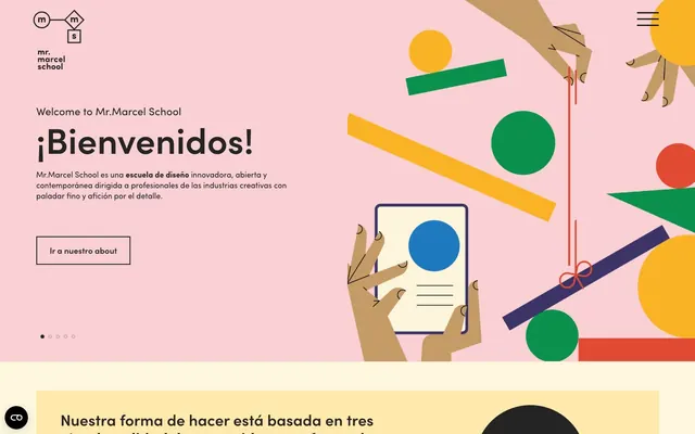
Mr. Marcel School employs a vibrant, educational workshop aesthetic, combining a primarily dark canvas with high-contrast, playful chromatic accents. The density is balanced, favoring clear separation between content blocks. Typography is confident yet friendly, set against dark surfaces with selective use of bright colors for emphasis. Components are sharp-edged, often outlined, and avoid heavy shadows, creating a lightweight, graphic feel.
The page primarily uses a max-width contained layout of 1320px, with content centered. The hero section is often full-bleed with an off-white background and a split-screen arrangement of text Left and a large, abstract illustration Right. Section rhythm is created through alternating background colors, primarily Midnight Canvas (#242424) and Mellow Yellow Background (#ffe9ad), but without explicit dividers – sections flow seamlessly. Content arrangement frequently uses two-column layouts, often text-left/visual-right, or stacked centered blocks for features. Card grids (typically 4-column) are employed for displaying individuals or program types. Navigation is a persistent top bar, sticky on scroll, with clear brand colors for active states. The overall density is comfortable, with clear vertical spacing between content blocks.
The site uses a mix of playful, abstract illustrations and tightly cropped product/profile photography. Illustrations are flat, graphic, and use a limited color palette of brand colors (green, orange, blue, yellow, red on pink or off-white backgrounds). They are often geometric with clear outlines or filled shapes, adding a whimsical yet structured feel. Photography focuses on professional headshots or clean product examples, often within square or circular masked frames, lacking busy backgrounds. Icons are minimal, either outlined (Font Awesome 6 Brands, fontello) or simple filled shapes, maintaining a consistent stroke weight. Imagery primarily serves a decorative and atmospheric role in hero sections, then transitions to explanatory or social proof in content blocks, occupying significant visual space.
Reminiscent of AIGA, Future London Academy, Supra Supply, Hyper Island.
# Mr. Marcel School — Style Reference
> Playful dark workshop

**Theme:** dark

**Site:** https://mrmarcelschool.com

Mr. Marcel School employs a vibrant, educational workshop aesthetic, combining a primarily dark canvas with high-contrast, playful chromatic accents. The density is balanced, favoring clear separation between content blocks. Typography is confident yet friendly, set against dark surfaces with selective use of bright colors for emphasis. Components are sharp-edged, often outlined, and avoid heavy shadows, creating a lightweight, graphic feel.

## Tokens — Colors

| Name | Value | Token | Role |
|------|------|------|------|
| Muted Sage | `#dbf3d0` | `--color-muted-sage` | Primary action backgrounds, decorative accents, and border elements |
| Mellow Yellow Background | `#ffe9ad` | `--color-mellow-yellow-background` | Background for specific content sections and highlighted text |
| Pale Peach Accent | `#f8c6ab` | `--color-pale-peach-accent` | Decorative borders, secondary accents, and subtle graphic elements |
| Vibrant Red | `#e24037` | `--color-vibrant-red` | Navigation active states, attention-grabbing text highlights |
| Midnight Canvas | `#242424` | `--color-midnight-canvas` | Primary background for pages and default dark surfaces, text on light surfaces |
| Ivory Canvas | `#ffffff` | `--color-ivory-canvas` | Text on dark backgrounds, secondary backgrounds for subtle contrast sections |
| Deep Black Text | `#020202` | `--color-deep-black-text` | Dominant text color on light backgrounds, hairline borders |
| Soft Black Surface | `#191919` | `--color-soft-black-surface` | Slightly elevated card and container backgrounds on the Midnight Canvas |
| Warm Beige | `#eee1d3` | `--color-warm-beige` | Neutral link defaults, subtle borders, and decorative outlines |
| Subtle Cream Card | `#fddebe` | `--color-subtle-cream-card` | Background for specific card variants or highlighted content blocks |
| Off-White Hero Base | `#fff6de` | `--color-off-white-hero-base` | Background for the hero section, offering a soft contrast |
| Pale Lavender | `#abc1e8` | `--color-pale-lavender` | Informative elements, active navigation indicators, and decorative borders |

## Tokens — Typography

### Sofia Pro
- **Substitute:** Montserrat
- **Weights:** 100, 400, 500, 600, 700, 900
- **Sizes:** 15px, 16px, 17px, 18px, 20px, 22px, 24px, 26px, 30px, 32px, 36px, 40px, 42px, 46px, 52px, 74px
- **Line height:** 1, 1.15, 1.2, 1.35, 1.4
- **Letter spacing:** normal
- **Role:** Primary typeface for all headings, body text, and UI elements. Its clean, geometric form provides a modern yet approachable feel.

### Font Awesome 6 Brands
- **Weights:** 400
- **Sizes:** 24px
- **Line height:** 1
- **Letter spacing:** normal
- **Role:** Iconography for brand and social elements across the interface.

### fontello
- **Weights:** 400
- **Sizes:** 18px
- **Line height:** 1
- **Letter spacing:** normal
- **Role:** Utility icon set for various UI functions.

### Helvetica
- **Substitute:** Arial
- **Weights:** 500
- **Sizes:** 15px
- **Line height:** 1.5
- **Letter spacing:** 0.0070em
- **Role:** Used for specific auxiliary text and button labels, providing a compact, familiar feel.

## Tokens — Type Scale

Perfect Fifth (1.5) from 15px base.

| Role | Size | Line height | Letter spacing |
|------|------|------|------|
| caption | 15px | 1.5 | 0.007em |
| subheading | 22px | 1.35 | — |
| heading-sm | 30px | 1.35 | — |
| heading | 42px | 1.2 | — |
| display | 74px | 1 | — |

## Tokens — Spacing

- **Max width:** 1320px
- **Section gap:** 24px
- **Card padding:** 12px
- **Element gap:** 12px

## Tokens — Radius

- **Buttons:** 50%
- **Cards:** 0px
- **other:** 40px

## Layout

The page primarily uses a max-width contained layout of 1320px, with content centered. The hero section is often full-bleed with an off-white background and a split-screen arrangement of text Left and a large, abstract illustration Right. Section rhythm is created through alternating background colors, primarily Midnight Canvas (#242424) and Mellow Yellow Background (#ffe9ad), but without explicit dividers – sections flow seamlessly. Content arrangement frequently uses two-column layouts, often text-left/visual-right, or stacked centered blocks for features. Card grids (typically 4-column) are employed for displaying individuals or program types. Navigation is a persistent top bar, sticky on scroll, with clear brand colors for active states. The overall density is comfortable, with clear vertical spacing between content blocks.

## Imagery

The site uses a mix of playful, abstract illustrations and tightly cropped product/profile photography. Illustrations are flat, graphic, and use a limited color palette of brand colors (green, orange, blue, yellow, red on pink or off-white backgrounds). They are often geometric with clear outlines or filled shapes, adding a whimsical yet structured feel. Photography focuses on professional headshots or clean product examples, often within square or circular masked frames, lacking busy backgrounds. Icons are minimal, either outlined (Font Awesome 6 Brands, fontello) or simple filled shapes, maintaining a consistent stroke weight. Imagery primarily serves a decorative and atmospheric role in hero sections, then transitions to explanatory or social proof in content blocks, occupying significant visual space.

## Components

### Ghost Circular Button
*Navigation and subtle actions*

backgroundColor=rgba(0, 0, 0, 0), color=rgb(36, 36, 36) - or rgb(219, 243, 208) for inverse, borderTopColor=rgb(36, 36, 36) - or rgb(219, 243, 208) for inverse, borderRadius=50%, paddingTop=0px, paddingRight=0px, paddingBottom=0px, paddingLeft=0px. Used for subtle, circular interaction areas without a strong background focus.

### Filled Square Accent Button
*Primary call to action in dark sections*

backgroundColor=rgb(36, 36, 36), color=rgb(171, 193, 232), borderTopColor=rgb(171, 193, 232), borderRadius=0px, paddingTop=8px, paddingRight=16px, paddingBottom=6px, paddingLeft=16px. A square, filled button with Pale Lavender text and border, standing out against dark backgrounds.

### Circular Icon Button
*Small, functional icons or badges*

backgroundColor=rgb(36, 36, 36), color=rgb(36, 36, 36), borderTopColor=rgb(36, 36, 36), borderRadius=50%, paddingTop=0px, paddingRight=0px, paddingBottom=0px, paddingLeft=0px. Used for small, circular elements that are visually contained, often representing icons.

### Transparent Content Card
*Grouping content without strong visual borders*

backgroundColor=rgba(0, 0, 0, 0), borderRadius=0px, boxShadow=none, paddingTop=0px, paddingRight=12px, paddingBottom=0px, paddingLeft=12px. Utilized for flexible content grouping where the background of the parent section defines the visual context, with subtle internal padding.

### Dark Content Card
*Prominent content blocks on dark backgrounds*

backgroundColor=rgb(36, 36, 36), borderRadius=0px, boxShadow=none, paddingTop=30px, paddingRight=30px, paddingBottom=30px, paddingLeft=30px. These cards provide clear separation and elevation on the primary Midnight Canvas background.

### Circular Card
*Highlighting specific items or profile pictures*

backgroundColor=rgb(36, 36, 36), borderRadius=100%, boxShadow=none, paddingTop=30px, paddingRight=30px, paddingBottom=30px, paddingLeft=30px. A distinct, large circular card for visual emphasis on individual elements.

### Hero Section Card
*Prominent content in light hero sections*

backgroundColor=rgb(253, 222, 190), borderRadius=0px, boxShadow=none, paddingTop=0px, paddingRight=0px, paddingBottom=0px, paddingLeft=0px. A specific card variant with a Mellow Yellow background, used within hero areas for visual contrast.

### Ghost Badge
*Tags or categories with minimal visual weight*

backgroundColor=rgba(0, 0, 0, 0), color=rgb(36, 36, 36), borderRadius=0px, paddingTop=0px, paddingRight=0px, paddingBottom=0px, paddingLeft=0px. Used for labels and tags where the text itself carries the primary emphasis, without any background fill or border.

## Guidelines

### Do

- Prioritize Midnight Canvas (#242424) for primary backgrounds and Soft Black Surface (#191919) for elevated elements, maintaining a dark theme.
- Use Muted Sage (#dbf3d0) for primary interactive elements and key brand accents to create visual punctuation.
- Apply a 0px border-radius for most rectangular UI elements like cards and some buttons to maintain a sharp, graphic feel.
- Utilize 50% border-radius for circular elements, such as ghost buttons or profile picture frames, for clear distinction.
- Maintain a clear visual hierarchy with Sofia Pro in various weights for headings and body text, especially the larger sizes of 52px and 74px for display text.
- Employ Pale Lavender (#abc1e8) for informational accents and active navigational items to guide user attention.
- Ensure generous padding of 30px within Dark Content Cards to provide ample breathing room around content.

### Don't

- Avoid applying heavy drop shadows; the system favors flat or outlined elements over dimensional ones.
- Do not use generic blue for primary action or informational states; instead, leverage Muted Sage (#dbf3d0) and Pale Lavender (#abc1e8).
- Refrain from using gradients broadly; the UI is characterized by flat colors and sharp contrasts.
- Do not introduce rounded corners arbitrarily; follow the established 0px for cards/blocks and 50% for circular elements.
- Avoid dense, information-packed sections without clear visual breaks; prioritize comfortable density for readability.
- Do not use standard system fonts when Sofia Pro or Helvetica (where specified) are designated for content.
- Do not override the distinct letter-spacing for Helvetica at 15px (0.0070em); this is a specific design choice.

## Agent Prompt Guide

**Quick Color Reference:**
text: #ffffff
background: #242424
border: #242424
accent: #f8c6ab
primary action: #dbf3d0 (filled action)

**3-5 Example Component Prompts:**
1. Create a Dark Content Card: backgroundColor #242424, borderRadius 0px, paddingTop 30px, paddingRight 30px, paddingBottom 30px, paddingLeft 30px. Place a Sofia Pro weight 700 headline at 36px, color #dbf3d0, and two lines of Sofia Pro weight 400 body text at 16px, color #ffffff.
2. Design a Ghost Circular Button: backgroundColor rgba(0, 0, 0, 0), color rgb(36, 36, 36), borderTopColor rgb(36, 36, 36), borderRadius 50%, paddingTop 0px, paddingRight 0px, paddingBottom 0px, paddingLeft 0px. Use a 'fontello' icon at 18px.
3. Create a Primary Action Button: #dbf3d0 background, #020202 text, 9999px radius, compact pill padding. Use this filled treatment for the main CTA.
More like this





Keep what you find
A free account saves references to boards and can send you a weekly email of picks based on what you save.
To see every result, go Pro.