Preview image. Unlock full-res
Midnight ocean with glowing buoys
Color palette
Primary action background, prominent interactive elements — a bright, inviting call to interaction
Green outline accent for tags, dividers, and focused UI edges
Red outline accent for tags, dividers, and focused UI edges
Blue outline accent for tags, dividers, and focused UI edges. Do not promote it to the primary CTA color
Link text, borders for ghost buttons, subtle interactive element highlights
Category tags, icon accents, highlights
Category tags, decorative iconography, ambient glows
Category tags, vibrant decorative accents
Category tags, vibrant decorative accents
Category tags, vibrant decorative accents
Category tags, vibrant decorative accents
Decorative background gradient used sparingly for visual depth
Primary page background, elevated surface base, deep shadows
Secondary background, subtle dark surfaces, layered shadows
Accent text, outlined element borders, subtle separation lines
Subtle headlines and body text, secondary interface elements
Shadow base for elevated components
Darker shadow base for more prominent elevated components
Muted body text for secondary information and tooltips
Primary text, icon fill, accessible foreground on dark backgrounds
Subtle background for category tags, secondary cards
Subtle background for links, dark page sections
Typography
- Weights
- 100
- Sizes
- 11px, 12px, 13px, 14px, 15px, 16px, 18px, 22px, 38px, 56px
- Line height
- 1.2, 1.3, 1.4, 1.6
- Letter spacing
- -0.0200em at 56px, -0.0100em at 38px, 0.0100em at 18px, 0.0200em at 11-16px
Primary body and sub-heading text, creating a light, modern feel with its variable weight and precise tracking. Its thinness makes larger headlines feel restrained.
- Weights
- 500
- Sizes
- 12px, 14px, 16px, 18px, 22px, 24px, 32px, 64px
- Line height
- 1, 1.09, 1.1, 1.2, 1.4, 1.6
- Letter spacing
- -0.0100em
Accent headings and prominent body text; its medium weight provides structure and readability for key information.
- Weights
- 670
- Sizes
- 28px
- Line height
- 1
- Letter spacing
- 0.0400em
Feature headings and callouts, designed for impact and distinctiveness with its tighter tracking.
- Weights
- 600
- Sizes
- 24px, 64px, 148px
- Line height
- 0.9, 1.1, 1.2
- Letter spacing
- -0.0200em
Large display headings and section titles, commanding attention with its semi-bold weight and generous scale.
- Weights
- 400
- Sizes
- 13px, 24px
- Line height
- 1.4
Standard body text, providing clarity and readability at smaller sizes for detailed information blocks.
- Weights
- 400
- Sizes
- 12px
- Line height
- 1.2
Fallback for system text, ensuring basic readability where custom fonts might not load.
Spacing & shape
Elevation
Components
Background: Iris Pop (#1c6cff), Text: Platinum Ghost (#ffffff), Border Radius: 16px, Padding: 12px vertical, 16px horizontal. Font: Jokker Medium, 12px, 500 weight.
Background: transparent, Text: Platinum Ghost (#ffffff), Border: 1px solid Ocean Glimmer (#597caa), Border Radius: 16px, Padding: 12px vertical, 16px horizontal. Font: Jokker Medium, 12px, 500 weight.
Background: Midnight Ink (#000814), Border Radius: 20px, Shadow: rgba(0, 0, 0, 0.07) 0px 0.36px 0.65px -1.5px, rgba(0, 0, 0, 0.05) 0px 3px 5.4px -3px, Padding: 14px vertical, 0px horizontal.
Background: Dynamic vivid color (e.g., Cherry Blossom #ff33aa, Pumpkin Zest #f27f0c), Text: Platinum Ghost (#ffffff), Border Radius: 40px (pill-shaped), Padding: 16px vertical, 24px-32px horizontal. Shadow: rgba(255, 255, 255, 0.16) inset 0px 24px 64px -12px, rgba(0, 0, 0, 0.16) inset 0px -24px 40px -12px, plus multiple inset highlights.
Text: Platinum Ghost (#ffffff) for active/hover, Ocean Glimmer (#597caa) for inactive. Font: Matte Variable Thin, 14px, 100 weight.
Background: Indigo Wash (#00215e), Text: Platinum Ghost (#ffffff), Border Radius: 0px. Padding: 5px vertical, 10px horizontal. Font: sans-serif, 12px, 400 weight.
Guidelines
- Prioritize Midnight Ink (#000814) or Deep Space (#010d1e) for all background canvases and card surfaces to maintain the dark theme.
- Use Platinum Ghost (#ffffff) for all primary body and headline text to ensure legibility and brand consistency.
- Apply Iris Pop (#1c6cff) exclusively for primary calls to action to create clear interaction points.
- Implement a 16px border-radius for all interactive elements like buttons and primary inputs.
- Use Matter Variable Thin with precise letter-spacing adjustments for headlines to achieve a light, modern typographic presence.
- Incorporate vibrant accent colors like Teal Glow (#00cc4b) or Crimson Beam (#ff4433) for category tags and small decorative elements, ensuring they stand out against the dark background.
- Employ inset shadows (like rgba(255, 255, 255, 0.16) inset) on vibrant tags and cards to give elements a subtle, glowing depth.
- Maintain an element gap of 16px (4 units) and card padding of 16px for consistent visual rhythm and content separation.
- Avoid using light backgrounds for primary content areas; maintain the dark theme's integrity.
- Do not introduce new saturated primary colors; limit vibrant accents to the established palette of Teal Glow, Crimson Beam, Iris Pop, etc.
- Do not use sharp 0px corners on any card-like or interactive UI elements; maintain soft radii (16px, 20px, 24px, 40px).
- Avoid heavy drop shadows; prefer the subtle, inset shadow styles or minimal elevation visible in the system.
- Do not use generic system fonts in place of Matter Variable Thin or Jokker; preserve the distinctive brand typography.
- Do not create dense, text-heavy blocks without sufficient padding or line height; ensure ample white space for readability within the dark context.
About this system
ShowHide
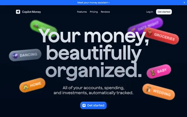
Copilot Money employs a sophisticated dark-mode aesthetic with a spacious canvas, primarily leveraging shades of deep blue and near-black. Dynamic, multi-colored 'tag' elements float across the interface, adding vibrant, soft-glow accents against the dark backdrop. Typography balances a modern geometric sans with a lighter, custom variable font, creating a refined information hierarchy. Components are soft-edged, often featuring inset shadows and subtle transparency, giving a sense of depth without harshness.
The page primarily uses a full-bleed structure for its dark background, combined with a contained maximum width for core content, which appears centered. The hero section features a large, centered headline overlaid with dynamically arranged, glowing 'tag' elements, creating an immediate sense of activity and organization. Sections are separated by consistent vertical spacing, and there's a pattern of presenting information in centered stacks or simple text-aligned-left compositions with a strong visual element on the right (though not strongly represented in the provided screenshots, suggested by the 'money organized' layout). The navigation is a sticky top bar, minimal and un-intrusive, designed to blend into the overall dark theme, with a primary call to action in the top right. Content density is generally spacious, allowing elements to breathe on the dark canvas.
The visual language focuses on abstract, illustrative 'tag' elements rendered with soft glows and a shallow depth of field, positioned against a dark, minimalist UI. These tags are color-varied, featuring clear and vivid hues like #00cc4b, #ff4433, #9019e6, and #fece4c. Icons are outlines, rendered in white against the dark background, maintaining a clean and functional appearance. Photography is notably absent, with the visual emphasis placed entirely on UI elements and stylized graphic accents. The density of these visuals is moderate, allowing them to serve as engaging focal points without overwhelming the sparse textual information. There are product screenshots of UI embedded in devices that are presented flat, consistent with the minimal aesthetic. These serve to showcase product functionality in context.
Reminiscent of Linear, Amie, Raycast, Notion (dark mode).
# Copilot Money — Style Reference
> Midnight ocean with glowing buoys

**Theme:** dark

**Site:** https://copilot.money

Copilot Money employs a sophisticated dark-mode aesthetic with a spacious canvas, primarily leveraging shades of deep blue and near-black. Dynamic, multi-colored 'tag' elements float across the interface, adding vibrant, soft-glow accents against the dark backdrop. Typography balances a modern geometric sans with a lighter, custom variable font, creating a refined information hierarchy. Components are soft-edged, often featuring inset shadows and subtle transparency, giving a sense of depth without harshness.

## Tokens — Colors

| Name | Value | Token | Role |
|------|------|------|------|
| Iris Pop | `#1c6cff` | `--color-iris-pop` | Primary action background, prominent interactive elements — a bright, inviting call to interaction |
| Teal Glow | `#00cc4b` | `--color-teal-glow` | Green outline accent for tags, dividers, and focused UI edges |
| Crimson Beam | `#ff4433` | `--color-crimson-beam` | Red outline accent for tags, dividers, and focused UI edges |
| Cosmic Blue | `#426088` | `--color-cosmic-blue` | Blue outline accent for tags, dividers, and focused UI edges. Do not promote it to the primary CTA color |
| Ocean Glimmer | `#597caa` | `--color-ocean-glimmer` | Link text, borders for ghost buttons, subtle interactive element highlights |
| Sunbeam | `#fece4c` | `--color-sunbeam` | Category tags, icon accents, highlights |
| Amethyst Flare | `#9019e6` | `--color-amethyst-flare` | Category tags, decorative iconography, ambient glows |
| Cherry Blossom | `#ff33aa` | `--color-cherry-blossom` | Category tags, vibrant decorative accents |
| Pumpkin Zest | `#f27f0c` | `--color-pumpkin-zest` | Category tags, vibrant decorative accents |
| Golden Harvest | `#ff9900` | `--color-golden-harvest` | Category tags, vibrant decorative accents |
| Lime Soda | `#59cc33` | `--color-lime-soda` | Category tags, vibrant decorative accents |
| Blue Gradient Overlay | `#5b7395` | `--color-blue-gradient-overlay` | Decorative background gradient used sparingly for visual depth |
| Midnight Ink | `#000814` | `--color-midnight-ink` | Primary page background, elevated surface base, deep shadows |
| Deep Space | `#010d1e` | `--color-deep-space` | Secondary background, subtle dark surfaces, layered shadows |
| Obsidian | `#11263b` | `--color-obsidian` | Accent text, outlined element borders, subtle separation lines |
| Mist Gray | `#ccced0` | `--color-mist-gray` | Subtle headlines and body text, secondary interface elements |
| Shadow Blue | `#29303a` | `--color-shadow-blue` | Shadow base for elevated components |
| Deep Shadow | `#303741` | `--color-deep-shadow` | Darker shadow base for more prominent elevated components |
| Muted Stone | `#7f8ba4` | `--color-muted-stone` | Muted body text for secondary information and tooltips |
| Platinum Ghost | `#ffffff` | `--color-platinum-ghost` | Primary text, icon fill, accessible foreground on dark backgrounds |
| Slate Blue | `#5c6f8a` | `--color-slate-blue` | Subtle background for category tags, secondary cards |
| Indigo Wash | `#00215e` | `--color-indigo-wash` | Subtle background for links, dark page sections |

## Tokens — Typography

### Matter Variable Thin
- **Weights:** 100
- **Sizes:** 11px, 12px, 13px, 14px, 15px, 16px, 18px, 22px, 38px, 56px
- **Line height:** 1.2, 1.3, 1.4, 1.6
- **Letter spacing:** -0.0200em at 56px, -0.0100em at 38px, 0.0100em at 18px, 0.0200em at 11-16px
- **Role:** Primary body and sub-heading text, creating a light, modern feel with its variable weight and precise tracking. Its thinness makes larger headlines feel restrained.

### Jokker Medium
- **Weights:** 500
- **Sizes:** 12px, 14px, 16px, 18px, 22px, 24px, 32px, 64px
- **Line height:** 1, 1.09, 1.1, 1.2, 1.4, 1.6
- **Letter spacing:** -0.0100em
- **Role:** Accent headings and prominent body text; its medium weight provides structure and readability for key information.

### Matter-TRIAL SemiBold
- **Weights:** 670
- **Sizes:** 28px
- **Line height:** 1
- **Letter spacing:** 0.0400em
- **Role:** Feature headings and callouts, designed for impact and distinctiveness with its tighter tracking.

### Jokker Semibold
- **Weights:** 600
- **Sizes:** 24px, 64px, 148px
- **Line height:** 0.9, 1.1, 1.2
- **Letter spacing:** -0.0200em
- **Role:** Large display headings and section titles, commanding attention with its semi-bold weight and generous scale.

### Jokker Regular
- **Weights:** 400
- **Sizes:** 13px, 24px
- **Line height:** 1.4
- **Role:** Standard body text, providing clarity and readability at smaller sizes for detailed information blocks.

### sans-serif
- **Weights:** 400
- **Sizes:** 12px
- **Line height:** 1.2
- **Role:** Fallback for system text, ensuring basic readability where custom fonts might not load.

## Tokens — Type Scale

| Role | Size | Line height | Letter spacing |
|------|------|------|------|
| caption | 11px | 1.2 | 0.22px |
| heading-sm | 22px | 1.2 | -0.22px |
| heading | 24px | 1 | -0.48px |
| heading-lg | 38px | 1.3 | -0.38px |
| display | 64px | 0.9 | -1.28px |

## Tokens — Spacing

- **Section gap:** 40px
- **Card padding:** 16px
- **Element gap:** 16px

## Tokens — Radius

- **Buttons:** 16px
- **Cards:** 24px
- **inlineElements:** 12px
- **smallElements:** 8px
- **tags:** 40px

## Tokens — Elevation

- **Floating Content Card:** `rgba(0, 0, 0, 0.07) 0px 0.362176px 0.651917px -1.5px, rgba(0, 0, 0, 0.05) 0px 3px 5.4px -3px`
- **Vibrant Category Tag:** `rgba(255, 255, 255, 0.16) 0px 24px 64px -12px inset, rgba(0, 0, 0, 0.16) 0px -24px 40px -12px inset, rgba(255, 255, 255, 0.16) 0px 0.636953px 1.14652px -0.5px inset, rgba(255, 255, 255, 0.17) 0px 1.9316px 3.47689px -1px inset, rgba(255, 255, 255, 0.19) 0px 5.10612px 9.19102px -1.5px inset, rgba(255, 255, 255, 0.24) 0px 16px 28.8px -2px inset`

## Layout

The page primarily uses a full-bleed structure for its dark background, combined with a contained maximum width for core content, which appears centered. The hero section features a large, centered headline overlaid with dynamically arranged, glowing 'tag' elements, creating an immediate sense of activity and organization. Sections are separated by consistent vertical spacing, and there's a pattern of presenting information in centered stacks or simple text-aligned-left compositions with a strong visual element on the right (though not strongly represented in the provided screenshots, suggested by the 'money organized' layout). The navigation is a sticky top bar, minimal and un-intrusive, designed to blend into the overall dark theme, with a primary call to action in the top right. Content density is generally spacious, allowing elements to breathe on the dark canvas.

## Imagery

The visual language focuses on abstract, illustrative 'tag' elements rendered with soft glows and a shallow depth of field, positioned against a dark, minimalist UI. These tags are color-varied, featuring clear and vivid hues like #00cc4b, #ff4433, #9019e6, and #fece4c. Icons are outlines, rendered in white against the dark background, maintaining a clean and functional appearance. Photography is notably absent, with the visual emphasis placed entirely on UI elements and stylized graphic accents. The density of these visuals is moderate, allowing them to serve as engaging focal points without overwhelming the sparse textual information. There are product screenshots of UI embedded in devices that are presented flat, consistent with the minimal aesthetic. These serve to showcase product functionality in context.

## Components

### Primary Filled Button
*Call to action button for primary user flows.*

Background: Iris Pop (#1c6cff), Text: Platinum Ghost (#ffffff), Border Radius: 16px, Padding: 12px vertical, 16px horizontal. Font: Jokker Medium, 12px, 500 weight.

### Ghost Button
*Secondary action or navigation link.*

Background: transparent, Text: Platinum Ghost (#ffffff), Border: 1px solid Ocean Glimmer (#597caa), Border Radius: 16px, Padding: 12px vertical, 16px horizontal. Font: Jokker Medium, 12px, 500 weight.

### Floating Content Card
*Displaying featured content or information blocks.*

Background: Midnight Ink (#000814), Border Radius: 20px, Shadow: rgba(0, 0, 0, 0.07) 0px 0.36px 0.65px -1.5px, rgba(0, 0, 0, 0.05) 0px 3px 5.4px -3px, Padding: 14px vertical, 0px horizontal.

### Vibrant Category Tag
*Categorization of items, dynamically colored.*

Background: Dynamic vivid color (e.g., Cherry Blossom #ff33aa, Pumpkin Zest #f27f0c), Text: Platinum Ghost (#ffffff), Border Radius: 40px (pill-shaped), Padding: 16px vertical, 24px-32px horizontal. Shadow: rgba(255, 255, 255, 0.16) inset 0px 24px 64px -12px, rgba(0, 0, 0, 0.16) inset 0px -24px 40px -12px, plus multiple inset highlights.

### Navigation Link
*Primary navigation elements in header or footer.*

Text: Platinum Ghost (#ffffff) for active/hover, Ocean Glimmer (#597caa) for inactive. Font: Matte Variable Thin, 14px, 100 weight.

### Message Banner
*Alerts or promotional messages at the top of the page.*

Background: Indigo Wash (#00215e), Text: Platinum Ghost (#ffffff), Border Radius: 0px. Padding: 5px vertical, 10px horizontal. Font: sans-serif, 12px, 400 weight.

## Guidelines

### Do

- Prioritize Midnight Ink (#000814) or Deep Space (#010d1e) for all background canvases and card surfaces to maintain the dark theme.
- Use Platinum Ghost (#ffffff) for all primary body and headline text to ensure legibility and brand consistency.
- Apply Iris Pop (#1c6cff) exclusively for primary calls to action to create clear interaction points.
- Implement a 16px border-radius for all interactive elements like buttons and primary inputs.
- Use Matter Variable Thin with precise letter-spacing adjustments for headlines to achieve a light, modern typographic presence.
- Incorporate vibrant accent colors like Teal Glow (#00cc4b) or Crimson Beam (#ff4433) for category tags and small decorative elements, ensuring they stand out against the dark background.
- Employ inset shadows (like rgba(255, 255, 255, 0.16) inset) on vibrant tags and cards to give elements a subtle, glowing depth.
- Maintain an element gap of 16px (4 units) and card padding of 16px for consistent visual rhythm and content separation.

### Don't

- Avoid using light backgrounds for primary content areas; maintain the dark theme's integrity.
- Do not introduce new saturated primary colors; limit vibrant accents to the established palette of Teal Glow, Crimson Beam, Iris Pop, etc.
- Do not use sharp 0px corners on any card-like or interactive UI elements; maintain soft radii (16px, 20px, 24px, 40px).
- Avoid heavy drop shadows; prefer the subtle, inset shadow styles or minimal elevation visible in the system.
- Do not use generic system fonts in place of Matter Variable Thin or Jokker; preserve the distinctive brand typography.
- Do not create dense, text-heavy blocks without sufficient padding or line height; ensure ample white space for readability within the dark context.

## Agent Prompt Guide

Quick Color Reference:
text: #ffffff
background: #000814
border: #11263b
accent: #00cc4b
primary action: #1c6cff (filled action)

Example Component Prompts:
1. Create a Primary Filled Button: background #1c6cff, text #ffffff, 16px radius, 12px 16px padding. Text 'Get started' using Jokker Medium, 12px, 500 weight.
2. Create a Vibrant Category Tag for 'Groceries': background #ff4433, text #ffffff, 40px radius, 16px 32px padding, with the specified inset shadow stack. Text 'GROCERIES' using Matter Variable Thin, 14px, 100 weight.
3. Create a Navigation Link for 'Pricing': text Ocean Glimmer (#597caa), 0px radius, 4px vertical 8px horizontal padding. Text 'Pricing' using Matter Variable Thin, 14px, 100 weight.
4. Create a Floating Content Card: background Midnight Ink (#000814), 20px radius, 14px vertical 0px horizontal padding, with the specified rgba(0,0,0) shadow. Content text: Platinum Ghost (#ffffff).
More like this





Keep what you find
A free account saves references to boards and can send you a weekly email of picks based on what you save.
To see every result, go Pro.