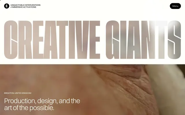
Preview image. Unlock full-res
Sculpted Minimalism on Canvas. An off-white backdrop frames strong typography and vibrant multimedia like exhibits in a pristine gallery.
Color palette
Card backgrounds, emphasizing specific content blocks with unexpected vibrancy.
Card backgrounds, introducing a cool, calming accent.
Card backgrounds, providing a dark, sophisticated contrast.
Decorative elements, small highlights.
Decorative elements, small highlights.
Decorative elements, small highlights.
Decorative elements, small highlights.
Decorative elements, small highlights.
Page backgrounds, card surfaces, form inputs.
Primary text, button backgrounds, borders, navigation elements. The stark contrast creates readability and visual weight.
Secondary text, subtle accents.
Input borders, subtle UI elements.
Text overlay on hero imagery, creating depth and grounding large typographic elements.
Typography
- Weights
- 300, 400
- Sizes
- 12px, 14px, 16px, 18px, 20px, 34px, 54px, 64px, 84px
- Line height
- 1, 1.25, 1.4, 1.43
- Letter spacing
- -0.04em at 84px, -0.027em at 64px, -0.023em at 54px, -0.02em at 34px, -0.018em at 20px, normal at smaller sizes
- Fallback
- system-ui, sans-serif
All textual content: body, headings, links, buttons. The custom font provides a unique structural clarity, while varied weights and careful negative letter-spacing for larger sizes prevent it from feeling too rigid, adding a refined, almost architectural feel.
Spacing & shape
Components
Transparent background, Ink Black text, no border or padding (0px padding, 0px border-radius). Used sparingly for minimalist interactive elements.
Ink Black background, Canvas White text. Extremely rounded (1440px border-radius) for a pill shape, with 14.08px vertical and 20px horizontal padding. Creates a distinct, organic interactive target.
Transparent background, Canvas White text. Extremely rounded (1440px border-radius) for a pill shape, with 8px all-around padding. Provides a softer, more integrated interactive element.
Transparent background, 0px border-radius, no shadow, 0px padding. Acts as a container for related content without adding visual weight.
Vivid Orchid (#ffacea) background, 0px border-radius, no shadow, generous 48px padding. Used for impactful, color-backed content blocks.
Muted Teal (#a5ebd6) background, 0px border-radius, no shadow, generous 48px padding. Similar to Vivid Orchid card but with a cooler tone.
Deep Plum (#101731) background, 0px border-radius, no shadow, generous 48px padding. Provides a dark, sophisticated stage for content.
Canvas White (#fffef7) background, Ink Black (#000000) text and border. 0px border-radius, with 8px top/bottom and 12px right padding. Focus on functionality with minimal styling.
Transparent background, Canvas White (#fffef7) text, 0px border-radius, 0px padding. For visually light menu items against a dark overlay.
Guidelines
- Prioritize Canvas White (#fffef7) for page and card backgrounds to maintain the clean, gallery-like aesthetic.
- Use Ink Black (#000000) for all primary text elements to ensure maximum contrast and legibility.
- Apply the 'Switzer' font family with specific letter-spacing adjustments: -0.04em for 84px, -0.027em for 64px, and -0.023em for 54px to maintain typographic distinction.
- Employ the 1440px border-radius for all interactive buttons to create a consistent pill-shaped form.
- Utilize 48px padding for content cards that use chromatic backgrounds (Vivid Orchid, Muted Teal, Deep Plum) to create emphasis and breathing room.
- Use 0px border-radius for all cards and input fields to maintain sharp, architectural lines, contrasting with the pill-shaped buttons.
- Ensure all interactive elements have sufficient contrast against their backgrounds as per the #000000 on #fffef7 (20.8:1 AAA) standard.
- Avoid using drop shadows on any element, as the design relies on color and proximity for depth, not elevation effects.
- Do not introduce additional font families; 'Switzer' is the singular typographic voice for the entire system.
- Refrain from using intermediate gray tones (#666666, #aaaaaa) for primary text or backgrounds — reserve them for secondary details.
- Do not deviate from the specified padding values for cards (48px) or buttons (14.08px vertical, 20px horizontal for solid buttons, 8px all-around for ghost buttons).
- Avoid generic rectangular buttons or elements with small radii; the extreme 1440px radius is a signature visual cue.
- Do not use background images or textures behind body text; maintain the clean Canvas White (#fffef7) or solid chromatic card backgrounds.
About this system
ShowHide
This design system feels like a gallery of contemporary art and industrial design, using a sparse, neutral palette as a canvas for striking typographic and image-based narratives. The dominant off-white background (#fffef7) and deep black text provide high contrast, while a unique 'Switzer' typeface with varied weights and precise letter-spacing sculpts a distinctive voice. Strategic use of full-bleed imagery and occasional vibrant, unexpected color blocks punctuates the otherwise minimalist composition, creating a dynamic rhythm without visual clutter. The absence of traditional shadows or overt decorative elements emphasizes clarity and directness.
The page primarily uses a full-bleed layout, particularly in the hero section where large-scale imagery dominates the viewport. Content appears to be centered within an implicit maximal width, though the hero extends edge-to-edge. Sections are separated by distinct background changes, primarily between Canvas White (#fffef7) and full-bleed imagery/video. Content arrangement often features large headlines (e.g., 'Creative Giants') overlaid directly onto images, and subsequent sections use left-aligned text with occasional multi-column layouts for features. There's a comfortable density with ample negative space. The navigation is a minimalist top-bar with a 'Menu' button, likely triggering an overlay.
The visual language is characterized by high-quality, full-bleed photography and video that feels cinematic and impactful. Images often serve as large background elements, sometimes with a dark gradient overlay. Content is either lifestyle-oriented (people in urban or artistic settings) or features abstract, artistic scenes. The treatment is raw with minimal processing or effects, focusing on strong compositions and natural lighting. Imagery plays a dual role: providing dramatic atmosphere and showcasing abstract creative work, occupying significant visual space on the page to enhance impact rather than merely decorate.
Reminiscent of AIGA, Sagmeister & Walsh, Pentagram, Stripe, Apple.
# Creative Giants — Style Reference
> Sculpted Minimalism on Canvas. An off-white backdrop frames strong typography and vibrant multimedia like exhibits in a pristine gallery.

**Theme:** light

**Site:** https://www.creativegiants.art

This design system feels like a gallery of contemporary art and industrial design, using a sparse, neutral palette as a canvas for striking typographic and image-based narratives. The dominant off-white background (#fffef7) and deep black text provide high contrast, while a unique 'Switzer' typeface with varied weights and precise letter-spacing sculpts a distinctive voice. Strategic use of full-bleed imagery and occasional vibrant, unexpected color blocks punctuates the otherwise minimalist composition, creating a dynamic rhythm without visual clutter. The absence of traditional shadows or overt decorative elements emphasizes clarity and directness.

## Tokens — Colors

| Name | Value | Token | Role |
|------|------|------|------|
| Vivid Orchid | `#ffacea` | `--color-vivid-orchid` | Card backgrounds, emphasizing specific content blocks with unexpected vibrancy. |
| Muted Teal | `#a5ebd6` | `--color-muted-teal` | Card backgrounds, introducing a cool, calming accent. |
| Deep Plum | `#101731` | `--color-deep-plum` | Card backgrounds, providing a dark, sophisticated contrast. |
| Sunburst Yellow | `#ffd001` | `--color-sunburst-yellow` | Decorative elements, small highlights. |
| Sky Blue | `#009fff` | `--color-sky-blue` | Decorative elements, small highlights. |
| Aqua Cyan | `#48d1d6` | `--color-aqua-cyan` | Decorative elements, small highlights. |
| Fiery Orange | `#fc4c00` | `--color-fiery-orange` | Decorative elements, small highlights. |
| Hot Pink | `#ee77cf` | `--color-hot-pink` | Decorative elements, small highlights. |
| Canvas White | `#fffef7` | `--color-canvas-white` | Page backgrounds, card surfaces, form inputs. |
| Ink Black | `#000000` | `--color-ink-black` | Primary text, button backgrounds, borders, navigation elements. The stark contrast creates readability and visual weight. |
| Medium Gray | `#666666` | `--color-medium-gray` | Secondary text, subtle accents. |
| Light Gray | `#aaaaaa` | `--color-light-gray` | Input borders, subtle UI elements. |
| Charcoal Gradient | `#4d4c4a` | `--color-charcoal-gradient` | Text overlay on hero imagery, creating depth and grounding large typographic elements. |

## Tokens — Typography

### Switzer
- **Substitute:** system-ui, sans-serif
- **Weights:** 300, 400
- **Sizes:** 12px, 14px, 16px, 18px, 20px, 34px, 54px, 64px, 84px
- **Line height:** 1, 1.25, 1.4, 1.43
- **Letter spacing:** -0.04em at 84px, -0.027em at 64px, -0.023em at 54px, -0.02em at 34px, -0.018em at 20px, normal at smaller sizes
- **Role:** All textual content: body, headings, links, buttons. The custom font provides a unique structural clarity, while varied weights and careful negative letter-spacing for larger sizes prevent it from feeling too rigid, adding a refined, almost architectural feel.

## Tokens — Type Scale

Major Third (1.25) from 16px base.

| Role | Size | Line height | Letter spacing |
|------|------|------|------|
| caption | 12px | 1.4 | — |
| body-sm | 14px | 1.4 | — |
| body | 16px | 1.4 | — |
| subheading | 18px | 1.4 | — |
| heading-sm | 20px | 1.4 | -0.36px |
| heading | 34px | 1.25 | -0.68px |
| heading-lg | 54px | 1.25 | -1.242px |
| display | 64px | 1 | -1.728px |
| display-lg | 84px | 1 | -3.36px |

## Tokens — Spacing

- **Section gap:** 48px
- **Card padding:** 48px
- **Element gap:** 8px

## Tokens — Radius

- **Buttons:** 1440px
- **other:** 1440px

## Layout

The page primarily uses a full-bleed layout, particularly in the hero section where large-scale imagery dominates the viewport. Content appears to be centered within an implicit maximal width, though the hero extends edge-to-edge. Sections are separated by distinct background changes, primarily between Canvas White (#fffef7) and full-bleed imagery/video. Content arrangement often features large headlines (e.g., 'Creative Giants') overlaid directly onto images, and subsequent sections use left-aligned text with occasional multi-column layouts for features. There's a comfortable density with ample negative space. The navigation is a minimalist top-bar with a 'Menu' button, likely triggering an overlay.

## Imagery

The visual language is characterized by high-quality, full-bleed photography and video that feels cinematic and impactful. Images often serve as large background elements, sometimes with a dark gradient overlay. Content is either lifestyle-oriented (people in urban or artistic settings) or features abstract, artistic scenes. The treatment is raw with minimal processing or effects, focusing on strong compositions and natural lighting. Imagery plays a dual role: providing dramatic atmosphere and showcasing abstract creative work, occupying significant visual space on the page to enhance impact rather than merely decorate.

## Components

### Menu Button + Nav Badge

### What We Do — Section Block

### News & Opinion — Article Cards

### Ghost Navigation Button
*Navigation, secondary actions*

Transparent background, Ink Black text, no border or padding (0px padding, 0px border-radius). Used sparingly for minimalist interactive elements.

### Pill Accent Button (Black)
*Primary calls to action in dark contexts*

Ink Black background, Canvas White text. Extremely rounded (1440px border-radius) for a pill shape, with 14.08px vertical and 20px horizontal padding. Creates a distinct, organic interactive target.

### Pill Accent Button (Transparent White Text)
*Secondary calls to action, especially over images*

Transparent background, Canvas White text. Extremely rounded (1440px border-radius) for a pill shape, with 8px all-around padding. Provides a softer, more integrated interactive element.

### Monochromatic Feature Card
*Content grouping, visually subtle sections*

Transparent background, 0px border-radius, no shadow, 0px padding. Acts as a container for related content without adding visual weight.

### Vivid Orchid Feature Card
*Highlighting specific content, adding visual interest*

Vivid Orchid (#ffacea) background, 0px border-radius, no shadow, generous 48px padding. Used for impactful, color-backed content blocks.

### Muted Teal Feature Card
*Highlighting specific content, adding visual interest*

Muted Teal (#a5ebd6) background, 0px border-radius, no shadow, generous 48px padding. Similar to Vivid Orchid card but with a cooler tone.

### Deep Plum Feature Card
*Highlighting specific content, adding visual interest*

Deep Plum (#101731) background, 0px border-radius, no shadow, generous 48px padding. Provides a dark, sophisticated stage for content.

### Text Input Field
*User data entry*

Canvas White (#fffef7) background, Ink Black (#000000) text and border. 0px border-radius, with 8px top/bottom and 12px right padding. Focus on functionality with minimal styling.

### Overlay Menu Badge
*Menu items within an overlay*

Transparent background, Canvas White (#fffef7) text, 0px border-radius, 0px padding. For visually light menu items against a dark overlay.

## Guidelines

### Do

- Prioritize Canvas White (#fffef7) for page and card backgrounds to maintain the clean, gallery-like aesthetic.
- Use Ink Black (#000000) for all primary text elements to ensure maximum contrast and legibility.
- Apply the 'Switzer' font family with specific letter-spacing adjustments: -0.04em for 84px, -0.027em for 64px, and -0.023em for 54px to maintain typographic distinction.
- Employ the 1440px border-radius for all interactive buttons to create a consistent pill-shaped form.
- Utilize 48px padding for content cards that use chromatic backgrounds (Vivid Orchid, Muted Teal, Deep Plum) to create emphasis and breathing room.
- Use 0px border-radius for all cards and input fields to maintain sharp, architectural lines, contrasting with the pill-shaped buttons.
- Ensure all interactive elements have sufficient contrast against their backgrounds as per the #000000 on #fffef7 (20.8:1 AAA) standard.

### Don't

- Avoid using drop shadows on any element, as the design relies on color and proximity for depth, not elevation effects.
- Do not introduce additional font families; 'Switzer' is the singular typographic voice for the entire system.
- Refrain from using intermediate gray tones (#666666, #aaaaaa) for primary text or backgrounds — reserve them for secondary details.
- Do not deviate from the specified padding values for cards (48px) or buttons (14.08px vertical, 20px horizontal for solid buttons, 8px all-around for ghost buttons).
- Avoid generic rectangular buttons or elements with small radii; the extreme 1440px radius is a signature visual cue.
- Do not use background images or textures behind body text; maintain the clean Canvas White (#fffef7) or solid chromatic card backgrounds.

## Agent Prompt Guide

Quick Color Reference:
- Text: #000000 (Ink Black)
- Background: #fffef7 (Canvas White)
- CTA Background: #000000 (Ink Black)
- CTA Text: #fffef7 (Canvas White)
- Accent Card: #ffacea (Vivid Orchid)

Example Component Prompts:
1. Create a hero section: full-bleed background image with a linear-gradient(rgb(77, 76, 74), rgb(0, 0, 0)) overlay; centered headline 'CREATIVE GIANTS' at 84px Switzer weight 300, #fffef7, letter-spacing -3.36px. Sub-headline 'Production, design, and the art of the possible.' at 34px Switzer weight 400, #fffef7, letter-spacing -0.68px.
2. Create a primary call-to-action button: background #000000, text 'send enquiry' in #fffef7, Switzer font weight 400, 1440px border-radius, 14.08px vertical padding, 20px horizontal padding.
3. Create a feature card: background #ffacea, 0px border-radius, 48px padding. Headline 'Shoulders of Giants' at 20px Switzer weight 400, #000000, letter-spacing -0.36px. Body text 'Your monthly look at where we’re finding inspiration in the world' at 16px Switzer weight 400, #000000.
4. Create a text input field: background #fffef7, border 1px solid #000000, 0px border-radius, 8px top/bottom padding, 12px right padding. Placeholder text in Medium Gray (#666666), Switzer weight 400.
More like this







Keep what you find
A free account saves references to boards and can send you a weekly email of picks based on what you save.
To see every result, go Pro.