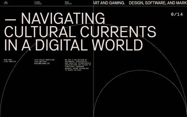
Preview image. Unlock full-res
Color palette
Page backgrounds, card surfaces, all primary backgrounds. Creates a high-contrast foundation for content
Primary text color, link text, navigation text, ghost button borders, and decorative accents. Provides stark contrast against the dark background
Typography
- Weights
- 400
- Sizes
- 32px, 35px, 121px
- Line height
- 0.85, 1, 1.2
- Letter spacing
- -0.016, -0.01
- Fallback
- Montserrat
Headlines and prominent display text. Its wide character forms at large sizes define the brand's assertive yet clean typographic voice, with tight tracking enhancing its impact.
- Weights
- 400
- Sizes
- 11px, 32px
- Line height
- 1, 1.2
- Letter spacing
- -0.045
- Fallback
- Space Mono
Body text, navigation, links, and various informational elements. Its monospace nature adds a technical, precise feel, with negative letter-spacing for a compact appearance.
Spacing & shape
Components
Uses Ghost Sand text on Midnight Void background, with 10px right padding for spacing between items. No border or radius, relying on text color for interaction states.
Text in Ghost Sand, with a 1px solid Ghost Sand border. Background is Midnight Void. No border radius or padding, creating a minimal, text-focused interactive element. The border is a subtle underline.
Guidelines
- Prioritize Midnight Void (#000000) for all background surfaces to maintain high contrast and the dark theme.
- Use Ghost Sand (#e7ded1) as the primary color for all text, links, and interactive element outlines.
- Employ NB Akademie for large, impactful headlines, ensuring letter-spacing values (-0.0160em to -0.0100em) are applied for proper visual density.
- Reserve NB Akademie Mono for body text, navigation, and detailed information, using its distinctive negative letter-spacing (-0.0450em) to create a compact, structured feel.
- Maintain a spacious density in layouts, utilizing 26px for section gaps and 10px for element gaps to provide ample breathing room between content blocks.
- Implement Ghost Primary Buttons using Ghost Sand (#e7ded1) text and a 1px solid Ghost Sand border on a Midnight Void background, with no padding or radius.
- Utilize 1px Ghost Sand (#e7ded1) lines for subtle visual dividers, such as those seen in the header and alongside body text blocks.
- Avoid using saturated or vivid colors for primary UI elements; color is reserved for decorative gradients or specific content within page sections.
- Do not introduce heavy shadows or elevation; the design relies on flat surfaces and high contrast for visual hierarchy.
- Refrain from using rounded corners on any UI elements; all corners should be sharp and angular (0px radius).
- Do not use generic system fonts; NB Akademie and NB Akademie Mono are essential to the brand's typographic identity.
- Avoid dense, information-heavy blocks of text without sufficient line breaks or spacing; maintain the spacious and minimalist aesthetic.
- Do not use filled buttons for primary calls to action; ghost buttons with a border are characteristic of this design system.
- Minimize the use of multiple font weights; the system primarily uses weight 400 for both typefaces.
About this system
ShowHide
Cthdrl presents a stark, high-contrast dark mode aesthetic, leveraging deep black backgrounds for dramatic visual impact. Typography is central, utilizing two bespoke sans-serif fonts in varied sizes to establish a strong hierarchical rhythm and distinctive brand voice. Interactive elements are minimalist, appearing as ghost controls or text links with a subtle off-white highlight, maintaining the overall severe and sophisticated atmosphere. The visual system emphasizes spaciousness, relying on precise typographic arrangement and discreet dividing lines rather than heavy components or decorative flourishes.
The page model is full-bleed, with a centered content approach that does not impose a strict max-width but rather uses horizontal white space as part of its design. The hero section is characterized by a full-bleed dark background with a large, centered headline that dominates the viewport. The section rhythm is primarily seamless, relying on typographic shifts and subtle dividing lines rather than alternating background colors. Content is often presented in a single column stack, emphasizing large headlines with smaller, supporting text blocks. Navigation is a minimal top bar, with elements precisely spaced and aligned.
The site uses minimal imagery, primarily relying on abstract, subtle line work and geometric arcs that weave across the dark background as decorative elements. Iconography, when present in the header, is monochromatic (Ghost Sand outline on Midnight Void fill), featuring a delicate stroke weight. The visual language is text-dominant, with graphics serving as atmospheric accents rather than prominent content showcases, contributing to a disciplined and structural feel.
Reminiscent of Aether, Basic.Space, Huge Inc..
# cthdrl — Style Reference
> Black canvas, stark typography

**Theme:** dark

**Site:** https://cthdrl.co

Cthdrl presents a stark, high-contrast dark mode aesthetic, leveraging deep black backgrounds for dramatic visual impact. Typography is central, utilizing two bespoke sans-serif fonts in varied sizes to establish a strong hierarchical rhythm and distinctive brand voice. Interactive elements are minimalist, appearing as ghost controls or text links with a subtle off-white highlight, maintaining the overall severe and sophisticated atmosphere. The visual system emphasizes spaciousness, relying on precise typographic arrangement and discreet dividing lines rather than heavy components or decorative flourishes.

## Tokens — Colors

| Name | Value | Token | Role |
|------|------|------|------|
| Midnight Void | `#000000` | `--color-midnight-void` | Page backgrounds, card surfaces, all primary backgrounds. Creates a high-contrast foundation for content |
| Ghost Sand | `#e7ded1` | `--color-ghost-sand` | Primary text color, link text, navigation text, ghost button borders, and decorative accents. Provides stark contrast against the dark background |

## Tokens — Typography

### NB Akademie
- **Substitute:** Montserrat
- **Weights:** 400
- **Sizes:** 32px, 35px, 121px
- **Line height:** 0.85, 1, 1.2
- **Letter spacing:** -0.016, -0.01
- **Role:** Headlines and prominent display text. Its wide character forms at large sizes define the brand's assertive yet clean typographic voice, with tight tracking enhancing its impact.

### NB Akademie Mono
- **Substitute:** Space Mono
- **Weights:** 400
- **Sizes:** 11px, 32px
- **Line height:** 1, 1.2
- **Letter spacing:** -0.045
- **Role:** Body text, navigation, links, and various informational elements. Its monospace nature adds a technical, precise feel, with negative letter-spacing for a compact appearance.

## Tokens — Type Scale

| Role | Size | Line height | Letter spacing |
|------|------|------|------|
| heading-sm | 32px | 1.2 | -0.512px |
| heading | 35px | 1 | -0.56px |
| display | 121px | 0.85 | -1.936px |

## Tokens — Spacing

- **Section gap:** 26px
- **Card padding:** 0px
- **Element gap:** 10px

## Tokens — Radius

- **Buttons:** 0px

## Layout

The page model is full-bleed, with a centered content approach that does not impose a strict max-width but rather uses horizontal white space as part of its design. The hero section is characterized by a full-bleed dark background with a large, centered headline that dominates the viewport. The section rhythm is primarily seamless, relying on typographic shifts and subtle dividing lines rather than alternating background colors. Content is often presented in a single column stack, emphasizing large headlines with smaller, supporting text blocks. Navigation is a minimal top bar, with elements precisely spaced and aligned.

## Imagery

The site uses minimal imagery, primarily relying on abstract, subtle line work and geometric arcs that weave across the dark background as decorative elements. Iconography, when present in the header, is monochromatic (Ghost Sand outline on Midnight Void fill), featuring a delicate stroke weight. The visual language is text-dominant, with graphics serving as atmospheric accents rather than prominent content showcases, contributing to a disciplined and structural feel.

## Components

### Ghost Navigation Link
*Top navigation and inline links*

Uses Ghost Sand text on Midnight Void background, with 10px right padding for spacing between items. No border or radius, relying on text color for interaction states.

### Ghost Primary Button
*Call to action buttons*

Text in Ghost Sand, with a 1px solid Ghost Sand border. Background is Midnight Void. No border radius or padding, creating a minimal, text-focused interactive element. The border is a subtle underline.

## Guidelines

### Do

- Prioritize Midnight Void (#000000) for all background surfaces to maintain high contrast and the dark theme.
- Use Ghost Sand (#e7ded1) as the primary color for all text, links, and interactive element outlines.
- Employ NB Akademie for large, impactful headlines, ensuring letter-spacing values (-0.0160em to -0.0100em) are applied for proper visual density.
- Reserve NB Akademie Mono for body text, navigation, and detailed information, using its distinctive negative letter-spacing (-0.0450em) to create a compact, structured feel.
- Maintain a spacious density in layouts, utilizing 26px for section gaps and 10px for element gaps to provide ample breathing room between content blocks.
- Implement Ghost Primary Buttons using Ghost Sand (#e7ded1) text and a 1px solid Ghost Sand border on a Midnight Void background, with no padding or radius.
- Utilize 1px Ghost Sand (#e7ded1) lines for subtle visual dividers, such as those seen in the header and alongside body text blocks.

### Don't

- Avoid using saturated or vivid colors for primary UI elements; color is reserved for decorative gradients or specific content within page sections.
- Do not introduce heavy shadows or elevation; the design relies on flat surfaces and high contrast for visual hierarchy.
- Refrain from using rounded corners on any UI elements; all corners should be sharp and angular (0px radius).
- Do not use generic system fonts; NB Akademie and NB Akademie Mono are essential to the brand's typographic identity.
- Avoid dense, information-heavy blocks of text without sufficient line breaks or spacing; maintain the spacious and minimalist aesthetic.
- Do not use filled buttons for primary calls to action; ghost buttons with a border are characteristic of this design system.
- Minimize the use of multiple font weights; the system primarily uses weight 400 for both typefaces.

## Agent Prompt Guide

**Quick Color Reference**
text: #e7ded1
background: #000000
border: #e7ded1
accent: none observed
primary action: no distinct CTA color

**3-5 Example Component Prompts**
1. Create a primary headline with supporting text: Headline 'Future Architectures' at 121px NB Akademie weight 400, #e7ded1, letter-spacing -1.936px. Subtext 'Building the next era' at 11px NB Akademie Mono weight 400, #e7ded1, letter-spacing -0.495px.
2. Create a ghost navigation link: Text 'WORK' at 11px NB Akademie Mono weight 400, #e7ded1, letter-spacing -0.495px, with 10px right padding.
3. Design a descriptive text block: 'We are a collection of designers, strategists, and creative technologists architecting the future.' at 11px NB Akademie Mono weight 400, #e7ded1, letter-spacing -0.495px.
4. Create a ghost button: Text 'DISCOVER' at 32px NB Akademie weight 400, #e7ded1, letter-spacing -0.512px. Add a 1px solid #e7ded1 border.
More like this





Keep what you find
A free account saves references to boards and can send you a weekly email of picks based on what you save.
To see every result, go Pro.