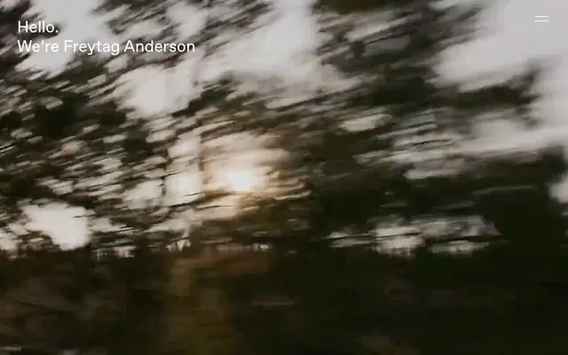
Preview image. Unlock full-res
Black canvas, stark typography
Color palette
Page backgrounds, primary text color for light elements on dark surfaces, borders for text-based components
Primary text color for dark elements on light surfaces, background for certain components and hover states
Subtle background for layered elements over Canvas Dark
Alternative subtle background, almost imperceptible against Canvas Dark
Border colors for interactive elements, background for ghost buttons, secondary text color on dark backgrounds
Very subtle background for specific sections, adding warmth against the dark theme
Typography
- Weights
- 300, 400
- Sizes
- 15px, 17px, 41px
- Line height
- 1, 1.18, 1.2, 1.4, 1.7
- Letter spacing
- -0.0220em, -0.0200em
- Fallback
- Inter
Primary typeface for all body text, links, buttons, and most headings. Its utilitarian feel supports the direct, no-nonsense brand message.
- Weights
- 300, 400
- Sizes
- 17px
- Line height
- 1.4, 1.7
- Letter spacing
- -0.0200em
- Fallback
- Open Sans
Used for specific supporting text, providing a slightly more structured but still understated alternative to FAVORIT.
- Weights
- 300
- Sizes
- 15px, 17px
- Line height
- 1.2, 1.4
- Letter spacing
- -0.0200em, 0.0200em
- Fallback
- Roboto
Used for minor interactive elements and specific UI text, contributing to the clean, modern feel.
Spacing & shape
Components
Background: Muted UI Gray (#dcdcdc), Text: Canvas Dark (#000000), Border: Muted UI Gray (#dcdcdc) with 300px radius, Padding: 12px vertical, 20px horizontal.
Background: transparent, Text: Canvas Dark (#000000), Border: Canvas Dark (#000000), Padding: 1px vertical, 6px horizontal.
Background: transparent, no shadow, no border, no padding, 0px radius. Relies on layout for separation.
Text: Canvas Light (#fafafa), no underline by default, visually distinct only on hover or active states (handled by interaction patterns).
Guidelines
- Prioritize text content and layout over decorative elements.
- Use Canvas Dark (#000000) for all main backgrounds and Canvas Light (#fafafa) for primary text in reversed contexts.
- Maintain high contrast ratios for all text elements.
- Apply 0px radius for all general containers and cards to maintain a sharp, deliberate edge.
- Use FAVORIT font for all body text and headings in varying sizes and weights, leveraging its clean, versatile character.
- Ensure generous negative space around all content blocks, using 17px as a base element gap.
- Employ the 300px radius for all interactive buttons and tags, creating a distinctive pill shape.
- Do not introduce strong accent colors; maintain the achromatic palette.
- Avoid using drop shadows or complex gradients; rely on flat surfaces and high contrast for visual hierarchy.
- Do not deviate from the specified font families; avoid generic system fonts.
- Do not add unnecessary borders or dividers; rely on spacing and typography for content separation.
- Avoid large imagery or elaborate illustrations; focus on text and minimal UI elements.
- Do not use generic button shapes; ensure all buttons adhere to the pill-shaped 300px radius.
- Avoid horizontal padding on cards; keep card content flush unless explicitly specified.
About this system
ShowHide
Freytag Anderson employs a minimalist, high-contrast aesthetic, building a visual language of quiet authority. Its dark-mode foundation with stark white typography creates dramatic legibility, while purposeful negative space and a constrained color palette emphasize content and text as primary visual elements. Interactions are subtle, relying on hover states and minimal accents rather than overt visual cues, conveying a sense of understated confidence.
The page maintains a full-bleed layout, taking advantage of the dark background. The hero section features large, centered headlines over a dynamic, dark motion background. Content sections flow vertically with consistent, spacious internal padding, often featuring large, centered text blocks or a more traditional left-aligned text approach within the dark canvas. There are no clear card grids on the main page, reinforcing the text-heavy, spacious feel. Navigation is minimal, typically a subtle right-aligned menu icon leading to an overlay.
The site primarily uses photography, often treated with a dark, moody filter and motion blur, conveying a dynamic atmosphere rather than static content. When clear, imagery appears as full-bleed background elements under text. Product imagery, if present, would likely be integrated subtly or presented with minimal adornment. Icons are minimal, represented by simple geometric shapes (e.g., a hamburger menu icon). The density is text-dominant, with imagery serving as an atmospheric backdrop.
Reminiscent of AIGA, Basic Agency, Work & Co.
# Freytag Anderson — Style Reference
> Black canvas, stark typography

**Theme:** dark

**Site:** https://www.freytaganderson.com

Freytag Anderson employs a minimalist, high-contrast aesthetic, building a visual language of quiet authority. Its dark-mode foundation with stark white typography creates dramatic legibility, while purposeful negative space and a constrained color palette emphasize content and text as primary visual elements. Interactions are subtle, relying on hover states and minimal accents rather than overt visual cues, conveying a sense of understated confidence.

## Tokens — Colors

| Name | Value | Token | Role |
|------|------|------|------|
| Canvas Dark | `#000000` | `--color-canvas-dark` | Page backgrounds, primary text color for light elements on dark surfaces, borders for text-based components |
| Canvas Light | `#fafafa` | `--color-canvas-light` | Primary text color for dark elements on light surfaces, background for certain components and hover states |
| Elevated Dark | `#1c1c1c` | `--color-elevated-dark` | Subtle background for layered elements over Canvas Dark |
| Subtle Dark | `#141109` | `--color-subtle-dark` | Alternative subtle background, almost imperceptible against Canvas Dark |
| Muted UI Gray | `#dcdcdc` | `--color-muted-ui-gray` | Border colors for interactive elements, background for ghost buttons, secondary text color on dark backgrounds |
| Warm Hint Gray | `#c2b5ae` | `--color-warm-hint-gray` | Very subtle background for specific sections, adding warmth against the dark theme |

## Tokens — Typography

### FAVORIT
- **Substitute:** Inter
- **Weights:** 300, 400
- **Sizes:** 15px, 17px, 41px
- **Line height:** 1, 1.18, 1.2, 1.4, 1.7
- **Letter spacing:** -0.0220em, -0.0200em
- **Role:** Primary typeface for all body text, links, buttons, and most headings. Its utilitarian feel supports the direct, no-nonsense brand message.

### Clarkson
- **Substitute:** Open Sans
- **Weights:** 300, 400
- **Sizes:** 17px
- **Line height:** 1.4, 1.7
- **Letter spacing:** -0.0200em
- **Role:** Used for specific supporting text, providing a slightly more structured but still understated alternative to FAVORIT.

### halyard-display
- **Substitute:** Roboto
- **Weights:** 300
- **Sizes:** 15px, 17px
- **Line height:** 1.2, 1.4
- **Letter spacing:** -0.0200em, 0.0200em
- **Role:** Used for minor interactive elements and specific UI text, contributing to the clean, modern feel.

## Tokens — Type Scale

Golden Ratio (1.618) from 41px base.

| Role | Size | Line height | Letter spacing |
|------|------|------|------|
| caption | 15px | 1.2 | — |
| body-sm | 17px | 1.2 | — |
| body | 41px | 1.2 | — |

## Tokens — Spacing

- **Section gap:** 43px
- **Card padding:** 0px
- **Element gap:** 17px

## Tokens — Radius

- **Buttons:** 300px
- **Cards:** 0px

## Layout

The page maintains a full-bleed layout, taking advantage of the dark background. The hero section features large, centered headlines over a dynamic, dark motion background. Content sections flow vertically with consistent, spacious internal padding, often featuring large, centered text blocks or a more traditional left-aligned text approach within the dark canvas. There are no clear card grids on the main page, reinforcing the text-heavy, spacious feel. Navigation is minimal, typically a subtle right-aligned menu icon leading to an overlay.

## Imagery

The site primarily uses photography, often treated with a dark, moody filter and motion blur, conveying a dynamic atmosphere rather than static content. When clear, imagery appears as full-bleed background elements under text. Product imagery, if present, would likely be integrated subtly or presented with minimal adornment. Icons are minimal, represented by simple geometric shapes (e.g., a hamburger menu icon). The density is text-dominant, with imagery serving as an atmospheric backdrop.

## Components

### Primary Filled Button
*Main call-to-action button, conveying prominence through fill.*

Background: Muted UI Gray (#dcdcdc), Text: Canvas Dark (#000000), Border: Muted UI Gray (#dcdcdc) with 300px radius, Padding: 12px vertical, 20px horizontal.

### Ghost Button
*Secondary action or navigation element, minimal visual weight.*

Background: transparent, Text: Canvas Dark (#000000), Border: Canvas Dark (#000000), Padding: 1px vertical, 6px horizontal.

### Feature Card
*Group related content without adding visual noise.*

Background: transparent, no shadow, no border, no padding, 0px radius. Relies on layout for separation.

### Text Link
*Interactive text for navigation or references.*

Text: Canvas Light (#fafafa), no underline by default, visually distinct only on hover or active states (handled by interaction patterns).

## Guidelines

### Do

- Prioritize text content and layout over decorative elements.
- Use Canvas Dark (#000000) for all main backgrounds and Canvas Light (#fafafa) for primary text in reversed contexts.
- Maintain high contrast ratios for all text elements.
- Apply 0px radius for all general containers and cards to maintain a sharp, deliberate edge.
- Use FAVORIT font for all body text and headings in varying sizes and weights, leveraging its clean, versatile character.
- Ensure generous negative space around all content blocks, using 17px as a base element gap.
- Employ the 300px radius for all interactive buttons and tags, creating a distinctive pill shape.

### Don't

- Do not introduce strong accent colors; maintain the achromatic palette.
- Avoid using drop shadows or complex gradients; rely on flat surfaces and high contrast for visual hierarchy.
- Do not deviate from the specified font families; avoid generic system fonts.
- Do not add unnecessary borders or dividers; rely on spacing and typography for content separation.
- Avoid large imagery or elaborate illustrations; focus on text and minimal UI elements.
- Do not use generic button shapes; ensure all buttons adhere to the pill-shaped 300px radius.
- Avoid horizontal padding on cards; keep card content flush unless explicitly specified.

## Agent Prompt Guide

Quick Color Reference:
text: #fafafa
background: #000000
border: #dcdcdc
accent: no distinct accent color
primary action: no distinct CTA color

Example Component Prompts:
1. Create a hero section with 'Hello. We’re Freytag Anderson' centered. Use Canvas Light (#fafafa) as text color. The font should be FAVORIT weight 400 at 41px line-height 1.00.
2. Design a supporting text block using Clarkson weight 300 at 17px line-height 1.40, color Canvas Light (#fafafa).
3. Create a secondary ghost button with the text 'Show More'. Use Canvas Dark (#000000) for border and text, 1px vertical padding, 6px horizontal padding. Font halyard-display weight 300 at 15px with letter-spacing 0.0200em.
More like this





Keep what you find
A free account saves references to boards and can send you a weekly email of picks based on what you save.
To see every result, go Pro.