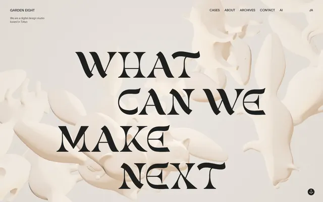
Preview image. Unlock full-res
velvety stark minimalism
Color palette
Page backgrounds, primary text, dark UI elements — provides a rich, deep base for content
Hairline borders, dividers, input outlines, and card edges on light surfaces. Do not promote it to the primary CTA color
Highly contrasting primary text used when Soft Vanilla is background, ensuring maximum legibility
Typography
- Weights
- 600
- Sizes
- 215px
- Line height
- 0.77
- Letter spacing
- normal
- Fallback
- Playfair Display
Display headlines and brand statements — its ornamental features provide a distinctive, old-world elegance.
- Weights
- 200, 400
- Sizes
- 12px, 14px, 15px, 215px
- Line height
- 1.25, 1.3, 1.42, 1.5, 1.6
- Letter spacing
- normal
- Fallback
- Inter
All functional text, including body copy, navigation, and labels — its clean, modern lines offer high legibility.
Spacing & shape
Components
Text-only buttons using Soft Vanilla for text, appearing as elegant, understated navigation items. Features flexible padding and a thin 1px Soft Vanilla border on hover/active states.
Features a 1px Soft Vanilla border, Soft Vanilla text, and 1440px border-radius for a distinct pill shape. Padding is 1px top/bottom and 12px left/right.
Guidelines
- Use Midnight Ink (#1e1f1f) for all primary backgrounds and main body text to maintain the dark theme.
- Apply Soft Vanilla (#dbd6d0) for all interactive elements, secondary text, and borders to create contrast.
- Utilize the gunsan font at 215px with line-height 0.77 for all prominent display headlines, embodying an ornate aesthetic.
- Ensure all functional text, including navigation and body copy, uses the lausanne font in weights 200 or 400 for clarity.
- Employ a 1440px border-radius for all button-like elements to achieve a distinct pill-shaped appearance.
- Maintain generous horizontal padding of 180px for main content areas to create a spacious feel.
- Use 1px borders in Soft Vanilla (#dbd6d0) for subtle emphasis on interactive outlines.
- Avoid using saturated colors other than Vivid Orange (#dc5648) as it is reserved for rare accent states.
- Do not use box-shadows or elevation effects; the design relies on flat surfaces and high contrast.
- Do not deviate from the defined lausanne (sans-serif) and gunsan (serif) fonts; no other typefaces are permitted.
- Avoid tight spacing between elements; maintain adequate elementGap (4px minimum) and sectionGap (60px) to preserve density.
- Do not use sharp corners on interactive components; ensure buttons always have a 1440px border-radius.
- Do not introduce gradients into UI elements; maintain a flat color palette.
- Avoid centering content horizontally beyond the main display headline; navigation and body text should align left.
About this system
ShowHide
Garden Eight embraces a monochromatic, stark aesthetic, pairing a velvety dark canvas with contrasting cream accents. Typography plays a central role, leveraging a traditional, elaborate serif for display elements and a modern sans-serif for functional text. The sparse use of color and ample negative space amplifies the visual impact of each element.
The page primarily uses a full-bleed layout, allowing background visuals to extend to the viewport edges. The hero section features a large, ornate display headline centered over the abstract 3D background. Content sections follow a consistent vertical rhythm with minimal visual dividers, flowing seamlessly. Navigation is a compact, right-aligned bar. Text is predominantly left-aligned, creating clear reading paths within the spacious design.
The site uses abstract, fluid 3D renders in a monochromatic, matte-cream palette. These visuals are atmospheric and sculptural, appearing as large, background accents that flow around and behind prominent text rather than serving as direct content or product showcases. The visuals are softly lit, giving them a ceramic or plaster-like quality, and contribute to the site's artful, minimalist tone. Icons are minimal, subtle, and outline-based, appearing with the same text color as surrounding elements.
Reminiscent of Awwwards, Locomotive, Dogstudio.
# Garden Eight — Style Reference
> velvety stark minimalism

**Theme:** dark

**Site:** https://garden-eight.com

Garden Eight embraces a monochromatic, stark aesthetic, pairing a velvety dark canvas with contrasting cream accents. Typography plays a central role, leveraging a traditional, elaborate serif for display elements and a modern sans-serif for functional text. The sparse use of color and ample negative space amplifies the visual impact of each element.

## Tokens — Colors

| Name | Value | Token | Role |
|------|------|------|------|
| Midnight Ink | `#1e1f1f` | `--color-midnight-ink` | Page backgrounds, primary text, dark UI elements — provides a rich, deep base for content |
| Soft Vanilla | `#dbd6d0` | `--color-soft-vanilla` | Hairline borders, dividers, input outlines, and card edges on light surfaces. Do not promote it to the primary CTA color |
| Shadowed Text | `#000000` | `--color-shadowed-text` | Highly contrasting primary text used when Soft Vanilla is background, ensuring maximum legibility |

## Tokens — Typography

### gunsan
- **Substitute:** Playfair Display
- **Weights:** 600
- **Sizes:** 215px
- **Line height:** 0.77
- **Letter spacing:** normal
- **Role:** Display headlines and brand statements — its ornamental features provide a distinctive, old-world elegance.

### lausanne
- **Substitute:** Inter
- **Weights:** 200, 400
- **Sizes:** 12px, 14px, 15px, 215px
- **Line height:** 1.25, 1.3, 1.42, 1.5, 1.6
- **Letter spacing:** normal
- **Role:** All functional text, including body copy, navigation, and labels — its clean, modern lines offer high legibility.

## Tokens — Type Scale

| Role | Size | Line height | Letter spacing |
|------|------|------|------|
| caption | 12px | 1.6 | — |
| body-sm | 14px | 1.5 | — |
| display | 215px | 0.77 | — |

## Tokens — Spacing

- **Section gap:** 60px
- **Card padding:** 12px
- **Element gap:** 4px

## Tokens — Radius

- **General:** 30px
- **Buttons:** 1440px

## Layout

The page primarily uses a full-bleed layout, allowing background visuals to extend to the viewport edges. The hero section features a large, ornate display headline centered over the abstract 3D background. Content sections follow a consistent vertical rhythm with minimal visual dividers, flowing seamlessly. Navigation is a compact, right-aligned bar. Text is predominantly left-aligned, creating clear reading paths within the spacious design.

## Imagery

The site uses abstract, fluid 3D renders in a monochromatic, matte-cream palette. These visuals are atmospheric and sculptural, appearing as large, background accents that flow around and behind prominent text rather than serving as direct content or product showcases. The visuals are softly lit, giving them a ceramic or plaster-like quality, and contribute to the site's artful, minimalist tone. Icons are minimal, subtle, and outline-based, appearing with the same text color as surrounding elements.

## Components

### Ghost Navigation Button
*Navigation and secondary actions*

Text-only buttons using Soft Vanilla for text, appearing as elegant, understated navigation items. Features flexible padding and a thin 1px Soft Vanilla border on hover/active states.

### Pill Outline Button
*Primary interactive element for calls to action*

Features a 1px Soft Vanilla border, Soft Vanilla text, and 1440px border-radius for a distinct pill shape. Padding is 1px top/bottom and 12px left/right.

## Guidelines

### Do

- Use Midnight Ink (#1e1f1f) for all primary backgrounds and main body text to maintain the dark theme.
- Apply Soft Vanilla (#dbd6d0) for all interactive elements, secondary text, and borders to create contrast.
- Utilize the gunsan font at 215px with line-height 0.77 for all prominent display headlines, embodying an ornate aesthetic.
- Ensure all functional text, including navigation and body copy, uses the lausanne font in weights 200 or 400 for clarity.
- Employ a 1440px border-radius for all button-like elements to achieve a distinct pill-shaped appearance.
- Maintain generous horizontal padding of 180px for main content areas to create a spacious feel.
- Use 1px borders in Soft Vanilla (#dbd6d0) for subtle emphasis on interactive outlines.

### Don't

- Avoid using saturated colors other than Vivid Orange (#dc5648) as it is reserved for rare accent states.
- Do not use box-shadows or elevation effects; the design relies on flat surfaces and high contrast.
- Do not deviate from the defined lausanne (sans-serif) and gunsan (serif) fonts; no other typefaces are permitted.
- Avoid tight spacing between elements; maintain adequate elementGap (4px minimum) and sectionGap (60px) to preserve density.
- Do not use sharp corners on interactive components; ensure buttons always have a 1440px border-radius.
- Do not introduce gradients into UI elements; maintain a flat color palette.
- Avoid centering content horizontally beyond the main display headline; navigation and body text should align left.

## Agent Prompt Guide

**Quick Color Reference:**
- text: #1e1f1f
- background: #1e1f1f
- border: #dbd6d0
- accent: #dc5648
- primary action: no distinct CTA color

**3-5 Example Component Prompts:**
- Create a site header with 'Garden Eight' (lausanne font, 15px, #1e1f1f) on the left, and a navigation bar on the right with 'Cases', 'About', 'Archives' (lausanne font, 15px, #1e1f1f, 10px horizontal padding).
- Design a hero section with a centered headline 'WHAT CAN WE MAKE NEXT' (gunsan font, 215px, #1e1f1f, line-height 0.77), over a background of abstract cream 3D shapes.
- Build a secondary content block that uses Soft Vanilla (#dbd6d0) for its background, with black text (#000000) and a Ghost Navigation Button (Soft Vanilla text, no background, 1px Soft Vanilla border on hover, 1440px radius, 1px top/bottom, 12px left/right padding).
More like this





Keep what you find
A free account saves references to boards and can send you a weekly email of picks based on what you save.
To see every result, go Pro.