Preview image. Unlock full-res
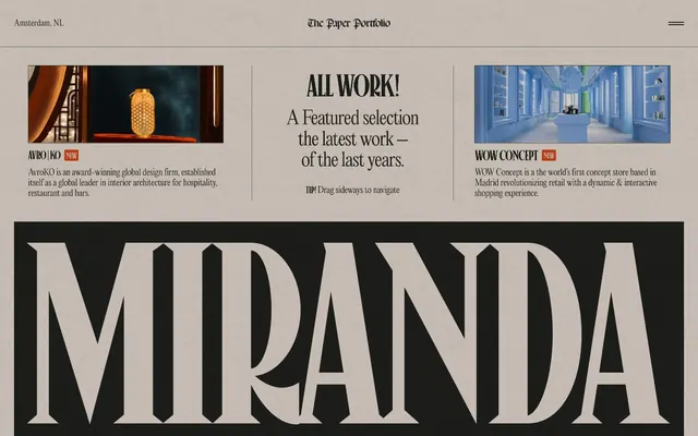
Vintage newsprint, bold headlines.
Color palette
Page backgrounds, primary text, active states, button fills, and strong borders — forms the dark canvas of the design; Base tint for subtle shadows, giving elevation a consistent, muted dark appearance
Card backgrounds, secondary text, and interactive elements — provides a warm, lighter surface contrast
Accent borders, visual separators, and strong typographic elements — used sparingly for maximum impact
Subtle background accents, image backgrounds, and very light surface highlights
Typography
- Weights
- 300
- Sizes
- 16px, 17px, 19px, 20px, 24px, 29px, 31px, 32px, 37px, 86px
- Line height
- 0.93, 1.08, 1.11, 1.15, 1.16, 1.18, 1.2, 1.25, 1.27, 1.33, 1.36
- Letter spacing
- -0.0400em, -0.0330em, -0.0300em, -0.0210em, -0.0200em, -0.0190em, -0.0100em
- Fallback
- Playfair Display
Primary text across navigation, body copy, and secondary headings. Its light weight at various sizes provides a refined, editorial feel.
- Weights
- 400
- Sizes
- 17px, 20px, 22px, 23px, 32px, 43px, 65px, 72px, 86px, 109px, 112px, 118px, 122px, 202px, 212px, 366px, 432px, 446px, 533px
- Line height
- 0.71, 0.73, 0.77, 0.78, 0.79, 0.81, 0.91, 1, 1.25
- Letter spacing
- -0.0890em, -0.0500em, -0.0450em, -0.0400em, -0.0360em, -0.0310em, -0.0300em, -0.0290em, -0.0140em, -0.0070em
- Fallback
- Anton
Display headings and section titles that demand bold presence. Its extreme letter-spacing and massive sizes create a striking, almost architectural visual impact.
- Weights
- 500
- Sizes
- 20px, 22px, 32px, 65px, 72px, 86px, 109px, 118px, 122px, 446px
- Line height
- 0.73, 0.78, 0.79, 0.91, 1
- Letter spacing
- -0.0600em, -0.0500em, -0.0310em, -0.0300em, -0.0200em
- Fallback
- Staatliches
Large, impactful headings used for key statements, often layered with other elements. Its bold forms and tight kerning contribute to the 'newspaper masthead' feel.
- Weights
- 400
- Sizes
- 158px
- Letter spacing
- -0.0040em
- Fallback
- Oswald
Single-purpose, extremely large decorative text for emphasis, often in single words or short phrases.
Spacing & shape
Elevation
Components
Solid filled button with a strong, dark background and no visible border radius. Uses Midnight Ink (#1d1d1b) for both background and text, with 7.2px top padding and 11.52px horizontal/bottom padding.
Aged Paper (#cdc6be) background with 11.52px border-radius. Features a soft, offset shadow (rgba(29, 29, 27, 0.2) -4px 4px 6px 0px) and generous internal padding (43.2px horizontal, 36px top, 43.2px bottom).
Transparent background with Midnight Ink (#1d1d1b) text. No padding or border-radius, appearing as inline text.
Guidelines
- Prioritize high contrast between Midnight Ink (#1d1d1b) and Aged Paper (#cdc6be) for readability and visual punch.
- Use Editorial New weight 300 for all body text and secondary headings, leveraging its refined character.
- Implement the square, zero-radius design for all action buttons using Midnight Ink (#1d1d1b) as background and text.
- Apply 11.52px border-radius consistently to all card-like containers and content blocks.
- Utilize extreme letter-spacing (-0.089em for Canopee at 17px, reducing for larger sizes) for display typography to reinforce the editorial aesthetic.
- Employ the subtle offset shadow rgba(29, 29, 27, 0.2) -4px 4px 6px 0px for elevated content cards, rather than hard borders.
- Maintain a comfortable rhythm with element gaps primarily around 14px and card padding at 43.2px.
- Avoid generic system fonts; always use the specified custom fonts (Editorial New, Canopee, Domaine Display, Germgoth) to maintain brand identity.
- Do not introduce sharp, angular shadows; stick to the soft, tinted shadows derived from Midnight Ink for all elevations.
- Refrain from using highly saturated colors for interface elements; the palette is primarily monochromatic with warm neutrals.
- Do not deviate from the specified padding for cards (43.2px horizontal, 36px top, 43.2px bottom); consistency is key for content blocks.
- Avoid large border-radii on interactive elements like buttons, adhering to the 0px radius for this component.
- Do not apply excessive visual decorations or gradients; the system relies on strong typography, high contrast, and subtle textures.
- Never use automatic letter-spacing for headings; manually apply the specified negative letter-spacing values to achieve the desired tight appearance.
About this system
ShowHide
Miranda's visual system evokes a vintage newspaper aesthetic with a modern, high-contrast twist. It combines deeply saturated, almost black backgrounds with warm, desaturated off-white surfaces, creating a dramatic stage for its expressive typography. The layout is structured yet dynamic, featuring oversized type and editorial-inspired content blocks with subtle elevation. This system prioritizes visual impact and textural richness over minimalist austerity.
The page embraces a contained, centered layout, punctuated by full-bleed sections or oversized typographic elements. The hero section establishes the newspaper aesthetic with a centered, massive headline (e.g., 'MIRANDA'). Content sections often alternate between dark (Midnight Ink) and light (Aged Paper) bands, creating a distinct visual rhythm. Inner sections frequently utilize a two-column grid for text and image combinations, or a more flexible editorial arrangement with asymmetrical content blocks and large, expressive typography. Navigation is subtle, typically a top-right hamburger menu and small, discreet links, maintaining focus on the content blocks. Vertical spacing is consistent but generous, contributing to a comfortable, unhurried reading experience.
The imagery on this site consists primarily of contained, full-color product or artistic shots. Photos and illustrations are presented within rectangular frames atop the Aged Paper (#cdc6be) surface, which usually includes Bleached Canvas (#e2dedb) for the image background itself. The treatment is isolated and contained, with no complex masking or overlapping, resembling framed art or magazine cutouts. Icons, when present, are minimal in style, likely outlined and monochrome to blend into the overall aesthetic.
Reminiscent of AIGA Eye on Design, The New York Times Online, Studio—JQ.
# Miranda — Style Reference
> Vintage newsprint, bold headlines.

**Theme:** dark

**Site:** https://www.niccolomiranda.com

Miranda's visual system evokes a vintage newspaper aesthetic with a modern, high-contrast twist. It combines deeply saturated, almost black backgrounds with warm, desaturated off-white surfaces, creating a dramatic stage for its expressive typography. The layout is structured yet dynamic, featuring oversized type and editorial-inspired content blocks with subtle elevation. This system prioritizes visual impact and textural richness over minimalist austerity.

## Tokens — Colors

| Name | Value | Token | Role |
|------|------|------|------|
| Midnight Ink | `#1d1d1b` | `--color-midnight-ink` | Page backgrounds, primary text, active states, button fills, and strong borders — forms the dark canvas of the design; Base tint for subtle shadows, giving elevation a consistent, muted dark appearance |
| Aged Paper | `#cdc6be` | `--color-aged-paper` | Card backgrounds, secondary text, and interactive elements — provides a warm, lighter surface contrast |
| Deep Shadow | `#000000` | `--color-deep-shadow` | Accent borders, visual separators, and strong typographic elements — used sparingly for maximum impact |
| Bleached Canvas | `#e2dedb` | `--color-bleached-canvas` | Subtle background accents, image backgrounds, and very light surface highlights |

## Tokens — Typography

### Editorial New
- **Substitute:** Playfair Display
- **Weights:** 300
- **Sizes:** 16px, 17px, 19px, 20px, 24px, 29px, 31px, 32px, 37px, 86px
- **Line height:** 0.93, 1.08, 1.11, 1.15, 1.16, 1.18, 1.2, 1.25, 1.27, 1.33, 1.36
- **Letter spacing:** -0.0400em, -0.0330em, -0.0300em, -0.0210em, -0.0200em, -0.0190em, -0.0100em
- **Role:** Primary text across navigation, body copy, and secondary headings. Its light weight at various sizes provides a refined, editorial feel.

### Canopee
- **Substitute:** Anton
- **Weights:** 400
- **Sizes:** 17px, 20px, 22px, 23px, 32px, 43px, 65px, 72px, 86px, 109px, 112px, 118px, 122px, 202px, 212px, 366px, 432px, 446px, 533px
- **Line height:** 0.71, 0.73, 0.77, 0.78, 0.79, 0.81, 0.91, 1, 1.25
- **Letter spacing:** -0.0890em, -0.0500em, -0.0450em, -0.0400em, -0.0360em, -0.0310em, -0.0300em, -0.0290em, -0.0140em, -0.0070em
- **Role:** Display headings and section titles that demand bold presence. Its extreme letter-spacing and massive sizes create a striking, almost architectural visual impact.

### Domaine Display
- **Substitute:** Staatliches
- **Weights:** 500
- **Sizes:** 20px, 22px, 32px, 65px, 72px, 86px, 109px, 118px, 122px, 446px
- **Line height:** 0.73, 0.78, 0.79, 0.91, 1
- **Letter spacing:** -0.0600em, -0.0500em, -0.0310em, -0.0300em, -0.0200em
- **Role:** Large, impactful headings used for key statements, often layered with other elements. Its bold forms and tight kerning contribute to the 'newspaper masthead' feel.

### Germgoth
- **Substitute:** Oswald
- **Weights:** 400
- **Sizes:** 158px
- **Letter spacing:** -0.0040em
- **Role:** Single-purpose, extremely large decorative text for emphasis, often in single words or short phrases.

## Tokens — Type Scale

| Role | Size | Line height | Letter spacing |
|------|------|------|------|
| body | 16px | 1.36 | — |
| subheading | 20px | 1.25 | — |
| heading | 32px | 1.15 | -0.64px |
| heading-lg | 86px | 0.93 | -2.58px |
| display | 446px | 0.73 | -4.46px |

## Tokens — Spacing

- **Section gap:** 43px
- **Element gap:** 14px

## Tokens — Radius

- **Buttons:** 0px
- **Cards:** 11.52px
- **misc:** 2.88px

## Tokens — Elevation

- **Card:** `rgba(29, 29, 27, 0.2) -4px 4px 6px 0px`

## Layout

The page embraces a contained, centered layout, punctuated by full-bleed sections or oversized typographic elements. The hero section establishes the newspaper aesthetic with a centered, massive headline (e.g., 'MIRANDA'). Content sections often alternate between dark (Midnight Ink) and light (Aged Paper) bands, creating a distinct visual rhythm. Inner sections frequently utilize a two-column grid for text and image combinations, or a more flexible editorial arrangement with asymmetrical content blocks and large, expressive typography. Navigation is subtle, typically a top-right hamburger menu and small, discreet links, maintaining focus on the content blocks. Vertical spacing is consistent but generous, contributing to a comfortable, unhurried reading experience.

## Imagery

The imagery on this site consists primarily of contained, full-color product or artistic shots. Photos and illustrations are presented within rectangular frames atop the Aged Paper (#cdc6be) surface, which usually includes Bleached Canvas (#e2dedb) for the image background itself. The treatment is isolated and contained, with no complex masking or overlapping, resembling framed art or magazine cutouts. Icons, when present, are minimal in style, likely outlined and monochrome to blend into the overall aesthetic.

## Components

### Filled Button (Email Me)
*Primary action button.*

Solid filled button with a strong, dark background and no visible border radius. Uses Midnight Ink (#1d1d1b) for both background and text, with 7.2px top padding and 11.52px horizontal/bottom padding.

### Feature Card
*Content container for showcased work or information blocks.*

Aged Paper (#cdc6be) background with 11.52px border-radius. Features a soft, offset shadow (rgba(29, 29, 27, 0.2) -4px 4px 6px 0px) and generous internal padding (43.2px horizontal, 36px top, 43.2px bottom).

### Callout Badge
*Small, contextual label for showcasing new content.*

Transparent background with Midnight Ink (#1d1d1b) text. No padding or border-radius, appearing as inline text.

## Guidelines

### Do

- Prioritize high contrast between Midnight Ink (#1d1d1b) and Aged Paper (#cdc6be) for readability and visual punch.
- Use Editorial New weight 300 for all body text and secondary headings, leveraging its refined character.
- Implement the square, zero-radius design for all action buttons using Midnight Ink (#1d1d1b) as background and text.
- Apply 11.52px border-radius consistently to all card-like containers and content blocks.
- Utilize extreme letter-spacing (-0.089em for Canopee at 17px, reducing for larger sizes) for display typography to reinforce the editorial aesthetic.
- Employ the subtle offset shadow rgba(29, 29, 27, 0.2) -4px 4px 6px 0px for elevated content cards, rather than hard borders.
- Maintain a comfortable rhythm with element gaps primarily around 14px and card padding at 43.2px.

### Don't

- Avoid generic system fonts; always use the specified custom fonts (Editorial New, Canopee, Domaine Display, Germgoth) to maintain brand identity.
- Do not introduce sharp, angular shadows; stick to the soft, tinted shadows derived from Midnight Ink for all elevations.
- Refrain from using highly saturated colors for interface elements; the palette is primarily monochromatic with warm neutrals.
- Do not deviate from the specified padding for cards (43.2px horizontal, 36px top, 43.2px bottom); consistency is key for content blocks.
- Avoid large border-radii on interactive elements like buttons, adhering to the 0px radius for this component.
- Do not apply excessive visual decorations or gradients; the system relies on strong typography, high contrast, and subtle textures.
- Never use automatic letter-spacing for headings; manually apply the specified negative letter-spacing values to achieve the desired tight appearance.

## Agent Prompt Guide

Quick Color Reference:
text: #1d1d1b
background: #1d1d1b
border: #1d1d1b
accent: no distinct accent color
primary action: #1d1d1b (filled action)

Example Component Prompts:
Create a hero section: Midnight Ink background. Headline 'MIRANDA' using Domaine Display 500 at 446px, #cdc6be, letter-spacing -4.46px. Subheadline 'ALL WORK!' using Canopee 400 at 86px, #cdc6be, letter-spacing -2.58px. Below it, add a Feature Card.

Create a Feature Card: Aged Paper background, 11.52px radius, shadow rgba(29, 29, 27, 0.2) -4px 4px 6px 0px. Internal padding: 43.2px horizontal, 36px top, 43.2px bottom. Headline 'WOW Concept' using Editorial New 300 at 24px, #1d1d1b, letter-spacing -0.48px. Body text in Editorial New 300 at 16px, #1d1d1b.

Create a navigation button 'Email Me': Midnight Ink background (#1d1d1b), text color #1d1d1b, 0px radius, 7.2px top padding, 11.52px right/bottom/left padding. Font Editorial New 300 at 16px.
More like this





Keep what you find
A free account saves references to boards and can send you a weekly email of picks based on what you save.
To see every result, go Pro.