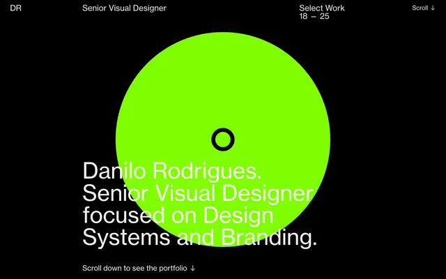
Preview image. Unlock full-res
High-contrast digital minimalist
Color palette
Supporting palette color for small decorative accents when the core palette needs contrast. Do not promote it to the primary CTA color
Page background, primary text on light backgrounds, content borders, ghost button accents
Hairline borders, dividers, input outlines, and card edges on light surfaces. Do not promote it to the primary CTA color
Muted secondary text, subtle element borders
Muted secondary text, descriptive labels
Subtle dark borders, low-contrast UI elements
Typography
- Weights
- 400
- Sizes
- 18px, 19px, 23px, 26px, 31px, 71px
- Line height
- 1, 1.1, 1.2, 1.3
- Letter spacing
- normal
- Fallback
- Inter
Primary content font for all headings, body text, and links. Its singular weight provides consistency, relying on size and color for hierarchy.
- Weights
- 400
- Sizes
- 13px
- Line height
- 1.2
- Letter spacing
- normal
- Fallback
- Times New Roman
Tertiary text for meta-information or small, decorative details, offering a distinct serif counterpoint to the primary sans-serif.
Spacing & shape
Components
Neue Haas Grotesk, 71px, weight 400, lineHeight 1.0, color Paper White. Used for primary page titles.
Neue Haas Grotesk, 18px, weight 400, lineHeight 1.3, color Paper White. Default styling for informational prose.
Neue Haas Grotesk, 23px, weight 400, lineHeight 1.2, color Fog Gray. Provides hierarchy with less visual weight than primary headings.
Neue Haas Grotesk, 18px, weight 400, lineHeight 1.3, color Fog Gray. Hover state changes text color to Paper White with an underline.
A circular shape with a background color of Neon Green, containing a smaller circular cutout with an Absolute Zero border. Radius 9999px for perfect circle.
Times, 13px, weight 400, lineHeight 1.2, color Steel Gray. Used for small, unobtrusive information.
Neue Haas Grotesk, 19px, weight 400, lineHeight 1.2, color Steel Gray. Features an arrow icon. Hover state changes text color to Neon Green.
Guidelines
- Always use Absolute Zero (#000000) for backgrounds and Paper White (#ffffff) for primary text to maintain high contrast.
- Apply Neon Green (#00ff00) exclusively for primary interactive elements or key brand highlights, ensuring impactful visual moments.
- Prioritize Neue Haas Grotesk for all primary text elements, leveraging size and line height to establish clear typographic hierarchy.
- Utilize generous vertical spacing, with a base unit of 13px for elements and 45px for section separation, to create an airy, uncrowded layout.
- Maintain sharp edges: border-radius should generally be 0px, reserving 9999px for perfectly circular elements only.
- Emphasize content through direct text presentation; imagery should be minimal and serve as abstract visual accents rather than detailed content.
- Ensure all interactive text elements (links, buttons) are differentiated by color changes on hover, primarily to Paper White or Neon Green.
- Avoid introducing additional saturated colors; the palette is strictly monochrome with a single Neon Green accent.
- Do not use shadows or elevation effects; surfaces are flat and defined by solid color blocks and clear borders.
- Do not use Neue Haas Grotesk below 18px for body text; switch to smaller, more legible fonts only for meta-information if necessary.
- Do not deviate from the established spacing values; consistent padding and margins are crucial for the minimalist aesthetic.
- Avoid decorative gradients or complex backgrounds; main surfaces should remain solid black to maintain visual intensity.
- Do not use generic system font styling. Adhere strictly to Neue Haas Grotesk and Times typefaces as specified.
- Avoid cluttering sections with numerous elements; maintain a clean, sparse arrangement where each element has room to breathe.
About this system
ShowHide
Danilo Rodrigues' portfolio establishes a striking visual identity through high-contrast monochrome design. The system emphasizes clear textual information with generous spacing on a deep black canvas. A singular, vivid green accent color is used sparingly for an immediate focal point, creating a focused and bold atmosphere. Typography plays a primary role, delivering content with directness and visual weight.
The page adheres to a full-bleed layout, maximizing the impact of the deep black canvas. The hero section features a large, horizontally centered headline over a background that interacts with a large abstract green circle. Sections maintain a consistent vertical rhythm, primarily composed of centered text blocks. Content primarily arranges in single columns for direct readability, with navigation elements positioned in the top corners for a balanced, minimalist visual structure. The layout prioritizes ample negative space, creating an uncluttered and focused experience.
The visual language is characterized by an absence of conventional imagery. Instead, abstract geometric shapes, notably a prominent Neon Green circle, serve as decorative and interactive focal points. Icons, when present, are minimal, often depicted as simple arrows or text-based indicators. The overall density is very low, ensuring text remains the primary content, with graphic elements providing atmospheric texture rather than detailed information or demonstration.
Reminiscent of Basic Apple Guy, Tobias van Schneider, Gusto.
# Danilo Rodrigues — Style Reference
> High-contrast digital minimalist

**Theme:** dark

**Site:** https://danilorodrigues.com

Danilo Rodrigues' portfolio establishes a striking visual identity through high-contrast monochrome design. The system emphasizes clear textual information with generous spacing on a deep black canvas. A singular, vivid green accent color is used sparingly for an immediate focal point, creating a focused and bold atmosphere. Typography plays a primary role, delivering content with directness and visual weight.

## Tokens — Colors

| Name | Value | Token | Role |
|------|------|------|------|
| Neon Green | `#00ff00` | `--color-neon-green` | Supporting palette color for small decorative accents when the core palette needs contrast. Do not promote it to the primary CTA color |
| Absolute Zero | `#000000` | `--color-absolute-zero` | Page background, primary text on light backgrounds, content borders, ghost button accents |
| Paper White | `#ffffff` | `--color-paper-white` | Hairline borders, dividers, input outlines, and card edges on light surfaces. Do not promote it to the primary CTA color |
| Fog Gray | `#eaeaea` | `--color-fog-gray` | Muted secondary text, subtle element borders |
| Steel Gray | `#878787` | `--color-steel-gray` | Muted secondary text, descriptive labels |
| Carbon | `#1e1e1e` | `--color-carbon` | Subtle dark borders, low-contrast UI elements |

## Tokens — Typography

### Neue Haas Grotesk
- **Substitute:** Inter
- **Weights:** 400
- **Sizes:** 18px, 19px, 23px, 26px, 31px, 71px
- **Line height:** 1, 1.1, 1.2, 1.3
- **Letter spacing:** normal
- **Role:** Primary content font for all headings, body text, and links. Its singular weight provides consistency, relying on size and color for hierarchy.

### Times
- **Substitute:** Times New Roman
- **Weights:** 400
- **Sizes:** 13px
- **Line height:** 1.2
- **Letter spacing:** normal
- **Role:** Tertiary text for meta-information or small, decorative details, offering a distinct serif counterpoint to the primary sans-serif.

## Tokens — Type Scale

Perfect Fifth (1.5) from 18px base.

| Role | Size | Line height | Letter spacing |
|------|------|------|------|
| caption | 13px | 1.2 | — |
| body | 18px | 1.3 | — |
| subheading | 23px | 1.2 | — |
| heading | 31px | 1.1 | — |
| display | 71px | 1 | — |

## Tokens — Spacing

- **Section gap:** 45px
- **Card padding:** 26px
- **Element gap:** 13px

## Tokens — Radius

- **Default:** 0px
- **circular:** 9999px

## Layout

The page adheres to a full-bleed layout, maximizing the impact of the deep black canvas. The hero section features a large, horizontally centered headline over a background that interacts with a large abstract green circle. Sections maintain a consistent vertical rhythm, primarily composed of centered text blocks. Content primarily arranges in single columns for direct readability, with navigation elements positioned in the top corners for a balanced, minimalist visual structure. The layout prioritizes ample negative space, creating an uncluttered and focused experience.

## Imagery

The visual language is characterized by an absence of conventional imagery. Instead, abstract geometric shapes, notably a prominent Neon Green circle, serve as decorative and interactive focal points. Icons, when present, are minimal, often depicted as simple arrows or text-based indicators. The overall density is very low, ensuring text remains the primary content, with graphic elements providing atmospheric texture rather than detailed information or demonstration.

## Components

### Primary Heading
*Hero section large text*

Neue Haas Grotesk, 71px, weight 400, lineHeight 1.0, color Paper White. Used for primary page titles.

### Body Text
*General paragraph text*

Neue Haas Grotesk, 18px, weight 400, lineHeight 1.3, color Paper White. Default styling for informational prose.

### Muted Subheading
*Secondary section titles or context*

Neue Haas Grotesk, 23px, weight 400, lineHeight 1.2, color Fog Gray. Provides hierarchy with less visual weight than primary headings.

### Navigation Link
*Top navigation menu items*

Neue Haas Grotesk, 18px, weight 400, lineHeight 1.3, color Fog Gray. Hover state changes text color to Paper White with an underline.

### Accent Circle
*Interactive visual element*

A circular shape with a background color of Neon Green, containing a smaller circular cutout with an Absolute Zero border. Radius 9999px for perfect circle.

### Fine Print Text
*Copyright or disclaimer text*

Times, 13px, weight 400, lineHeight 1.2, color Steel Gray. Used for small, unobtrusive information.

### Email Link
*Contact information*

Neue Haas Grotesk, 19px, weight 400, lineHeight 1.2, color Steel Gray. Features an arrow icon. Hover state changes text color to Neon Green.

## Guidelines

### Do

- Always use Absolute Zero (#000000) for backgrounds and Paper White (#ffffff) for primary text to maintain high contrast.
- Apply Neon Green (#00ff00) exclusively for primary interactive elements or key brand highlights, ensuring impactful visual moments.
- Prioritize Neue Haas Grotesk for all primary text elements, leveraging size and line height to establish clear typographic hierarchy.
- Utilize generous vertical spacing, with a base unit of 13px for elements and 45px for section separation, to create an airy, uncrowded layout.
- Maintain sharp edges: border-radius should generally be 0px, reserving 9999px for perfectly circular elements only.
- Emphasize content through direct text presentation; imagery should be minimal and serve as abstract visual accents rather than detailed content.
- Ensure all interactive text elements (links, buttons) are differentiated by color changes on hover, primarily to Paper White or Neon Green.

### Don't

- Avoid introducing additional saturated colors; the palette is strictly monochrome with a single Neon Green accent.
- Do not use shadows or elevation effects; surfaces are flat and defined by solid color blocks and clear borders.
- Do not use Neue Haas Grotesk below 18px for body text; switch to smaller, more legible fonts only for meta-information if necessary.
- Do not deviate from the established spacing values; consistent padding and margins are crucial for the minimalist aesthetic.
- Avoid decorative gradients or complex backgrounds; main surfaces should remain solid black to maintain visual intensity.
- Do not use generic system font styling. Adhere strictly to Neue Haas Grotesk and Times typefaces as specified.
- Avoid cluttering sections with numerous elements; maintain a clean, sparse arrangement where each element has room to breathe.

## Agent Prompt Guide

Quick Color Reference:
text: #ffffff
background: #000000
border: #eaeaea
accent: #00ff00
primary action: no distinct CTA color

Example Component Prompts:
1. Create a hero section: background #000000. Display text 'Danilo Rodrigues.' in Neue Haas Grotesk, 71px, weight 400, lineHeight 1.0, color #ffffff. Place a large circular element with background color #00ff00 behind the text.
2. Design a navigation link: 'Senior Visual Designer' in Neue Haas Grotesk, 18px, weight 400, lineHeight 1.3, color #eaeaea. On hover, change text color to #ffffff.
3. Implement a body text paragraph: 'Danilo Rodrigues. Over 16 years experience...' in Neue Haas Grotesk, 18px, weight 400, lineHeight 1.3, color #ffffff. Set a padding-bottom of 26px after the paragraph.
More like this





Keep what you find
A free account saves references to boards and can send you a weekly email of picks based on what you save.
To see every result, go Pro.