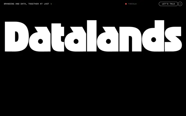
Preview image. Unlock full-res
Monochromatic Canvas, Vivid Punctuation
Color palette
Decorative illustration accents, SVG fills
Highlight backgrounds, brand accent for specific sections
Primary call-to-action button background — a vibrant pop against the dark UI
Orange wash for highlight backgrounds, decorative bands, and soft emphasis behind content
Page backgrounds, primary text, borders, dark overlay for content visibility
Primary text on dark backgrounds, icon fills, card backgrounds
Input text and input borders on light surfaces
Input field backgrounds, light surface elements
Dark borders and separators for elevated surfaces and inverted UI. Do not promote it to the primary CTA color
Muted body text on dark backgrounds
Subtle dark background for distinct interactive elements or cards
Typography
- Weights
- 400
- Sizes
- 12px
- Line height
- 1.2
sans-serif — detected in extracted data but not described by AI
- Weights
- 400
- Sizes
- 358px
- Line height
- 0.83, 1.5
- Letter spacing
- -0.0100em
- Fallback
- Black Ops One
Display headlines and hero text. The singular heavy weight and massive size create an immediate, impactful visual statement, making text into an architectural element.
- Weights
- 400
- Sizes
- 14px, 18px, 22px, 35px, 38px, 42px, 60px, 80px
- Line height
- 1, 1.1, 1.2, 1.25, 1.45
- Letter spacing
- -0.0400em, -0.0360em, -0.0100em, -0.0080em, -0.0030em, -0.0020em, 0.0200em
Primary body text, subheadings, and larger content headings. Its wide range of sizes allows it to establish clear hierarchy from detailed text to prominent section titles, maintaining a consistent, refined feel.
- Weights
- 400
- Sizes
- 13px, 16px
- Line height
- 1.25, 1.45
- Letter spacing
- normal, 0.0500em, 0.1000em, -0.0500em, 0.0200em
Used for navigation, metadata, labels, and specific interactive elements. The monospace nature introduces a technical, precise undertone, offering a clear contrast to the more expressive primary headings.
- Weights
- 200, 600
- Sizes
- 18px
- Line height
- 1.4
Martian Mono Std xLt Extra-light — detected in extracted data but not described by AI
- Weights
- 400
- Sizes
- 16px
- Line height
- 1.45
- Letter spacing
- -0.05
Martian Mono Std xLt — detected in extracted data but not described by AI
- Weights
- 400
- Sizes
- 12px
- Line height
- 1.2
Martian Mono Nr xLt — detected in extracted data but not described by AI
- Weights
- 200
- Sizes
- 12px
- Line height
- 1
Martian Mono Extra-light — detected in extracted data but not described by AI
- Weights
- 400
- Sizes
- 15px
- Line height
- 1.25
- Letter spacing
- 0.02
Martian Mono ExtraLight — detected in extracted data but not described by AI
Spacing & shape
Components
Transparent background with #000000 text. Padding: 10px vertical, 4px horizontal. No border, no border-radius. Minimalist, designed to blend with the background until hovered.
Solid #fc74dd background with #3d3d3d text. Padding: 48px vertical, 36px horizontal. Large border-radius of 96px creates a pill-shaped button. High contrast and soft edges for prominent actions.
Semi-transparent dark background rgba(56, 50, 50, 0.51) with #000000 text. No padding, no border. Small 8px border-radius. Subtly interactive.
Transparent background, #0000ee text (browser default). Large border-radius of 300px, making it circular. Generous 48px padding creates a substantial clickable area. Used for eye-catching navigation.
#f3f3ef background, #111212 text and border. Padding: 48px vertical, 36px horizontal. Large border-radius of 96px for a soft, pill-shaped input. The light background stands out against the dark canvas.
Guidelines
- Prioritize #000000 as the dominant background for most sections to maintain the system's dark theme.
- Use OZIK Black at its largest sizes for hero text and major headings, establishing text as a monumental visual element.
- Apply 96px border-radius to all primary interactive elements like buttons and input fields for a soft, pill-like aesthetic.
- Emphasize actions with the #fc74dd Fuchsia Pulse as a vibrant background color for primary CTA buttons.
- Utilize Martian Mono for all navigation items, labels, and meta-information to introduce a technical, structured feel.
- Ensure generous vertical spacing between sections, using at least '80px' sectionGap for a comfortable, uncrowded layout.
- Use #ffffff for primary titles and body text against dark backgrounds, ensuring maximum contrast and readability.
- Avoid using light backgrounds extensively; the system relies on a predominantly dark canvas.
- Do not use subtle variations of gray for backgrounds; maintain the stark contrast between #000000 and the few light elements.
- Do not introduce small, sharp-edged buttons or input fields; maintain the generous 96px border-radius for softness.
- Avoid generic sans-serif fonts for display or body text; the custom typefaces are integral to the brand's unique voice.
- Do not use muted or desaturated colors for primary calls to action; vibrancy is key for accent colors.
- Do not clutter layouts; maintain ample elementGap and cardPadding for clear, purposeful visual hierarchy.
- Avoid using default browser link colors unless specifically for unstyled, secondary links within body text.
About this system
ShowHide
Datalands embraces a stark, high-contrast dark mode aesthetic, where deep black functions as a vast canvas for bold, expressive typography and selective pops of chromatic color. The design system emphasizes strong visual statements through custom, often unconventional typefaces and generously spaced layouts. Interaction elements such as buttons and inputs feature large radii, giving them a distinct soft, almost friendly, tactile quality against the severe background. Color is used sparingly but impactfully as an accent for calls to action or to highlight specific UI elements, breaking the monochrome with vibrant hues.
The page maintains a full-bleed dark canvas, with content primarily flowing vertically. The hero section features monumental, centered typography over a stark black background. Subsequent sections follow a rhythm of consistent vertical spacing, creating an uncrowded feel. Content arrangement often appears as centered stacks of text, or less frequently, as split sections with text and abstract visuals. There's a subtle grid usage for showcasing case studies or features, often within a card-like structure. Navigation is a minimalist top bar, displaying concise information and subtle interactive elements, ensuring the main content remains the focus.
The visual language for imagery is minimal and functional. Photography is not present. Illustrations appear as abstract, geometric shapes (circles, rectangles) with bold, vivid colors (like neon green or orange) on dark backgrounds, often used as data visualizations. Icons are simple, outlined, and monochromatic (white on black or black on colored backgrounds) with a medium stroke weight. Imagery serves primarily as explanatory content or decorative atmosphere, providing visual interest without distracting from the highly typographic focus. Image density is low, making way for ample negative space and large typography.
Reminiscent of Awwwards, Build with Assembly, Locomotive Agency, Superlist.
# Datalands — Style Reference
> Monochromatic Canvas, Vivid Punctuation

**Theme:** dark

**Site:** https://datalands.co

Datalands embraces a stark, high-contrast dark mode aesthetic, where deep black functions as a vast canvas for bold, expressive typography and selective pops of chromatic color. The design system emphasizes strong visual statements through custom, often unconventional typefaces and generously spaced layouts. Interaction elements such as buttons and inputs feature large radii, giving them a distinct soft, almost friendly, tactile quality against the severe background. Color is used sparingly but impactfully as an accent for calls to action or to highlight specific UI elements, breaking the monochrome with vibrant hues.

## Tokens — Colors

| Name | Value | Token | Role |
|------|------|------|------|
| Deep Space Blue | `#122d8b` | `--color-deep-space-blue` | Decorative illustration accents, SVG fills |
| Cyan Sky | `#94bcee` | `--color-cyan-sky` | Highlight backgrounds, brand accent for specific sections |
| Fuchsia Pulse | `#fc74dd` | `--color-fuchsia-pulse` | Primary call-to-action button background — a vibrant pop against the dark UI |
| Lava Orange | `#ff4c33` | `--color-lava-orange` | Orange wash for highlight backgrounds, decorative bands, and soft emphasis behind content |
| Midnight Ink | `#000000` | `--color-midnight-ink` | Page backgrounds, primary text, borders, dark overlay for content visibility |
| Ghost White | `#ffffff` | `--color-ghost-white` | Primary text on dark backgrounds, icon fills, card backgrounds |
| Storm Gray | `#111212` | `--color-storm-gray` | Input text and input borders on light surfaces |
| Mist | `#f3f3ef` | `--color-mist` | Input field backgrounds, light surface elements |
| Charcoal | `#3d3d3d` | `--color-charcoal` | Dark borders and separators for elevated surfaces and inverted UI. Do not promote it to the primary CTA color |
| Light Gray | `#d9d9d9` | `--color-light-gray` | Muted body text on dark backgrounds |
| Twilight Black | `#1d1a1a` | `--color-twilight-black` | Subtle dark background for distinct interactive elements or cards |

## Tokens — Typography

### sans-serif
- **Weights:** 400
- **Sizes:** 12px
- **Line height:** 1.2
- **Role:** sans-serif — detected in extracted data but not described by AI

### OZIK Black
- **Substitute:** Black Ops One
- **Weights:** 400
- **Sizes:** 358px
- **Line height:** 0.83, 1.5
- **Letter spacing:** -0.0100em
- **Role:** Display headlines and hero text. The singular heavy weight and massive size create an immediate, impactful visual statement, making text into an architectural element.

### Basis Grotesque Pro
- **Weights:** 400
- **Sizes:** 14px, 18px, 22px, 35px, 38px, 42px, 60px, 80px
- **Line height:** 1, 1.1, 1.2, 1.25, 1.45
- **Letter spacing:** -0.0400em, -0.0360em, -0.0100em, -0.0080em, -0.0030em, -0.0020em, 0.0200em
- **Role:** Primary body text, subheadings, and larger content headings. Its wide range of sizes allows it to establish clear hierarchy from detailed text to prominent section titles, maintaining a consistent, refined feel.

### Martian Mono
- **Weights:** 400
- **Sizes:** 13px, 16px
- **Line height:** 1.25, 1.45
- **Letter spacing:** normal, 0.0500em, 0.1000em, -0.0500em, 0.0200em
- **Role:** Used for navigation, metadata, labels, and specific interactive elements. The monospace nature introduces a technical, precise undertone, offering a clear contrast to the more expressive primary headings.

### Martian Mono Std xLt Extra-light
- **Weights:** 200, 600
- **Sizes:** 18px
- **Line height:** 1.4
- **Role:** Martian Mono Std xLt Extra-light — detected in extracted data but not described by AI

### Martian Mono Std xLt
- **Weights:** 400
- **Sizes:** 16px
- **Line height:** 1.45
- **Letter spacing:** -0.05
- **Role:** Martian Mono Std xLt — detected in extracted data but not described by AI

### Martian Mono Nr xLt
- **Weights:** 400
- **Sizes:** 12px
- **Line height:** 1.2
- **Role:** Martian Mono Nr xLt — detected in extracted data but not described by AI

### Martian Mono Extra-light
- **Weights:** 200
- **Sizes:** 12px
- **Line height:** 1
- **Role:** Martian Mono Extra-light — detected in extracted data but not described by AI

### Martian Mono ExtraLight
- **Weights:** 400
- **Sizes:** 15px
- **Line height:** 1.25
- **Letter spacing:** 0.02
- **Role:** Martian Mono ExtraLight — detected in extracted data but not described by AI

## Tokens — Type Scale

| Role | Size | Line height | Letter spacing |
|------|------|------|------|
| caption | 12px | 1 | 0.05em |
| body | 14px | 1.45 | -0.003em |
| body-lg | 18px | 1.4 | -0.008em |
| heading-sm | 22px | 1.25 | -0.01em |
| heading | 35px | 1.25 | -0.036em |
| heading-lg | 60px | 1.2 | -0.04em |
| display | 358px | 0.83 | -0.01em |

## Tokens — Spacing

- **Section gap:** 80px
- **Card padding:** 48px
- **Element gap:** 10px

## Tokens — Radius

- **Buttons:** 96px
- **Inputs:** 96px
- **Cards:** 30px
- **decorativeElements:** 300px
- **links:** 30px

## Layout

The page maintains a full-bleed dark canvas, with content primarily flowing vertically. The hero section features monumental, centered typography over a stark black background. Subsequent sections follow a rhythm of consistent vertical spacing, creating an uncrowded feel. Content arrangement often appears as centered stacks of text, or less frequently, as split sections with text and abstract visuals. There's a subtle grid usage for showcasing case studies or features, often within a card-like structure. Navigation is a minimalist top bar, displaying concise information and subtle interactive elements, ensuring the main content remains the focus.

## Imagery

The visual language for imagery is minimal and functional. Photography is not present. Illustrations appear as abstract, geometric shapes (circles, rectangles) with bold, vivid colors (like neon green or orange) on dark backgrounds, often used as data visualizations. Icons are simple, outlined, and monochromatic (white on black or black on colored backgrounds) with a medium stroke weight. Imagery serves primarily as explanatory content or decorative atmosphere, providing visual interest without distracting from the highly typographic focus. Image density is low, making way for ample negative space and large typography.

## Components

### Ghost Navigation Button
*Navigation and secondary actions.*

Transparent background with #000000 text. Padding: 10px vertical, 4px horizontal. No border, no border-radius. Minimalist, designed to blend with the background until hovered.

### Primary Action Button
*Key interaction calls to action.*

Solid #fc74dd background with #3d3d3d text. Padding: 48px vertical, 36px horizontal. Large border-radius of 96px creates a pill-shaped button. High contrast and soft edges for prominent actions.

### Dark Overlay Button
*Interactive elements within dark sections, often containing media.*

Semi-transparent dark background rgba(56, 50, 50, 0.51) with #000000 text. No padding, no border. Small 8px border-radius. Subtly interactive.

### Circular Link Button
*Decorative and functional links, often with icons.*

Transparent background, #0000ee text (browser default). Large border-radius of 300px, making it circular. Generous 48px padding creates a substantial clickable area. Used for eye-catching navigation.

### Pill Input Field
*Data entry fields requiring user input.*

#f3f3ef background, #111212 text and border. Padding: 48px vertical, 36px horizontal. Large border-radius of 96px for a soft, pill-shaped input. The light background stands out against the dark canvas.

## Guidelines

### Do

- Prioritize #000000 as the dominant background for most sections to maintain the system's dark theme.
- Use OZIK Black at its largest sizes for hero text and major headings, establishing text as a monumental visual element.
- Apply 96px border-radius to all primary interactive elements like buttons and input fields for a soft, pill-like aesthetic.
- Emphasize actions with the #fc74dd Fuchsia Pulse as a vibrant background color for primary CTA buttons.
- Utilize Martian Mono for all navigation items, labels, and meta-information to introduce a technical, structured feel.
- Ensure generous vertical spacing between sections, using at least '80px' sectionGap for a comfortable, uncrowded layout.
- Use #ffffff for primary titles and body text against dark backgrounds, ensuring maximum contrast and readability.

### Don't

- Avoid using light backgrounds extensively; the system relies on a predominantly dark canvas.
- Do not use subtle variations of gray for backgrounds; maintain the stark contrast between #000000 and the few light elements.
- Do not introduce small, sharp-edged buttons or input fields; maintain the generous 96px border-radius for softness.
- Avoid generic sans-serif fonts for display or body text; the custom typefaces are integral to the brand's unique voice.
- Do not use muted or desaturated colors for primary calls to action; vibrancy is key for accent colors.
- Do not clutter layouts; maintain ample elementGap and cardPadding for clear, purposeful visual hierarchy.
- Avoid using default browser link colors unless specifically for unstyled, secondary links within body text.

## Agent Prompt Guide

Quick Color Reference:
text: #ffffff
background: #000000
border: #111212 (for inputs), #000000 (for ghost buttons)
accent: #fc74dd
primary action: #fc74dd (filled action)

Example Component Prompts:
1. Create a hero section: #000000 background. Centered headline 'Datalands' at 358px OZIK Black weight 400, #ffffff, letter-spacing -0.01em. Top-right 'Let’s talk' button: #fc74dd background, #3d3d3d text, 96px border-radius, 48px vertical/36px horizontal padding.
2. Create an input field: #f3f3ef background, #111212 text and border, 96px border-radius, 48px vertical/36px horizontal padding. Placeholder text in Martian Mono weight 200, 18px.
3. Create a secondary navigation link: Transparent background, #000000 text, 10px vertical/4px horizontal padding, no border, no border-radius. Font is sans-serif 12px weight 400.
More like this





Keep what you find
A free account saves references to boards and can send you a weekly email of picks based on what you save.
To see every result, go Pro.