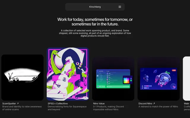
Preview image. Unlock full-res
Minimalist Dark Canvas — bold text on deep charcoal.
Color palette
Page backgrounds, primary container backgrounds
Primary text, active button borders, accent strokes
Elevated card backgrounds, distinct interface panels
Secondary text, helper text, inactive elements
Typography
- Weights
- 400
- Sizes
- 16px, 17px
- Line height
- 1.18, 1.29, 1.5
- Letter spacing
- -0.0090em
- Fallback
- system-ui
Body text, button labels, navigation links, and descriptive content. Its standard weight provides legibility against the dark background.
- Weights
- 400
- Sizes
- 32px
- Line height
- 1.1
- Letter spacing
- -0.0400em
- Fallback
- Arial
Primary headings. Its broad letter-spacing and substantial size give it a commanding presence that anchors sections.
Spacing & shape
Components
Background transparent (rgba(0, 0, 0, 0)), text and border in Frost White (#fafafa). Padding 4px on all sides. Radius 0px. Used for navigation and primary content links.
Background is Midnight Core (#181818). Rounded corners at 24px create a soft, contained feel. Text uses Inter 16px Frost White (#fafafa) for titles and Ash Muted (#a3a3a3) for descriptions.
Background in Midnight Core (#181818), with a top padding of 16px and bottom padding of 16px. Contains a Ghost Button for the brand name and a hamburger icon for menu.
Guidelines
- Prioritize Frost White (#fafafa) for all primary text and active states against dark backgrounds.
- Use Midnight Core (#181818) as the default background for pages and main content blocks.
- Elevate content visually by applying Slate Surface (#262626) for distinct cards or panels.
- Utilize 'twkLausanne' at 32px with -0.0400em letter-spacing for all significant headings to establish brand presence.
- Apply a generous border-radius of 24px to main surface containers for a soft, modern shape.
- Ensure a horizontal element gap of 8px for consistent spacing between interactive elements or grid items.
- Maintain a clear vertical rhythm with section gaps of 45px between major content blocks.
- Avoid the use of strong accent colors; the system relies on high-contrast neutrals.
- Do not introduce visible drop shadows; surface changes are conveyed via background color shifts.
- Refrain from using bold or heavy font weights; Inter 400 and twkLausanne 400 are the established textual weights.
- Do not use rectangular or sharp-edged components; all primary containers should feature a minimum 16px radius.
- Avoid cluttering backgrounds with patterns or textures; surfaces should remain flat and monochromatic.
- Do not deviate from the established letter-spacing values like -0.0400em for headings; they are critical for the typographic identity.
- Avoid tight vertical spacing in sections; ensure adequate 45px separation between content blocks.
About this system
ShowHide
Kirschberg employs a sparse, high-contrast dark mode aesthetic, reminiscent of a command-line interface. The design prioritizes content with minimal chrome, using stark white typography against deep charcoal backgrounds. Surface differentiation is achieved through subtle shifts in background tone and rounded containers, rather than heavy shadows. The overall impression is one of restrained confidence and directness.
This site features a mix of abstract digital illustrations and product screenshots. The illustrations are vibrant, organic, and utilize a high-contrast color palette, standing out against the dark UI. Product screenshots are typically centered or contained within card-like structures. Icons, when present, are minimal and serve functional navigation purposes. Imagery serves primarily as decorative atmosphere and to showcase work, occupying significant visual space within structured grid layouts.
Reminiscent of Linear, Github, Blinkist.
# David Kirschberg — Style Reference
> Minimalist Dark Canvas — bold text on deep charcoal.

**Theme:** dark

**Site:** https://kirschberg.co.nz

Kirschberg employs a sparse, high-contrast dark mode aesthetic, reminiscent of a command-line interface. The design prioritizes content with minimal chrome, using stark white typography against deep charcoal backgrounds. Surface differentiation is achieved through subtle shifts in background tone and rounded containers, rather than heavy shadows. The overall impression is one of restrained confidence and directness.

## Tokens — Colors

| Name | Value | Token | Role |
|------|------|------|------|
| Midnight Core | `#181818` | `--color-midnight-core` | Page backgrounds, primary container backgrounds |
| Frost White | `#fafafa` | `--color-frost-white` | Primary text, active button borders, accent strokes |
| Slate Surface | `#262626` | `--color-slate-surface` | Elevated card backgrounds, distinct interface panels |
| Ash Muted | `#a3a3a3` | `--color-ash-muted` | Secondary text, helper text, inactive elements |

## Tokens — Typography

### Inter
- **Substitute:** system-ui
- **Weights:** 400
- **Sizes:** 16px, 17px
- **Line height:** 1.18, 1.29, 1.5
- **Letter spacing:** -0.0090em
- **Role:** Body text, button labels, navigation links, and descriptive content. Its standard weight provides legibility against the dark background.

### twkLausanne
- **Substitute:** Arial
- **Weights:** 400
- **Sizes:** 32px
- **Line height:** 1.1
- **Letter spacing:** -0.0400em
- **Role:** Primary headings. Its broad letter-spacing and substantial size give it a commanding presence that anchors sections.

## Tokens — Spacing

- **Section gap:** 45px
- **Card padding:** 16px
- **Element gap:** 8px

## Tokens — Radius

- **Default:** 16px
- **surfaces:** 24px

## Imagery

This site features a mix of abstract digital illustrations and product screenshots. The illustrations are vibrant, organic, and utilize a high-contrast color palette, standing out against the dark UI. Product screenshots are typically centered or contained within card-like structures. Icons, when present, are minimal and serve functional navigation purposes. Imagery serves primarily as decorative atmosphere and to showcase work, occupying significant visual space within structured grid layouts.

## Components

### Ghost Button
*Interactive elements with minimal visual weight.*

Background transparent (rgba(0, 0, 0, 0)), text and border in Frost White (#fafafa). Padding 4px on all sides. Radius 0px. Used for navigation and primary content links.

### Work Item Card
*Cards for showcasing portfolio pieces.*

Background is Midnight Core (#181818). Rounded corners at 24px create a soft, contained feel. Text uses Inter 16px Frost White (#fafafa) for titles and Ash Muted (#a3a3a3) for descriptions.

### Navigation Bar
*Sticky header for site navigation.*

Background in Midnight Core (#181818), with a top padding of 16px and bottom padding of 16px. Contains a Ghost Button for the brand name and a hamburger icon for menu.

## Guidelines

### Do

- Prioritize Frost White (#fafafa) for all primary text and active states against dark backgrounds.
- Use Midnight Core (#181818) as the default background for pages and main content blocks.
- Elevate content visually by applying Slate Surface (#262626) for distinct cards or panels.
- Utilize 'twkLausanne' at 32px with -0.0400em letter-spacing for all significant headings to establish brand presence.
- Apply a generous border-radius of 24px to main surface containers for a soft, modern shape.
- Ensure a horizontal element gap of 8px for consistent spacing between interactive elements or grid items.
- Maintain a clear vertical rhythm with section gaps of 45px between major content blocks.

### Don't

- Avoid the use of strong accent colors; the system relies on high-contrast neutrals.
- Do not introduce visible drop shadows; surface changes are conveyed via background color shifts.
- Refrain from using bold or heavy font weights; Inter 400 and twkLausanne 400 are the established textual weights.
- Do not use rectangular or sharp-edged components; all primary containers should feature a minimum 16px radius.
- Avoid cluttering backgrounds with patterns or textures; surfaces should remain flat and monochromatic.
- Do not deviate from the established letter-spacing values like -0.0400em for headings; they are critical for the typographic identity.
- Avoid tight vertical spacing in sections; ensure adequate 45px separation between content blocks.

## Agent Prompt Guide

Quick Color Reference:
text: #fafafa
background: #181818
border: #ffffff14
accent: no distinct accent color
primary action: no distinct CTA color

Example Component Prompts:
1. Create a page hero: Midnight Core (#181818) background. Headline 'twkLausanne' 32px weight 400, #fafafa, letter-spacing -0.0400em. Subtext 'Inter' 17px weight 400, #fafafa.
2. Design a Ghost Navigation Button: Background rgba(0, 0, 0, 0), text #fafafa (Inter 16px weight 400), border #fafafa, 4px padding, 0px radius.
3. Build a Work Item Card: Slate Surface (#262626) background, 24px radius. Content title 'Inter' 16px weight 400, #fafafa. Description 'Inter' 16px weight 400, #a3a3a3. Place an image inside the card.
More like this





Keep what you find
A free account saves references to boards and can send you a weekly email of picks based on what you save.
To see every result, go Pro.