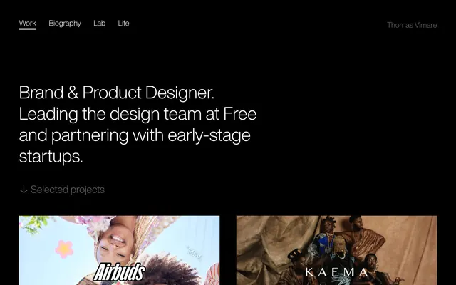
Preview image. Unlock full-res
Color palette
Page backgrounds, card surfaces, all base UI elements. Provides a canvas for high-contrast typography
Hairline borders, dividers, input outlines, and card edges on light surfaces. Do not promote it to the primary CTA color
Secondary text, descriptive sub-headings, and decorative borders. Offers a softer textual accent without competing with primary content
Typography
- Weights
- 400
- Sizes
- 16px, 20px, 24px, 28px, 32px, 56px
- Line height
- 1, 1.2, 1.4, 1.5
- Letter spacing
- -0.0100em at 56px, -0.0080em at 32px, -0.0070em at 28px, -0.0060em at 24px, -0.0050em at 20px, -0.0030em at 16px
- Fallback
- system-ui, sans-serif
All textual content, from headings to body text and navigation. Its light weight at larger sizes creates a sense of understated authority and spaciousness.
Spacing & shape
Components
Uses HelveticaNowDisplay-Light at 16px, Polar White (#ffffff) text, and a 2px solid white underline (`border-color: #ffffff`) on active states. Padding: 5px top, 10px bottom.
Has a Deep Night (#171717) background. The primary headline and images are followed by a subtitle. Uses Quiet Fog (#9a9a9a) for supporting text and Polar White (#ffffff) for borders detected implicitly on images, suggesting a deliberate border treatment on contained elements.
Rendered in HelveticaNowDisplay-Light at various display sizes (e.g., 56px) with Polar White (#ffffff) text. Features tight kerning (e.g. -0.010em at 56px) for a sophisticated appearance.
Uses HelveticaNowDisplay-Light at body-sm or body sizes with Quiet Fog (#9a9a9a) text color. Visually de-emphasized from primary headings.
Guidelines
- Always use Deep Night (#171717) as the background for body and component surfaces to maintain the dark theme.
- Render all primary text and active states in Polar White (#ffffff) for maximum contrast against Deep Night (#171717).
- Apply Quiet Fog (#9a9a9a) sparingly for secondary information, subheadings, or subtle decorative borders.
- Maintain generous spacing: use 120px for vertical section gaps and 20px horizontally between elements.
- Utilize HelveticaNowDisplay-Light for all typography, adjusting size and letter-spacing according to the type scale for semantic roles.
- Implement the 2px solid Polar White (#ffffff) border for emphasizing interactive or visually contained elements like images or navigation items.
- Avoid using any colors other than Deep Night, Polar White, and Quiet Fog for UI elements; stick to the achromatic palette.
- Do not introduce heavy shadows or overt elevation patterns; surfaces should remain flat.
- Do not deviate from the specified HelveticaNowDisplay-Light font family; do not mix in other typefaces.
- Avoid tight element spacing; maintain at least 20px between horizontal elements and 120px between major sections.
- Do not use rounded corners on UI elements; maintain sharp, crisp 0px radii across the board.
- Refrain from using gradients on backgrounds or interactive elements; surfaces are solid Deep Night.
- Do not use bold or heavy font weights; the system relies on the light weight of HelveticaNowDisplay-Light for its aesthetic.
About this system
ShowHide
Thomas Vimare's design system is a stark, high-contrast dark theme emphasizing readability and a minimalist aesthetic. Typography reigns supreme, with delicate 'HelveticaNowDisplay-Light' forming the core of its visual identity. Surfaces are deep black, providing a silent backdrop for content defined by subtle borders and carefully chosen typefaces, allowing visual work to take center stage.
The page primarily employs a max-width 1600px, centered content model. The hero section is full-bleed Deep Night, featuring a prominent centered headline. Below the hero, content is arranged in a fluid grid or stack, with images and associated text forming paired blocks. Vertical rhythm is established through significant 120px section gaps. The navigation is a minimalist top bar, simple links on the left and the brand name on the right, floating over the Deep Night background.
This site features primarily project-specific visuals, including photography and possibly product screenshots, tightly cropped within their containers. Imagery serves as content showcases rather than decorative atmosphere. Treatments appear standard, without unique masking or overlaps, but implicitly use a 2px Polar White border for definition. The overall density leans text-dominant, with imagery serving as visual anchors within content sections.
Reminiscent of Apple (services), Stripe (older branding), Linear, Read.cv.
# Thomas Vimare — Style Reference
> Minimalist gallery wall

**Theme:** dark

**Site:** https://thms.works

Thomas Vimare's design system is a stark, high-contrast dark theme emphasizing readability and a minimalist aesthetic. Typography reigns supreme, with delicate 'HelveticaNowDisplay-Light' forming the core of its visual identity. Surfaces are deep black, providing a silent backdrop for content defined by subtle borders and carefully chosen typefaces, allowing visual work to take center stage.

## Tokens — Colors

| Name | Value | Token | Role |
|------|------|------|------|
| Deep Night | `#171717` | `--color-deep-night` | Page backgrounds, card surfaces, all base UI elements. Provides a canvas for high-contrast typography |
| Polar White | `#ffffff` | `--color-polar-white` | Hairline borders, dividers, input outlines, and card edges on light surfaces. Do not promote it to the primary CTA color |
| Quiet Fog | `#9a9a9a` | `--color-quiet-fog` | Secondary text, descriptive sub-headings, and decorative borders. Offers a softer textual accent without competing with primary content |

## Tokens — Typography

### HelveticaNowDisplay-Light
- **Substitute:** system-ui, sans-serif
- **Weights:** 400
- **Sizes:** 16px, 20px, 24px, 28px, 32px, 56px
- **Line height:** 1, 1.2, 1.4, 1.5
- **Letter spacing:** -0.0100em at 56px, -0.0080em at 32px, -0.0070em at 28px, -0.0060em at 24px, -0.0050em at 20px, -0.0030em at 16px
- **Role:** All textual content, from headings to body text and navigation. Its light weight at larger sizes creates a sense of understated authority and spaciousness.

## Tokens — Type Scale

| Role | Size | Line height | Letter spacing |
|------|------|------|------|
| caption | 16px | 1.5 | -0.003em |
| body-sm | 20px | 1.5 | -0.005em |
| body | 24px | 1.4 | -0.006em |
| subheading | 28px | 1.2 | -0.007em |
| heading | 32px | 1.2 | -0.008em |
| display | 56px | 1 | -0.01em |

## Tokens — Spacing

- **Max width:** 1600px
- **Section gap:** 120px
- **Card padding:** 60px
- **Element gap:** 20px

## Tokens — Radius

- **Default:** 0px

## Layout

The page primarily employs a max-width 1600px, centered content model. The hero section is full-bleed Deep Night, featuring a prominent centered headline. Below the hero, content is arranged in a fluid grid or stack, with images and associated text forming paired blocks. Vertical rhythm is established through significant 120px section gaps. The navigation is a minimalist top bar, simple links on the left and the brand name on the right, floating over the Deep Night background.

## Imagery

This site features primarily project-specific visuals, including photography and possibly product screenshots, tightly cropped within their containers. Imagery serves as content showcases rather than decorative atmosphere. Treatments appear standard, without unique masking or overlaps, but implicitly use a 2px Polar White border for definition. The overall density leans text-dominant, with imagery serving as visual anchors within content sections.

## Components

### Navigation Link
*Top navigation items.*

Uses HelveticaNowDisplay-Light at 16px, Polar White (#ffffff) text, and a 2px solid white underline (`border-color: #ffffff`) on active states. Padding: 5px top, 10px bottom.

### Project Card
*Displays individual portfolio projects.*

Has a Deep Night (#171717) background. The primary headline and images are followed by a subtitle. Uses Quiet Fog (#9a9a9a) for supporting text and Polar White (#ffffff) for borders detected implicitly on images, suggesting a deliberate border treatment on contained elements.

### Primary Heading
*Main page titles and key descriptive text.*

Rendered in HelveticaNowDisplay-Light at various display sizes (e.g., 56px) with Polar White (#ffffff) text. Features tight kerning (e.g. -0.010em at 56px) for a sophisticated appearance.

### Secondary Description
*Subtitles and supporting text for projects or sections.*

Uses HelveticaNowDisplay-Light at body-sm or body sizes with Quiet Fog (#9a9a9a) text color. Visually de-emphasized from primary headings.

## Guidelines

### Do

- Always use Deep Night (#171717) as the background for body and component surfaces to maintain the dark theme.
- Render all primary text and active states in Polar White (#ffffff) for maximum contrast against Deep Night (#171717).
- Apply Quiet Fog (#9a9a9a) sparingly for secondary information, subheadings, or subtle decorative borders.
- Maintain generous spacing: use 120px for vertical section gaps and 20px horizontally between elements.
- Utilize HelveticaNowDisplay-Light for all typography, adjusting size and letter-spacing according to the type scale for semantic roles.
- Implement the 2px solid Polar White (#ffffff) border for emphasizing interactive or visually contained elements like images or navigation items.

### Don't

- Avoid using any colors other than Deep Night, Polar White, and Quiet Fog for UI elements; stick to the achromatic palette.
- Do not introduce heavy shadows or overt elevation patterns; surfaces should remain flat.
- Do not deviate from the specified HelveticaNowDisplay-Light font family; do not mix in other typefaces.
- Avoid tight element spacing; maintain at least 20px between horizontal elements and 120px between major sections.
- Do not use rounded corners on UI elements; maintain sharp, crisp 0px radii across the board.
- Refrain from using gradients on backgrounds or interactive elements; surfaces are solid Deep Night.
- Do not use bold or heavy font weights; the system relies on the light weight of HelveticaNowDisplay-Light for its aesthetic.

## Agent Prompt Guide

### Quick Color Reference
text: #ffffff
background: #171717
border: #ffffff
accent: no distinct accent color
primary action: no distinct CTA color

### 3-5 Example Component Prompts
1. Create a primary heading: 'Brand & Product Designer.', use display size 56px, HelveticaNowDisplay-Light, Polar White (#ffffff), letter-spacing -0.01em.
2. Design a navigation link: 'Work', use 16px HelveticaNowDisplay-Light, Polar White (#ffffff), with a 2px solid #ffffff bottom border for active state. Padding: 5px top, 10px bottom.
3. Develop a project card description: 'The social music widget for Gen Z & Alpha', use body-sm size 20px, HelveticaNowDisplay-Light, Quiet Fog (#9a9a9a), on a Deep Night (#171717) background.
4. Construct a secondary text element: '↓ Selected projects', using body size 24px, HelveticaNowDisplay-Light, Polar White (#ffffff).
More like this





Keep what you find
A free account saves references to boards and can send you a weekly email of picks based on what you save.
To see every result, go Pro.