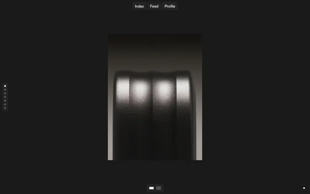
Preview image. Unlock full-res
Midnight gallery showcase
Color palette
Text default, primary borders for ghost buttons, decorative outlines, icon fills
Primary page background
Subtle background for interactive elements and secondary surfaces
Primary text color, prominent borders, active tab text
Background for specific interactive links, hover states, and filled icons
Typography
- Weights
- 400
- Sizes
- 12px
- Line height
- 1.2
- Letter spacing
- 0
- Fallback
- system-ui
Labels for compact navigation, utility text, and small interactive elements. Relies on system-default for speed and legibility at small sizes.
- Weights
- 500
- Sizes
- 18px, 22px
- Line height
- 1.13, 1.15
- Letter spacing
- -0.025
- Fallback
- Inter, Arial
Primary body text, article titles, and larger content headings. The negative letter-spacing (-0.025em) provides a distinctive, tight feel, while the specific font feature settings enforce a unique, structured character rendering.
Spacing & shape
Components
Text-only buttons using no background, no border, and 0px border-radius. Text color is #000000. Padding is extremely minimal (0px).
Minimal fill buttons with a translucent dark background rgba(43, 43, 43, 0.6) and #000000 text. Borders are 0px, radius 0px. Padding 10px vertical, 12px horizontal.
Guidelines
- Prioritize large, impactful imagery or video content, allowing it to dictate the mood and occupy significant visual space.
- Use Pitch Black (#000000) as the default text and border color for ghost components, ensuring high contrast against light surfaces or as an accent on dark.
- Apply Charcoal Canvas (#1a1a1a) for all primary page backgrounds, creating a consistent dark foundation.
- Maintain a compact density, using 10px for vertical and horizontal gaps between most elements.
- Set all interactive rectangular elements, like buttons and containers, to '0px' border-radius, enforcing a sharp, precise aesthetic.
- Employ ABC Diatype with its specific font feature settings and -0.025em letter-spacing for all primary headings and body copy, ensuring consistent brand typography.
- Use the Muted Interaction (#5d5d5d) background color for subtle interactive highlights or secondary links, indicating interactivity without strong visual emphasis.
- Avoid using any border-radius greater than 0px; the system emphasizes sharp edges.
- Do not introduce colorful UI accents or vibrant primary action colors; maintain a monochromatic palette with subtle transparency for interaction.
- Refrain from using strong box-shadows or heavy elevation effects; depth is achieved primarily through surface shifts or content imagery itself.
- Do not deviate from the specified font families, weights, and letter-spacing for brand typography, especially ABC Diatype.
- Avoid large, prominent buttons with strong background fills unless utilizing the specific 'Filled Navigation Button' style.
- Do not use generic system fonts for prominent content text; always use ABC Diatype for body and heading roles.
- Avoid introducing significant padding or broad spacing for individual elements; maintain the compact density with 10px element gaps.
About this system
ShowHide
PostNew employs a dark-themed, highly compact visual system that prioritizes content over decorative UI. Deep charcoal backgrounds serve as a canvas for crisp white typography and minimal, unbordered components. The design maintains an atmospheric, theatrical aesthetic through its use of subtle blurring and a focus on raw imagery, allowing the content to define the mood. Interactive elements are sparse, using opacity shifts and a tight typographic hierarchy to convey function.
The site employs a full-bleed layout strategy, particularly for its hero and main content sections, allowing imagery and motion to extend to the viewport edges. Content often appears in split-screen arrangements with distinct canvases, sometimes alternating. The hero pattern is dynamic, featuring large, immersive visuals often paired with bold, custom typography within the content itself. Vertical rhythm is established by section gaps of 50px, but within components, spacing is very compact. Navigation is minimal, consisting of a top-centered, semi-transparent bar with ghost text links and a subtle left-aligned utility bar. Content is generally centered or arranged in a text-left/visual-right pattern, adapting to the dynamic media.
The visual language predominantly features high-impact, full-bleed motion graphics and 3D renders that act as primary content. These visuals often have a hyper-realistic or abstract quality, using vibrant, sometimes surreal, colors in contrast to the muted UI. Imagery is central to the experience, often taking up entire screen sections or split views, rather than being contained within cards or frames. There are no consistent corner treatments; images are raw-edged, emphasizing their content. Icons are minimal, typically monochrome outlines, used sparingly for navigation or utility.
Reminiscent of Awwwards, Framer, Huge Inc., Basic Type Foundry.
# PostNew — Style Reference
> Midnight gallery showcase

**Theme:** dark

**Site:** https://www.postnew.xyz

PostNew employs a dark-themed, highly compact visual system that prioritizes content over decorative UI. Deep charcoal backgrounds serve as a canvas for crisp white typography and minimal, unbordered components. The design maintains an atmospheric, theatrical aesthetic through its use of subtle blurring and a focus on raw imagery, allowing the content to define the mood. Interactive elements are sparse, using opacity shifts and a tight typographic hierarchy to convey function.

## Tokens — Colors

| Name | Value | Token | Role |
|------|------|------|------|
| Pitch Black | `#000000` | `--color-pitch-black` | Text default, primary borders for ghost buttons, decorative outlines, icon fills |
| Charcoal Canvas | `#1a1a1a` | `--color-charcoal-canvas` | Primary page background |
| Active Charcoal | `#242424` | `--color-active-charcoal` | Subtle background for interactive elements and secondary surfaces |
| Whisper Gray | `#fafafa` | `--color-whisper-gray` | Primary text color, prominent borders, active tab text |
| Muted Interaction | `#5d5d5d` | `--color-muted-interaction` | Background for specific interactive links, hover states, and filled icons |

## Tokens — Typography

### sans-serif
- **Substitute:** system-ui
- **Weights:** 400
- **Sizes:** 12px
- **Line height:** 1.2
- **Letter spacing:** 0
- **Role:** Labels for compact navigation, utility text, and small interactive elements. Relies on system-default for speed and legibility at small sizes.

### ABC Diatype
- **Substitute:** Inter, Arial
- **Weights:** 500
- **Sizes:** 18px, 22px
- **Line height:** 1.13, 1.15
- **Letter spacing:** -0.025
- **Role:** Primary body text, article titles, and larger content headings. The negative letter-spacing (-0.025em) provides a distinctive, tight feel, while the specific font feature settings enforce a unique, structured character rendering.

## Tokens — Type Scale

Perfect Fourth (1.333) from 18px base.

| Role | Size | Line height | Letter spacing |
|------|------|------|------|
| caption | 12px | 1.2 | — |
| body | 18px | 1.13 | -0.45px |
| heading | 22px | 1.15 | -0.55px |

## Tokens — Spacing

- **Section gap:** 50px
- **Card padding:** 12px
- **Element gap:** 10px

## Tokens — Radius

- **Buttons:** 0px
- **Cards:** 0px
- **tabs:** 0px

## Layout

The site employs a full-bleed layout strategy, particularly for its hero and main content sections, allowing imagery and motion to extend to the viewport edges. Content often appears in split-screen arrangements with distinct canvases, sometimes alternating. The hero pattern is dynamic, featuring large, immersive visuals often paired with bold, custom typography within the content itself. Vertical rhythm is established by section gaps of 50px, but within components, spacing is very compact. Navigation is minimal, consisting of a top-centered, semi-transparent bar with ghost text links and a subtle left-aligned utility bar. Content is generally centered or arranged in a text-left/visual-right pattern, adapting to the dynamic media.

## Imagery

The visual language predominantly features high-impact, full-bleed motion graphics and 3D renders that act as primary content. These visuals often have a hyper-realistic or abstract quality, using vibrant, sometimes surreal, colors in contrast to the muted UI. Imagery is central to the experience, often taking up entire screen sections or split views, rather than being contained within cards or frames. There are no consistent corner treatments; images are raw-edged, emphasizing their content. Icons are minimal, typically monochrome outlines, used sparingly for navigation or utility.

## Components

### Ghost Navigation Button
*Primary navigation elements*

Text-only buttons using no background, no border, and 0px border-radius. Text color is #000000. Padding is extremely minimal (0px).

### Filled Navigation Button
*Contextual navigation or utility buttons*

Minimal fill buttons with a translucent dark background rgba(43, 43, 43, 0.6) and #000000 text. Borders are 0px, radius 0px. Padding 10px vertical, 12px horizontal.

## Guidelines

### Do

- Prioritize large, impactful imagery or video content, allowing it to dictate the mood and occupy significant visual space.
- Use Pitch Black (#000000) as the default text and border color for ghost components, ensuring high contrast against light surfaces or as an accent on dark.
- Apply Charcoal Canvas (#1a1a1a) for all primary page backgrounds, creating a consistent dark foundation.
- Maintain a compact density, using 10px for vertical and horizontal gaps between most elements.
- Set all interactive rectangular elements, like buttons and containers, to '0px' border-radius, enforcing a sharp, precise aesthetic.
- Employ ABC Diatype with its specific font feature settings and -0.025em letter-spacing for all primary headings and body copy, ensuring consistent brand typography.
- Use the Muted Interaction (#5d5d5d) background color for subtle interactive highlights or secondary links, indicating interactivity without strong visual emphasis.

### Don't

- Avoid using any border-radius greater than 0px; the system emphasizes sharp edges.
- Do not introduce colorful UI accents or vibrant primary action colors; maintain a monochromatic palette with subtle transparency for interaction.
- Refrain from using strong box-shadows or heavy elevation effects; depth is achieved primarily through surface shifts or content imagery itself.
- Do not deviate from the specified font families, weights, and letter-spacing for brand typography, especially ABC Diatype.
- Avoid large, prominent buttons with strong background fills unless utilizing the specific 'Filled Navigation Button' style.
- Do not use generic system fonts for prominent content text; always use ABC Diatype for body and heading roles.
- Avoid introducing significant padding or broad spacing for individual elements; maintain the compact density with 10px element gaps.

## Agent Prompt Guide

### Quick Color Reference
text: #fafafa
background: #1a1a1a
border: #000000
accent: #2b2b2b99
primary action: no distinct CTA color

### 3-5 Example Component Prompts
1. Create a primary navigation bar: background #1a1a1a, with centered 'Index', 'Feed', 'Profile' text links. Each link should be #000000 text and act as a Ghost Navigation Button (0px padding, 0px border-radius, no background).
2. Design a content block on a #1a1a1a background: large headline 'Magic Is In The Air' using ABC Diatype, weight 500, size 22px, line height 1.15, letter-spacing -0.025em, color #fafafa. Below it, a line of body text at 18px ABC Diatype, weight 500, line height 1.13, letter-spacing -0.025em, color #fafafa.
3. Create a secondary action button for a menu: Text 'More Info' using sans-serif, weight 400, size 12px, color #000000. Background #242424, 0px border-radius, 10px vertical and 12px horizontal internal padding.
More like this





Keep what you find
A free account saves references to boards and can send you a weekly email of picks based on what you save.
To see every result, go Pro.