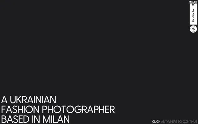
Preview image. Unlock full-res
Midnight gallery wall.
Color palette
Page background, card background for dark-themed elements
Hairline borders, dividers, input outlines, and card edges on light surfaces. Do not promote it to the primary CTA color
Secondary text, subtle borders, helper text
Typography
- Weights
- 400
- Sizes
- 24px, 75px
- Line height
- 0.95
- Letter spacing
- -0.0200em
- Fallback
- Montserrat
Headlines and prominent display text, using a wide letter-spacing for impact and a modern, angular feel.
- Weights
- 400
- Sizes
- 14px
- Line height
- 1.39
- Letter spacing
- normal
- Fallback
- Helvetica Neue
Minimal functional text, typically for small auxiliary information like labels or navigation hints.
- Weights
- 400
- Sizes
- 20px, 32px
- Line height
- 0.95, 1.2
- Letter spacing
- normal
- Fallback
- Georgia
Body text and less prominent headlines, providing contrast to the display font with its slightly more traditional character.
Spacing & shape
Components
A circular card with an Obsidian Slate (#1d1d1f) background and no box shadow, borders, or internal padding. Primarily used for visual separation.
A circular card with a Ghost White (#f1f1f1) background and no box shadow, borders, or internal padding. Used for visual contrast in specific areas.
Text rendered in Greycliff, weight 400, color Ghost White (#f1f1f1), with sizes 75px and letter-spacing -0.0200em, line-height 0.95. Used for impactful, large headings.
Text rendered in Corradine, weight 400, color Ghost White (#f1f1f1), with sizes 20px and 32px, and line-heights 0.95 and 1.20. Provides clear, readable content.
Text rendered in Arial, weight 400, color Muted Ash (#656565), size 14px, line-height 1.39. Used for navigation hints or secondary information.
A button with a Ghost White (#f1f1f1) border, transparent background, and Ghost White (#f1f1f1) text. Text is in Arial, 14px. Used only for discrete actions like navigation or 'click to continue' prompts.
Guidelines
- Always use Obsidian Slate (#1d1d1f) as the primary background color for pages and dark-themed components.
- Reserve Ghost White (#f1f1f1) for primary text, interactive states, and outlined borders to ensure high contrast.
- For display text and large headlines, use Greycliff at 75px, 400 weight, with a line-height of 0.95 and letter-spacing of -0.0200em.
- Apply Muted Ash (#656565) for secondary text and subtle navigational or informational elements.
- Utilize circular shapes (100% border-radius) for decorative card elements, creating soft visual accents.
- Maintain a compact layout, prioritizing content density while providing sufficient visual breathing room through minimal element spacing (e.g. 7px for tight groups).
- Do not introduce additional saturated colors; the palette is strictly achromatic with high contrast.
- Avoid using box shadows for elevation; rely on color contrast and direct sizing for visual hierarchy.
- Do not break away from the defined typefaces (Greycliff, Arial, Corradine) or their specified sizes and weights.
- Do not use large, prominent buttons with solid backgrounds; interactive elements should be minimal, often text-based or ghost-bordered.
- Avoid decorative gradients; the visual system is flat and relies on solid color blocks.
- Do not over-space elements; the design emphasizes a compact and focused presentation.
About this system
ShowHide
Dmitrkutsenko.com uses a muted, high-contrast dark aesthetic that highlights content through stark value differences rather than color. The design feels photographic, focusing on bold typography and subtle interactive elements against a deep gray canvas. White is reserved primarily for high-impact headlines and functional UI elements, creating a clear visual hierarchy. Interactions are minimal, often relying on border changes or text color shifts to signify state.
The page exhibits a full-bleed structure with a dark background, establishing a vast canvas. The hero section features a centered, high-impact headline using large, bold typography. Navigation elements are minimal and positioned discretely in the top right, creating an uncluttered and focused visual field. Content is arranged either in a large, centered block for textual emphasis or within subtle geometric shapes (circular cards) that act as visual anchors.
No direct imagery or photography is shown in the provided context, suggesting a UI-heavy or content-dominant approach where imagery might appear within content sections rather than as part of the core UI. If imagery were to be introduced, it would likely be full-bleed, high-contrast photography to align with the stark, minimalist aesthetic, or tight product crops.
Reminiscent of Aytm.com, Squarespace (certain portfolio templates), B&O (Bang & Olufsen), Acme.com.
# Dima Kutsenko — Style Reference
> Midnight gallery wall.

**Theme:** dark

**Site:** https://www.dmitrkutsenko.com

Dmitrkutsenko.com uses a muted, high-contrast dark aesthetic that highlights content through stark value differences rather than color. The design feels photographic, focusing on bold typography and subtle interactive elements against a deep gray canvas. White is reserved primarily for high-impact headlines and functional UI elements, creating a clear visual hierarchy. Interactions are minimal, often relying on border changes or text color shifts to signify state.

## Tokens — Colors

| Name | Value | Token | Role |
|------|------|------|------|
| Obsidian Slate | `#1d1d1f` | `--color-obsidian-slate` | Page background, card background for dark-themed elements |
| Ghost White | `#f1f1f1` | `--color-ghost-white` | Hairline borders, dividers, input outlines, and card edges on light surfaces. Do not promote it to the primary CTA color |
| Muted Ash | `#656565` | `--color-muted-ash` | Secondary text, subtle borders, helper text |

## Tokens — Typography

### Greycliff
- **Substitute:** Montserrat
- **Weights:** 400
- **Sizes:** 24px, 75px
- **Line height:** 0.95
- **Letter spacing:** -0.0200em
- **Role:** Headlines and prominent display text, using a wide letter-spacing for impact and a modern, angular feel.

### Arial
- **Substitute:** Helvetica Neue
- **Weights:** 400
- **Sizes:** 14px
- **Line height:** 1.39
- **Letter spacing:** normal
- **Role:** Minimal functional text, typically for small auxiliary information like labels or navigation hints.

### Corradine
- **Substitute:** Georgia
- **Weights:** 400
- **Sizes:** 20px, 32px
- **Line height:** 0.95, 1.2
- **Letter spacing:** normal
- **Role:** Body text and less prominent headlines, providing contrast to the display font with its slightly more traditional character.

## Tokens — Type Scale

Perfect Fifth (1.5) from 20px base.

| Role | Size | Line height | Letter spacing |
|------|------|------|------|
| caption | 14px | 1.39 | — |
| body | 20px | 0.95 | — |
| subheading | 24px | 0.95 | -0.48px |
| heading | 32px | 1.2 | — |
| display | 75px | 0.95 | -1.5px |

## Tokens — Spacing

- **Card padding:** 0px
- **Element gap:** 7px

## Tokens — Radius

- **circular:** 100%

## Layout

The page exhibits a full-bleed structure with a dark background, establishing a vast canvas. The hero section features a centered, high-impact headline using large, bold typography. Navigation elements are minimal and positioned discretely in the top right, creating an uncluttered and focused visual field. Content is arranged either in a large, centered block for textual emphasis or within subtle geometric shapes (circular cards) that act as visual anchors.

## Imagery

No direct imagery or photography is shown in the provided context, suggesting a UI-heavy or content-dominant approach where imagery might appear within content sections rather than as part of the core UI. If imagery were to be introduced, it would likely be full-bleed, high-contrast photography to align with the stark, minimalist aesthetic, or tight product crops.

## Components

### Dark Circular Card
*Decorative card container*

A circular card with an Obsidian Slate (#1d1d1f) background and no box shadow, borders, or internal padding. Primarily used for visual separation.

### Light Circular Card
*Decorative card container*

A circular card with a Ghost White (#f1f1f1) background and no box shadow, borders, or internal padding. Used for visual contrast in specific areas.

### Primary Display Text
*Main page headlines and focal points*

Text rendered in Greycliff, weight 400, color Ghost White (#f1f1f1), with sizes 75px and letter-spacing -0.0200em, line-height 0.95. Used for impactful, large headings.

### Secondary Body Text
*General content and supporting copy*

Text rendered in Corradine, weight 400, color Ghost White (#f1f1f1), with sizes 20px and 32px, and line-heights 0.95 and 1.20. Provides clear, readable content.

### Auxiliary Label
*Small, functional labels*

Text rendered in Arial, weight 400, color Muted Ash (#656565), size 14px, line-height 1.39. Used for navigation hints or secondary information.

### Outline Ghost Button
*Subtle interactive element*

A button with a Ghost White (#f1f1f1) border, transparent background, and Ghost White (#f1f1f1) text. Text is in Arial, 14px. Used only for discrete actions like navigation or 'click to continue' prompts.

## Guidelines

### Do

- Always use Obsidian Slate (#1d1d1f) as the primary background color for pages and dark-themed components.
- Reserve Ghost White (#f1f1f1) for primary text, interactive states, and outlined borders to ensure high contrast.
- For display text and large headlines, use Greycliff at 75px, 400 weight, with a line-height of 0.95 and letter-spacing of -0.0200em.
- Apply Muted Ash (#656565) for secondary text and subtle navigational or informational elements.
- Utilize circular shapes (100% border-radius) for decorative card elements, creating soft visual accents.
- Maintain a compact layout, prioritizing content density while providing sufficient visual breathing room through minimal element spacing (e.g. 7px for tight groups).

### Don't

- Do not introduce additional saturated colors; the palette is strictly achromatic with high contrast.
- Avoid using box shadows for elevation; rely on color contrast and direct sizing for visual hierarchy.
- Do not break away from the defined typefaces (Greycliff, Arial, Corradine) or their specified sizes and weights.
- Do not use large, prominent buttons with solid backgrounds; interactive elements should be minimal, often text-based or ghost-bordered.
- Avoid decorative gradients; the visual system is flat and relies on solid color blocks.
- Do not over-space elements; the design emphasizes a compact and focused presentation.

## Agent Prompt Guide

Quick Color Reference: text: #f1f1f1, background: #1d1d1f, border: #f1f1f1, accent: no distinct accent color, primary action: no distinct CTA color

Example Component Prompts:
1. Create a full-page dark canvas with a main headline: background Obsidian Slate (#1d1d1f). Headline 'A UKRAINIAN FASHION PHOTOGRAPHER' using Greycliff, 400 weight, 75px size, -0.0200em letter-spacing, color Ghost White (#f1f1f1), centered horizontally and vertically.
2. Design a subtle navigation item: text 'MENU W.' using Arial, 400 weight, 14px size, color Ghost White (#f1f1f1). This text should have an invisible 7px spacing around it, on an Obsidian Slate (#1d1d1f) background. When hovered, the text color changes to Muted Ash (#656565).
3. Create a 'CLICK ANYWHERE TO CONTINUE' prompt: text 'CLICK ANYWHERE TO CONTINUE' using Arial, 400 weight, 14px size, color Muted Ash (#656565), positioned at the bottom right of the screen with slight padding from the edge. When clicked, it has an outline of Ghost White (#f1f1f1) and its text changes to Ghost White (#f1f1f1).
4. Design a decorative circular element with a light background: a perfect circle with background color Ghost White (#f1f1f1) and 0px padding. This element should implicitly stand out against the Obsidian Slate page background.
More like this





Keep what you find
A free account saves references to boards and can send you a weekly email of picks based on what you save.
To see every result, go Pro.