Preview image. Unlock full-res
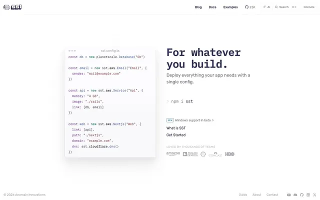
Config File on Paper — An architects precise blueprint on pristine white, using code as a primary visual element.
Color palette
Main call-to-action text, links, and prominent headings. This muted violet provides the primary brand identity, appearing frequently for interactive elements.
Syntax highlighting in code blocks, for specific types of values or keywords.
Syntax highlighting in code blocks, providing vivid contrast for important elements like function names or variables.
Syntax highlighting for specific code elements, like type definitions or comments.
Syntax highlighting for string literals or other specific code constructs.
Syntax highlighting for certain keywords or declarations within code blocks.
Page backgrounds, elevated components like the code editor card.
Subtle borders on interactive elements like search buttons and code editors, providing minimal visual separation.
Body text and secondary information, offering good contrast against white without being stark black.
Tertiary text, icons, and muted UI elements. It provides a soft, secondary visual cue.
Dimmed or inactive text elements, such as placeholder text or disabled states, providing low visual impact.
Heading text, providing highest contrast for primary titles.
Typography
- Weights
- 400, 600
- Sizes
- 14px, 16px, 18px, 48px
- Line height
- 1, 1.1, 1.8
- Letter spacing
- -0.021em
- Fallback
- monospace
Code blocks and monospaced text. The tight letter-spacing gives code a compact, precise appearance.
- Weights
- 400, 500, 600
- Sizes
- 12px, 13px, 14px, 16px, 18px, 20px
- Line height
- 1, 1.2, 1.5, 1.65, 1.78, 1.8
- Letter spacing
- 0.016em (for 12px), 0.038em (for 13px), 0.056em (for 14px)
- Fallback
- sans-serif
General UI text, headings, buttons, and body copy. Variable weights and fine letter-spacing adjustments provide legibility and a crisp, modern feel across different sizes.
Spacing & shape
Elevation
Components
Uses 'Text Jet' (#111111) text color, IBM Plex Mono, 48px size, 600 weight, and 1.00 line height, creating a bold, assertive primary statement.
Background 'Page White' (rgba(255, 255, 255, 0.8)), text 'Text Graphite' (rgba(26, 26, 46, 0.6)), border 'Border Ash' (rgb(232, 232, 242)), 4px border radius with 4px 0px 0px 4px for left grouping and 0px 4px 4px 0px for right. Padding is 1px top/bottom, 9-10px left/right. Uses Rubik Variable 400 weight.
Background 'Page White' (rgba(255, 255, 255, 0.8)), text 'Text Graphite' (rgba(26, 26, 46, 0.6)), border 'Border Ash' (rgb(232, 232, 242)), 4px border radius. Padding is 0px top/bottom, 12px left/right. Uses Rubik Variable 400 weight.
Transparent background, text 'Primary Violet' (rgb(48, 48, 85)), no border radius. Uses Rubik Variable 400 weight with no explicit padding, relying on surrounding text flow.
Background 'Page White' (#ffffff) with a subtle shadow, 8px border radius, and text styled with 'IBM Plex Mono'. Contains syntax highlighting with 'Code Rose' (#984e4d), 'Code Magenta' (#8844ae), 'Code Sky' (#5196b3), 'Code Indigo' (#3b61b0), and 'Code Teal' (#096e72).
Text 'Primary Violet' (rgb(48, 48, 85)) on a transparent background, prefixed with a 'Text Slate' (rgb(118, 118, 130)) chevron icon. Acts as a simple, actionable link.
Guidelines
- Prioritize 'Primary Violet' (#303055) for all interactive clickable elements to maintain brand identity.
- Use 'Page White' (#ffffff) as the primary background for all page sections and elevated components.
- Apply 'Border Ash' (#e8e8f2) for subtle borders on all secondary buttons and input fields to define interactive regions subtly.
- Ensure headings use 'Text Jet' (#111111) to establish clear hierarchy and strong visual anchors.
- Employ IBM Plex Mono for all code displays, capitalizing on its fixed-width and precise letter-spacing of -0.021em.
- Maintain a default border-radius of 4px for all buttons and interactive elements, and 8px for cards and containers.
- Utilize the full range of custom colors for syntax highlighting within code blocks to ensure legibility and structural clarity.
- Avoid using highly saturated, non-brand colors outside of code syntax highlighting.
- Do not use letter-spacing values less than -0.021em or greater than 0.056em for any text element.
- Do not introduce strong, intrusive shadows; rely on 'Page White' backgrounds on 'Border Ash' for subtle elevation.
- Avoid mixed-case headings; all primary headings are sentence case with a strong weight.
- Do not use large images or prominent graphical elements that disrupt the clean, text-heavy layout.
- Never use `background-color: transparent` for primary call-to-action buttons; solid backgrounds are preferred for prominence.
About this system
ShowHide
This design system presents complex technical configurations with a light, spacious, and highly legible aesthetic. The dominant use of a nearly white background provides a clean canvas, while a nuanced palette of near-gray and muted violet shades for text and interactive elements grounds the interface without heavy contrasts. A signature element is the code block's precise syntax highlighting, which uses a range of vivid and moderate hues to structure information within a constrained, elegant form.
The page maintains a centered, max-width layout, relying on ample white space. The hero section prominently features a split layout with a large, bold 'IBM Plex Mono' headline on the right and a 'Code Editor Card' on the left, demonstrating the product's core functionality upfront. Content generally follows a vertical stacking of sections, with consistent padding. Navigation is handled by a standard top bar with right-aligned utility links and branding on the left. The overall density is comfortable, prioritizing readability and systematic information presentation.
The site primarily uses code snippets and icons as its visual language. Photography is absent. Illustrations are minimal and functional, focused on conveying technical concepts rather than decorative flourishes. The code snippets, particularly the 'Code Editor Card', are themselves a central visual element, colorized using the accent palette for enhanced readability and visual interest. Icons are either monocolor (Text Slate, Primary Violet) or outlined, maintaining a lightweight and functional aesthetic. Visuals serve an explanatory role, illustrating product functionality directly and minimally, rather than creating atmosphere.
Reminiscent of Vercel, Stripe, GitHub Docs.
# SST — Style Reference
> Config File on Paper — An architects precise blueprint on pristine white, using code as a primary visual element.

**Theme:** light

**Site:** https://sst.dev

This design system presents complex technical configurations with a light, spacious, and highly legible aesthetic. The dominant use of a nearly white background provides a clean canvas, while a nuanced palette of near-gray and muted violet shades for text and interactive elements grounds the interface without heavy contrasts. A signature element is the code block's precise syntax highlighting, which uses a range of vivid and moderate hues to structure information within a constrained, elegant form.

## Tokens — Colors

| Name | Value | Token | Role |
|------|------|------|------|
| Primary Violet | `#303055` | `--color-primary-violet` | Main call-to-action text, links, and prominent headings. This muted violet provides the primary brand identity, appearing frequently for interactive elements. |
| Code Rose | `#984e4d` | `--color-code-rose` | Syntax highlighting in code blocks, for specific types of values or keywords. |
| Code Magenta | `#8844ae` | `--color-code-magenta` | Syntax highlighting in code blocks, providing vivid contrast for important elements like function names or variables. |
| Code Sky | `#5196b3` | `--color-code-sky` | Syntax highlighting for specific code elements, like type definitions or comments. |
| Code Indigo | `#3b61b0` | `--color-code-indigo` | Syntax highlighting for string literals or other specific code constructs. |
| Code Teal | `#096e72` | `--color-code-teal` | Syntax highlighting for certain keywords or declarations within code blocks. |
| Page White | `#ffffff` | `--color-page-white` | Page backgrounds, elevated components like the code editor card. |
| Border Ash | `#e8e8f2` | `--color-border-ash` | Subtle borders on interactive elements like search buttons and code editors, providing minimal visual separation. |
| Text Graphite | `#403f53` | `--color-text-graphite` | Body text and secondary information, offering good contrast against white without being stark black. |
| Text Slate | `#767682` | `--color-text-slate` | Tertiary text, icons, and muted UI elements. It provides a soft, secondary visual cue. |
| Text Fog | `#a8a8b0` | `--color-text-fog` | Dimmed or inactive text elements, such as placeholder text or disabled states, providing low visual impact. |
| Text Jet | `#111111` | `--color-text-jet` | Heading text, providing highest contrast for primary titles. |

## Tokens — Typography

### IBM Plex Mono
- **Substitute:** monospace
- **Weights:** 400, 600
- **Sizes:** 14px, 16px, 18px, 48px
- **Line height:** 1, 1.1, 1.8
- **Letter spacing:** -0.021em
- **Role:** Code blocks and monospaced text. The tight letter-spacing gives code a compact, precise appearance.

### Rubik Variable
- **Substitute:** sans-serif
- **Weights:** 400, 500, 600
- **Sizes:** 12px, 13px, 14px, 16px, 18px, 20px
- **Line height:** 1, 1.2, 1.5, 1.65, 1.78, 1.8
- **Letter spacing:** 0.016em (for 12px), 0.038em (for 13px), 0.056em (for 14px)
- **Role:** General UI text, headings, buttons, and body copy. Variable weights and fine letter-spacing adjustments provide legibility and a crisp, modern feel across different sizes.

## Tokens — Type Scale

Perfect Fourth (1.333) from 14px base.

| Role | Size | Line height | Letter spacing |
|------|------|------|------|
| caption | 12px | 1.78 | 0.016em |
| body | 14px | 1.5 | 0.056em |
| body-lg | 16px | 1.5 | — |
| subheading | 18px | 1.2 | — |
| heading | 20px | 1.2 | — |
| display | 48px | 1.1 | -0.96px |

## Tokens — Spacing

- **Section gap:** 64px
- **Element gap:** 3-16px

## Tokens — Radius

- **Default:** 4px
- **Buttons:** 4px
- **Cards:** 8px

## Tokens — Elevation

- **Code Editor Card:** `0px 1px 3px rgba(0, 0, 0, 0.1), 0px 1px 2px rgba(0, 0, 0, 0.06)`

## Layout

The page maintains a centered, max-width layout, relying on ample white space. The hero section prominently features a split layout with a large, bold 'IBM Plex Mono' headline on the right and a 'Code Editor Card' on the left, demonstrating the product's core functionality upfront. Content generally follows a vertical stacking of sections, with consistent padding. Navigation is handled by a standard top bar with right-aligned utility links and branding on the left. The overall density is comfortable, prioritizing readability and systematic information presentation.

## Imagery

The site primarily uses code snippets and icons as its visual language. Photography is absent. Illustrations are minimal and functional, focused on conveying technical concepts rather than decorative flourishes. The code snippets, particularly the 'Code Editor Card', are themselves a central visual element, colorized using the accent palette for enhanced readability and visual interest. Icons are either monocolor (Text Slate, Primary Violet) or outlined, maintaining a lightweight and functional aesthetic. Visuals serve an explanatory role, illustrating product functionality directly and minimally, rather than creating atmosphere.

## Components

### Code Editor Card

### npm Install CTA with Badge

### Nav Button Group

### Primary Heading
*Hero section titles*

Uses 'Text Jet' (#111111) text color, IBM Plex Mono, 48px size, 600 weight, and 1.00 line height, creating a bold, assertive primary statement.

### Nav Button Default
*Secondary navigation and utility buttons*

Background 'Page White' (rgba(255, 255, 255, 0.8)), text 'Text Graphite' (rgba(26, 26, 46, 0.6)), border 'Border Ash' (rgb(232, 232, 242)), 4px border radius with 4px 0px 0px 4px for left grouping and 0px 4px 4px 0px for right. Padding is 1px top/bottom, 9-10px left/right. Uses Rubik Variable 400 weight.

### Nav Button Solitary
*Standalone secondary actions or filters in header.*

Background 'Page White' (rgba(255, 255, 255, 0.8)), text 'Text Graphite' (rgba(26, 26, 46, 0.6)), border 'Border Ash' (rgb(232, 232, 242)), 4px border radius. Padding is 0px top/bottom, 12px left/right. Uses Rubik Variable 400 weight.

### Text Link Button
*Inline textual actions*

Transparent background, text 'Primary Violet' (rgb(48, 48, 85)), no border radius. Uses Rubik Variable 400 weight with no explicit padding, relying on surrounding text flow.

### Code Editor Card
*Display of structured code examples*

Background 'Page White' (#ffffff) with a subtle shadow, 8px border radius, and text styled with 'IBM Plex Mono'. Contains syntax highlighting with 'Code Rose' (#984e4d), 'Code Magenta' (#8844ae), 'Code Sky' (#5196b3), 'Code Indigo' (#3b61b0), and 'Code Teal' (#096e72).

### npm install Button
*Call to action for installation*

Text 'Primary Violet' (rgb(48, 48, 85)) on a transparent background, prefixed with a 'Text Slate' (rgb(118, 118, 130)) chevron icon. Acts as a simple, actionable link.

## Guidelines

### Do

- Prioritize 'Primary Violet' (#303055) for all interactive clickable elements to maintain brand identity.
- Use 'Page White' (#ffffff) as the primary background for all page sections and elevated components.
- Apply 'Border Ash' (#e8e8f2) for subtle borders on all secondary buttons and input fields to define interactive regions subtly.
- Ensure headings use 'Text Jet' (#111111) to establish clear hierarchy and strong visual anchors.
- Employ IBM Plex Mono for all code displays, capitalizing on its fixed-width and precise letter-spacing of -0.021em.
- Maintain a default border-radius of 4px for all buttons and interactive elements, and 8px for cards and containers.
- Utilize the full range of custom colors for syntax highlighting within code blocks to ensure legibility and structural clarity.

### Don't

- Avoid using highly saturated, non-brand colors outside of code syntax highlighting.
- Do not use letter-spacing values less than -0.021em or greater than 0.056em for any text element.
- Do not introduce strong, intrusive shadows; rely on 'Page White' backgrounds on 'Border Ash' for subtle elevation.
- Avoid mixed-case headings; all primary headings are sentence case with a strong weight.
- Do not use large images or prominent graphical elements that disrupt the clean, text-heavy layout.
- Never use `background-color: transparent` for primary call-to-action buttons; solid backgrounds are preferred for prominence.

## Agent Prompt Guide

### Quick Color Reference
- Text: #111111 (Jet)
- Primary CTA: #303055 (Violet)
- Background: #ffffff (White)
- Border: #e8e8f2 (Ash)
- Secondary Text: #403f53 (Graphite)

### 3-5 Example Component Prompts
1. Create a primary heading: 'For whatever you build.' using IBM Plex Mono, weight 600, size 48px, line height 1.00, color #111111. Position it prominently in a hero section.
2. Construct a button group for header navigation: two buttons. Left button: background rgba(255, 255, 255, 0.8), text rgba(26, 26, 46, 0.6), border #e8e8f2, border-radius 4px 0px 0px 4px, padding 1px 10px 1px 10px. Right button: same style but border-radius 0px 4px 4px 0px, padding 1px 9px 1px 10px. Both use Rubik Variable 400 weight.
3. Design a code editor card: background #ffffff, border-radius 8px, box-shadow light elevation. Inside, display code using IBM Plex Mono, 14px, 400 weight, letter-spacing -0.021em, with various syntax colors: #984e4d, #8844ae, #5196b3, #3b61b0, #096e72.
4. Generate an 'npm install' prompt: Text 'npm i sst' in rgb(48, 48, 85) using Rubik Variable 400 weight, preceded by a chevron icon in rgb(118, 118, 130).
More like this





Keep what you find
A free account saves references to boards and can send you a weekly email of picks based on what you save.
To see every result, go Pro.