Preview image. Unlock full-res
Dark mode command center
Color palette
Subtle background for promotional banners, indicating importance without being as visually heavy as the solid accent
Page backgrounds, card surfaces, primary text on light backgrounds, element borders
Secondary surface background for elevated components like cards and buttons, providing a slight distinction from the main canvas
Primary text across dark backgrounds, navigation links, and button text
Muted text, secondary navigation items, subtle borders
Medium-contrast borders, control outlines, and structural separators. Do not promote it to the primary CTA color
Dark borders and separators for elevated surfaces and inverted UI.
Subtle fill for decorative SVG elements, barely visible against the dark background
Typography
- Weights
- 400, 600, 700, 800
- Sizes
- 15px, 16px, 18px, 20px, 24px
- Line height
- 1, 1.33, 1.4, 1.5, 1.56
- Letter spacing
- normal
- Fallback
- system-ui
The primary typeface for all text elements. Its straightforward and efficient appearance supports the platform's professional and instructional context. Weights 400 and 600 handle body text and subheadings, while 700 and 800 are reserved for prominent headings, maintaining compact energy.
Spacing & shape
Components
Solid Charcoal Black (#111111) background with Whisper White (#ffffff) text. No border-radius, giving it a stark, immediate presence. Padding is 12px vertical and 40px horizontal for a substantial feel, or a more compact 8px vertical and 16px horizontal for secondary actions.
Small label with a Faded Ink (#2c3e50) text and border, providing a subtle highlight for upcoming features against the dark background. 4px vertical padding and 16px horizontal.
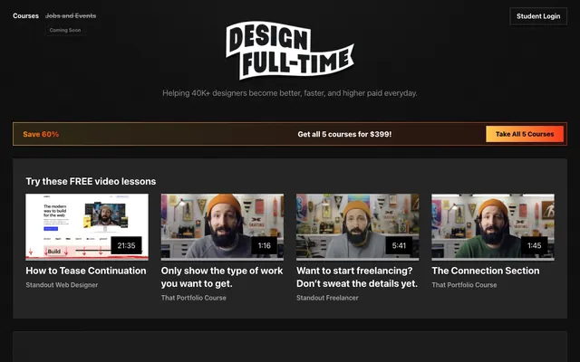
A full-width banner featuring a Sunset Fire Light (#ffc84e) gradient background from rgba(255, 200, 78, 0.12) to rgba(250, 58, 25, 0.1), with prominent white text. Text for critical info is Whisper White (#ffffff), while 'Save 60%' is a specific orange-yellow for impact. A solid Sunset Fire (#ff8a00) Call to Action button is embedded within it.
Uses the main Absolute Zero (#000000) background to blend seamlessly. Video titles are Whisper White (#ffffff) with descriptive text in Slate Gray (#888888). No explicit border or radius for these content cards, relying on spacing for separation.
Guidelines
- Prioritize Absolute Zero (#000000) as the canvas and Charcoal Black (#111111) for elevated surfaces, maintaining a dark base.
- Use Whisper White (#ffffff) for all primary headings and body text on dark backgrounds to ensure high contrast.
- Apply the Sunset Fire (#ff8a00) gradient for all primary call-to-action buttons and critical highlights to draw immediate attention.
- Employ plain-edged, square components with a 0px border-radius for buttons and input fields to maintain a stark, functional aesthetic.
- Maintain a clear hierarchy using Inter font weights: 400 for body, 600 for subheadings, and 700-800 for prominent headlines.
- Separate content blocks and components primarily through generous vertical spacing, using 32px marginBottom on sections or elements.
- Avoid using any rounded corners; all elements should have a 0px border-radius.
- Do not introduce light backgrounds beyond Whisper White text; the theme is strictly dark with minimal surface variation.
- Refrain from using pastel or desaturated colors outside of the defined accent gradients; maintain a high contrast and dark tone.
- Do not use subtle drop shadows or complex elevation effects; rely on color differences and borders for hierarchy.
- Avoid decorative illustrations or organic shapes; prioritize clear, functional UI elements and direct photography/video thumbnails.
- Do not use generic blue for links or interactive elements; all interactive accents should derive from the Sunset Fire gradient.
About this system
ShowHide
Design Full-Time employs a dark, pragmatic aesthetic for a focused learning environment. The palette centers around deep blacks and charcoals, accented by bright whites for primary text and a distinct orange-to-red gradient for calls to action. Typography is functional and compact, prioritizing direct communication without flourishes. Components are understated, relying on subtle borders and minimal elevation to define interactive elements against the dark background, creating an efficient and professional feel.
The page adheres to a max-width contained layout, with content centered. The hero section is full-bleed black with a centered brand logo and tagline, followed by a full-width promotional banner. Content sections below are primarily dark, arranged in a single column of stacked blocks. Video lessons are presented in a responsive grid, with each video card having a title and subtitle. Navigation is a simple top bar, fixed at the top, offering minimal options and a 'Student Login' button.
The site primarily uses product-focused video thumbnails featuring a single speaker in a studio setting. Photography is candid, focused on a person, and not treated with filters. Icons are minimal, utility-driven, and typically white against the dark background. Imagery's role is explanatory and informative, directly showcasing the content. The layout is text-dominant, with images serving as embedded content blocks rather than full-bleed decorative elements.
Reminiscent of Level Up Tutorials, Egghead.io, Wes Bos, DesignCode.io.
# Design Full-Time — Style Reference
> Dark mode command center

**Theme:** dark

**Site:** https://designfulltime.com

Design Full-Time employs a dark, pragmatic aesthetic for a focused learning environment. The palette centers around deep blacks and charcoals, accented by bright whites for primary text and a distinct orange-to-red gradient for calls to action. Typography is functional and compact, prioritizing direct communication without flourishes. Components are understated, relying on subtle borders and minimal elevation to define interactive elements against the dark background, creating an efficient and professional feel.

## Tokens — Colors

| Name | Value | Token | Role |
|------|------|------|------|
| Sunset Fire Light | `#ffc840` | `--color-sunset-fire-light` | Subtle background for promotional banners, indicating importance without being as visually heavy as the solid accent |
| Absolute Zero | `#000000` | `--color-absolute-zero` | Page backgrounds, card surfaces, primary text on light backgrounds, element borders |
| Charcoal Black | `#111111` | `--color-charcoal-black` | Secondary surface background for elevated components like cards and buttons, providing a slight distinction from the main canvas |
| Whisper White | `#ffffff` | `--color-whisper-white` | Primary text across dark backgrounds, navigation links, and button text |
| Slate Gray | `#888888` | `--color-slate-gray` | Muted text, secondary navigation items, subtle borders |
| Cool Steel | `#a0a0a0` | `--color-cool-steel` | Medium-contrast borders, control outlines, and structural separators. Do not promote it to the primary CTA color |
| Faded Ink | `#2c3e50` | `--color-faded-ink` | Dark borders and separators for elevated surfaces and inverted UI. |
| Midnight Graphite | `#343434` | `--color-midnight-graphite` | Subtle fill for decorative SVG elements, barely visible against the dark background |

## Tokens — Typography

### Inter
- **Substitute:** system-ui
- **Weights:** 400, 600, 700, 800
- **Sizes:** 15px, 16px, 18px, 20px, 24px
- **Line height:** 1, 1.33, 1.4, 1.5, 1.56
- **Letter spacing:** normal
- **Role:** The primary typeface for all text elements. Its straightforward and efficient appearance supports the platform's professional and instructional context. Weights 400 and 600 handle body text and subheadings, while 700 and 800 are reserved for prominent headings, maintaining compact energy.

## Tokens — Type Scale

| Role | Size | Line height | Letter spacing |
|------|------|------|------|
| body-sm | 15px | 1.56 | — |
| subheading | 18px | 1.4 | — |
| heading | 20px | 1.33 | — |
| heading-lg | 24px | 1 | — |

## Tokens — Spacing

- **Section gap:** 48px
- **Card padding:** 16px
- **Element gap:** 8px

## Tokens — Radius

- **none:** 0px

## Layout

The page adheres to a max-width contained layout, with content centered. The hero section is full-bleed black with a centered brand logo and tagline, followed by a full-width promotional banner. Content sections below are primarily dark, arranged in a single column of stacked blocks. Video lessons are presented in a responsive grid, with each video card having a title and subtitle. Navigation is a simple top bar, fixed at the top, offering minimal options and a 'Student Login' button.

## Imagery

The site primarily uses product-focused video thumbnails featuring a single speaker in a studio setting. Photography is candid, focused on a person, and not treated with filters. Icons are minimal, utility-driven, and typically white against the dark background. Imagery's role is explanatory and informative, directly showcasing the content. The layout is text-dominant, with images serving as embedded content blocks rather than full-bleed decorative elements.

## Components

### Primary Filled Button
*Interactive element for key actions*

Solid Charcoal Black (#111111) background with Whisper White (#ffffff) text. No border-radius, giving it a stark, immediate presence. Padding is 12px vertical and 40px horizontal for a substantial feel, or a more compact 8px vertical and 16px horizontal for secondary actions.

### Coming Soon Tag
*Informational label*

Small label with a Faded Ink (#2c3e50) text and border, providing a subtle highlight for upcoming features against the dark background. 4px vertical padding and 16px horizontal.

### Promotional Banner
*Highlighting special offers*

A full-width banner featuring a Sunset Fire Light (#ffc84e) gradient background from rgba(255, 200, 78, 0.12) to rgba(250, 58, 25, 0.1), with prominent white text. Text for critical info is Whisper White (#ffffff), while 'Save 60%' is a specific orange-yellow for impact. A solid Sunset Fire (#ff8a00) Call to Action button is embedded within it.

### Video Thumbnail Card
*Container for video content*

Uses the main Absolute Zero (#000000) background to blend seamlessly. Video titles are Whisper White (#ffffff) with descriptive text in Slate Gray (#888888). No explicit border or radius for these content cards, relying on spacing for separation.

## Guidelines

### Do

- Prioritize Absolute Zero (#000000) as the canvas and Charcoal Black (#111111) for elevated surfaces, maintaining a dark base.
- Use Whisper White (#ffffff) for all primary headings and body text on dark backgrounds to ensure high contrast.
- Apply the Sunset Fire (#ff8a00) gradient for all primary call-to-action buttons and critical highlights to draw immediate attention.
- Employ plain-edged, square components with a 0px border-radius for buttons and input fields to maintain a stark, functional aesthetic.
- Maintain a clear hierarchy using Inter font weights: 400 for body, 600 for subheadings, and 700-800 for prominent headlines.
- Separate content blocks and components primarily through generous vertical spacing, using 32px marginBottom on sections or elements.

### Don't

- Avoid using any rounded corners; all elements should have a 0px border-radius.
- Do not introduce light backgrounds beyond Whisper White text; the theme is strictly dark with minimal surface variation.
- Refrain from using pastel or desaturated colors outside of the defined accent gradients; maintain a high contrast and dark tone.
- Do not use subtle drop shadows or complex elevation effects; rely on color differences and borders for hierarchy.
- Avoid decorative illustrations or organic shapes; prioritize clear, functional UI elements and direct photography/video thumbnails.
- Do not use generic blue for links or interactive elements; all interactive accents should derive from the Sunset Fire gradient.

## Agent Prompt Guide

Quick Color Reference:
text: #ffffff
background: #000000
border: #2c3e50
accent: #ff8a00
primary action: #111111 (filled action)

Example Component Prompts:
1. Create a Primary Action Button: #111111 background, #ffffff text, 9999px radius, compact pill padding. Use this filled treatment for the main CTA.
2. Design a 'Coming Soon' label: 'Coming Soon', text #2c3e50, 1px solid #2c3e50 border, Inter 400 at 15px, 4px vertical padding, 16px horizontal padding, 0px border-radius.
3. Implement a general text input field: background #000000, 1px solid #4d4d4d border, text #ffffff, Inter 400 at 16px, 8px vertical padding, 16px horizontal padding, 0px border-radius.
4. Create a subsection heading: 'Try these FREE video lessons', text #ffffff, Inter 800 at 24px, 32px bottom margin.
More like this





Keep what you find
A free account saves references to boards and can send you a weekly email of picks based on what you save.
To see every result, go Pro.