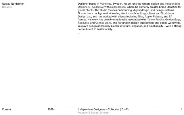
Preview image. Unlock full-res
monochromatic curriculum vitae
Color palette
Primary text, critical headings, active states, dividing lines, icon fills. The dominant foreground color, creating high contrast against the canvas
Hairline borders, dividers, input outlines, and card edges on light surfaces. Do not promote it to the primary CTA color
Muted secondary text, descriptive labels, subtle borders for inactive elements. Offers a softer contrast for less critical information
Dark borders and separators for elevated surfaces and inverted UI. Do not promote it to the primary CTA color
Typography
- Weights
- 400
- Sizes
- 20px, 21px
- Line height
- 1.2, 1.24
- Letter spacing
- -0.021em at 20px, -0.020em at 21px
- Fallback
- system-ui, sans-serif
Single, consistent typeface for all content. Its precise, neutral geometry supports the brand's emphasis on clarity and structure.
Spacing & shape
Components
Text in Iron Link (#333333), Univers Next Pro, weight 400. On hover, a solid 1px Midnight Ink (#000000) border appears on the bottom. Padding of 7px top, 3px bottom.
Paragraphs use Univers Next Pro, weight 400, 20px, line height 1.2, in Midnight Ink (#000000). Successive blocks are spaced with 21px top margin.
Each item is a row. Dates in Ghost Gray (#949494), roles/companies in Midnight Ink (#000000). A subtle 1px border in Iron Link (#f0f0f0) separates items, acting as a visual ruler. Right-aligned arrow icon in Midnight Ink (#000000). Implicit 30px row gap.
Text in Midnight Ink (#000000), Univers Next Pro, weight 400, 20px. Serves as a fixed left-aligned header element.
Text in Ghost Gray (#949494), Univers Next Pro, weight 400, 20px.
Guidelines
- Always use a Midnight Ink (#000000) text on White Canvas (#f0f0f0) background for maximum contrast and readability.
- Maintain minimal spacing between inline text elements; rely on line height rather than vertical padding for internal text rhythm.
- Employ the 1px solid Midnight Ink (#000000) border as a primary interactive indicator for hovered or active text links.
- Use Ghost Gray (#949494) exclusively for secondary, non-critical text such as labels or sub-information to soften hierarchy.
- Ensure all text, regardless of role, adheres to the Univers Next Pro font family at weight 400 for stylistic consistency.
- Utilize 1px solid Iron Link (#f0f0f0) borders as subtle horizontal dividers for lists or structured content, not for visual separation of large sections.
- Do not introduce any color outside the defined neutral palette; chroma is reserved for content, not UI.
- Avoid using multiple font weights or sizes; stick to the single defined style for all text.
- Do not use box-shadows or drop shadows; the design system relies on flat surfaces and high contrast for visual separation.
- Do not deviate from the high-contrast text-on-background model by using low-contrast text colors on the White Canvas.
- Avoid decorative icons or illustrations; the visual language is purely typographic and structural.
- Do not add rounded corners to any UI element; all shapes should be strictly rectangular.
About this system
ShowHide
Gustav Nordebrink's design system embodies a stark, high-contrast digital resume aesthetic. It prioritizes clarity and directness through a monochromatic palette, compact typography, and a distinct lack of decorative elements. The visual signature is an "inverted" dark mode, employing black text on an off-white canvas, with accents appearing as subtle hovers and thin underlines rather than bold colors. The system projects a sense of understated authority and meticulous organization.
The page operates on a fixed-width, single-column model within a White Canvas (#f0f0f0) background, with content primarily left-aligned. The hero section is a simple, fixed header with the brand name and 'Resume' link. Content sections are composed of tightly-packed, left-aligned text blocks, with large vertical section gaps (120px) to delineate major areas like 'Current', 'Past experience', and 'Education'. Lists or structured content, such as job entries, are presented as clean, horizontally segmented rows with subtle 1px dividers. The overall density is comfortable, balancing information with ample negative space around major content blocks.
The site is imagery-free, relying solely on typography and layout for visual communication. Icons are minimal, represented by simple arrows in Midnight Ink (#000000), serving purely functional navigation purposes (e.g., indicating expansion or external links). This approach emphasizes content and structure over decorative visuals.
Reminiscent of Read.cv, Blinkist (desktop app), Superhuman, Minimalist Blogs (e.g., Marginalian).
# Gustav Nordebrink — Style Reference
> monochromatic curriculum vitae

**Theme:** dark

**Site:** https://nordebrink.com

Gustav Nordebrink's design system embodies a stark, high-contrast digital resume aesthetic. It prioritizes clarity and directness through a monochromatic palette, compact typography, and a distinct lack of decorative elements. The visual signature is an "inverted" dark mode, employing black text on an off-white canvas, with accents appearing as subtle hovers and thin underlines rather than bold colors. The system projects a sense of understated authority and meticulous organization.

## Tokens — Colors

| Name | Value | Token | Role |
|------|------|------|------|
| Midnight Ink | `#000000` | `--color-midnight-ink` | Primary text, critical headings, active states, dividing lines, icon fills. The dominant foreground color, creating high contrast against the canvas |
| White Canvas | `#f0f0f0` | `--color-white-canvas` | Hairline borders, dividers, input outlines, and card edges on light surfaces. Do not promote it to the primary CTA color |
| Ghost Gray | `#949494` | `--color-ghost-gray` | Muted secondary text, descriptive labels, subtle borders for inactive elements. Offers a softer contrast for less critical information |
| Iron Link | `#333333` | `--color-iron-link` | Dark borders and separators for elevated surfaces and inverted UI. Do not promote it to the primary CTA color |

## Tokens — Typography

### Univers Next Pro
- **Substitute:** system-ui, sans-serif
- **Weights:** 400
- **Sizes:** 20px, 21px
- **Line height:** 1.2, 1.24
- **Letter spacing:** -0.021em at 20px, -0.020em at 21px
- **Role:** Single, consistent typeface for all content. Its precise, neutral geometry supports the brand's emphasis on clarity and structure.

## Tokens — Spacing

- **Section gap:** 120px
- **Card padding:** 16px
- **Element gap:** 16px

## Tokens — Radius

- **none:** 0px

## Layout

The page operates on a fixed-width, single-column model within a White Canvas (#f0f0f0) background, with content primarily left-aligned. The hero section is a simple, fixed header with the brand name and 'Resume' link. Content sections are composed of tightly-packed, left-aligned text blocks, with large vertical section gaps (120px) to delineate major areas like 'Current', 'Past experience', and 'Education'. Lists or structured content, such as job entries, are presented as clean, horizontally segmented rows with subtle 1px dividers. The overall density is comfortable, balancing information with ample negative space around major content blocks.

## Imagery

The site is imagery-free, relying solely on typography and layout for visual communication. Icons are minimal, represented by simple arrows in Midnight Ink (#000000), serving purely functional navigation purposes (e.g., indicating expansion or external links). This approach emphasizes content and structure over decorative visuals.

## Components

### Navigation Link
*Primary navigation elements and general inline links.*

Text in Iron Link (#333333), Univers Next Pro, weight 400. On hover, a solid 1px Midnight Ink (#000000) border appears on the bottom. Padding of 7px top, 3px bottom.

### Body Text Block
*Main content paragraphs and descriptions.*

Paragraphs use Univers Next Pro, weight 400, 20px, line height 1.2, in Midnight Ink (#000000). Successive blocks are spaced with 21px top margin.

### Experience Item
*Row-based display of resume entries (dates, roles, companies).*

Each item is a row. Dates in Ghost Gray (#949494), roles/companies in Midnight Ink (#000000). A subtle 1px border in Iron Link (#f0f0f0) separates items, acting as a visual ruler. Right-aligned arrow icon in Midnight Ink (#000000). Implicit 30px row gap.

### Header Branding
*Site title and section indicator.*

Text in Midnight Ink (#000000), Univers Next Pro, weight 400, 20px. Serves as a fixed left-aligned header element.

### Muted Label
*Category labels for resume sections (e.g., 'Current', 'Past experience').*

Text in Ghost Gray (#949494), Univers Next Pro, weight 400, 20px.

## Guidelines

### Do

- Always use a Midnight Ink (#000000) text on White Canvas (#f0f0f0) background for maximum contrast and readability.
- Maintain minimal spacing between inline text elements; rely on line height rather than vertical padding for internal text rhythm.
- Employ the 1px solid Midnight Ink (#000000) border as a primary interactive indicator for hovered or active text links.
- Use Ghost Gray (#949494) exclusively for secondary, non-critical text such as labels or sub-information to soften hierarchy.
- Ensure all text, regardless of role, adheres to the Univers Next Pro font family at weight 400 for stylistic consistency.
- Utilize 1px solid Iron Link (#f0f0f0) borders as subtle horizontal dividers for lists or structured content, not for visual separation of large sections.

### Don't

- Do not introduce any color outside the defined neutral palette; chroma is reserved for content, not UI.
- Avoid using multiple font weights or sizes; stick to the single defined style for all text.
- Do not use box-shadows or drop shadows; the design system relies on flat surfaces and high contrast for visual separation.
- Do not deviate from the high-contrast text-on-background model by using low-contrast text colors on the White Canvas.
- Avoid decorative icons or illustrations; the visual language is purely typographic and structural.
- Do not add rounded corners to any UI element; all shapes should be strictly rectangular.

## Agent Prompt Guide

Quick Color Reference:
text: #000000
background: #f0f0f0
border: #f0f0f0
accent: no distinct accent color
primary action: no distinct CTA color

Example Component Prompts:
1. Create a page hero: fixed left-aligned text 'Gustav Nordebrink' at 20px Univers Next Pro weight 400 in #000000. Underneath, a link 'Resume' at 20px Univers Next Pro weight 400 in #000000, underlined on hover with a 1px #000000 line.
2. Create a body text block: Paragraph 'Designer based in Mariefred, Sweden. He co-runs...' using 20px Univers Next Pro weight 400, line height 1.2, in #000000. Add a 21px top margin if it follows another text block.
3. Create an experience item row: On a #f0f0f0 background, display '2019-2021' in 20px Univers Next Pro weight 400 #949494. Centered, 'Stockholm Design Lab' in 20px Univers Next Pro weight 400 #000000. At the right end, an arrow icon in #000000. A 1px #f0f0f0 border should separate this row from the next. The row has an implicit 30px row gap.
More like this





Keep what you find
A free account saves references to boards and can send you a weekly email of picks based on what you save.
To see every result, go Pro.