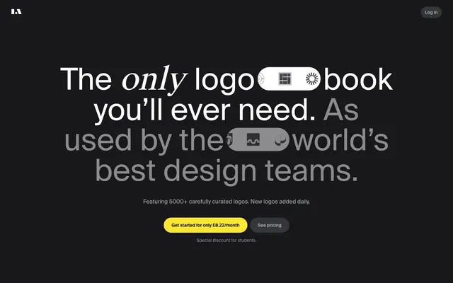
Preview image. Unlock full-res
Deep Digital Archive.
Color palette
Yellow outline accent for tags, dividers, and focused UI edges. Do not promote it to the primary CTA color
Page background (primary), card surfaces, text on bright surfaces
Decorative fill for icons and abstract shapes
Card backgrounds, button backgrounds, secondary surface color
Dark borders and separators for elevated surfaces and inverted UI. Do not promote it to the primary CTA color
Muted secondary text, helper text, subtle borders
List item backgrounds, tertiary background for subtle differentiation
Primary text, icon fill, button text, card borders
Subtle background tones, light border accents
Typography
- Weights
- 400, 500
- Sizes
- 12px, 14px, 16px, 18px, 19px, 24px, 28px, 65px, 96px
- Line height
- 0.9, 1, 1.2, 1.75
- Letter spacing
- normal
- Fallback
- Inter
Primary content font for all text elements: headings (bold, large), body text, navigation, and button labels. Its wide range of weights and sizes provides clear visual hierarchy within a consistent aesthetic.
- Weights
- 400
- Sizes
- 65px, 96px
- Line height
- 1, 1.2
- Letter spacing
- normal
- Fallback
- Lora
Used selectively for large, prominent headings, specifically for the main hero statements. Its distinct character provides a stylistic contrast to Suisse International while maintaining legibility.
Spacing & shape
Components
Filled with Amber Glow (#fde533) with Midnight Ink (#000000) text, 20px border radius, and 4px 10px padding.
Transparent background with Porcelain (#ffffff) text and 1px Porcelain (#ffffff) border, 20px border radius, and 4px 10px padding.
Filled with Steel Gray (#27272a) background with Porcelain (#ffffff) text, 20px border radius, and 4px 10px padding.
Steel Gray (#27272a) background, 28px border radius, and 120px 0px 0px 0px padding. No shadow.
Ash Gray (#343538) background, 22px border radius, and 32px 48px 32px 32px padding. No shadow.
Midnight Ink (#000000) background, 28px border radius. No padding.
Porcelain (#ffffff) background with Midnight Ink (#000000) text, 999px border radius for a pill shape.
Guidelines
- Use Midnight Ink (#000000) for all primary page backgrounds and main text on Amber Glow surfaces.
- Apply Suisse International for all type, adjusting weight and size to create hierarchy, except for specific large hero headlines.
- Employ Steel Gray (#27272a) for default card backgrounds and subtle interactive elements.
- Prioritize a 28px border radius for most content cards and a 20px radius for buttons.
- Use Amber Glow (#fde533) exclusively for primary calls to action, tags, and small functional highlights.
- Maintain a compact element spacing with 8px as the default gap between components where possible.
- Ensure primary text is Porcelain (#ffffff) on dark backgrounds for optimal contrast.
- Avoid using multiple chromatic colors; Amber Glow (#fde533) is the primary accent.
- Do not use box shadows for elevation; rely on background color differences and subtle borders instead.
- Refrain from using thin weights of type on dark backgrounds where legibility could be compromised.
- Do not introduce square or minimally rounded corners; all interface elements should embrace significant corner radii.
- Avoid large empty spaces beyond the pageMaxWidth; the layout should feel dense yet organized.
- Do not use generic system fonts; Suisse International and Suisse Works Book define the brand's typographic voice.
- Do not use generic grey for interactive states; utilize the Amber Glow (#fde533) for hover/active where appropriate for primary actions.
About this system
ShowHide
LogoArchive presents a commanding dark-mode experience, reminiscent of a digital archive or library. Its aesthetic is dominated by deep, muted neutrals, creating a profound backdrop for content. Typography favors compact, confident sans-serifs, reserving a single, vivid yellow for functional accents. Components are lightweight with subtle border treatments and generous curves, balancing utility with a soft, approachable feel against the dark canvas.
The page maintains a centered, max-width contained layout rather than full-bleed, creating a focused experience within the surrounding Midnight Ink canvas. The hero section features large, centered headlines over the dark background, often incorporating a single graphic element. Section rhythm is built on consistent vertical spacing, often with content blocks stacking vertically or arranging in multi-column grids (like the pricing cards). There are no overt visual dividers; sections flow into each other via background changes. Navigation is a minimal top bar with simple text links.
This site prominently features product screenshots and abstract graphics. Product screenshots are typically close-cropped UI elements or full interface views presented on the deep dark background, often showcasing geometric logo arrays. Imagery is contained, never full-bleed, and integrates seamlessly with the surrounding UI. Icons are simple, outlined or filled in monochromatic tones (Porcelain, Carbon), maintaining a clean, utilitarian aesthetic. The focus is on visual content as explanatory rather than decorative, showcasing the product directly.
Reminiscent of Linear, Raycast, Figma (dark mode), Setapp.
# LogoArchive — Style Reference
> Deep Digital Archive.

**Theme:** dark

**Site:** https://www.logo-archive.org

LogoArchive presents a commanding dark-mode experience, reminiscent of a digital archive or library. Its aesthetic is dominated by deep, muted neutrals, creating a profound backdrop for content. Typography favors compact, confident sans-serifs, reserving a single, vivid yellow for functional accents. Components are lightweight with subtle border treatments and generous curves, balancing utility with a soft, approachable feel against the dark canvas.

## Tokens — Colors

| Name | Value | Token | Role |
|------|------|------|------|
| Amber Glow | `#fde533` | `--color-amber-glow` | Yellow outline accent for tags, dividers, and focused UI edges. Do not promote it to the primary CTA color |
| Midnight Ink | `#000000` | `--color-midnight-ink` | Page background (primary), card surfaces, text on bright surfaces |
| Carbon | `#18181b` | `--color-carbon` | Decorative fill for icons and abstract shapes |
| Steel Gray | `#27272a` | `--color-steel-gray` | Card backgrounds, button backgrounds, secondary surface color |
| Ash Gray | `#343538` | `--color-ash-gray` | Dark borders and separators for elevated surfaces and inverted UI. Do not promote it to the primary CTA color |
| Sky Haze | `#a8afb7` | `--color-sky-haze` | Muted secondary text, helper text, subtle borders |
| Stone | `#8c8c8d` | `--color-stone` | List item backgrounds, tertiary background for subtle differentiation |
| Porcelain | `#ffffff` | `--color-porcelain` | Primary text, icon fill, button text, card borders |
| Polar Mist | `#dadee4` | `--color-polar-mist` | Subtle background tones, light border accents |

## Tokens — Typography

### Suisse International
- **Substitute:** Inter
- **Weights:** 400, 500
- **Sizes:** 12px, 14px, 16px, 18px, 19px, 24px, 28px, 65px, 96px
- **Line height:** 0.9, 1, 1.2, 1.75
- **Letter spacing:** normal
- **Role:** Primary content font for all text elements: headings (bold, large), body text, navigation, and button labels. Its wide range of weights and sizes provides clear visual hierarchy within a consistent aesthetic.

### Suisse Works Book
- **Substitute:** Lora
- **Weights:** 400
- **Sizes:** 65px, 96px
- **Line height:** 1, 1.2
- **Letter spacing:** normal
- **Role:** Used selectively for large, prominent headings, specifically for the main hero statements. Its distinct character provides a stylistic contrast to Suisse International while maintaining legibility.

## Tokens — Type Scale

Perfect Fourth (1.333) from 16px base.

| Role | Size | Line height | Letter spacing |
|------|------|------|------|
| caption | 12px | 1.75 | — |
| body-sm | 14px | 1.75 | — |
| body | 16px | 1.75 | — |
| subheading | 18px | 1.75 | — |
| heading-sm | 24px | 1.2 | — |
| heading | 28px | 1.2 | — |
| heading-lg | 65px | 1 | — |
| display | 96px | 0.9 | — |

## Tokens — Spacing

- **Section gap:** 24px
- **Card padding:** 32px
- **Element gap:** 8px

## Tokens — Radius

- **Buttons:** 20px
- **Cards:** 28px
- **lists:** 40px
- **tags:** 999px

## Layout

The page maintains a centered, max-width contained layout rather than full-bleed, creating a focused experience within the surrounding Midnight Ink canvas. The hero section features large, centered headlines over the dark background, often incorporating a single graphic element. Section rhythm is built on consistent vertical spacing, often with content blocks stacking vertically or arranging in multi-column grids (like the pricing cards). There are no overt visual dividers; sections flow into each other via background changes. Navigation is a minimal top bar with simple text links.

## Imagery

This site prominently features product screenshots and abstract graphics. Product screenshots are typically close-cropped UI elements or full interface views presented on the deep dark background, often showcasing geometric logo arrays. Imagery is contained, never full-bleed, and integrates seamlessly with the surrounding UI. Icons are simple, outlined or filled in monochromatic tones (Porcelain, Carbon), maintaining a clean, utilitarian aesthetic. The focus is on visual content as explanatory rather than decorative, showcasing the product directly.

## Components

### Primary Action Button
*Call to action*

Filled with Amber Glow (#fde533) with Midnight Ink (#000000) text, 20px border radius, and 4px 10px padding.

### Ghost Secondary Button
*Secondary action*

Transparent background with Porcelain (#ffffff) text and 1px Porcelain (#ffffff) border, 20px border radius, and 4px 10px padding.

### Subtle Secondary Button
*Secondary action on dark backgrounds*

Filled with Steel Gray (#27272a) background with Porcelain (#ffffff) text, 20px border radius, and 4px 10px padding.

### Standard Content Card
*Content grouping*

Steel Gray (#27272a) background, 28px border radius, and 120px 0px 0px 0px padding. No shadow.

### Elevated Content Card
*Content grouping, slightly more prominent*

Ash Gray (#343538) background, 22px border radius, and 32px 48px 32px 32px padding. No shadow.

### Minimal Card
*Basic container*

Midnight Ink (#000000) background, 28px border radius. No padding.

### Pill Tag
*Informational tag or filter*

Porcelain (#ffffff) background with Midnight Ink (#000000) text, 999px border radius for a pill shape.

## Guidelines

### Do

- Use Midnight Ink (#000000) for all primary page backgrounds and main text on Amber Glow surfaces.
- Apply Suisse International for all type, adjusting weight and size to create hierarchy, except for specific large hero headlines.
- Employ Steel Gray (#27272a) for default card backgrounds and subtle interactive elements.
- Prioritize a 28px border radius for most content cards and a 20px radius for buttons.
- Use Amber Glow (#fde533) exclusively for primary calls to action, tags, and small functional highlights.
- Maintain a compact element spacing with 8px as the default gap between components where possible.
- Ensure primary text is Porcelain (#ffffff) on dark backgrounds for optimal contrast.

### Don't

- Avoid using multiple chromatic colors; Amber Glow (#fde533) is the primary accent.
- Do not use box shadows for elevation; rely on background color differences and subtle borders instead.
- Refrain from using thin weights of type on dark backgrounds where legibility could be compromised.
- Do not introduce square or minimally rounded corners; all interface elements should embrace significant corner radii.
- Avoid large empty spaces beyond the pageMaxWidth; the layout should feel dense yet organized.
- Do not use generic system fonts; Suisse International and Suisse Works Book define the brand's typographic voice.
- Do not use generic grey for interactive states; utilize the Amber Glow (#fde533) for hover/active where appropriate for primary actions.

## Agent Prompt Guide

Quick Color Reference:
text: #ffffff
background: #000000
border: #ffffff
accent: #fde533
primary action: #27272a (filled action)

Example Component Prompts:
1. Create a Primary Action Button: #27272a background, #ffffff text, 9999px radius, compact pill padding. Use this filled treatment for the main CTA.
2. Build a content card with a title 'Monthly' in Suisse International, weight 500, size 24px, line-height 1.2, color #ffffff. Use a Steel Gray (#27272a) background, 28px border radius, and 120px 0px 0px 0px padding. Inside, include a ghost text button: 'See pricing' with text #ffffff, transparent background, 1px border #ffffff, 20px radius, 4px 10px padding.
3. Design a small informational tag: 'A new format' using Amber Glow (#fde533) background, text #000000, and a 999px border radius with 4px 10px padding. Place it with an 8px element gap from a larger heading.
More like this





Keep what you find
A free account saves references to boards and can send you a weekly email of picks based on what you save.
To see every result, go Pro.